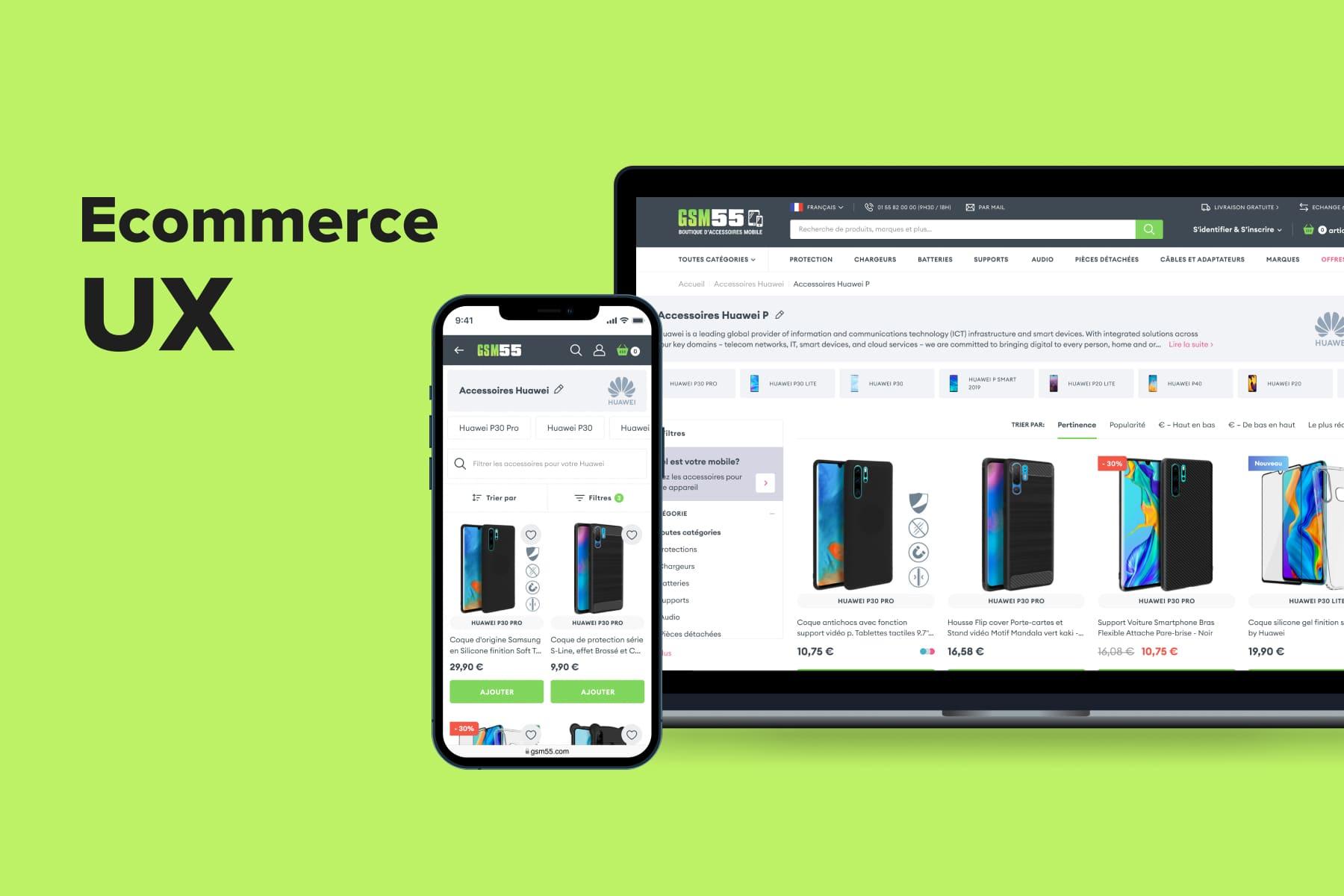
Being an integral part of eCommerce navigation, filtering directly impacts the overall user experience. The wider assortment a store has, the better product filters must work. Otherwise, many prospects won’t find suitable goods as swiftly and effortlessly as they want.
It does matter where you locate a filtering menu on mobile and desktop layouts; how intuitive the interaction is; which filters are available; what’s done to avoid zero results; how quickly the system responds to users’ actions, and so forth. Our experts will share Onilab’s experience in optimizing eCommerce filters from the UX perspective.
Table of Content
1. Why Are Filters So Important?
Some online stores don’t need filtering and sorting, like those selling a minimal range of products. If there’re a dozen items in a catalog, additional functionality will only overload an interface and distract leads. In other cases, filters enhance a shopping experience in a few ways:
- Aid in finding products that meet all user’s requirements as an addition to a good .
- Weed out products that prospects are less interested in and focus on the most relevant ones.
- Make a selection digestible. Narrowing down the choices makes it easier for users to decide on the purchase.
- Help to discover large categories efficiently. Without filters, users would only have the patience to leaf through several pages, which is often just the tip of the iceberg.
- Accelerate the customer journey. This benefit naturally follows from the previous points. Actually, each store should strive to reduce the amount of time visitors spend on the website. A fast and smooth path to the checkout promises higher conversions, whereas obstacles like ill-conceived decrease motivation to complete an order.
- Create a feeling of a personalized experience. Despite users ticking checkboxes by themselves, accurately working filters fetch them a refined selection as if a mindful shop assistant helped them.
When it comes to sorting, it might serve both consumers and brands:
- For the former group, sorting is a vital tool to further improve the relevance of the results.
- For the latter, it can be an additional promotional means. Let’s say a store wants to sell particular products more actively. It can attribute the “Bestseller” tag to them so that they appear at the top when users sort by popularity. Surely, brands should not overuse such a trick.
2. How to Define the Needed Filters?
Let’s consider two major cases:
a) a store has been up and running for some time, and
b) it’s a fresh one. For each, it’s wise to kick off with the customer behavior analysis, but resources will differ.
For brands that want to enhance their filtering UX, the workflow might look like this:
- Collect corresponding website data to identify the most/least popular filters (for further prioritization) and search requests (for creating new filters);
- Record user sessions using webvisor to fact-check your findings and see how exactly visitors interact with the filtering system and what issues they encounter;
- Look at heatmaps to detect the areas of the closest users’ attention.
When it comes to businesses that are about to enter the market and want to build the filtering system from scratch, we recommend the following:
- Make a competitor analysis to identify the strategies that successful rivals stick to;
- Conduct user interviews with a focus on the filters people opt for most frequently and what irritates them during the process.
The insights aid in designing the filtering menu not blindly: choose the right filters and get rid of redundant ones, as well as position them accordingly to their popularity.
Then is time to deal with nuances regarding the usability principles and logic behind a filtering system. Let’s talk about them, analyze some mistakes, and see worthy eCommerce filter examples.

Get a Free UX Audit Example
Read our demo UX report exploring the online store’s checkout issues.
3. UX Best Practices for Filtering
While creating or revising filtering on category and search results pages, you must consider two core aspects. Firstly, the tech one: accurate results and their fast delivery. It depends on which search solution you have and how thoroughly the team works on product attributes (color, volume, brand, price, and so on) and their weight. We delved into this topic in the guide on .
Secondly, it’s the user experience provided by product filters. That’s what we’ll discuss further, taking a closer look at the following:
- Improving eCommerce filters UX for smartphones and laptops/PCs;
- Universal usability principles for setting up convenient filtering.
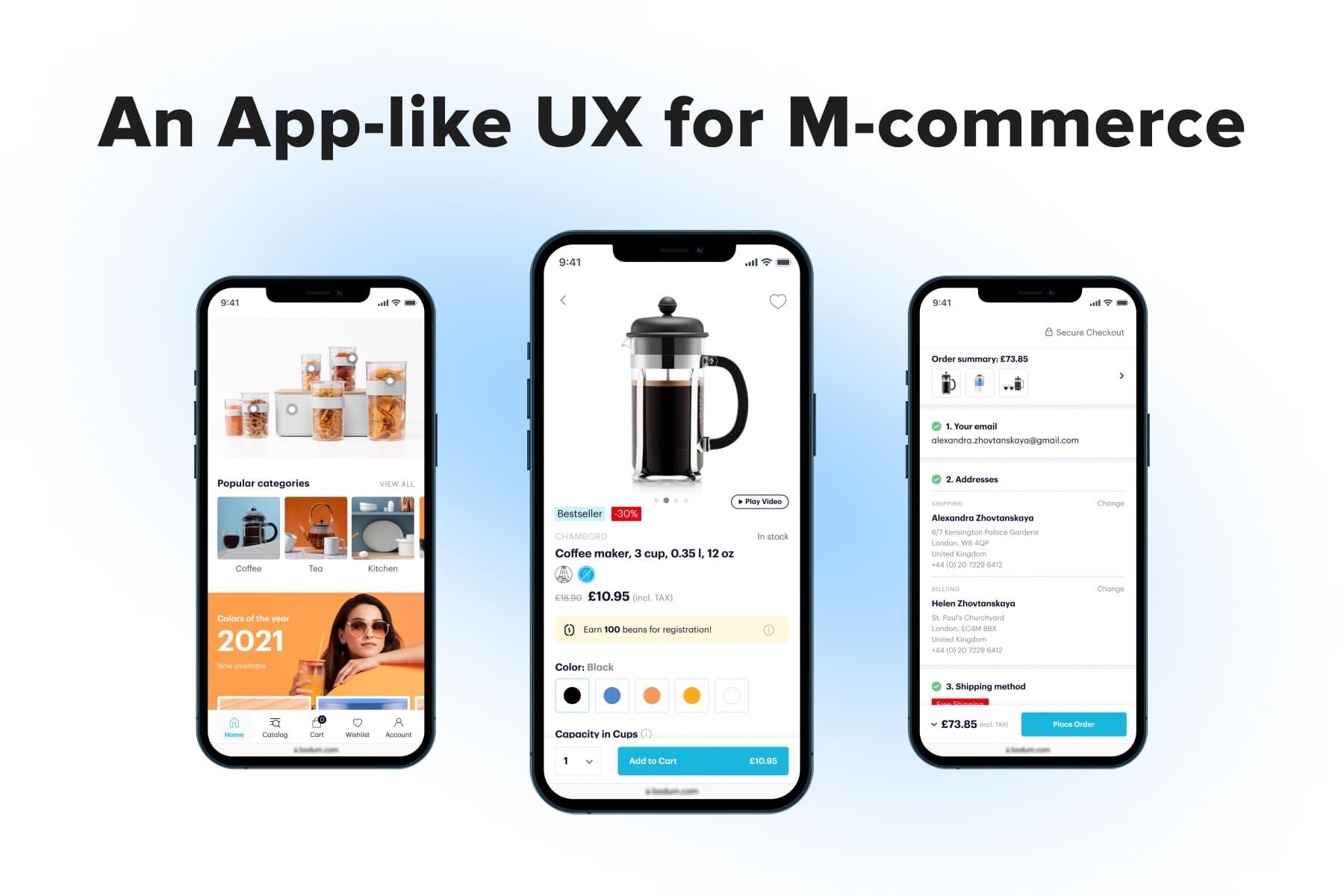
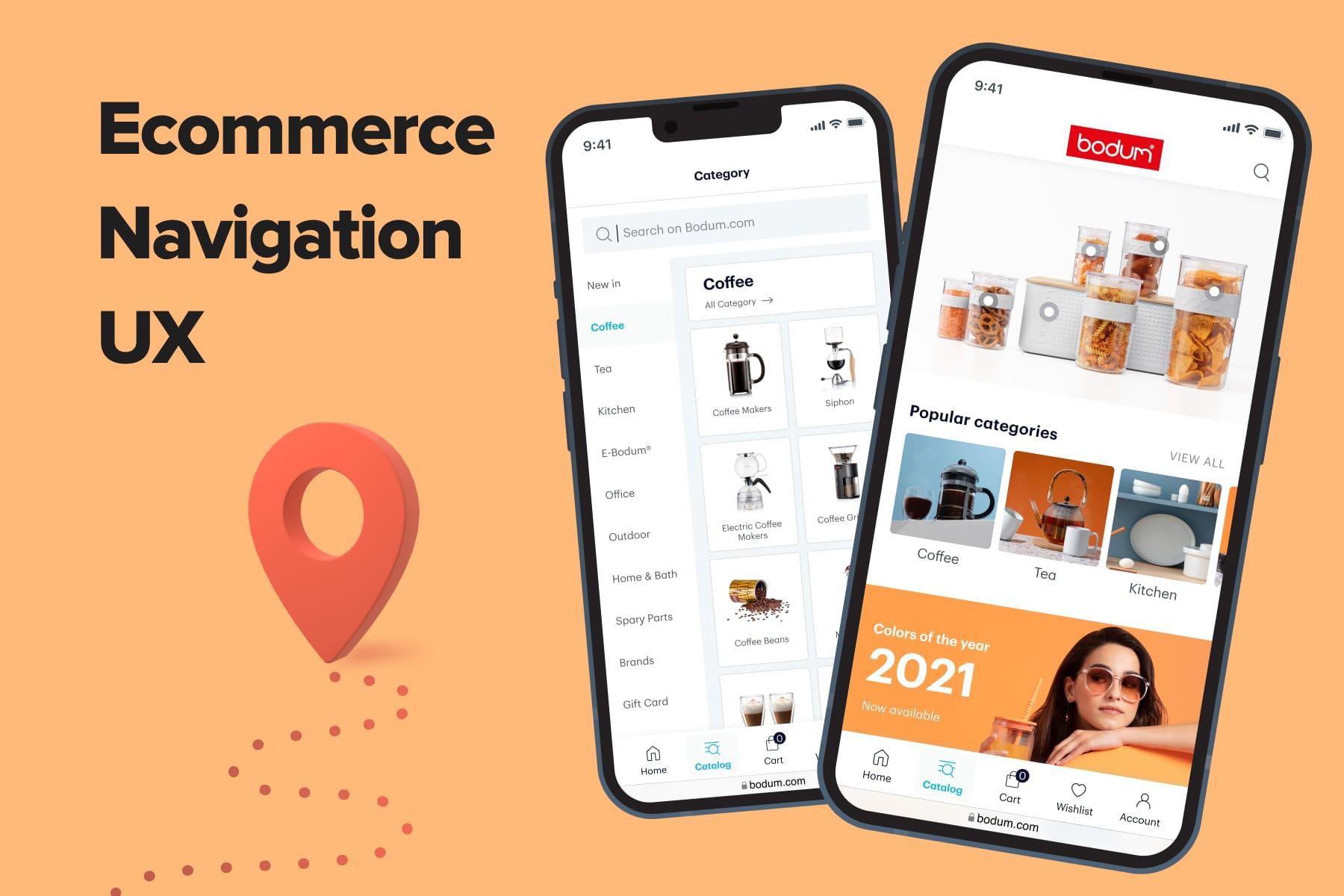
3.1 Mobile Filtering UX
So we’ll start with eCommerce filters best practices for mobile devices. Basically, there’s no other way than to open filters in a pop-up window. But the devil is in the details: the feature’s accessibility, ways to display filters, close the menu, and the visibility of applied filters.
How to Make the Feature Accessible?
With relatively small smartphone screens, users have to scroll a lot. With large catalog sections, having filtering and sorting at hand becomes a must-have. A sticky bar pinned to the top (sometimes bottom) is a perfect solution in UX terms, and there are two ways to apply it:
- The sticky bar is present all the time. While prospects are scrolling in any direction, they always have access to the filters. Onilab’s designers give preference to this solution; you can see the implementation for Overneed, one of our clients.
- The sticky bar appears when users scroll up because such behavior may indicate that a person wants to change some options. This trick saves a bit more space compared to the first one, but it’s not so clear that filters can be “called” like that (see the example from ASOS).
Unfortunately, many online stores don’t take care of this aspect, forcing users to scroll right to the top when they want to revise filters (see the example from Mango).
How to Show the Filters Inside the Menu?
Frankly speaking, it’s the most challenging part of optimizing eCommerce filters. You can come across various methods, some of which are quite controversial from the UX perspective.
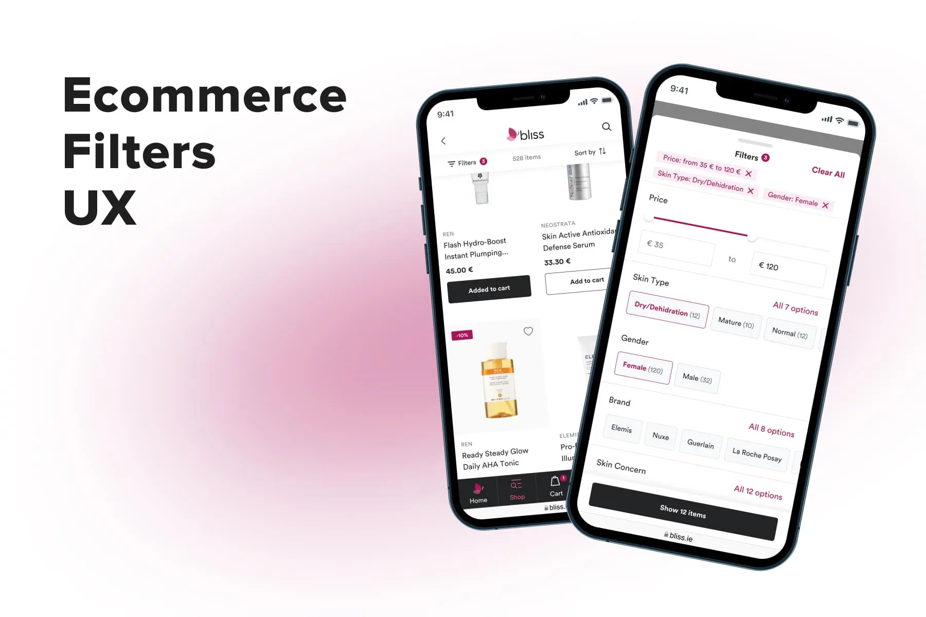
a) Showing off the options straight away. That’s what Onilab’s design team considers the best possible solution since it reduces the number of clicks: we demonstrate maximum options with minimum effort from the customers’ side.
If it's just several variants inside one filter, we showcase all of them. If it’s more, we put them into a horizontal scrollbar. But not everyone will guess this bar is scrollable, so we also add the “All options” link opening the list in a new pop-up atop the previous one. Below is how it looks in one of our projects.
b) Hiding filters in new pop-ups. Unlike in the first configuration, shoppers can’t see anything but the filter titles. Sometimes there are just a couple of options inside or not-so-relevant ones, but users should tap to see. This type forces them to go back and forth many times.
On Zalando, navigation is additionally complicated. To go one step back, users must tap on the arrow; if they don’t apply a filter and swipe right, they’ll leave the menu.
c) Hiding filters in accordions. On the one hand, it allows prospects to see more filter titles at once. On the other hand, it requires many taps and scrolls (see the example from Swarovski).
d) Accordions + scrollbars. Stores with a large assortment (like Home Depot) try to tackle the problem of endless filtering options by hiding them in accordions and making the lists scrollable inside blocks. It’s an attempt to make the filtering menu more or less compact.
Interestingly, Home Depot doesn’t collapse the previous accordion when buyers expand the next one, which is handier for them. Here scrollbars are great helpers, too: without them, the filtering menu would be literally endless.
By the way, when you use checkboxes, mind their sizes. If the click areas are smaller than the usability standards imply, users can slip and select the wrong options.
How to Make a Closure Convenient?
Since the filtering menu is a pop-up, there’s an opportunity to design several ways to close it. Stores employing more than one have the upper hand in terms of user experience.
- A swipe down. For many smartphone users, swipes are customary and intuitive, while the rest are gradually getting used to them. That’s why we add swipes to almost all pop-ups. There may also be left/right swipes if product filters open sideways. But this feature is less widespread than it could be: for instance, Ikea doesn’t provide swipes.
- A cross. This standard option is the clearest sign for customers, so we do recommend having it as well.
- A tap outside the pop-up. This third variant is possible if the store implements pop-ups that cover the screen partly.
- A swipe right. If the pop-up takes up the whole screen (like the one on Zalando we saw above), it will be an expected feature behavior.
An important note. Mobile filtering menus always have the “Apply” button, that in most cases, is fixed in a sticky bar to be reachable. But it’s vital to apply filters even when shoppers don’t press it and close the menu.
3.2 Desktop Filtering UX
Now, let’s discuss eCommerce filters UX on the desktop. First and foremost, designers are able to create a few types of filtering, and the choice largely depends on which industry the store represents.
What Filtering Menu Type to Choose?
Let’s see which three templates are used most often.
a) A pop-up. In this case, filters are hidden; the link to them is located in the sticky bar to be at one’s disposal if needed. It prevents disorientation; otherwise, prospects can assume there’re no filters at all.
This behavior was borrowed from the , where pop-ups are absolutely irreplaceable staples. At Onilab, we use this type primarily for brands that regard filters as an extra option that’s not so frequently used.
These are stores where customers make many so-called emotional purchases largely inspired by visuals. For instance, it’s relevant for apparel or tableware sellers. While opting for such items, a user is more interested in how they look on the whole rather than which specific properties they have.
Another argument favoring this type is that it occupies tiny space on the page, giving room for larger pics in the listing. If quality photos are a significant fraction of the concept, this approach definitely makes sense.
b) A sidebar. A full-blown filtering menu is placed on the left/right and remains open while visitors scroll through the catalog/search results.
This type is particularly relevant for stores selling complex goods like home appliances and electronics. These are rational, thought-through purchases selected by a bunch of characteristics; the choice here depends less on the photos. So showing off the filters is logical.
c) A top bar. It’s a sort of compromise between the previous options. It looks like a more or less narrow bar with filters appearing in drop-downs (rarely in pop-ups). Some stores display all labels, while others add the most used ones and the “Show all” button. Sometimes stores pin the bar to the top and thereby accentuate the feature.
How to Organize a Vast Set of Filters?
Suppose your products are highly specific, having more than a dozen characteristics. In addition, the catalog is extensive, so each filter has loads of options as well. Then you face the challenging task of organizing these numerous fields. It’s doubtful that you’ll fit them all compactly, so there’s a need for some tricks.
Let’s take a sidebar as an example. Firstly, you can hide less popular filtering options into accordions. Some stores even organize the entire filtering menu like this, but we reckon it’s better to keep frequently used filters open.
Secondly, these collapsed filters can expand in a different fashion:
a) When users click “Show all”, the whole list opens. This behavior is suitable for limited sets (less than 10);
b) When users hover over the “All options” button, a kind of tooltip appears. Buyers can see the rest and tick the boxes without scrolling.
c) When users click the button, they see a scrollbar inside the block. It’s better for longer option lists.
However, some stores display all options as is (see the example from Amazon), but most likely, users will spend more time exploring the menu because it’s so extensive.
And thirdly, mind the UI part: does the template look optimized, or can you further refine it? For instance, on Home Depot, filters take more than four desktop screens which require excessive scrolling. In the meantime, the spacing between options and the blocks themselves is greater than it should be.
Furthermore, it’s worth redesigning the price filter: instead of checkboxes and fields for manual input, there can be a neat range slider.
3.3 The General Filtering Tips & Tricks
Finally, many recommendations are equally applicable to both mobile and desktop filtering. Below, we’ll talk about the filter types and prioritization, ways to prevent zero results, and steps to make product filtering handy and smooth. Of course, these are just part of the measures to create the best website filter designs.
Which Filter Types to Include?
At first glance, setting eCommerce filters is a no-brainer since it’s all about product characteristics. But we suggest looking from other perspectives too. Apart from the basic product and category-specific filters (size, color, price, fabric, etc.), consider these ones:
- Thematic filters: style (classic, casual, sporty, romantic); occasion (cocktail party, formal, bridal, casual, home); season;
- Specification and benefits-based filters: wash cycles (for dishwashers); fabric properties (for sofas); compatibility (for gadgets);
- Filtering by reviews (in stars) or by reviews with photos/videos.
What About Prioritization?
It’s worth noting that designers need to analyze each category individually since the users’ patterns may drastically differ from section to section. Therefore, the filter configuration (not only the selection but also the order) may vary.
The best website filter designs will look different in a grocery, marketplace, shoe, or accessories store. For instance, on Overneed (an online department store), we put a price filter closer to the top because that’s what interests its customers the most. On the contrary, for The Webster’s customers (a fashion boutique), the brand is above all, so we moved it to the top.
How to Avoid Zero Results?
Let’s imagine a visitor dedicating time to applying a number of filters. Obviously, they do so for the sake of finding the needed goods faster. But once all filters are set, the user sees no results. Everything will go awry immediately: the prospect will feel disappointed and may even bounce as a result.
So what are the UX best practices for filtering in this case? Probably, the only way to resolve such an issue is to employ interactive filtering. This approach implies that the product selection updates after each chosen option, and customers see only relevant fields in the menu.
It’s opposed to now antiquated batch filtering. In this case, users tick the boxes, press the “Apply” button, and then the page refreshes. If there’re some mutually exclusive filters in this scope, shoppers end up with nothing found.
So the choice is clear: it’s worth implementing interactive filtering. Here are the tips to further improve it:
- Constantly watch the store’s loading speed. If there’re troubles, interactive filtering will only highlight the issue and deteriorate the UX. A whole lot of factors negatively affect the site’s performance, but some cutting-edge tech solutions aid in addressing them, like integrating a .
- As users choose parameters, hide those leading to no results. You can also disable them, but the first method is less distractive.
- Show the number of results next to each option. Users will foresee what quantity they’ll deal with in each case which can influence further decisions.
- Show how many results will be on the list as users opt for filters. This move helps users decide whether to narrow down or widen the selection.
A case in point is Zalando. It does eliminate dead-end variants but doesn’t show how many results will remain after applying the next filter. Thus, leads may see just a few or even one item in the end. If they had known the outcome, many would have picked other filters.
How to Simplify Changing the Filters?
Firstly, it’s important to clarify that it worked (the filters were applied):
- On smartphones, there’s little we can do because of space limitations. But the number of active filters next to the corresponding title will be indicative.
- Desktops are roomy enough to mention not only the quantity but also the filter labels themselves and the “Clear all” button.
Then, if customers want to alter the selection or remove all filters at once, designers should facilitate these actions:
- Put the chosen options to the top (inside the menu, in case of mobile). Accompany the labels with crosses so that visitors understand there’s no need to untick the boxes below.
For example, Zalando doesn’t display the chosen options, forcing users to go to each section if they want to remove some filters. It makes the flow longer and frustrates customers.
- Don’t forget to add the “Clear all” button. Again, Zalando doesn’t provide this feature, complicating the shopping process. To remove filters, shoppers should either open each drop-down and click “Reset” or click/swipe back.
How to Make Using Filters Even Handier?
Obviously, we should aim to make interactions with the filtering menu as convenient and understandable as possible. Behind this platitude is thorough design work, especially in large stores and specific industries.
Here are additional tips that help to ease utilizing filters in different cases:
- Tell and show. The simplest example is adding swatches to the “Color” section because people process visual data faster. Moreover, some customers might have trouble imagining tones like “Sage”, “Purple,” or “Ecru” without such a prompt.In turn, swatches without labels are troublesome for people with vision problems, and different device screens might display colors incorrectly. So don’t forget to add titles to the hues.
- Visualize complex notions. Oftentimes people come across quite specific terms from, e.g., fashion: “Monk Straps”, “Lace-Ups”, and “Loafers”, or “Herringbone”, “Houndstooth”, and “Bird's Eye”. The former group denotes shoe styles, and the latter is about fabric patterns. So why not just draw them?Suit supply does this really well (although there’s too much blank space in the menu). In turn, Aliexpress doesn’t always apply this life hack pertinently. While visualizing the sleeve and neckline shape (which is helpful), it also draws the pieces’ length (which is senseless).
- Allow searching. This tip is a must for multibrand stores in the first place but also for any site having loads of options for particular filters. Expanding the whole list of a hundred titles and forcing people to scroll it through inside a small window is horrendous. Instead, embed a search field into the section (see our design for The Webster).
- Explain. Clarify the meaning of parameters that users may not know about. Let’s say the store sells IoT systems (like ThingPark Market, one of our clients). These items have various specifications that may seem unclear for part of buyers. We accompany these titles with prompts in tooltips (on desktops) or pop-ups (on mobiles). Users see little “?” icons marking these characteristics.
- Remove filters when users press “Back”. While many customers undo filters by tapping on the cross or “Clear all”, others, either out of habit or because of inexperience, click/swipe back. It’s better if the store is prepared for this pattern. Technically, it’s representing the application of each filter as a separate event.
Finally, What About Sorting?
When developing the sorting system, the team needs to address two questions:
- What options make sense to include?
- Which one of them is worth setting as default?
Again, analytics is the most credible source here. Check which sorting options customers prefer, test new ones, and decide. Some tend to sort by price, others by new items, popular goods, or a discount percentage.
A bonus tip for the desktop templates: don’t hide sorting options in the menu. Most often, there’s enough space to fit all sorting labels and cut the customer journey by one small step.
Filtering is a Crucial Feature for Good UX
Creating a first-rate filtering system that suits all customers’ needs is truly challenging. But the deliverables are worth it: better navigation brings a better user experience leading to a higher conversion rate.
While eCommerce still abounds with sites delivering a mediocre customer experience, stores with a polished UX have all chances to outperform rivals. Onilab is focused exactly on this aim, reaching it via new approaches to eCommerce web development and .