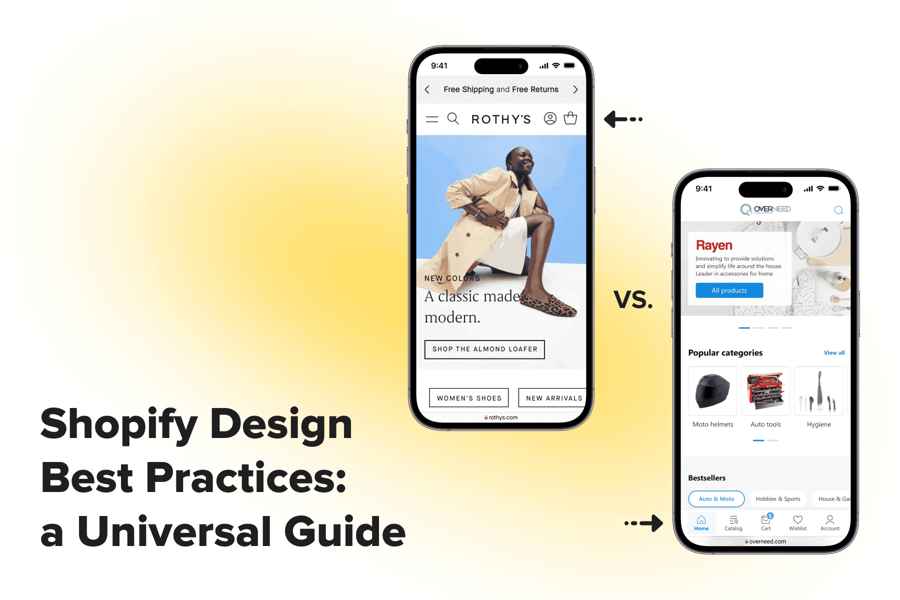
Outdated and/or ill-conceived design is quite a widespread and potentially life-threatening issue for online stores. You might have an excellent product or brand selection and competitive prices, but it’s not enough. You also have to facilitate buying online from whatever device customers use; otherwise, the rivals will successfully “seize” the prospects.
E-commerce website redesign is now all about improving the user experience, particularly on smartphones. The UX part is primary, as it accounts for the convenient interaction with the store, helping customers to order faster. Then goes the UI design, which concerns the interface style, visual appeal, brand recognition, and ease of perceiving info.
In this article, Onilab’s designers explain when your store needs an overhaul/partial redesign, what the process looks like, who’s involved, and what the terms and costs are. We’ll also discuss some of our latest projects to understand what a good UX/UI redesign is.
Table of Content
1. Why Should You Redesign the Store?
A design greatly impacts multiple aspects of the store’s performance and financial success. Let’s see the top reasons to redesign an eCommerce website, starting with the most significant.
The conversion rate is too low. While there can be other causes, a poor user experience is highly likely to trigger such a downtrend in the CR. At some point in the customer journey, people abandon their carts or bounce even before choosing goods because something went awry. A bunch of obstacles might scare away visitors: confusing navigation, a thorny, complicated checkout, absence of essential info, and so on. In this context, understanding can be particularly beneficial to identify and implement strategies that can enhance your store's conversion rate.
- The bounce rate is too high. If a large proportion of users don’t act and close the store on the same page they opened, it’s a sign of issues on it. If it’s a homepage, maybe it has to do with content: few blocks to go further, no benefits listed, inconspicuous navigation, etc. Or the store just looks untrustworthy.
- The store isn’t mobile-friendly. Now people prefer smartphones over desktops for online shopping. Having the store’s mobile version geared for cell phones should have become a prevalent practice. But no, we still come across those horrendously inconvenient sites with non-intuitive designs done with no understanding of mobile usability principles.
- The business is outgrowing the website. Let’s say you’re scaling, planning to offer new features and services, or changing the branding. If the website is your business’s face and primary touchpoint, it’s definitely high time to rethink it.
- You’re ready to go custom. Many businesses start with standard or free themes. But, firstly, they’re run-of-the-mill, similar to thousands of other templates. Secondly, they’re too generic and don’t fully fit particular niches, product types, and audiences. Thirdly, they often overlook vital usability rules for desktops and mobiles. So when you can afford to allocate money and substitute default templates with a custom UX/UI design, go for it.
Successful eCommerce website redesign brings considerable benefits to the store:
- Better KPIs. Namely, lower cart abandonment and bounce rates and a higher conversion rate. BTW, an overwhelming majority of conversion rate optimization tactics imply redesigning stores, at least partly. A critical aspect of this is the , which plays a significant role in reducing cart abandonment rates.
- Higher customer loyalty. As the statistics suggest, are reluctant to come back to a website after experiencing issues. The better UX you provide, the more returning customers the store will have.
- More newcomers. Once a store becomes user-friendly on any device, Google notices it. And if everything is being done right SEO-wise, the store gets a boost in SERPs meaning more traffic comes to the website. Not to mention new users trust well-designed sites more.
All in all, the redesign should be regarded as a powerful tool to increase sales, raise brand awareness and attractiveness (that also eventually leads to more orders).
Basically, if you have an insufficient amount of traffic, it makes sense to prioritize customer acquisition. And if you have enough visitors to the store, but they convert worse than expected, the design might be a reason. Experts can make a comprehensive audit and tell for sure whether the design is a weak spot and what can be done to ameliorate the situation.
2. How Does the Store Redesign Process Looks Like?
Redesigning an eCommerce website is a voluminous task. To succeed, we first and foremost conduct a thorough investigation and prioritization, then draw mockups and move to the development and testing. Basically, the process presupposes the next steps:
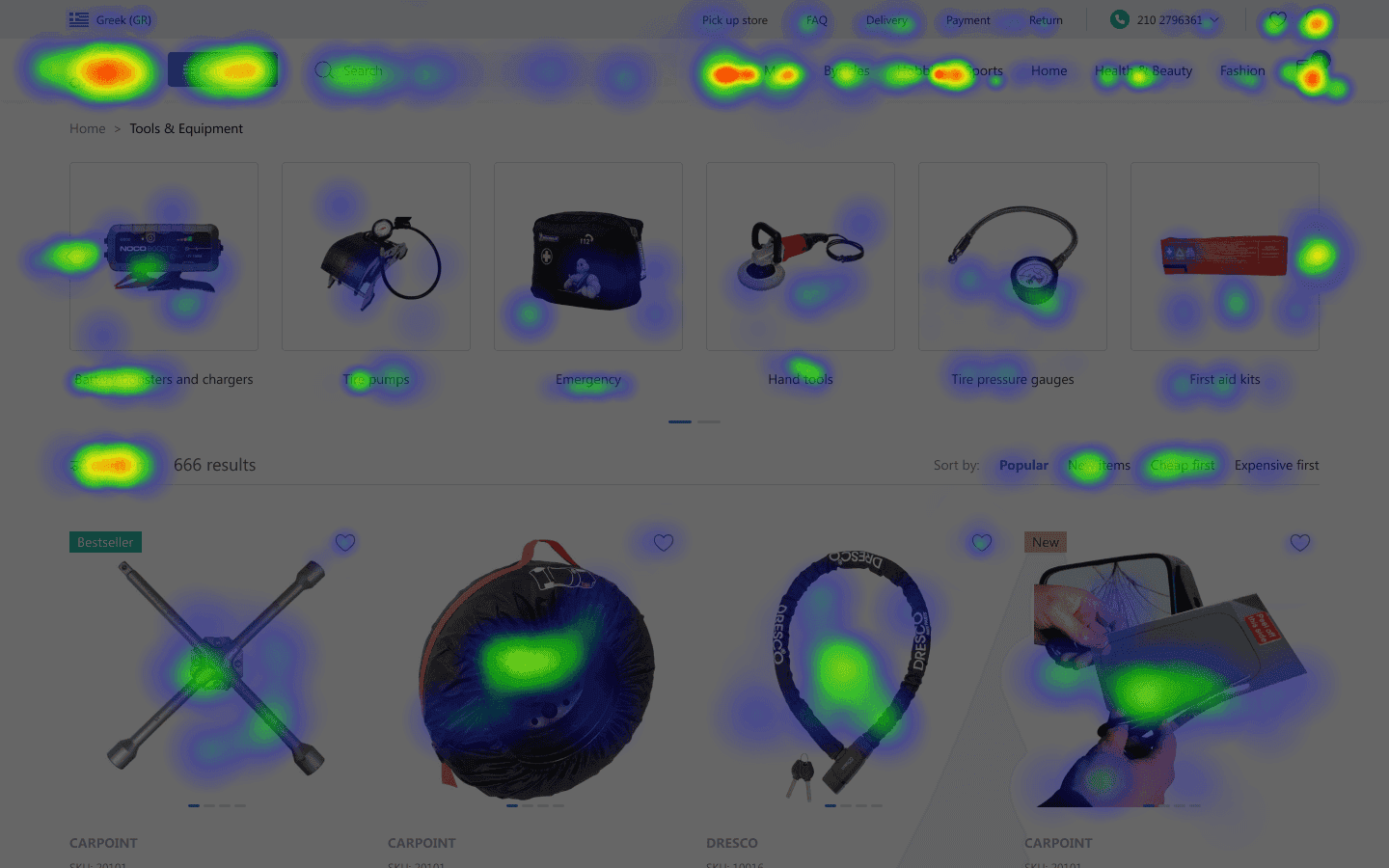
- Research. The aim is to study the store, the target audience (its pain points and desires), and the competitors. To draw the correct conclusions, we interview the client and fill out the brief. Also, we analyze GA reports, heat and scroll maps, video sessions, survey findings, and user feedback reports. Sometimes we conduct usability testing and in-depth interviews with potential customers.
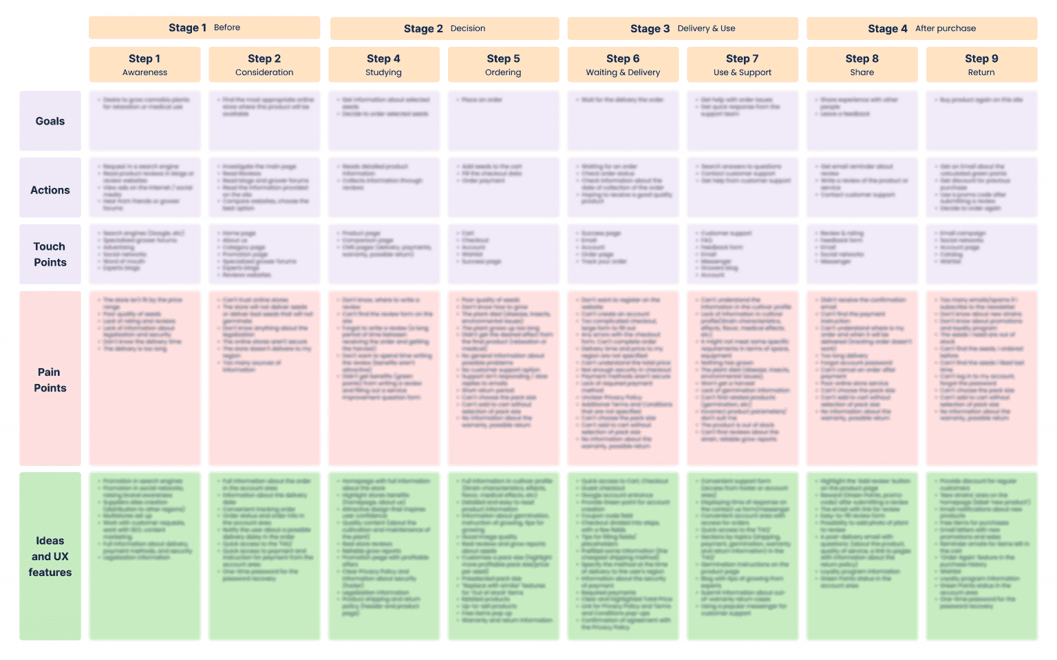
- Customer journey mapping. Then we create personas and customer journey maps (CJMs) for each segment if they differ considerably. In the CJM, we mention possible UX improvements for every stage of a conversion funnel. But we have to prioritize the pages, features, and elements that are the most critical for the store’s bottom line. We’ll rework them in the first place.
- Wireframing. Our focus in this phase is designing a seamless customer journey. A modern interface gently guides users toward the finish of the sales funnel and makes shopping effortless. We rethink an informational architecture and navigation, organize the sections and controls, change how different elements work, and simplify the interactions. We can create the UX part first and then move to the UI. If we already have a brand book and UI kit, the visual part can be added as we work on the UX.
- Presentation. During the wireframing stage, we often come up with a few hypotheses for one page and make several mockups. We then discuss the solutions, doubts, and options with the client to decide what’s better for them or what’s worth A/B testing. Prior to presenting some ideas, we consult with the developers since there can be relatively difficult and time-consuming solutions.
- Development & QA. It’s a huge chunk of work with many subtasks. We prepare the layouts and add comments about the logic behind some elements; then, a project manager prioritizes the tasks for the dev team. Throughout the development process, designers stay involved as supervisors: they communicate with developers and QAs to ensure the solutions are being implemented properly.
- Release. Finally, the new designs go live and start working for both customers and the business.
3. Which Redesign Approach Should You Choose?
There are several paths to go: revamp page by page, redraw all at once or rebuild an entire frontend, including the technical part. While the usability rules behind all three remain the same, each has pros and cons.
3.1. A Gradual Redesign
It implies remaking the separate parts of the website and deploying them one by one as soon as they’re ready. Typically, we start with the most troublesome components, like navigation or the checkout page, and then move to those pages/features/blocks needing less attention.
Speaking about the advantages of such an approach:
- The first improvements are seen faster. When we create and implement smaller chunks of new designs straight away, the UX starts to ameliorate immediately, and so do the performance metrics.
- It resolves the issue if it’s related to a particular page. Let’s say it’s an inconvenient checkout structure that forces users to abandon it. If designers and data analysts identify the root of the issue correctly and fix it, we might even notice an immediate effect on sales.
- It reduces the financial burden on the store. The redesign can be costly, but when making it steadily, the business can feel more confident about its bottom line. Moreover, as the revenue grows, the store can invest in further changes.
- The store remains familiar to customers. People get used to interfaces, and it’s psychologically comfy to see incremental changes rather than open a totally different site one day. Some will leave it because they can’t find the needed features and don’t want to learn the new flow at the moment. Gradual changes strike a balance between the need to enhance the UX and natural people’s resistance to changes.
However, there are some drawbacks (as ever):
- It doesn’t fully address the store issues. As a rule, if the UX is unsatisfactory on one page, there are problems on others too. So we recommend redesigning the entire store eventually.
- We can’t create a PWA (progressive web app). PWA is a type of website with a split frontend and backend. Changing the way the data is transmitted significantly speeds up the store. But implies rewriting the frontend itself in JavaScript. Remaking the theme partly doesn’t allow us to introduce major changes to the frontend.
- It’s challenging to harmonize newer and older parts. Renewed elements will appear across the store, even on the pages we didn’t touch. So, whatever we change in the templates (even minor elements), we always need to cross-check whether it looks/works fine on other pages and doesn’t argue with the overall design. It must remain consistent in the visitors’ eyes.
3.2 An Entire Redesign
Some clients order a major redesign when each and every page undergoes an overhaul. The benefits of the approach are the following:
- It’s a systemic change. We work through the whole scope of UX issues, tackle them, and create a flawless data-driven customer experience. The user flow from top to bottom of the conversion funnel is well-thought-out and smooth.
- There are no boundaries to designers’ creativity. They don’t need to match the new and old designs, as well as stick to the existing color scheme, fonts, or other UI elements (unless it’s required by the client and brand guides).
But take the shortcomings of this method into consideration too:
- It’s time-consuming and costly. The whole redesign takes several months (not counting the development stage), depending on the project scale and complexity. During the process, the store just invests without seeing the effect. Many companies can afford this, but if the store lacks financial stability, it’s maybe ill-advised to redesign all at once.
- The KPIs can dip after implementing a new design. As we’ve said, customers might initially be lazy to rediscover the store. But it’s usually a temporary problem. Regular buyers will gradually come back, and newcomers will surely appreciate the UX. Also, it’s important to combine the new design with marketing and SEO optimization efforts: many new customers can mitigate the negative impact of switching to the new design.
- The design dates a bit. While the design and dev teams work on the project, somebody may create more advanced solutions. And it’s unlikely the store will be happy to allocate an additional sum to update the theme. Fortunately, the UX/UI rules haven’t changed dramatically since smartphones took over PCs and laptops in eCommerce.
3.3 An Advanced Frontend
So far, we’ve been talking about the design part only. We can make a good UX for desktops and app-like interfaces for mobiles without a technological upgrade. It’s faster and cheaper, while performance optimization aids in accelerating the site.
But there’s an ultramodern when we rebuild both the storefront design and the website’s architecture. Most store owners might not think about how backward their current websites are from the IT perspective. PWAs, as the type of headless commerce sites, are faster than so-called monolithic ones (that still make up the majority of websites) because they work in a completely different principle.
PWA embrace the positive traits of mobile apps (speed, UX) while not requiring users to download them and flood the phone memory. So they’ve become a working alternative to native apps. Since the eCommerce industry is moving towards headless solutions, consider making this tech leap together with the redesign.
4. E-commerce Revamp Best Practices: Onilab’s Case Studies
Well, it’s time to see what exactly we mean by the modern user- and mobile-friendly eCommerce design worth investing in. We’ll show Onilab’s latest projects and explain the usability principles and must-have features utilized.
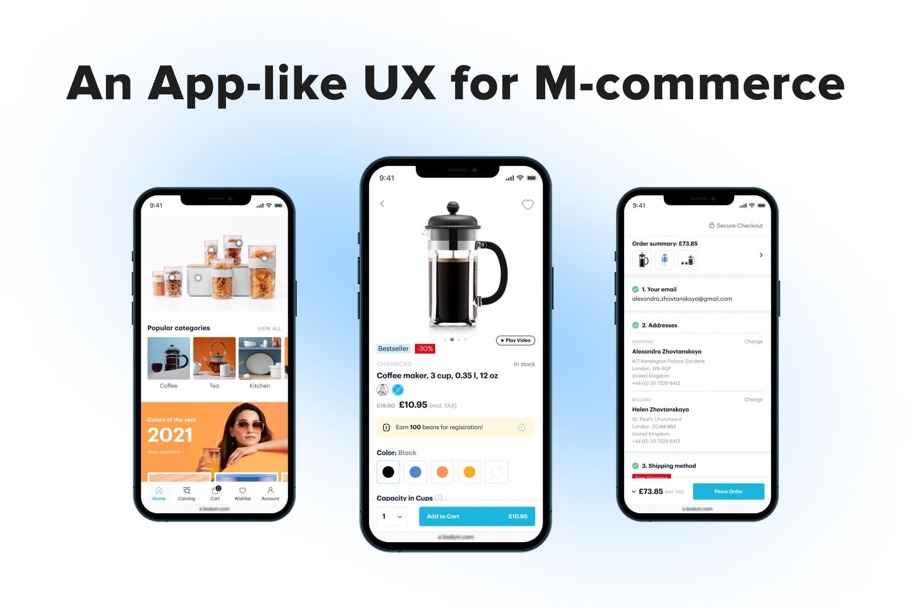
4.1 The Mobile-first Approach
10-12 years ago, it was normal to create the desktop design to then squeeze and alter it for the mobile store. But the mobile traffic surpassing the desktop and the rise of mobile app development became a tipping point for UX/UI design.
To provide a much-demanded decent user experience on smartphones and create truly responsive websites, designers had to ditch the old way of work and move to the mobile-first approach. It’s guided by the mobile UX rules, taking into account cell phones’ peculiarities and user behavior patterns.
Apart from drawing the mobile mockups prior to desktop ones, we at Onilab also apply the usability principles for native applications. This shift in our design strategy results in super convenient app-like mobile themes.
Take a look at one of our eCommerce redesign projects, the Danish tableware store we redesigned with the in mind. The most crucial of them are:
- Navigation at the bottom. We place essential buttons and controls at the bottom of the screen so that it’s easier to operate even with one hand.
- Sticky bars. To reduce the need to scroll long mobile pages, we pin CTAs and filters (sometimes content menus and headers, too) to the top/bottom.
- Pop-ups. Opening additional features, details, and different forms over the current page solves three issues: we don’t disrupt the shopping process by sending people to new pages, don’t increase loading time, and don’t overflow the layouts with content.
- Swiping. Where possible, we offer more than one option to close menus and other pop-ups: e.g., tap the cross and swipe.
Some of the practices turned out to work well on desktops too. The reversed approach helped us to create well-structured desktop templates.
4.2 Navigation
There’s no universal solution when developing a new and more effective information architecture and . When the store sells goods from one category (e.g., apparel or shoes), it’s not a big deal to structure a bunch of sections. But when it’s a department store or a marketplace, organizing the categories and filters gets challenging.
Here is the navigation we created for ThingPark Market, a French marketplace selling IoT devices. The following traits of the desktop version are worth highlighting:
- A thoroughly structured mega menu that showcases all categories and subcategories for a chosen one;
- Pictograms and pics as additional visual cues helping to grasp the sections’ content immediately;
- A filtering menu without accordions. In some blocks, the whole option lists are hidden, but they open in pop-ups to avoid layout jumps and redundant scrolling.
On mobile, the main solutions were as follows:
- A tab bar at the bottom of the screen. The main controls are under the thumb and are handier in use compared to the icons in the header.
- Subcategories opening on new screens. Instead of expanding and collapsing accordions, we made exploring subsections more convenient.
- Filtering and sorting are fixed at the top. They’re always in the viewport and available instantly. Plus, users can switch between the two grid types.
4.3 The Homepage
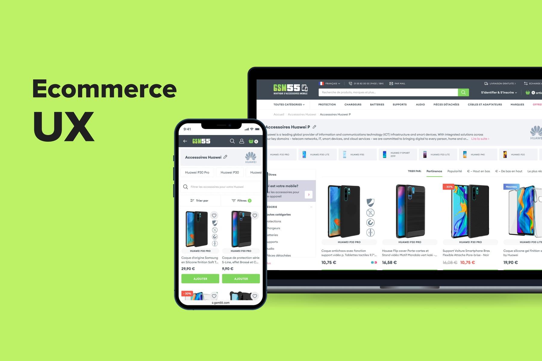
As many visitors start their customer journey from the main page, it should give an idea of the store and its benefits as well as facilitate exploring the site further; it’s the essence of the . For GSM55, a French mobile accessories store with an extensive catalog, we had an extra task: to help people quickly find their phone model amongst hundreds and see only compatible gadgets and accessories. So we:
- Streamlined navigation. Previously, there were two menus on the page that looked confusing and untidy. We completely reworked the above-the-fold area to make it more informative.
- Put an additional navigation block right on the homepage. It contains the most popular models for major brands and is constantly updated.
- Added many touchpoints: top categories, new products, and popular search requests.
- Underlined the store benefits, trustworthiness, and expertise. The benefit bar with clear info, reviews, and blog articles perfectly serve these aims.
4.4 The Category Page
The more items a store has in its catalog, the more meticulous work is needed. The category page must be informative (but not “noisy”) and easily manageable. Everything matters: the grid size, how the cards look, how the next scope in the listing is loaded, where the filters are, and so on.
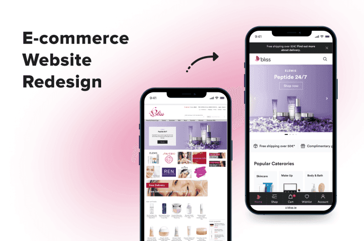
For Bliss, an Irish cosmetic store, Onilab’s designers created a page with the following characteristics:
- The “Add to cart” buttons are present at this stage of the customer journey. They help shoppers with a higher buying intent proceed with the order faster, skipping the product page. It’s also an indispensable feature for stores with large average orders and where buyers don’t tend to read product details.
- Wish list icons on the cards allow users to save goods for later.
- Options are available to preview and opt for in pop-ups. Again, customers don’t need to move to a dedicated product page to see and choose the colors/volumes.
- Pagination is used in addition to infinite scroll. People see how many pages the selection takes, tap “Load more” to see the full selection, and can return to any page right away, thanks to a sticky bar with page numbers at the bottom.
- Filters are placed in a sticky bar. They can be closed by swiping on cell phones. Also, we changed how the filters look and behave. Check our guide to see best practices for , showing color options effectively, and organizing the filtering system on desktops and smartphones.
4.5 The Product Page
To present goods in all their glory and persuade users to add them to a cart, striking the eye with excellent photos and videos is not enough. The product page needs to reflect numerous nuances: the options, product details, size guide/”true to size” (for clothing/shoe/accessories stores), matching items, and more. Another challenge on the way to a perfect is organizing this extensive info.
For The Webster, an American fashion boutique, we came up with a sleek product page layout focusing on luxurious pieces:
- The photos occupy more space because the store’s audience is keen on how items look.
- The CTA button is in a sticky bar to allow adding a product from any position on the page. On the desktop, the whole block on the right is sticky.
- Shipping info on the product page lets prospects know about the options and terms as soon as possible.
- Product details are partly hidden and open in pop-ups. This way, we keep the page minimalistic while allowing users to explore pieces conveniently.
- Recommendation blocks are present (“Wear with”, “You might also like”, “Recently viewed”). They aid in either cross/up-selling or attracting attention to something else if one changes their mind about the current product.
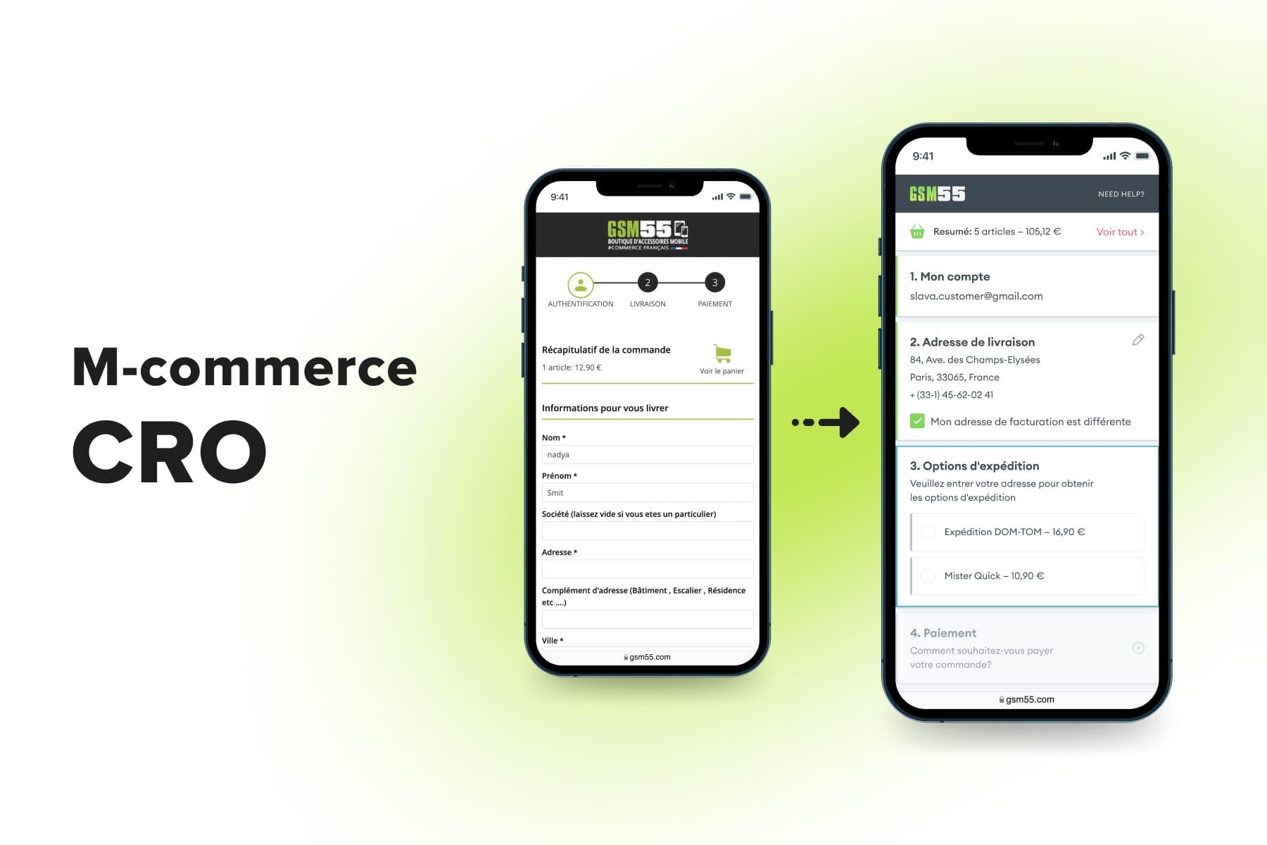
4.6 The Checkout
This step traditionally casts a shadow on a customer journey: users often end up bouncing exactly from the checkout. It happens when users see no suitable ways to log in/pay, get disappointed by the shipping options/costs, or feel overwhelmed by the number of forms/fields/pages in the flow.
For a Greek department store called Overneed, we designed a seamless checkout process using the solutions we tested firsthand on different projects, refined many times, and finally approved as effective. It has the following peculiarities:
- Social media or Google login. It’s a way out for people who don’t have an account and don’t want to create one.
- One-time passwords for customers. If a person forgets their password or something goes wrong with the auto-fill, they can instantly receive a code by email.
- An incentive to create an account. Newcomers can get a 10% discount if they sign up: they need to tick the checkbox, create a password, and that’s it.
- The shipping method form goes first. This store has pick-up points, so filling out the shipping form may be unnecessary. A map accompanies the in-store pick-up option.
- The modern features accelerate the checkout process. The address finder automatically fills out most address lines after entering a postal code. With mobile-friendly payment options like digital wallets, shoppers skip inputting the cart data.
- It’s a one-step checkout: all forms are on the same page and open in pop-ups. It differs from most solutions on the market. First, users don’t wait until the next page is loaded. Second, they see the number of steps straight away. Third, they almost don’t need to scroll to see the whole form. And fourth, we don’t disable the CTA: once tapped, it returns users to the step they missed. You’ll find more tips on in a dedicated article.
5. How Much Does It Cost to Redesign an E-commerce Website?
If you see a drastic difference between your store design and the projects showcased above, you might be very interested in how much time and money it takes to create and develop a new store design. While the terms highly depend on the project size, complexity, and other parameters, we’ll give at least a rough evaluation.
5.1 The Time Estimate
Onilab’s UX/UI design team can conduct the audit and fully redesign the store in 2-3 months. The time for the UX/UI part is approximately allocated like this:
- Research (including the site UX/UI & and GA reports studying, meetings with the client and competitor analysis, creating buyer personas and CJMs): 40-60 hours;
- The homepage: 60-80 hours;
- The category page: 55-85 hours;
- The product page: 75-120 hours (simple), 130-180 hours (with a product customizer);
- The cart page: 45-70 hours;
- The one-step checkout: 60-95 hours;
- The account page: 35-60 hours;
- The CMS pages (contact, customer service, FAQ, 404, success, and other basic pages): 40-65 hours.
The total for the design part is between 410 and 695 hours.
5.2 The Cost Estimate
So what about the expenditure on the redesign? Apart from the work scope, the sum will highly depend on the region the team is located. Speaking of the designers’ hourly rates around the world:
- The US and Canada: from $60 up to $170;
- The UK, Northern, and Western Europe: from $60 to $120;
- Eastern Europe: between $35 and $45;
- South America: around $45;
- Asia: up to $40.
A side note. Over time, Eastern European countries have become world-renowned IT hubs with plenty of highly qualified teams and decent rates. Onilab also has offices in the region.
When it comes to the development costs, they’re quite hard to predict because they hugely depend on the tech stack your store operates on. so that we get acquainted with the project and give a more precise time & cost assessment.
6. The Online Store Redesign: FAQ
Finally, let’s discuss some questions you may still have about the eCommerce website UX/UI revamp.
6.1 How Often Should I Redesign the Store?
Once in 3-5 years is regarded as a standard for eCommerce. We think the five-year interval is optimal. But between the redesigns, we recommend making alterations to the current mockups, adding new features, and discarding obsolete elements. Surely, it all must be based on analytics, heatmaps, and usability testing.
6.2 Should I Implement New Design Trends in the Store?
Yes and no. First things first: before designing some fancy features, make sure you’ve made your store mobile-friendly. It’s not a trend anymore; it’s a good practice that customers expect.
Ok, what’s next? Some trends might be game-changers for a user experience, worthwhile to test. For instance, let’s recall the era of AR-powered virtual try-on features that took the beauty industry by storm. It was a remarkable trend for cosmetic stores.
But we must warn you against too-bold experiments with the store’s interface. If you take a look at websites winning design awards, they’ll most likely be flamboyant and staffed with animated elements. For eCommerce, these features are inappropriate: they distract users and slow down already heavily loaded stores. UX/UI designers are now refusing to use even tiny animations on buttons, listings, and carousels. In turn, minimalism will always be relevant.
6.3 Can I Just Use Ready-Made Templates?
Yes, but. When it comes to default, off-the-shelf, and free themes, they can be useful in some cases. For instance, you’re starting a business and don’t fully understand who your buyer is or what your audience likes and can’t stand UX-wise. If you begin with a cheaper version, there’s a possibility to test it out, obtain insights, and accumulate a budget for an eCommerce website redesign.
Another reason to go with such an option is when you’re lucky enough to find a solution aligning with the target audience’s behavior and your concept.
In other cases, we’d revise the layouts. The UX/UI design reflects how the business sees its customers. The main benefit of custom-made themes is the ability to build a storefront exactly for your typical buyer and niche. The ready-made designs, in turn, are too universal. This means fewer chances to please your target audience and meet business needs.

Get a Free UX Audit Example
Read our demo UX report exploring the online store’s checkout issues.
Final Word
We believe a user-centered store design is crucial to achieving higher customer loyalty and better revenue. To understand whether you need a refresh in the nearest future, answer the question: how does your business fare regarding conversions, cart abandonment, and bounce rate? Then recall the last time you revised the website’s interface.
If you see the reasons to redesign your eCommerce website, turn to our . With the help of our team, dozens of online stores managed to raise their KPIs and win more regular and new customers.