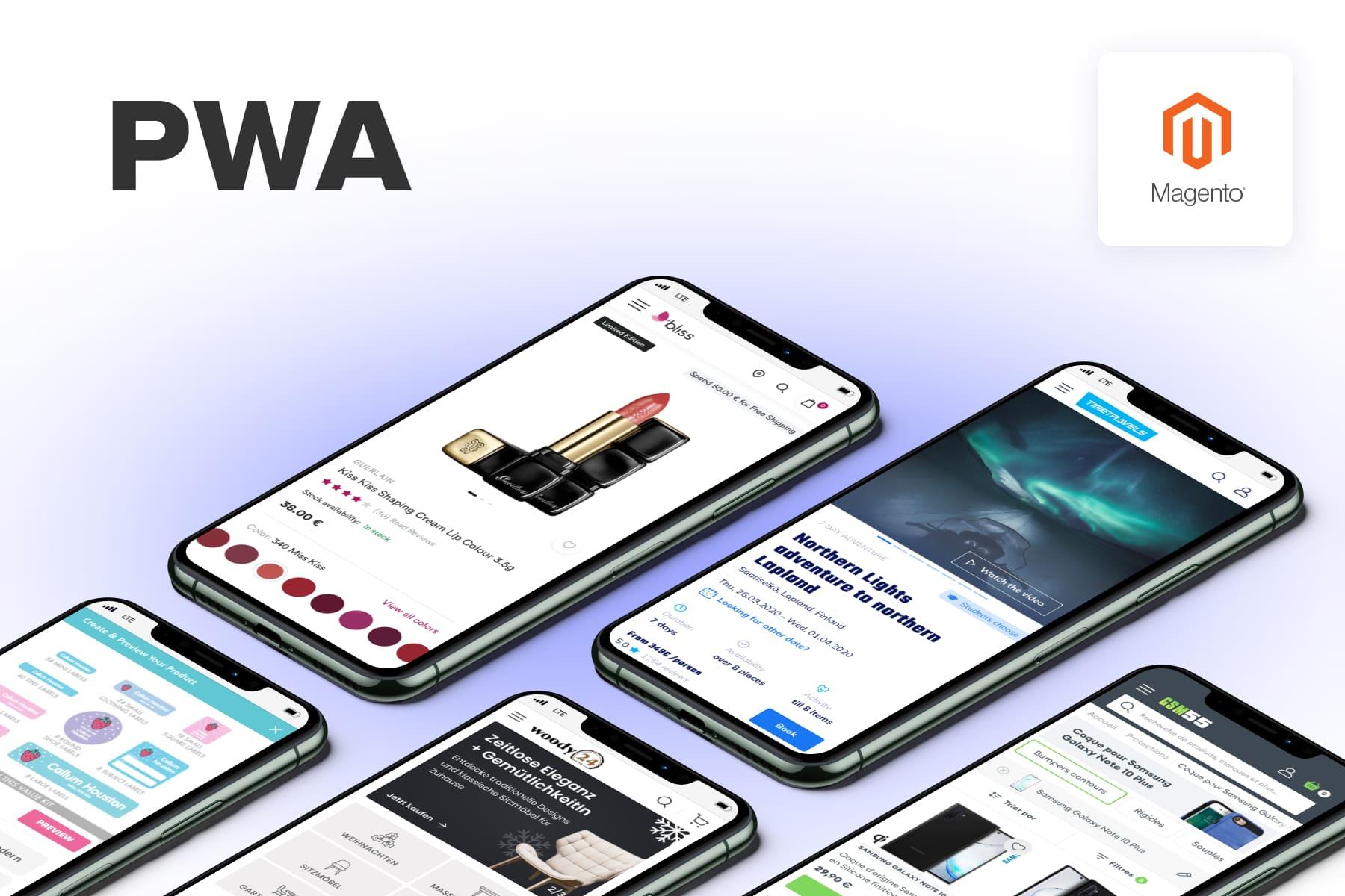
The popularity of progressive web applications is growing by leaps and bounds, especially in online retail. This is why many eCommerce store owners are craving progressive web apps, with the growth of mobile commerce and the importance of speed and a native app-like UX being as relevant as ever.
In this ultimate guide, we'll walk you through the process of development. We’ll show you how to develop a Magento (currently Adobe Commerce) storefront and create a PWA based on the experience we've obtained and the methodology we used while crafting our .
We'll provide many detailed examples, go over all the specific steps needed for building a proper frontend and backend, as well as speak about server-side and client-side rendering. Plus, we'll cover the essential points that regard great UX and UI on PWAs and give tips on the dos and don'ts during PWA development.
Table of Content
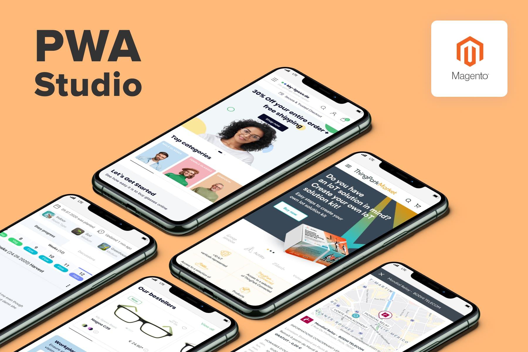
What Are Progressive Web Applications?
First things first, let's define what a progressive web application is and what a PWA in Magento 2 (or Adobe Commerce) is.
Abbreviated as PWA, such advanced and responsive websites are designed to act like native applications, adopting their best qualities while still being a website. They are often created as the first step of making . PWAs make browsing the site from a mobile device a blast without the need to download a traditional application directly to the device.
Some strong sides of progressive web apps to be noted include:
- They have quick performance and faster page loading than regular websites, boosting user engagement.
- They follow the UX and UI best practices previously inherent in native apps.
- Progressive web apps ensure a good mobile shopping experience, perfectly fitting the mobile commerce environment and increasing mobile conversions.
- A PWA supports push notifications and is available offline.Not to mention their budget-effectiveness in terms of web development (if compared to the resources needed for creating a native app).
As of now, the entire web is dynamically moving towards PWA development, and the sphere of eCommerce is certainly no exception.
To provide you with some relevant examples demonstrating what progressive web apps are like, browse the following articles: we have compiled a , overviewed , and analyzed the UX errors and strong points in PWA web development.
What to Expect from This Magento PWA Tutorial
Now that we have a better understanding of what a Magento PWA storefront is, let's take a closer look at how to build a Magento PWA site. Note that we're assuming that your store has already migrated from Magento 1 to Magento 2 with a PWA. Yet this article is also suitable for those of you who already have an existing Magento store and are interested in integrating PWA into Magento 2.
That said, let's start by mentioning that progressive web applications have to be good in terms of UX/UI. What's for development, progressive web apps are composed of two relatively independent parts: the frontend and the backend. Thus, in this post, we'll cover:
- PWA UI/UX,
- PWA frontend development on Magento,
- PWA backend development on Magento.
Below we'll overview the in-depth peculiarities that deal with all three parts and how to create Magento progressive web apps, giving examples to support the stated ideas. Following that, we'll move on to:
- the issue of server-side rendering in further detail,
- give you a heads-up on which mistakes to avoid during PWA development,
- as well as provide some tips regarding various PWA solutions.
Let’s roll!
1. Progressive Web Apps: The Major UX/UI Points to Note
It is commonly known that you won't gain much by just transferring your existing website design from Magento 1 to Magento 2 (nor to Magento 2 with a PWA). In essence, the problem lies in the outdatedness of the used designs.
From Desktop-First to Mobile-First: How Design Approaches Evolved
Explaining why your designs might not be up-to-date, ten years ago, web designers thought differently. At the time, mobile devices only started to occupy a larger and more significant portion of the market, and back then, designers:
- Created the mock-ups of the site's desktop first.
- Then shrunk and adjusted them to fit different screen resolutions (for small desktops, tablets, mobile phones, etc.)
As you can guess, the site's mobile versions turned out as scaled-down desktop layouts with some parts rebuilt and/or hidden. Obviously, this wasn't what the mobile users expected.
In an attempt to fix these issues, leading companies and UX specialists began the mobile-first approach propaganda. It stated that the mobile site versions should come before desktops in terms of priority. So, designers flipped the sequence, crafting the mobile version first.
Their mobile designs remained practically the same. They just created them before they moved on to the desktop ones. This design approach was far from perfect and didn't bring fruitful results as they didn't understand that the UX for mobile devices and desktop versions must be radically different.
Meanwhile, mobile apps were on the rise. When working on designs for native mobile apps, designers reconsidered many things, and their main focus shifted to the app's ease of use from mobile phones. And as a consequence, effective native app design standards emerged.
But this resulted in a big gap. Native application designs were well-adapted for mobile devices, whereas the mobile versions of regular sites weren't.
How the PWA Approach Appeared
Google took notice of the issue and offered a great solution that would implant native app design UX/UI standards in the mobile versions of sites. This way, browsing sites from mobile devices would be just as nice as using a native app since the sites would behave and look like native mobile apps. Together with additional features, the PWA approach appeared.
The general changes in the UX of mobile PWA sites were mostly related to coming up with an effective layout solution that would be capable of living up to the expectations of mobile users who are constantly on the go and who tend to use mobile devices more often than desktop computers.
As such, according to the mobile-first approach, the main focus should be made on one action per screen. Because of the mobile screen's limited space, it should display only important information in a single-screen view without bunching the elements. This way, we can amplify mobile conversions and direct mobile users to take the desired action, be it reading a text in a pop-up, selecting a product category, or anything else.
This is among the main reasons why PWA designs often use templates and patterns that are conventional for native applications. To compare, it used to be customary to stack product categories one beneath the other. The user would scroll down to view them.
With PWA designs, space is saved. Instead of stacking the most important categories, they are placed in a line (often with a slider format). Thus, the categories don't take up several full scrolls of the screen, just a part of one screen so that there's room for other information.
Of course, there's so much more to that. So, below, we'll go over some of the major “rules” designers follow when creating PWA prototypes and mock-ups with good UX and UI.
10 Fundamental Principles Behind PWA Storefront UX/UI
Here we'd like to list the core rules designers strive to follow to provide a great look and feel for the PWA website.
- Prioritizing faster page loading.
- Each new significant action is displayed on a new screen or pop-up.
- For Magento 2 stores, optimizing for speed is crucial, and there are specific that can be implemented to achieve this. These include effective use of caching, optimizing images and assets, and ensuring efficient server response times.
- Navigation, such as going back to the previous screen, is simple.
- Using plain fonts and basic elements.
- Refreshing data without completely reloading pages.
- Thinking through the difference in offline mode engagement.
- Accentuating tapped-on areas for visualization ease.
- Placing tappable functionality (buttons, pop-ups, menus, etc.) towards the bottom of the screen.
- Universal cross-device design solutions that'll be suitable for various screen dimensions.
- When working on layouts for mobile devices, it is vital to keep in mind that the keyboard can occupy about half the screen on many devices.
The above-listed practices are essential for those who want to deliver a truly native app-like experience for customers. When creating UX/UI for the clients, our designers ensure that the progressive apps look almost exactly like a native application. Turn to our if you want to surpass what competitors have and win the market.
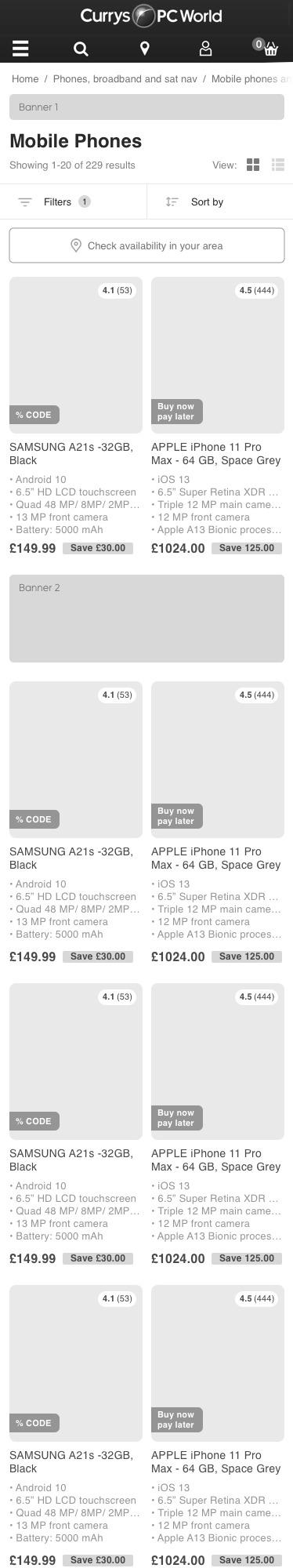
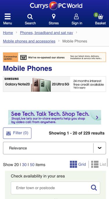
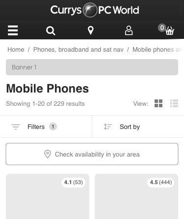
PWA Storefront UX/UI: Illustrative Before-After Examples
In this section, we'd like to share some “before” and “after” app designs we've prepared for popular . When working on on-site designs, we always prioritize the matter of how to develop PWA apps that'll be intuitive, fast, appealing, and easy to use.
The screenshots in the left columns display how the web pages currently look like on the mobile versions of responsive websites. We've placed our prototype suggestions of how they're supposed to be on the PWA storefront in the right columns. We've kept in mind the fundamental principles of UX/UI mentioned above and will explain why we've made the specific design choices seen in our prototypes.
a) Homepage
| How the current mobile design looks like (full screenshot) | Our full prototype for the PWA mobile design |


The first presented example (in the left column) displays how the homepage of the looks on the mobile device right now. Simply put, at the moment, all desktop version elements of the website are placed one beneath the other in the mobile version layout. This is certainly not the best solution.
And because the major aim of every designer is to do their best to cover all the needs of users, we've put together a custom PWA prototype (on the right) that can enhance the UX and UI of the website for those who'll be browsing this eCommerce store on a mobile device. Feel free to scroll through both designs to follow the explanation comments below.
| How the current mobile design looks like | Our prototype for the mobile design of the PWA |

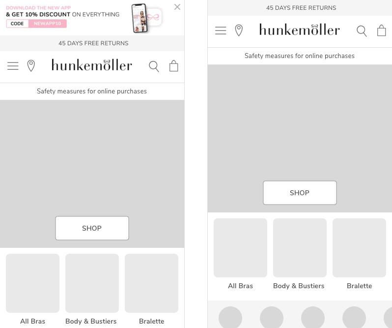
- Among the first things we took care of was the positioning of the call-to-action block that invites users to download the application and receive a discount. We moved this right to the top of the page to let the users know right away that there is an alternative for browsing the store using the app. What is more, on the prototype screenshots on the right side, you can see how much additional space can be saved by giving the opportunity to close the message.
- Secondly, we narrowed the area of the top menu and header to save space. Likewise, we only left the most often-used navigation points (the menu, location, search, and bag).
| How the current mobile design looks like | Our prototype for the mobile design of the PWA |


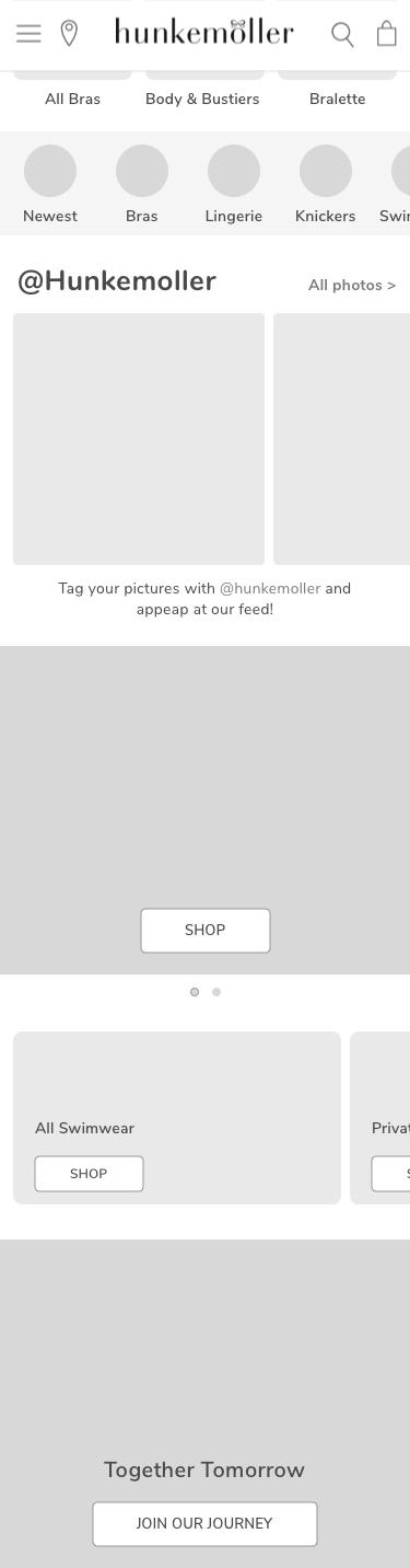
- Thirdly, we believe how the main categories are shown on the ongoing mobile layout is irrational. Having them positioned in 2 or 3 excessive full-screen scrolls is not the best way to go, as it's inconvenient and wastes the user's time on unnecessary scrolling. Therefore, we replaced this with one main banner of the collection with a “Shop” button and put the corresponding subcategories (“All Bras”, “Body & Bustiers”, “Bralette”, etc.) right below it in a slider that's made up of small blocks.
- Continuing the categories question, the initial design has the rest of the available categories (such as “New Arrivals”) listed toward the bottom of the page. This is confusing and inconvenient since not everyone will scroll that far down the homepage. Plus, moving from one category to another with ease is a crucial instrument in eCommerce, so we put the possible options in small circles right beneath the categories mentioned in the previous point.
- Next, it's worth mentioning the socials block. The original version doesn't have any links to actual user-generated posts. We'd like to change that and show such posts in a widget slider. This is needed to provide social proof and inspire site users to sign up for the brand's official social accounts.
| How the current mobile design looks like | Our prototype for the mobile design of the PWA |


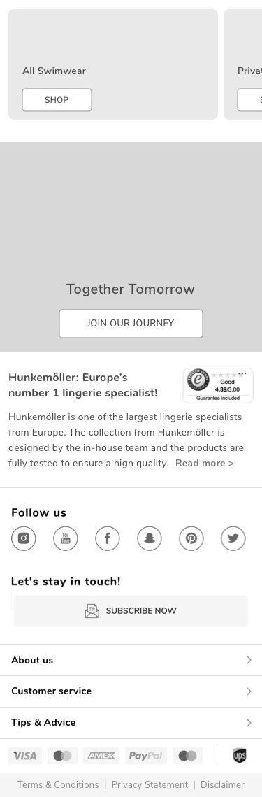
- We'd like to point out the SEO text section, too (“Hunkemoller: Europe's number 1 lingerie specialist”). We believe the “Trust mark” widget with a rating should belong in the SEO block to back up what's described and boost SEO, so we moved it up from the footer. The text itself was too long, and we introduced a “Read more” space-saving solution.
- Lastly, the footer. It was overcrowded with scattered elements. Thus, we reorganized them and shortened the section.
b) Category Page
Next on our “before-after” list are the UX/UI solutions that apply to category pages.
| How the current mobile design looks like (full screenshot) | Our full prototype for the mobile PWA design |
We'll begin our UX/UI improvement ideas for category pages by overviewing the one on the .
| How the current mobile design looks like | Our prototype for the mobile design of the PWA |
- The first thing that we believe is a “must” to change here is decluttering the header and top menu. To be fair, there's no need to add labels to the menu. Icons are self-explanatory and more than enough, so this is what we've opted for.
- Breadcrumbs are also an important point of a website as they define the path and help understand where the person is on the site now. Since the product categorization is multi-level and quite complex, for navigation ease purposes, we have added breadcrumbs. But we believe that situating a breadcrumb path into one swipeable line (as opposed to several lines) adds a more app-like experience.
- On our PWA storefront, we decided to leave the mobile phone banner. Nevertheless, breaking up category names from filters and sorting with a banner is a bad idea, so we changed things around a bit.
- Next, we proceeded with the content shown in the pop-ups when tapping on the sorting or the “Check availability in your area” buttons. As before, we followed the mobile approach in which one screen is designated for one action.
| How the current mobile design looks like | Our prototype for the mobile design of the PWA |
- The product listing is too jammed with information in the initial design. We've shortened it in terms of volume and made the image our primary focus. We moved the rating element and all the key labels (like the “Sale” label) atop the photo as well. What's for the textual description of the product, we left only the major unique points that are worth mentioning. All other details (such as “Free credit available” or “Free delivery”) should be placed directly on the product page. There's no need for them on the category page.
- What's for the banners with advertisements, we put them right within the product grid. Their placement at the top of the page wasn't convenient. Therefore, we split them into two banners.
| How the current mobile design looks like: | Our prototype for the mobile design of the PWA |

- For the category page not to be too lengthy, we believe that it makes sense to add automatic upload functionality (“Load more”) with pagination (“Page 1 of 25”). This way, the user can access the SEO text conveniently presented in its shortened version with a “Read more” button.
- Moving on to the “People also viewed section” that's present in the initial design, we think that it's much better to put such item upselling and cross-selling blocks directly on product pages where they are more appropriate.
| How the current mobile design looks like: | Our prototype for the mobile design of the PWA |
- The “Live Chat” button floats in the original design, this isn't very convenient and can be quite irritating, so we replaced it with a differently-shaped element that slides from the side.
- Lastly, we got rid of the “frozen” header that “sticks” to the top of the screen as the user scrolls down. Instead, we've frozen the header as the person scrolls up. Secondly, we fastened the more vital elements (the filter and sorting) to the bottom of the page as the person scrolls down. This will help the user to pull out more accurate product results quickly.
c) Product Page
Let's move on to the third part of the “before-after” block, in which we'll share our professional UX/UI advice regarding what can be done to enhance product pages.
| How the current mobile design looks like (full screenshot) | Our full prototype for the mobile PWA design |


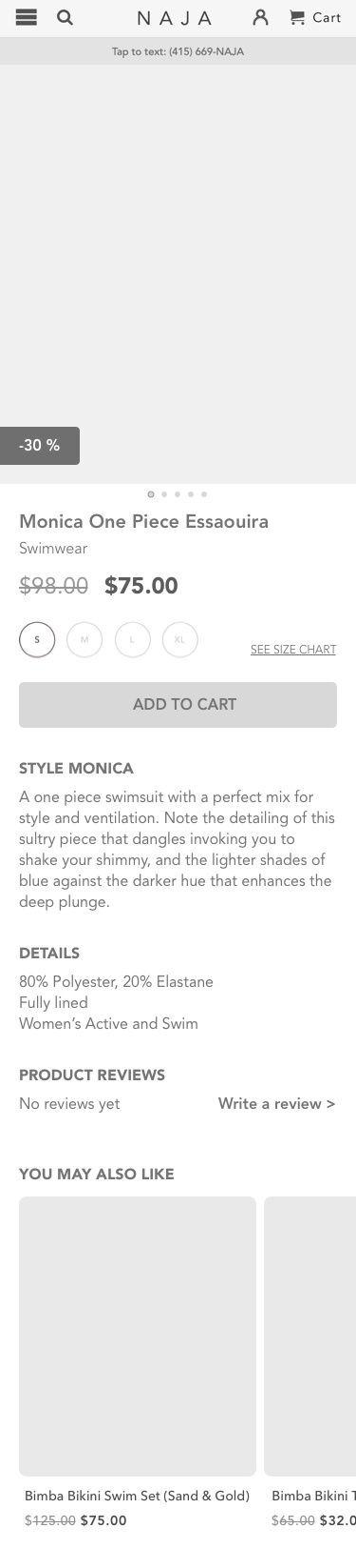

In this product page example, we bring you the product page of the .
| How the current mobile design looks like | Our prototype for the mobile design of the PWA |
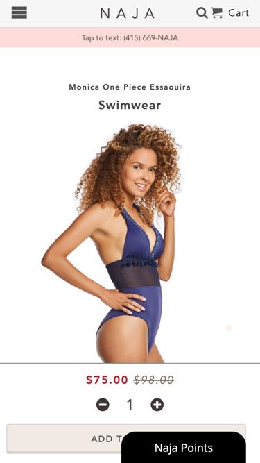
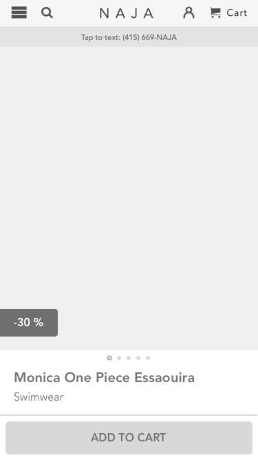
- The first thing that caught our eye in the original design and that we decided to change was the “Naja Points” loyalty points label. It covers up the main “Add to cart” button, so we removed it.
- The header of the product page looks pretty good as it is, yet to make the elements easier to click on, we moved them apart a bit. Plus, we've added the “Account” element here.
- Next, we swapped the gallery and product name to shift focus on the images since, as a rule, the user cares more about how an item looks rather than how it's called.
- On the original design, it isn't obvious that the item is on sale. This is why we replaced the cross-out price option with a sale label right on the image.
- To declutter the elements, we removed the quantity indicator on our PWA storefront.
Usually, identical clothing items are rarely purchased in more than one set, so it makes sense to place this in the Cart area.
| How the current mobile design looks like | Our prototype for the mobile design of the PWA |
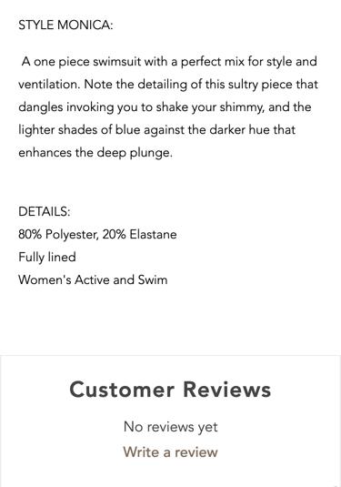
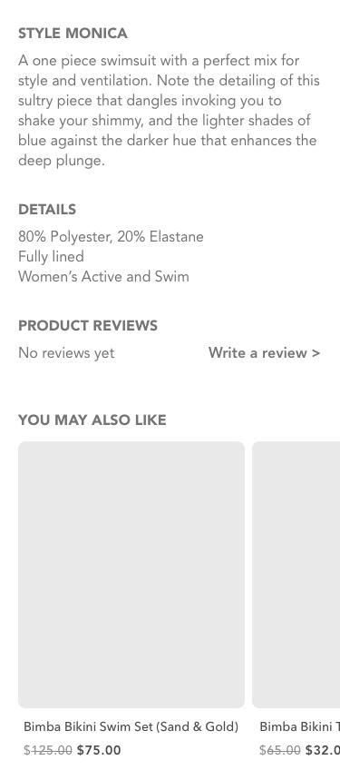
- Because the product description isn't large, we've left it as it is yet without the extra windows open.
- Mentioning a rather odd point we've noticed on the original design deals with reviews. There are two review sections, that's why we renamed the first one as “Product Reviews” and the second one as “Store Reviews”. Plus, we've made the “Write a review” button the primary focus among “Product Reviews” because such feedback is very influential. The “Store Reviews” are moved to slider format for convenience.
- The ongoing design was missing a cross-sell section. Thus, we've added a personalization block that'll pitch “You May Also Like” items.
| How the current mobile design looks like | Our prototype for the mobile design of the PWA |


- The “Meet The Maker” block took up too much space, so we shortened it and introduced a “Read More >” button.
- Lastly, we entirely reworked the footer area and left only the most important information. As such, we hid many links within sections and, on the contrary, “pulled out” the contact information to the full extent.
How to Achieve Such UX/UI as You Create a Magento PWA App
Now that the objectives in terms of what we'd like to reach in UX/UI are apparent, let's go over how this can be accomplished.
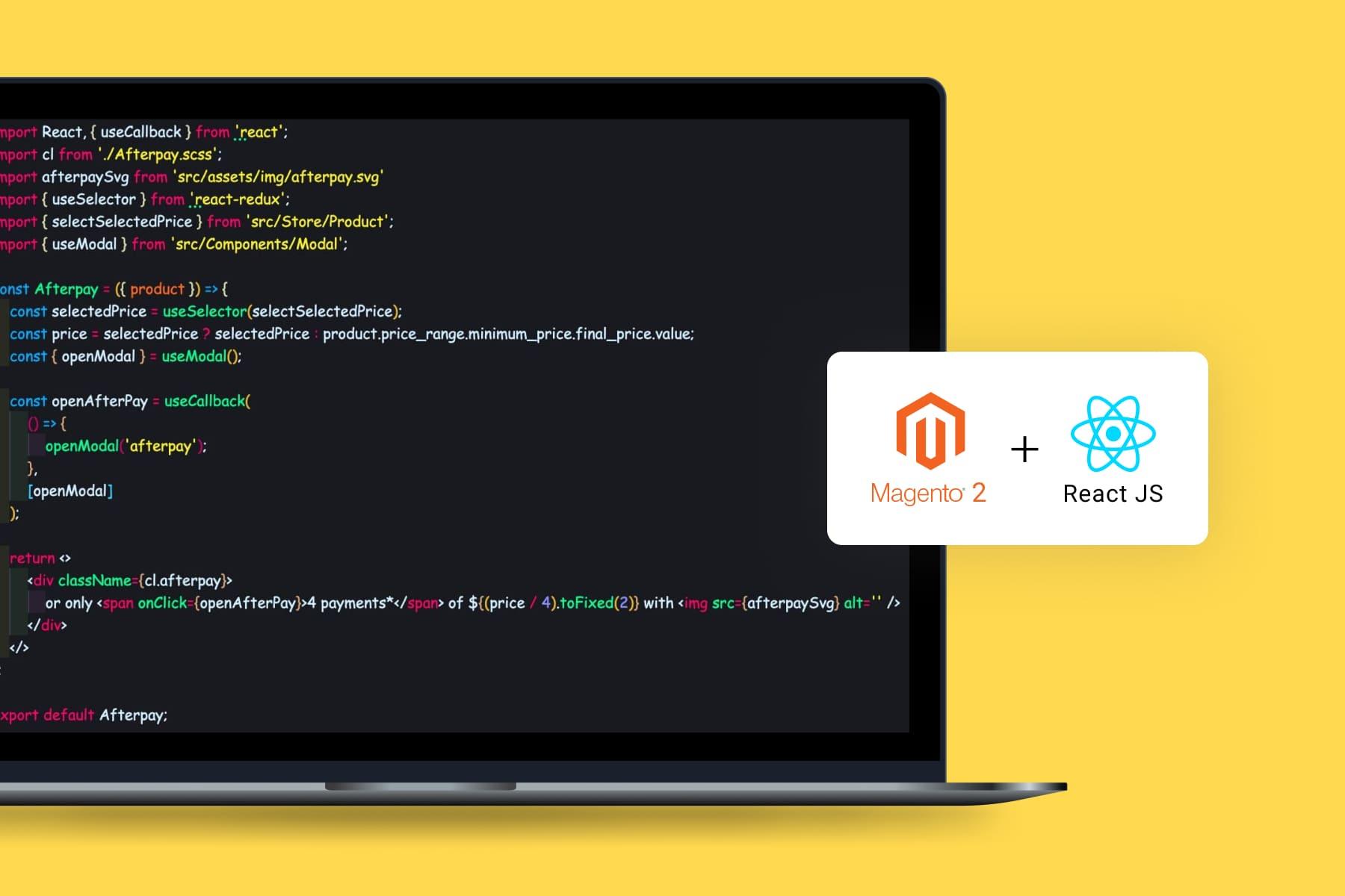
We should start by making it clear that the frontend part of the PWA storefront has to be implemented using a progressive framework such as React, Vue, and Angular, among others. This is needed so that the application code can be loaded once (or, if required, in parts), as well as for receiving only the necessary requested data when navigating the pages. Plus, progressive framework use can assist in following the UX/UI principles that were mentioned earlier.
So, to fit all the criteria, your team should be split into two parts:
- Backend developers who are responsible for PHP logic on the server side.
- Frontend developers who create user interfaces on ReactJS
It is challenging to find experienced with knowledge of React.js and an extensive portfolio of successful PWA projects under their belts. We have such guys at Onilab! We have been working with Magento 1 and Magento 2 since 2011 and are ready to share our expertise. Feel free to benefit from our .
Is React or Vue Better for Your Magento 2 PWA?
React and Vue are currently the two most popular and widely used progressive frameworks. Speaking of React, there are numerous paths that can be followed when it comes to . In essence, developers can choose to:
- code on plain React themselves (build PWA with React from the ground up),
- customize ready-made PWA solutions (such as those offered by the PWA Studio),
- or to use a combination of the two.
The situation with VueJS and the Vue Storefront toolkit is very alike. But which one is better, React or Vue?
Quite a while ago, here at Onilab, we were unsure which of the frameworks to choose for building our very first progressive web apps. We selected ReactJS because the Vue Storefront seemed like a more complicated PWA technology. There were several reasons for that.
For starters, the Vue Storefront toolkit was created as a universal “one-fits-all” solution that would require too much customization and extra code creation. Moreover, there are additional layering peculiarities between Vue Storefront and the Magento eCommerce platform. They could complicate the development process and bring in further abstractions to the infrastructure that may cause serious issues in the long run. Plus, we didn't find any Vue-created eCommerce websites with progressive web apps that we found to be impressive.
To be fair, at the time, there weren't any awe-inspiring React-built PWA eCommerce sites either. Yet we were aware that the Magento team was already working on the PWA Studio tools on the basis of ReactJS.
Having that in mind, we understood that we could partially adopt some of the business logic that was created by the official Magento team as we built our progressive web apps. This is why our final choice was to create React apps for eCommerce stores. Importantly, though, it's worth noting that we've developed our Magento PWA projects both on the basis of the Magento PWA Studio tools and using just plain ReactJS.
The final result of the developed Magento PWA is practically the same. Therefore, both of the paths are valid. From our experience, we can suggest that the option of is the option a dev team may choose if they haven't built progressive web apps before. What's for plain ReactJS PWA development, this approach can allow you to get rid of unnecessary abstractions and possible bugs that appear within the PWA Studio code.
2. Building a PWA on Magento: The Frontend Part
As a short reminder, it is necessary to pay attention to both the frontend and the backend to build a progressive web application. This section of our Magento 2.3 PWA tutorial is devoted to frontend development.
In this section, we'll overview the entire process in detail. As an example, we'll create the homepage of a progressive web application with proper architecture using plain ReactJS.
As a result, we would like our homepage to have:
- a header,
- a login/logout button that depends on the state of the application,
- and several widgets (for instance, the featured products slider as well as several CMS blocks that can be managed via the Admin panel),
- an email sign-up section,
- a footer.
Step 1: Adjusting the System for Further ReactJS Work
a) Configurations & Setups Preparation
We'll begin the process by dealing with all the necessary configurations on Ubuntu 18.04.
Start with the configuration and setup preparation of the required version of nodeJS to launch React. These setups, for instance, include curl, a library used for complying with HTTP requests. All the commands will be executed in the console.
sudo apt update
sudo apt -y install curl dirmngr apt-transport-https lsb-release ca-certificates
curl -sL //deb.nodesource.com/setup_12.x | sudo -E bash -
b) Installing NodeJS
After this is done, install nodeJS (a runtime environment using JavaScript) and NPM (used for managing the packages of nodeJS). NodeJS is a JavaScript implementation on engine V8, responsible for translating JavaScript into machine code. We will use it to launch our React app.
sudo apt -y install nodejsStep 2: Installing ReactJS & Creating a Progressive Web App
a) Install ReactJS
As mentioned earlier, a progressive framework is needed to create a PWA. This is why we install ReactJS.
npm install react@latestb) Implementing SSR
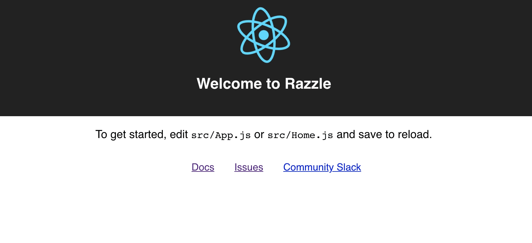
Let's create a web app. This is also the step to implement server-side rendering on Magento (we'll give you more details about what server-side rendering, short for SSR, is further on in the article). For our PWA's SSR, use Razzle, a Javascript framework.
The Razzle tool simplifies installation and configuration as much as possible. It is essential to highlight that Razzle should be added specifically at this initial point of PWA development to avoid difficulties further on. If not, you will deal with updating the entire code (or reworking it completely to work correctly with SSR), which is both time-consuming and tricky.
Side note: you can name your progressive web app how you want by changing the “my-app” part.
sudo npm install -g create-razzle-app
create-razzle-app my-app
c) Project Folder
Next, move on to the folder that contains our Magento PWA project.
cd my-appd) Launching the Web App
Finally, let's launch the progressive web app. At the moment, we have the opportunity to launch the default Magento PWA in its minimal build. Run the command below so that nodeJS sets the server with our application into action.
npm startAnd now we have a PWA storefront!
Step 3: Adding Libraries
Our PWA's homepage will need libraries. Here are the most commonly used ones to install.
a) Swiper (this library is necessary for adding sliders to the application).
npm install swiper --saveb) SASS (this library will be used for working with the app's CSS and styles).
npm install node-sass --savec) GraphQL (we'll need the GraphQL protocol together with its dependents that include apollo client, graphql tag, and others).
npm install graphql --save
npm install apollo-client --save
npm install apollo-cache-inmemory --save
npm install apollo-link-http --save
npm install apollo-link-context --save
npm install react-apollo --save
npm install graphql-tag --save
d) React Redux (allows you to monitor and change the application's states).
npm install react-redux --savee) React Notifications (used for displaying notification messages such as successful user sign-up, log-in, error notifications, etc).
npm install react-notifications --savef) Formik (this library is used for simplifying the processing of form inquiries and the data from forms; in our app, it'll be used for handling authorization as well).
npm install formik --saveStep 4: Starting to Build the Architecture
On to the web app architecture. Let's use architecture with folders to preserve the code structure and its navigation as the size of the progressive web app grows. What regards React development in general, it is highly important to split the page into components logically so your web app functions correctly further on in the future. Mostly this is because React is good at handling small pieces in large volumes.
Moreover, it is vital to create code so that the navigation and the architecture of folder placement are broken down logically.
Currently, for our progressive web app, we have an SRC folder within our project file that contains the app's code. As you can see, it should have several additional folders:
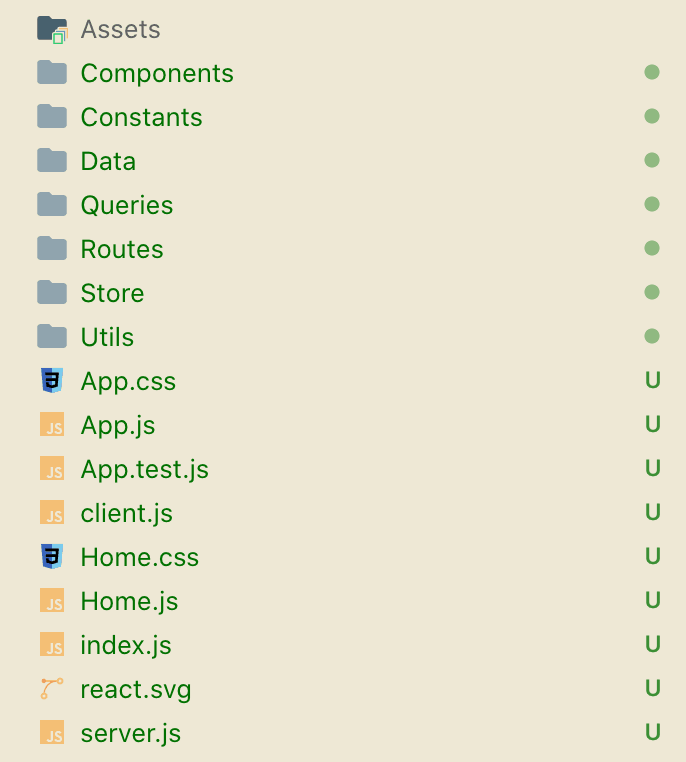
- Assets (elements of style and design, fonts, images, etc., are kept in this folder);
- Components (this folder contains ReactJS components and the elements of the React application);
- Constants (this is where various constants that are used in the project are placed, these are global features that are required for building the logic);
- Data (this folder keeps data such as the progressive web apps' main menu);
- Queries (used for storing GraphQL server queries);
- Routes (here, the data on the described routing logic is stored, this logic determines which components will be launched by the page);
- Stores (here we keep all the setups for Redux that are responsible for storing the application's state, i.e., this is the place where user authorization data is held);
- Utils (this folder stores general functions used in the app).
Step 5: Assembling the Web App Based on the Laid-out Architecture
a) Piecing Together the Web App
Let's begin piecing together our web app. First, set up its components, Redux and GraphQL. As briefly mentioned earlier, Redux is used in React for monitoring and changing the states of the PWA storefront. GraphQL is used in the frontend for querying and describing which data should be obtained.
Importantly, the link for the GraphQL endpoint must be on the same domain as the React app. This is required because the rest of the links will be blocked by the Cross-Origin Resource Sharing policy (the outlines the set of rules that the browser uses to allow resources to load).
Also, during the GraphQL setups, install a token that'll be used for user authorization. At this point, GraphQL is initiated, and a token is used to handle the question of how users are authorized on the app. When such a query to Magento occurs, Magento will see the token and understand that it's tied to a certain customer or session. This way, Magento will be able to distinguish whether the user is authorized or not. Note that the same thing should be done in the src/server.js file.
<?xml version="1.0" ?>
<config xmlns:xsi="http://www.w3.org/2001/XMLSchema-instance" xsi:noNamespaceSchemaLocation="urn:magento:framework:Module/etc/module.xsd">
<module name="MyHomepage_Slider" setup_version="1.0.0">
 <sequence>
  <module name="Magento_Catalog"/>
 </sequence>
</module>
</config>
b) Redux Storage Configuration
In this step, configure the Redux storage. The Redux storage consists of reducers describing possible actions with data bound to this or that reducer.
Our reducer should look like this:
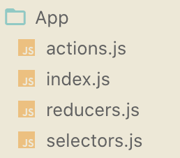
There are several major files here:
- actions.js (describes possible actions with the storage),
export const CHANGE_TYPE_OF_DEVICE = 'CHANGE_TYPE_OF_DEVICE';
export const UPDATE_CONFIG = 'UPDATE_CONFIG';
export function changeTypeOfDevice(deviceType) {
   return {
       type: CHANGE_TYPE_OF_DEVICE,
       deviceType
   }
};
export function updateConfig(config) {
   return {
       type: UPDATE_CONFIG,
       config
   }
};- reducers.js (contains all the storage operations),
import {
   UPDATE_CONFIG,
   CHANGE_TYPE_OF_DEVICE
} from './actions';
import { DESKTOP_DEVICE, MOBILE_DEVICE, DESKTOP_SIZE } from 'src/Constants/App';
import { getWindow } from 'src/Utils/Environment';
const initialState = {
   typeOfDevice: getWindow().innerWidth > DESKTOP_SIZE ? DESKTOP_DEVICE : MOBILE_DEVICE,
   cmsBlocks: {
       items: []
   }
};
function app(state = initialState, action) {
   switch (action.type) {
       case UPDATE_CONFIG:
           return {
               ...state,
               ...action.config
           }
       case CHANGE_TYPE_OF_DEVICE:
           return {
               ...state,
               typeOfDevice: action.deviceType
           }
       default:
           return state;
   }
}
export default app;- selectors.js (contains operations that allow you to get data from our storage),
export const selectState = state => state.AppReducers;

export const selectTypeOfDevice = state => selectState(state).typeOfDevice;

export const selectCmsBlocks = state => selectState(state).cmsBlocks;- index.js (this file all the data from the listed above files together),
export * from './actions';
export { default as AppReducers } from './reducers';
export * from './selectors';- Furthermore, we need a file that gathers all the reducers together (it is required for passing them on for storage initialization).
import { combineReducers } from 'redux';
import { CustomerReducers } from './Customer';
import { AppReducers } from './App';
export const reducers = {
   CustomerReducers,
   AppReducers
};
const combinedReducers = combineReducers(reducers);
export default combinedReducers;
c) Razzle Configuration
Move on to the Razzle configurations and setups. Indicate the alias for the src path that'll be used to load the components (as shown in the example below).
const path = require('path');

module.exports = {
   modify: (config, { target, dev }, webpack) => {
       config.resolve['alias'] = {
           'src': path.resolve(__dirname, './src/')
       }
       return config;
   },
};
d) Routes
Proceed to the routes. Routes determine which page part will be changed and when it should happen. There are multiple ways that this can be achieved since there's more than one router type that can be chosen.
As such, the Memory Router option works in a way that the URL isn't changed in the browser. Instead, it stores the changes in the memory. The second option, Hash Router, uses client-side hash routing and the URL's hash part. The third option is the Browser Router which displays the regular URL using the HTML 5 history API. We've opted for the third Browser Router option since we'd like the URL to change as the user browses the website (this way, having regular full URLs, such links can be saved or shared by the users).
Just as in the code below, define the rules that'll line out how the required parts of the page will be displayed based on the indicated URL path. For instance, in our example, the exact match URL path “/” shows the homepage, whereas “/category” uses the category components.
Because this is an entry point to our application, let's upload the footer content using GraphQL and save it in Redux. This same location can be used for downloading app settings, but in our case, we don't need them, so we won't upload them.
import React, { useEffect } from "react";
import { useQuery } from 'react-apollo';
import { useDispatch } from 'react-redux';
import { Switch, Route } from "react-router-dom";
import { NotificationManager } from 'react-notifications';

import {
   CMS_BLOCKS_IDENTIFIERS,
   DESKTOP_DEVICE,
   MOBILE_DEVICE,
   DESKTOP_SIZE
} from 'src/Constants/App';
import Footer from 'src/Components/Footer';
import Header from 'src/Components/Header';
import Home from 'src/Components/HomePage';
import Category from 'src/Components/Category';
import ContactUs from 'src/Components/ContactUs';
import { getWindow } from 'src/Utils/Environment';
import { updateConfig, changeTypeOfDevice } from 'src/Store/App';
import NewsletterWidget from 'src/Components/NewsletterWidget';
import { configQuery } from 'src/Queries/App.js';

const Routes = () => {

   const dispatch = useDispatch();

   const { data } = useQuery(configQuery, {
       variables: {
           'ids': CMS_BLOCKS_IDENTIFIERS
       },
       onError: error => {
           NotificationManager.error(getErrorMessage(error));
       }
   });

   if (data) {
       dispatch(updateConfig(formatConfig(data)));
   }

   useEffect(() => {

       const handleResize = () => {
           const newTypeOfDevice = getWindow().innerWidth > DESKTOP_SIZE ? DESKTOP_DEVICE : MOBILE_DEVICE;
           if (typeOfDevice !== newTypeOfDevice) {
               dispatch(changeTypeOfDevice(newTypeOfDevice));
           }
       }
       getWindow().addEventListener('resize', handleResize);
       return () => {
           getWindow().removeEventListener('resize', handleResize);
       }
   }, [dispatch, typeOfDevice]);

   return (
       <div className={'layout'}>
           <div className={'page-container'}>
               <Header />
               <main className={'page-main'}>
                   <div className={'page-wrapper'}>
                       <Switch>
                           <Route exact path="/" component={ Home } />
                           <Route path="/category" component={ Category } />
                           <Route path="/contact-us" component={ ContactUs } />
                       </Switch>
                   </div>
               </main>
               <NewsletterWidget />
               <Footer/>
           </div>
       </div>
   );
}

export default Routes;
e) Header
Depending on the address in the browser, routes will line out how the page is built. There are several parts that'll be displayed. Let's start with the page header.
Our app's header contains general information as well as the main navigation menu. The code below relates to the information components that are included in the header.
import React from 'react';
import { Link } from "react-router-dom";

import InfoBoxes from 'src/Components/InfoBoxes';
import Search from 'src/Components/Search';
import AccountMini from 'src/Components/AccountMini';
import NavigationMenu from 'src/Components/Navigation';

import logo from 'src/Assets/img/logo.svg';
import cl from './Header.scss';

export default () => {
   return <header className={ cl.header } id="header">
       <div className={ 'wrapper page-wrapper' }>
           <InfoBoxes />
           <div className={ cl.inner }>
               <Search />
               <div className={ cl.logo }>
                   <Link to="/" className={ cl.link }>
                       <img src={ logo } alt="" className={ cl.img } />
                   </Link>
               </div>
               <div className={cl.userNav}>
                   <AccountMini />
               </div>
           </div>
           <NavigationMenu />
       </div>
   </header>;
}
f) Login and Logout
Now let's move on to the login and logout element. This component will also change depending on the state of the web app.
The user needs to be allowed to log in or offered quick links to access their account. To do this, use Redux, which will enable you to control the state of the progressive web app and easily change it.
The code below is an example of authorizing the user and generating a token. This token is saved to the local storage.
import React, { useCallback } from 'react';
import { Link } from "react-router-dom";
import { useSelector } from 'react-redux';
import { selectIsSignedIn } from 'src/Store/Customer';
import { useQuery } from '@apollo/react-hooks';

import useLogin    from 'src/Utils/useLogin';
import Loader      from 'src/Components/General/Loader';

import { customerInfoQuery } from 'src/Queries/Customer';
import cl from './AccountMini.scss';

export default () => {
   const { logout } = useLogin();
   const isSignedIn = useSelector(selectIsSignedIn);

   const { data, loading } = useQuery(customerInfoQuery, {
       fetchPolicy: "network-only"
   });

   const logoutCallback = useCallback(
       () => {
           logout();
       }, [logout]
   );

   if (loading) {
       return <Loader />;
   }

   return <>
       <div className={ cl.customer }>
           <div>
               <i className={cl.icon + ' icon-user'}>{isSignedIn && <span className={cl.stateIcon}></span>}</i>
               {isSignedIn && <ul className={cl.links}>
                   <li className={ cl.customerName }>Hello { data.full_name }!</li>
                   <li><Link to="/customer/account">Account Details</Link></li>
                   <li><Link to="/customer/address/list">My Addresses</Link></li>
                   <li><Link to="/customer/order/list">My Orders</Link></li>
                   <li><Link to="/customer/wishlist">My Wishlist</Link></li>
               </ul>}
               {isSignedIn && <span className={ 'clickable' } onClick={ logoutCallback }>Sign Out</span>}
           </div>
       </div>
   </>
}
When the user is successfully logged in, a new token will be generated in Magento. The token will be saved to the local browser storage. This token will also be added when the application is initialized, and we'll send it to the server along with each GraphQL.
g) Navigation Menu
Next, let's continue to the navigation menu that's also part of the header.
Data for the navigation menu will be obtained from the following file: src/Data/Navigation.js. This file stores navigation-related data as a hardcoded set of constituents.
import React from 'react';

import NavigationPoint from './NavigationPoint';
import { navigationLinks } from 'src/Data/Navigation';
import { prepareNavigation } from 'src/Utils/Navigation';

import cl from './NavigationMenu.scss';

const NavigationMenu = () => {

   const items = prepareNavigation(navigationLinks);

   return <nav className={ cl.menu }>
       <ul className={ cl.list }>
           { items.map(item => <NavigationPoint key={ item.url } item={ item } />) }
       </ul>
   </nav>
}
h) Dynamic Parts of the Page
The dynamic part of the page follows the header. The content of this page area will change based on the URL. For instance, this particular part can be occupied by a slider with images on the homepage, while on a category page, this same area may be used by product details.
import React from 'react';

import Slider from 'src/Components/Slider';

const HomePage = () => {
   return <div>
       <h1>Home Page</h1>
       <Slider />
   </div>;
}

export default HomePage;
For the homepage, let's add a slider with products and images. Use swiper for these purposes (this swiper library was added in the third step).
import React from 'react';
import { Link } from "react-router-dom";
import { Query } from 'react-apollo';
import Swiper from 'swiper/react';

import { DESKTOP_SIZE } from 'src/Constants/App';
import Placeholder from "src/Components/General/Placeholder";
import Error from "src/Components/General/Error";

import cl from "./Slider.scss";

import { hompageProductsQuery } from 'src/Queries/Homepage'

const Slider = () => {

   return (
       <Query
           query={ hompageProductsQuery }
       >
           {({ loading, error, data }) => {
               if (loading) return <Placeholder/>
               if (error) return <Error />

               const breakpointsSettings = {};
               breakpointsSettings[DESKTOP_SIZE] = {
                   slidesPerView: 5,
                   spaceBetween: 20
               };

               const params = {
                   slidesPerView: 2.2,
                   spaceBetween: 0,
                   loop: (items.length > 5),
                   loopedSlides: items.length,
                   breakpoints: breakpointsSettings
               };

               return <Swiper {...params}>
                   <>
                       {data.hompagePorudcts.map(product => {
                           return <div key={ product.id } className={ cl.productSliderItem }>
                               <Link to={ product.url } className={ cl.productImage }>
                                   <img src={product.image} />
                               </Link>
                               <Link to={ product.url } className={ cl.productName }>
                                   { product.name }
                               </Link>
                           </div>
                       })}
                   </>
               </Swiper>
           }}
       </Query>
   );
}

export default Slider;
i) Homepage Slider Area
Because we want the homepage slider to contain products, we use GraphQL to describe the data that we'd like to obtain.
Once the request is made, there's more than one way that we can get this data. As such, it can be taken directly from the database, or if this data type is rarely updated, it can be pulled from the cache (this way, we won't burden the database without necessity).
To explain this in examples, our progressive web app will contain different data types. Some will be more dynamic (such as featured products), and others will be more static (like the CMS blocks). The latter can be cached as they won't be changed frequently.
In the subsequent code, you can see frontend queries.
import gql from "graphql-tag";

export const hompageProductsQuery = gql`
   query hompageProducts {
       hompageProducts {
           id
           name
           url
           image
       }
   }
`;
j) Email Sign-Up
For the email sign-up section, create CMS blocks. These blocks are responsible for displaying various data, including a text section and an SMM block that'll pull content on the page via a newsletter widget. In our case, the subscription form should only be displayed for users who haven't subscribed to the newsletter yet. This is the code that we used:
import React from 'react';
import { useSelector } from 'react-redux';
import { Formik, Field } from 'formik';
import { useMutation } from 'react-apollo';
import { NotificationManager } from 'react-notifications';

import cl from './NewsletterWidget.scss';

import Loader from 'src/Components/General/Loader';
import { selectCustomer, selectIsSignedIn } from 'src/Store/Customer';
import { subscribeGuestToNewsletterMutation } from 'src/Queries/Customer';
import { getErrorMessage } from 'src/Utils/Graphql';

const NewsletterWidget = () => {
   const isSignedIn = useSelector(selectIsSignedIn);
   const customer = useSelector(selectCustomer);

   const [updateGuest, {loading: updateLoading}] = useMutation(subscribeGuestToNewsletterMutation, {
       onCompleted({ subscribeGuestToNewsletter }) {
           NotificationManager.success(subscribeGuestToNewsletter);
       },
       onError: error => {
           NotificationManager.error(getErrorMessage(error));
       }
   });

   if (isSignedIn && customer.is_subscribed) {
       return null
   }

   return (
       <div className={cl.subscribe + (isSignedIn ? ' ' + cl.signedIn : '')}>
           <div className={cl.main}>
               <div className={cl.content}>
                   <div className={cl.text}>Be in the know with our newsletter!</div>
               </div>
               <div className={cl['form-container']}>
                   <Formik
                       initialValues={{ email: '' }}
                       onSubmit={values => {
                           updateGuest({ variables: { email: values.email } });
                       }}
                   >
                       {({ handleSubmit, values, errors, touched }) => <form onSubmit={handleSubmit} className={cl.form}>
                           {!isSignedIn && <div className="inputBox">
                               <Field name="email" type="email" className={cl.input + ' input' + (values.email ? ' filled' : '') + (errors.email && touched.email ? ' validationError filled' : '')} placeholder={(errors.email && touched.email ? errors.email : '')} />
                               <span className={cl.label + " label"}>Enter your email address</span>
                           </div>}
                           <button type="submit" className={cl.btn + ' btn'}>Subscribe</button>
                       </form>}
                   </Formik>
               </div>
           </div>
           { updateLoading && <Loader /> }
       </div>
   );
};

export default NewsletterWidget;
k) Footer
Furthermore, our app's homepage should have a footer section at the bottom of the page.
At this point, keep in mind the peculiarities of the desktop and mobile versions. Since the user can browse the web application on different devices, the progressive web app has to change to fit various screens in terms of dimension. Use Redux to achieve this.
Let's break the footer area into two parts. The first part is a text block that'll be taken from a Magento static block from Redux.
The second part of the footer should display additional links for navigating the website. These footer links will also be taken from the file with hardcoded navigation links:
src/Data/Navigation.js.
import React from 'react';
import { useSelector } from 'react-redux';

import FooterMobile from 'src/Components/Footer/Mobile';
import FooterDesktop from 'src/Components/Footer/Desktop';
import { selectCmsBlocks, selectTypeOfDevice, FOOTER_CONTENT_BLOCK } from 'src/Store/App';
import { MOBILE_DEVICE } from 'src/Constants/App';
import { getCmsBlockByIdentifier } from 'src/Utils/App';

import cl from './Footer.scss';

const Footer = () => {
   const typeOfDevice = useSelector(selectTypeOfDevice);
   const cmsBlocks = useSelector(selectCmsBlocks);

   const cmsAbout = getCmsBlockByIdentifier(cmsBlocks.items, FOOTER_CONTENT_BLOCK);

   return <div className={ cl.footer }>
       <div className={ cl.footerRow }>
           <div className={ cl.footerCol }>{ cmsAbout.content }</div>
           <div className={ cl.footerCol }>{ typeOfDevice === MOBILE_DEVICE ? <FooterMobile /> : <FooterDesktop /> }</div>
       </div>
   </div>;
}

export default Footer;
3. Building a PWA on Magento: The Backend Part
As we continue to build our Magento PWA and its hypothetical homepage, we move on to the Magento backend. Let's begin by straightening out an important thing that regards GraphQL:
- This query language is needed on the frontend for querying which data should be obtained (we've mentioned this in the fifth step of the previous section).
- What’s for the backend, GraphQL is used for outlining the type of data needed and where to get it from.
Thankfully, Magento has already partially taken care of the backend side and has introduced GraphQL support in numerous parts. You are welcome to read our to find out more about it.
In our application, we used both solutions that are already implemented in Magento and those that we created ourselves:
- Giving examples of ready-made ones, these include the CMS blocks and customer information.
- The custom ones are, for instance, the featured product. As you may have noticed, it is very easy to add and remove queries in Magento.
Furthermore, there are different types of GraphQL that can be called when the page loads. There are common cases when we need to get general information about the user (e.g., we need to find out the user's status and if he's authorized or not), data on general store settings, or some data for analytics. To do this, we will receive such data every time the page loads via GraphQL and use it for each user session.
Now let's overview what needs to be done on the Magento backend side.
Step 1: Creating a Module
We'll start by creating a module on Magento 2. Several files are required for that. First of all, make a folder for the module in which we indicate the organization name “MyHomepage” and the module name “Slider”.
Next, move on to creating the files that will be needed for the module to function.
<?xml version="1.0" ?>
<config xmlns:xsi="http://www.w3.org/2001/XMLSchema-instance" xsi:noNamespaceSchemaLocation="urn:magento:framework:Module/etc/module.xsd">
<module name="MyHomepage_Slider" setup_version="1.0.0">
 <sequence>
  <module name="Magento_Catalog"/>
 </sequence>
</module>
</config>
<?php
\Magento\Framework\Component\ComponentRegistrar::register(
\Magento\Framework\Component\ComponentRegistrar::MODULE,
'MyHomepage_Slider',
__DIR__
);After that, run the following command.bin/magento setup:upgrade
bin/magento setup:upgradeStep 2: Describing the GraphQL
To make it possible for the products to be visible within the slider on our PWA's homepage, organize GraphQL query processing to receive the product data. The code below is an example of how to indicate the data structure and the type in which it can be submitted.
type Query {
   hompagePorudcts: [ HomepageProductsGroup ] @resolver(class: "MyHomepage\\Slider\\Model\\Resolver\\HomepageProducts")
}

type HomepageProductsGroup {
   name: String
   url: String
   image: String
   id: Int
}
Next, make a resolver that’ll provide the data that was queried.
<?php
declare (strict_types = 1);
namespace MyHomepage\Slider\Model\Resolver;
use Magento\Framework\GraphQl\Config\Element\Field;
use Magento\Framework\GraphQl\Query\ResolverInterface;
use Magento\Framework\GraphQl\Schema\Type\ResolveInfo;
use Magento\Catalog\Model\ResourceModel\Product\CollectionFactory as ProductCollectionFactory;
class HomepageProducts implements ResolverInterface
{
   const HOMEPAGE_PRODUCTS_LIMIT = 10;
   /**
    * $productCollectionFactory
    *
    * @var ProductCollectionFactory
    */
   private $productCollectionFactory;
   /**
    * __construct
    *
    * @param ProductCollectionFactory $productCollectionFactory
    */
   public function __construct(
       ProductCollectionFactory $productCollectionFactory
   ) {
       $this->productCollectionFactory = $productCollectionFactory;
   }
   /**
    * @inheritdoc
    */
   public function resolve(Field $field, $context, ResolveInfo $info, array $value = null, array $args = null)
   {
       $result = [];
       $storeId = $context->getExtensionAttributes()
           ->getStore()
           ->getStoreId();
       $collection = $this->productCollectionFactory
           ->create()
           ->addStoreFilter($storeId)
           ->setOrder('sort_order', 'ASC')
           ->setPageSize(self::HOMEPAGE_PRODUCTS_LIMIT);
       foreach ($collection as $item) {
           $data = [];
           $data['name'] = $item->getName();
           $data['url'] = $item->getProductUrl();
           $data['image'] = $item->getImage();
           $data['id'] = $item->getId();
           $result[] = $data;
       }
       return $result;
   }
}
After you finish the GraphQL part, clear the cache before launching the application.
bin/magento cache:flush4. Service Workers in eCommerce: How to Use & Create Them
A service worker (or SW) is a Javascript file that runs in a separate thread in the browser. It is used in progressive web apps to speed up page loading thanks to the caching of static files and requests. The file is asynchronous and exists separately from the page.
For example, when a page loads in web browsers, this occurs in a single thread, yet there are resources that can block the thread and slow things down (e.g., while styles are loaded, JS can't be executed). This is where the “work” of an SW comes in. This file is completely event-driven, meaning it interacts with the web browsers solely based on events.
The service worker can be used as a proxy for processing HTTP requests to the network. This is why it can cache data, allowing you to cache the parts that make up your web pages (these can be unchanging files, texts, fonts, styles, images, etc.). Being an intermediary between the server and what the user sees, the approach speeds up the page loading on the user's side.
Furthermore, the service worker file makes sure the progressive web app supports push notifications.
Do service worker files have downsides?
Mentioning some of the "weaknesses" of service workers, they aren't capable of making synchronous XHR AJAX requests. Plus, because the file works in a completely separate thread, it doesn't have access to the browser's HTML DOM. Also, the service worker communicates with the main thread by means of a messaging mechanism.
How to Handle the Service Worker Matter on a PWA?
Now let’s go over the main steps that need to be taken to set up the service worker.
Step 1: Install a Razzle JS Plugin
Install several required modules and the plugin for Razzle JS. This will allow us to implement the service worker in our Magento 2 PWA.
npm install razzle-plugin-serviceworker --save-dev
npm install offline-plugin --save
Step 2: Add the Service Worker to the App
Then add the service worker to the progressive web app. In our case, it is the “Razzle/SW”, you can use the code as in the example below.
module.exports = {
 plugins: ['serviceworker'],
};
Step 3: Register the Service Worker in the Web App
In order to register the service worker in the web app, two things need to be done in the src_client.js file:
a) Import the library to initialize the module with the service worker:
import * as OfflinePluginRuntime from "offline-plugin/runtime";b) And at the very bottom of the file, you need to register it. Specify the file in which the service worker will be located here too.
OfflinePluginRuntime.install();Step 4: Create a Simple Service Worker File
By default, our application will attempt to load the service worker from files /sw.js. We need to create it and add simple logic for caching static files.
var CACHE_NAME = 'razzle-pwa-hompage';
var urlsToCache = [
 '/',
 '/styles/main.css',
 '/script/main.js'
];

self.addEventListener('install', function(event) {
 // Perform install steps
 event.waitUntil(
   caches.open(CACHE_NAME)
     .then(function(cache) {
       console.log('Opened cache');
       return cache.addAll(urlsToCache);
     })
 );
});
5. Offline Mode: What It Is & How to Create It
One of the benefits of a progressive web app is that it allows users to use it when they're offline. From a technical perspective, the offline mode is carried out using the service worker file and functions thanks to caching.
The process works the following way: if a user is browsing (or has previously browsed) the site, the pages that were seen and the various data the site contains get cached. Thus, when the Internet connection is lost, the user can still continue using the PWA.
In this scenario, the user has access only to those pages he has already seen before and just to the cached data. This brings up the matter of an offline "illusion" since the user doesn't actually have the chance to browse the entire website, only those pages that were opened previously.
Nevertheless, as the site is used in offline mode, the user can make dynamic actions (say, add products to their cart). These actions form a queue of requests which will be sent and processed only when the Internet connection is back. This means that the added items will actually make it to the user's cart area when there is an Internet connection again.
In Which Parts of the PWA Does It Make Sense to Use the Offline Mode?
Of course, the offline mode isn't an all-embracing solution that's suitable for the entire data scope of the PWA storefront.
As such, it is wise to use the offline mode for various content pages that are more or less static. These can be components of a homepage, category pages, product pages, and informative pages such as “About Us” or “Contact Us”.
On the other hand, it isn't reasonable to apply the offline mode to those pages that are dynamic and subject to constant change. These are, for instance, the user's account area, shopping cart, or checkout.
How to Handle the Offline Mode Matter on a PWA?
There's more than one approach to working on the data caching for a PWA's offline mode. Below, we'd like to cover the main caching strategies, usually executed via the Service Worker and Cache API.
a) Service Worker + Just Cache
As shortly mentioned, the service worker solution best applies to static data that'll remain practically unchanged (these are various content pages, the homepage, product pages, etc.).
In the first simple case, all requests are fetched by the service worker to cache. Pages in offline mode are thus formed based on the received static data that is stored in the cache. If some data isn't cached, then the user won't have access to it.
b) Cache Relying on the Network
The second offline mode path to take here is to pull data via the service worker from the cache but with one minor difference from the previous point. If the requested data is not cached, the service worker will turn to the API to pitch data from the network.
This way, the user will have access to data, but the provided results might not be the most recently updated ones.
c) Cache vs. Network
This option is very similar to the one above, yet the data requests don't occur in a sequence (with the SW turning first to cache, then, if not getting a result, moving on to the network). Instead, the data is pitched either from the cache or API, whichever delivers first. To avoid data mismatch, here it makes sense to update the cache every time the data pulled from the API was a success.
d) Network First, Then Cache
In the fourth case, the service worker first turns to the network for data. If it receives a successful response, the data is updated in the cache accordingly. If the service worker fails to get data from the API, it turns to the cache for the results.
This method is considered to be a good choice since the PWA will show the freshest data and be accessible offline. A minor drawback here is that the execution of this approach may require more time.
e) Cache First, Then API
The final point on the list is the approach when data is pulled from the cache (provided that this is quicker). Following that, the cached data is updated according to what's in the network. In this case, the user first sees this data, and after a while, it gets updated with data from the API. Although difficult to implement, this is a good method for solving the issue of displaying a PWA's dynamic data offline.
Which is Better?
To provide a quick conclusion, it makes sense to opt for one of the two latter solutions that were described above when working on a PWA's offline mode.
6. Server-Side Rendering: What It's for & How It's Implemented on Magento
As promised in “Step 2: Installing ReactJS & creating an application”, we'll cover server-side rendering in a bit more detail.
A Few Words Regarding Rendering
Before anything else, let's get to the bottom of what server-side rendering (short for SSR) is.
Server-side rendering is responsible for generating the complete scope of the page's HTML in response to a server request. Once you click a link to the website and address the server, it returns the full HTML, so the browser doesn’t have to create it on the client side.
All information comes to you from the backend, and your browser doesn’t need to repeat the process using JavaScript. Technically, it’s sending JavaScript anyway, it’s just that the JavaScript doesn’t render the whole site. You have HTML coming in, and the browser quickly renders it.
Such an approach allows for a rather quick first rendering. This eliminates the need for additional data requests from the client since the server undertakes the full load before sending a response. The received page is, in this case, generated on the server (not the browser). This makes sense since this approach is suitable for a large range of network conditions and devices, as well as provides ground for browser optimization activities.
Of course, there are drawbacks. The main one is that page formation can be a bit time-consuming as the entire code is loaded from scratch every time a page is refreshed or every time the user decides to browse a different page. However, this is not necessarily the case since you can cache some information after generating the page and use the cached version so as not to build it every time.
Server-Side Rendering or Client-Side Rendering?
The main difference between SSR and client-side rendering (CSR) is that the client-side renders pages right in the browser using JavaScript files. This means that all the routing, data retrieval, and logic are dynamically handled on the client's side (as opposed to the server). This approach makes it possible for the user to get only the requested pieces of data (not the whole scope) without the need to refresh the page.
Noteworthy, this becomes possible after there is a full first load which will still happen via server-side rendering. Yet, the server will return the page with a JavaScript key that will rebuild the page using the progressive framework. After that, the request will only revolve around the dynamic content that changes from page to page. The static content will remain the same.
As you can see, CSR is more flexible than SSR. It eliminates the need for loading the whole HTML every time you browse the website pages. As soon as the browser receives the HTML, React is initialized. It waits for user actions and loads the necessary data. In our PWA projects, we often make this connection: the first load happens via SSR, and then CSR comes into play.
Because keeping up fast speed on mobile devices is vital, CSR usually requires some additional optimization to work quickly and efficiently. This is sometimes noted as its main weak point.
Interestingly, numerous modern frameworks, including ReactJS, AngularJS, and VueJS, grant the opportunity to render applications on both the server and client sides. So the bottom line is that you can’t say that one is better than the other. Depending on the store’s requirements, both options are needed for various cases.
Approaches to Server-Side Rendering
There’s more than one way to handle the SSR matter.
1. Headless Browser
Among them is its implementation using a headless browser (it can be added to the server using Selenium or Puppeteer).
Unlike in the case with regular non-PWA websites, progressive web applications have the backend and the frontend separate from each other; the logic is split. In this scenario, the backend serves as a headless browser, meaning it is not responsible for rendering the page. I.e., it doesn't deal with the design, web page slicing, or CSS styles, only with the data passed to the server. In turn, all the requested page content is rendered on the server's side (not in web browsers), returning the needed page content to the user.
What's for headless Magento, React addresses the server via API. Such a Magento model is quite common as it eliminates unnecessary pressure on the storage and speeds up the page load (if compared to browser rendering).
2. NodeJS
Another way to work with SSR is to go for the nodeJS option. We usually opt for this custom solution when building complex progressive web applications.
3. Razzle (or Analogous Tools)
As you probably remember, the SSR tool that we used in this article's PWA homepage example is called Razzle. This tool is very intuitive and keeps SSR setups as simple as they can get.
There are other options to use instead of Razzle (like Next.js or react-ssr). Yet these applications internally use node servers for rendering js. This means that you'll have to remove those variables in the code that are not present on the frontend (for example, window/document). Though, if you do opt for another option, there exist libraries that can be used to emulate these variables on the server.
4. Using Proxy
The fourth option for handling server-side rendering is using a proxy. A proxy server is a service that performs the role of a mediator, which processes client requests made in the browser when a person seeks something. Generally, such resources are provided to the server from Magento, and the proxy is a workaround solution for this.
In such a case, the proxy serves as an intermediary between the server and Magento. With its use, the page will be generated by proxy without the need for the server to call the eCommerce platform. That said, the proxy will receive a template of our future page and insert data from the cache (Redis or Elasticsearch, ). Thus, the page will be put together, omitting Magento calls.
Even though this method can be very productive, we need to place all the data for each page in the cache in advance. Another option here is to store the data in the form of separate page blocks (i.e., the header, footer, filters, and menu items). Yet the difficulty with this proxy implementation (when a page is split into blocks) lies in the fact that we need to be able to generate the data for these blocks separately and have the opportunity to dynamically update them if the data is changed in any block.
The proxy option is rather time-consuming and requires a lot more work, but it's worth it if you're craving good performance.
7. Common Mistakes During PWA Development & Tips from the Pros
It's more than fair to say that every progressive web application will be different. And whether you like it or not, there will be obstacles to overcome during the process of PWA creation. In this block of the article, we'll provide you with some professional recommendations regarding the frontend and backend that might save you some time.
Mistakes with Libraries, Structure & Other Frontend Architecture Issues
a) There are many things that can go wrong as you build the PWA frontend. But mentioning the apparent and often occurring issues, the first one we'd like to bring up deals with irrational component size. It is vital to monitor the size of the components that become part of the architecture and to do your best to keep them small.
Mind that you need to organize page elements into small components for the successful rerendering of just the required separate parts of the page. Otherwise, if the components are too large, you can cause the rerendering of the entire page. Moreover, if you don't keep an eye on the size of the components, you'll load the browser heavily, which is a mistake made quite often.
b) Secondly, when information is refreshed on a page, ReactJS refreshes the components in accordance with the given key. Below is an example of a key:
<ul className={cl.list }>{
   items.map(item => <NavigationPoint key={item.url} item={ item } />)
} </ul>
It is crucial that you use a key so that React is aware of which element to refresh with which key when changes are made. If not, React will update all parts that don't have a key and rerender everything across-the-board, which slows down the performance immensely.
c) The third widespread mistake we'd like to point out occurs if the architectural components are laid out incorrectly. In such a case, when a filter is changed, the other filters are rendered as well.
d) One more tip that we'd like to give you is to not send a lot of data in GraphQL requests. Because any GraphQL request is made in the HSR, it'll take a lot of additional time to process and download the data. You'd want to avoid that because the app should ideally be very fast, and you don't want to keep your clients waiting.
e) Lastly, use the Service Worker for caching the resources in the browser, for instance, for caching the downloaded Javascript files. This script runs in the background, and it gives you the chance to decide how requests are handled.
Recommendations for Building a Superb PWA Backend
Covering the topic of typical backend issues that can occur in the course of PWA development, here are our main tips:
a) Again, just as we noted in the frontend tips, this one also applies to the backend. Avoid sending many GraphQL requests. The reason is that each initializes Magento, and every initialization takes time. Therefore, do your best not to send excessive requests.
Use Varnish for GraphQL caching. This web app accelerator and high-performance HTTP proxy is an outstanding alternative to using internal Magento storage for handling caching. This solution is capable of coping with content-heavy applications and dynamic websites.
c) Mind your query performance. Provided you have the opportunity, use tools for monitoring traffic, for instance, New Relic. This is needed to ensure that although everything works fast in the browser, at the same time, it shouldn't slow down the request in the backend.
d) Separate your GraphQL schema from the config cache in a different entity. As the GraphQL schema is assembled, Magento's GraphQL won't respond. And if someone accidentally saves the config in the Admin Panel, the GraphQL schema will be cleared together with the config. This will result in the web app not responding and being down and unreachable for quite some time.
e) Third-party modules can really influence the app's performance. Be twice as careful as you add new plugins, and make sure to monitor their performance and efficiency. If the performance of your progressive web app is suffering, it can ruin both your SEO and user experience. Your progressive app can have lots of non-explicit issues influencing the overall speed. Our expertise allows us to detect those issues and fix the bugs to make your Magento store work seamlessly and boost SEO. Turn to our for support.
8. A Brief Overview of the PWA’s Other Page Types: What to Keep in Mind
Of course, applications usually have more page types apart from the homepage. We won't be going into much detail on how to create them for a PWA step by step, but we would like to share our expertise on which "sharp points" to bear in mind both during backend and frontend development of other kinds of pages.
Both in the case of product and category pages, it is vital to pay attention to their productivity right from the first minutes of Magento 2 PWA development.
The page architecture should be thought through very carefully for the frontend and backend. Otherwise, the consequences will be very difficult to fix. For example, depending on the type of product and its specifics, the page can look different from product to product, and such points need to be taken into consideration straight away.
All in all, because every website is different, proper planning should be the step that precedes implementation. This way, you can omit various unnecessary fixes and wasted time.
Magento 2 PWA Tutorial: Final Word
In conclusion, although the process of creating a progressive web application on Magento 2 isn't easy and requires a lot of knowledge and tech talent, it can bring back fruitful results. With correctly chosen UX/UI solutions, PWA users can feel like they're using a native app.
With a properly developed frontend, backend, and a well-set-up SSR, the Magento PWA storefront will function superbly, offering utmost speed and enhanced navigation. Not to mention that can be a pleasant surprise compared to the costs of creating a regular native application.
We hope you've found our complete Magento progressive web app development guide useful! And if you wish to get a progressive app for eCommerce of your own or convert the Magento website to a PWA, we'll be glad to assist you and happy to offer you our .