Your store’s design has a great deal of impact on what visitors end up doing: placing orders or leaving. Everything matters: from foundational aspects, like navigation convenience and the checkout page structure, to the aesthetic side, like the color scheme and spacing. That’s why UX/UI designers advise not to settle for default Shopify themes but revise them.
Depending on the plan and the theme itself, Shopify offers a certain extent of flexibility with design settings. Store teams can make some adjustments themselves, while for more advanced changes, you’ll need assistance from experienced designers and developers.
In this guide, we’ll discuss what benefits your design efforts will bring and which customizations are available on different levels. We’ll also talk you through DIY Shopify website design, content, and performance tips applicable to each and every Shopify store. Finally, we’ll show how to tailor the store’s UX/UI for specific products and audiences and boost conversion rates on desktop and mobile devices.
Table of Content
1. Default, DIY, and Custom Shopify Store Design
As a SaaS solution, Shopify implies that pretty much everything is already made/provided for you, including hosting, technical support, and various store themes. So you can choose a design to your liking from the Shopify theme store/plug in a third-party one and kick-off: fill the catalog, upload product photos, add product descriptions, and sell.
But actually, each theme gives room for improvement design and feature-wise:
- Shopify themes are more or less configurable in the settings;
- Thousands of applications are available to expand the Shopify store functionality and elevate the design;
- The theme code is editable to some extent, depending on the Shopify plan you use.
1.1 Shopify Plans and Their Design Possibilities
It’s definitely worth your while to tap into these opportunities. Let us just remind you what Shopify web design may look like on different plans.
Basic, Shopify, and Advanced
No-code operations like changing the colors, fonts, and displayed blocks are possible in the theme editor. More sophisticated design and feature modifications are available via additional apps. Some of them might require additional coding or setup, while others can be used as is.
To customize the Shopify store further, you need developers to change the theme's Liquid code. But you can’t heavily edit the checkout, having access only to some UI settings. It means the standard multipage checkout template can’t be transformed into a one-page, and it’s impossible to delete/add fields.
Shopify Plus
For bigger eCommerce entrepreneurs, Shopify offers more flexibility. Among other advantages like switching to the , it implies much wider Shopify web design possibilities. Apart from utilizing the theme editor, apps, and custom coding, Shopify Plus stores have a couple of options to modify the checkout layout by altering the code. To unlock the advanced features of Shopify Plus and create a unique store experience, it's better to collaborate with a .
As you see, considerable design improvements are reachable on every Shopify site. Then you have three options when it comes to introducing actual design changes.
1.2. A Default Theme
In some cases, a ready-made theme can fit the business as is, with little to no design changes. BTW, it’s not obligatory to buy a theme: you may select one of the 12 free template sets created by Shopify and proceed with the basic design.
But we’d say this approach has a limited application. It’s acceptable for a small website that needs to start ASAP and save money. Also, it’s a way out for stores with no strictly defined brand style (but we’re not sure they exist now).
1.3 A “DIY” Theme
Stores rarely go with basic designs since both free and paid themes give them some leeway in customizations. The “do-it-yourself” approach entails opting for a theme and then changing design settings within the given limits (but with no coding involved).
Most Shopify themes allow online merchants to alter the colors, fonts, page structure (displayed blocks and their order), and some elements like a search feature look. An additional no-code way to modify the theme is via apps from the Shopify App Store. However, introducing more significant changes to the store theme is possible only through code editing.
This is an optimal path for many eCommerce websites, especially for SMBs wanting to improve the UX but without a considerable investment.
1.4 A Custom Theme
Hiring professionals in UX/UI design and software engineering is needed for complex customizations like improving mobile navigation or adding a unique loyalty program functionality.
In this case, you have much freedom and are limited only by two factors. The first is that Basic/Shopify/Advanced plans allow modifying everything but the checkout page (it’s only possible on Plus). And the second one is your budget.
You can redesign separate elements/blocks/pages or order a unique bespoke storefront with meticulous UX research done prior to wireframing and development. This option is optimal for large and growing businesses wanting to gain the upper hand in the market and cater to their specific target audiences.
Get a Free UX Audit Example
Read our demo UX report exploring the online store’s checkout issues.
2. What Is Great Store Design Capable of?
As an eCommerce development company, we always advocate customizing the store design. We believe no off-the-shelf storefront compares to one made exactly for this or that brand. Bespoke Shopify store design done right covers all the bases:
- Provides a pitch-perfect representation of your product, concept, and brand values;
- Delivers a flawless user experience for your specific audience;
- Makes your brand stand out in the market;
- Increases your revenue as a result.
It’s all because web design is much more than combining colors and fonts on the website. Let’s see what UX/UI consists of and how exactly it’s linked to your essential store metrics.
2.1 What is UX/UI?
When saying “a store theme”, “a storefront”, or “a frontend”, we mean everything that online shoppers see and interact with. It includes several parts forming a certain user experience: the UX and UI design and the technical side of the frontend.
The UX (user experience) means constructing the customer journey in a seamless way so that visitors find products, explore them, and make orders effortlessly. In the “form and matter” dimension, it’s a matter. It’s all about convenient navigation, logical page structure, and user-friendly site features both on laptops and smartphones.
The UI (user interface) defines the visual part: the icons' look, the color palettes, typography, element sizes, spacing, and so on. So it’s the form. Of course, the UI part hugely affects the user perception and the whole browsing experience.
The frontend itself is in charge of the theme’s performance, which is one more mainstay of a pleasant customer experience. In this article, we won’t go into technical details like the store architecture (the type of frontend and backend interconnection), code quality, or advanced optimization techniques, but will give some tips on how to keep your Shopify website speedy.
2.2 How Does Design Affect KPIs?
When you allocate funds to designing a Shopify store for a smooth and seamless shopping experience, you inevitably reach better (and measurable) results. See how smart and modern design choices can enhance some store KPIs.
Bounce Rate
It’s the share of users closing the very first page they visited. It most likely means they didn’t find the needed info/items or weren’t happy with what they saw. Then drawing more attention to navigation and the homepage layout is the right strategy.
Average Session Duration
While we strive to make the user journey as simple and fast as possible, it’s also a good practice to prolong user sessions. By encouraging prospects to explore your product catalog a bit more, you raise the odds they’ll come across something suitable and eventually buy it. Product pages with all the needed details and various cross- and upselling blocks on the home, product, and even cart pages are the best helpers here.
Cart/Checkout Abandonment Rate
This crucial metric shows the percentage of prospective buyers dropping out of the sales funnel at the climax stage of completing the order. A large portion is those who practice window shopping or wait for the sales to start, but there are also people who change their minds because of some obstacles. Most often, it has to do with the checkout flow: it may be poorly organized, confusing, slow, etc.
To further enhance the user experience, especially in the crucial aspect of shopping cart design, consider exploring best practices. This can significantly impact the overall customer journey, from browsing products to finalizing their purchases. Implementing effective shopping cart design strategies can reduce cart abandonment rates and improve conversion, making it a key element in Shopify store optimization.
Conversion Rate (CR)
One more essential indicator measures the share of visitors making purchases. Many UX factors contribute to unsatisfactory CR, so it’s worth doubling down on Shopify store design refining with a stronger focus on navigation, product, cart, and checkout pages.
Average Order Value (AOV)
It’s the average sum customers leave in the store per transaction. Increasing this figure is possible with relevant and informative product recommendation blocks.
Customer Lifetime Value (CLV)
It’s a forecast of the entire profit the business might have during the relationship with a customer. Obviously, regular customers have a higher CLV, and stores are interested in retaining these loyal people. The website's look and feel and its convenience in use on smartphones and laptops have a huge impact on the shopping experience.
Learn more about the correlation between website design and customer satisfaction in our guide. And without further ado, let’s explore tips on DIY and custom Shopify store design.
3. How to Design a Shopify Website: DIY Dos and Don’ts
Well, we at Onilab reckon the more geared the design is for each particular online store, the better. But having said that, it’s ok to give up some ideas or postpone their implementation if it’s too costly.
Anyway, one-and-done UX/UI design is impossible; you’ll need to revise it once in a while. Often it’s more rational to start with a kind of MVP (Minimum viable product), accumulate more money, and return to the design matter later when a business is stable and can afford the design level-up.
This section will be helpful for those who decide to customize the store without inviting UX/UI designers and developers. Here we’ll discuss how to select a proper theme, what to do with its settings, which UX/UI-improving apps to look for, and how to optimize the Shopify store on a basic level.
3.1. Choosing a Shopify Store Theme
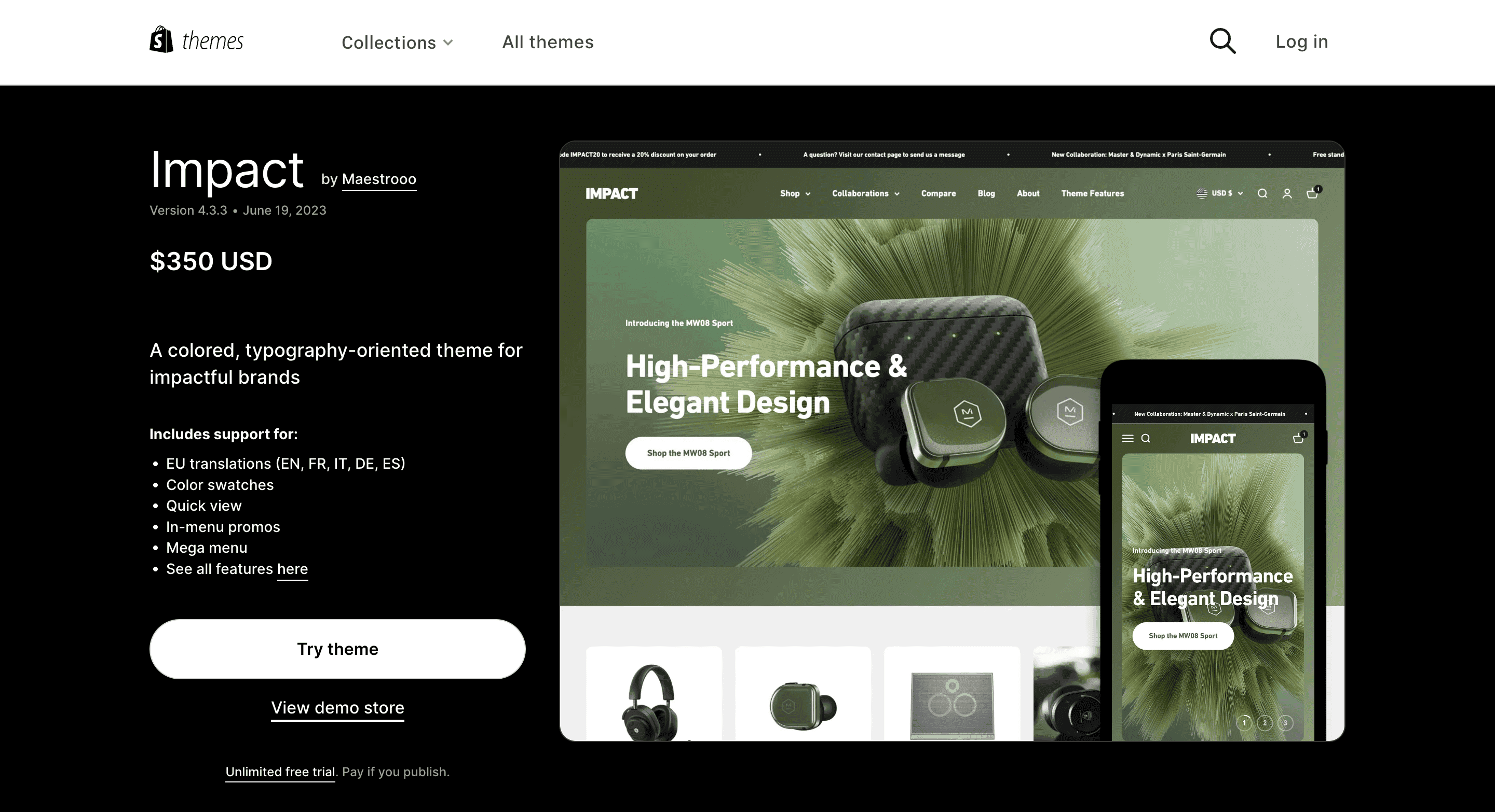
If you’re starting an eCommerce business or want to completely redesign a current shop, then the very first place to visit is Shopify’s Theme Store. It features both themes created by the platform and many third-party designs.
Currently, it has 12 free and 134 paid themes, ranging in price from $170 to $380 as a one-time payment. But most likely, it won’t be a final sum even if you follow the DIY path because of various apps and add-ons to expand the functionality and enrich the design.
But how to pick the best possible ready-made Shopify theme? Here are some points to bear in mind.
The Feature Set
Depending on the product, store concept, and customers, you’ll need specific functionality. Shopify’s store has a filtering system allowing us to select themes by industry, catalog size, and particular features.
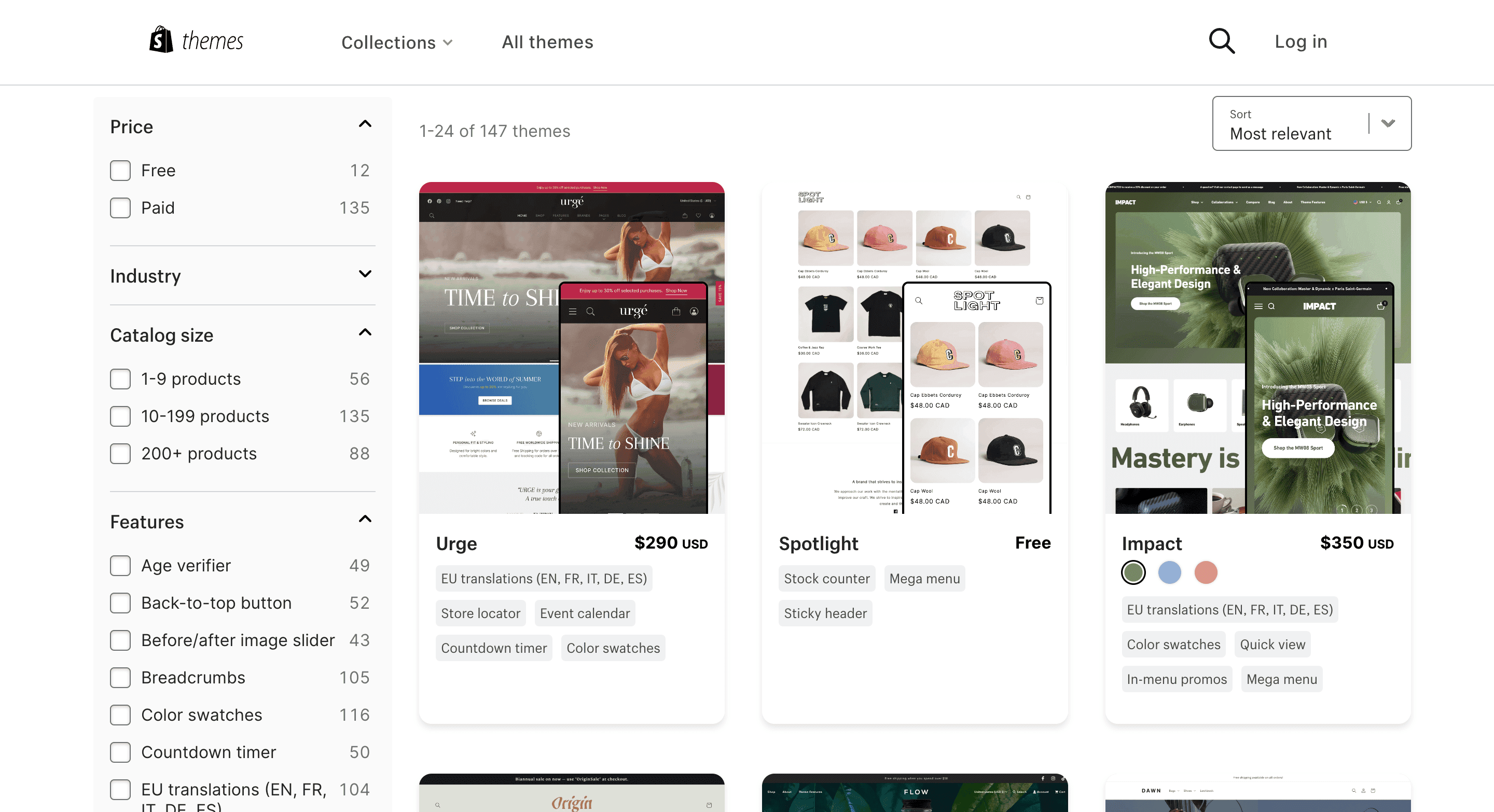
For instance, for a Shopify website with an extensive catalog, tick at least the following checkboxes: “200+ products”, “Mega menu” (to organize lots of categories conveniently), and “Quick view” (to allow learning more about items from the category page without visiting multiple product pages).
If you have offline stores, a “Store locator” would be useful. If you sell the same items in different colors, select “Color swatches” to display all the options on one page and make switching between them seamless. If you practice sales, the “Countdown timer” and “In-menu promos” are your nice-to-have features.
Unfortunately, the filtering menu mentions not as many helpful features as we’d like to see. Be cautious with the “Sticky header” and “Infinite scroll”, and check how exactly they’re implemented. In a suitable theme, the former has to be narrow enough not to hinder the shopping process. The latter won’t be good for a large Shopify website because it should be possible to reach the footer.
Check how the category pages are organized. For stores focused on items’ appearance, the grid view is preferable. For those selling equipment, electronics, and various B2B goods, it would be better to have both a grid and a list view. The latter shows more product info while prospects stay on the category page. Fewer clicks mean a shorter and handier customer journey toward a transaction.
A couple more recommendations:
- Mindfully read the theme specification to understand whether you can get the needed features out of the box;
- Browse demo stores and visit actual ones based on the themes you pre-selected to try out;
- Contact the vendors and ask them to clarify this or that moment concerning theme functionality.
The Photo Gallery
Madia (photos and videos) are essential in presenting products online. And when it comes to garments, shoes, accessories, furniture, home decor, and many other groups of goods, visuals must be the top priority for store owners.
So when selecting a Shopify theme, make sure it's able to showcase items in all their glory if it’s important for high sales. There are several ways to display the photo gallery:
- The placeholders themselves can be larger (for a better item representation) or smaller (for cases when product characteristics outweigh their look);
- The gallery can show one photo at a time or all the pics at once;
- The preview can be under the viewport or sideways (in this case, users see the overview and can instantly choose the pics they want to see closer);
- Zooming in/out and scrolling may work in different ways. Opt for one with the most intuitive and effortless manner of interaction.
Mobile Responsiveness
With and 63% of orders coming from smartphones in 2023, your store must be mobile-friendly to compete with others. Always check both desktop and mobile versions of the theme and see it in action in the stores using it. Moreover, vendors offer an unlimited free trial before going live, so try on the templates on your own Shopify website.
Unfortunately, even the most expensive themes can’t deliver top-notch app-like UX. They have no bottom nav bar (which hinders smooth navigation), the blocks oftentimes take more space than they could (on small screens, it means less useful info in the viewport and more scrolling), sometimes there are no sticky bars with the price and CTA, and so forth.
Hence, this tier of mobile responsiveness is achievable only with a custom Shopify store design. An app-like look and feel for mobile themes is our signature approach to theme development.
3.2 Theme Settings
Each theme goes with loads of settings. These are predominantly UI ones touching upon the colors, fonts, spacings, button shapes/positions, and so on (they may vary in different themes). You can also hide, add, and move many of the sections and elements. Even with these more or less “cosmetic” customizations, stores can better reflect their individuality and differentiate themselves from other stores utilizing the same site design.
Shopify has extensive documentation and detailed tutorials on this matter. We highly recommend reading and watching these pieces to equip yourself with more knowledge and leverage theme settings.
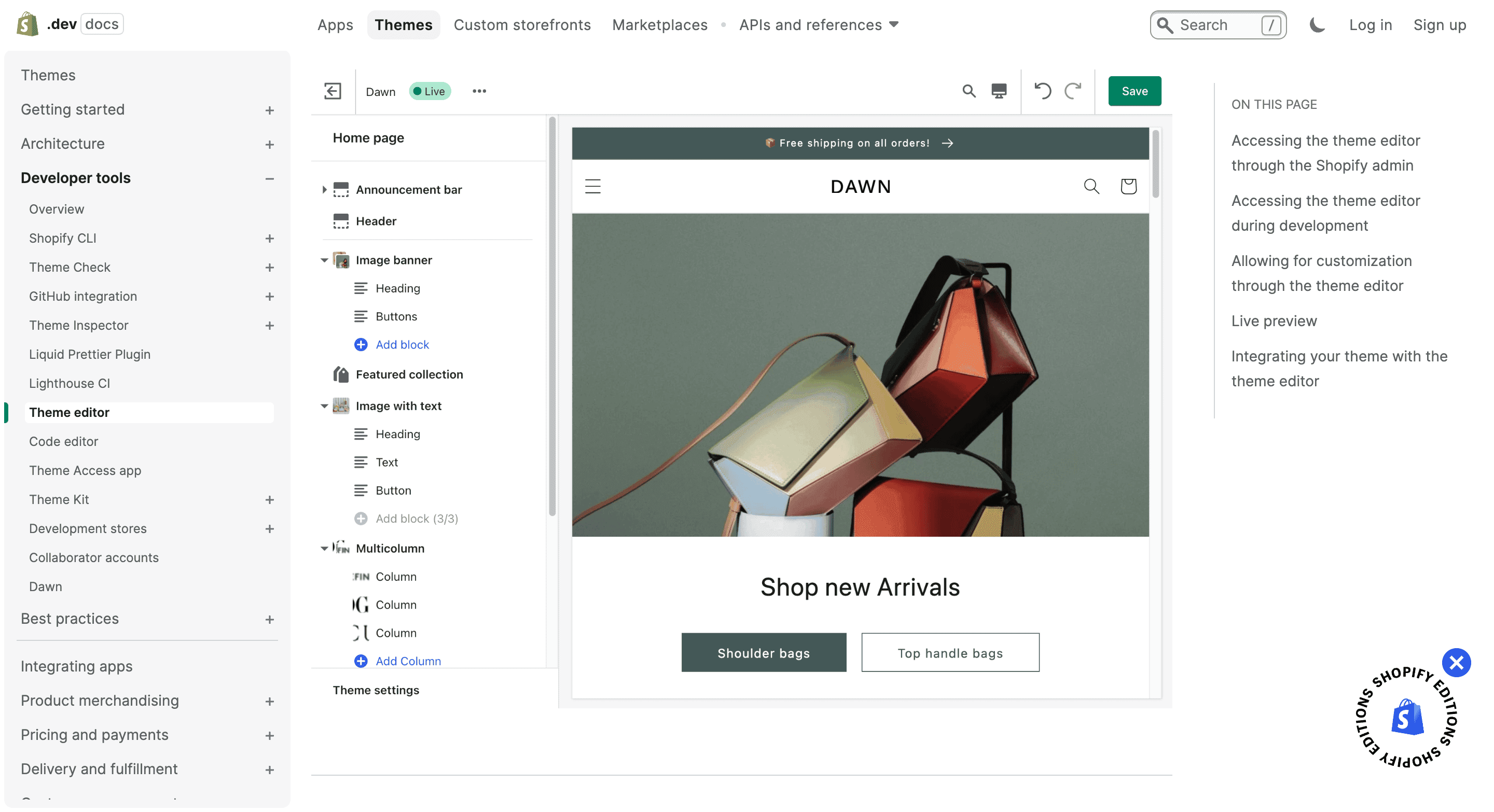
We made a checklist with critical moments worth your attention. Hope they'll aid in making your Shopify website more about your brand.
General Rules
Seeing the number of options for the first time may be overwhelming, especially for people who have hardly ever dealt with design tasks. In this case, the best strategy to embrace is to keep it all minimalistic.
- The color scheme. It’s pretty simple if you have a brand book/UI kit: just stick to your brand hues. If not, try creating a color palette on specialized websites. It’s important to use as few colors as possible and be consistent with button (or other element) colors from page to page.
- Typography. Again, the fonts are part of your brand style. If you haven’t determined it yet, then we’d advise keeping the default typography or using no more than two fonts.
- Spacings, thickness, shadows, opacity, etc. You can also regulate these parameters, highlighting certain elements like buttons, quantity selectors, pop-ups, or grids. But let us warn you: don't get carried away with these settings. They may be changed to no avail at best, and there’s a risk of getting a less balanced and modern theme look.
- Sections, blocks, and elements. You can add, delete, and move these page parts (some themes have more layout flexibility, others less). Anyway, we suggest that you actively use these settings to add calls to action where they’re needed and prioritize more important blocks by shifting them higher.
- Your content (media and copy). The right theme means a lot. But it's the unique content of high quality that makes the brand appealing and trustworthy. Professional product photos and videos, structured and detailed product descriptions, and precisely targeted marketing messages are critical for the store's success.
Design Tips for the Homepage
On an eCommerce site, each page is accountable for some part of the sales pipeline. Let’s make the user interactions more effective by adjusting several pillar pages.
The homepage is the face of your Shopify website, so it has to tell about its niche, show off the best products, and communicate the value proposition. Besides, your homepage must seem easy to navigate from the very start. Let’s make a list of your focal points here:
- The announcement (benefit) bar. Always use it to promote upcoming or ongoing sales, new collections, or your attractive shipping/returns policy. The more laconic and to the point your message is, the more it affects visitors’ purchasing decisions.
- The menu. If you can break down the catalog into more than 4-5 categories and then subcategories, do so for sure. In this case, you’ll need a mega menu (that’s what it’s called on desktops) displaying all the headings in one area as users hover over the menu.
- The search box and service icons. If your theme allows, show not only the search icon but the field too. It’s a must-have for online stores with large catalogs. Speaking of other important features, account, cart, and sometimes wish list and contact links must be in the header. After mastering Shopify store UI/UX design best practices, elevate your eCommerce strategy further by reading our .
- Product collections. To get people acquainted with the brand, feature your staples, discounted products, and new drops in curated collections and place them on the homepage.
- Social media links. Mention them, especially if social media are a huge part of your marketing and selling strategies. Typically, social media icons are located in the footer.
And what about other pages of your Shopify website? In fact, many customizations that do make a difference in the UX are impossible without coding or, at least, adding apps. Let’s name some highlights:
- The product page. Give details about shipping costs, terms (or even precise dates), and return policy right here. This info may be decisive for new customers and regular ones as well.
- The checkout. While you can’t make substantial changes there yourself, don’t forget to bring the colors and fonts into line with the rest of the website. Plus, upload your logo (the checkout doesn’t have a customary header and footer, with the logo remaining the only way back to the store from this page).
3.3 Shopify Apps
A huge advantage of Shopify is its App Store, with 8 000 applications for expanding functionality, customizing, and optimization. The right theme paired with helpful apps elevates the UX and then sales figures.
Let’s see what design-related tasks you can resolve with apps.
- Add customer reviews functionality as a means to showcase social proof;
- Add social media feeds (in particular, Instagram ones) to connect store visitors to your socials and share flamboyant user-generated content (UGC);
- Add product recommendations to personalize the customer journey and cross-sell;
- Enhance navigation: find better mega menus, set filtering, and plug AI-powered search;
- Set a loyalty or referral program to boost customer engagement;
- Build custom landing pages for marketing campaigns;
- Optimize (compress) photos used on the website to speed up the store without image quality loss.
There are some downsides to turning to apps, though. The most noticeable one is the price: apps are based on the subscription model, meaning you’re charged each month. Nevertheless, there is a portion of free apps or ones with free plans.
The second one is that too many additional apps may slow down the store. So just bear it in mind and plug only the most necessary ones.

Explore our eCommerce portfolio on Behance
See how Onilab's designers and developers transform the UX and improve conversions for online stores across the globe.
4. Custom Shopify UI/UX Design: the Workflow and Examples
Your new or existing site might have several reasons to cross the border of DYI design and go the extra mile in the team with UX/UI designers and developers. Let’s outline these prerequisites:
- Your conversion and revenue growth ground to a halt and the UX is proven to be the root cause. So you need a drastic improvement to boost sales.
- The themes/apps you see in the market don’t fit your specific business needs like an advanced customizer, app-like navigation, or checkout structure. So custom coding is the only way out.
- You want to build a unique shopping experience and stand out from the competition. So the aforementioned tidy-up measures feel insufficient.
Professional Shopify store redesign includes three main stages: UX research, wireframing, and development. We’ll explain how the analysis part is conducted and compare some Shopify website design solutions from ready-made themes with examples from our practice.
4.1 UX Research
Before discussing concrete designs, we’d like to briefly acquaint you with an essential phase we never skip when creating store UX/UI. We can’t come up with ideas without having an exhaustive knowledge of the website’s concept, industry, and target audience (or potential customers).
- We begin with the kick-off meeting, filling out the brief (the spreadsheet overviewing the online store, its metrics, pain points, and competitors), and task definition.
- Then follows the research stage. We dig into Google Analytics reports, watch session recordings, check heat/scroll maps, conduct user testing/interviews, and more. If it’s a brand new Shopify store not having such valuable data, we focus on the competitors, market research done by the client, and our eCommerce expertise.
- Next, based on the findings, we define buyer personas and customer journey maps (CJMs) for them. At this point, we’re ready to create hypotheses on the needed features and changes able to improve the UX on each step of the sales funnel and beyond. We put all our insights and ideas together in these documents.
Only then we move to the actual design and dev tasks: create information architecture, user flow, wireframes, and UI part. Then prototypes go to developers and QA.
4.2 Shopify UX Design Mistakes and Best Practices
As you remember, UX/UI design is more about the convenience of user interactions than color schemes and the beauty of typography. Let’s see a few examples of what custom store design is capable of in contrast with off-the-shelf Shopify templates.
And to better illustrate our point, it'll be mobile UX of Shopify themes vs. custom ones by us. No nitpicking, game-changing features only.
The Hompage
The homepage helps in getting to know the brand and directs visitors further into the store. So our best efforts should be used to make this storefront informative and intuitive, especially on smartphones.
(Onilab’s custom design). The first two screens contain several promotional banners, popular categories (filtered by product and device types), and convey the value proposition.
The header includes all the main controls: the menu, account, wish list, and cart links in the customary pictogram form. It's handy because these icons are in plain view, and users always know where to find them. The search is an open field with a prompt inside.
Glossier. The first two screens include just one banner and two quite generic categories. We’d recommend using this limited space a bit more effectively.
While this Shopify store has a sticky header (which is plus), it doesn’t include the account and wish list provoking more guesswork and superfluous actions. The search is closed, so an additional tap is needed to open it. Finally, we’d prefer icons to words because they look more familiar and intuitive.
For more, read our guide on the .
Navigation
Well-thought-out navigation is the lifeblood of an online store. With so many pages to browse, options to choose from, buttons to tap, and data to input, all these actions must be easy for shoppers. We must strive to cause no confusion and reduce the number of required interactions.
(Onilab’s custom design). Most theme makers are still apt to overlook the app-like UX/UI principles when creating Shopify design. We venture to guess it’s a question of price: it’s cheaper to slightly modify the desktop theme and get the mobile one than design two quite different sets of mock-ups.
We like to apply native app UX/UI to custom web development when creating mobile templates. The bottom navbar contains the main controls, and it’s at hand wherever users go (except for the checkout page and when pop-ups open).
The menu displays the maximum of the store’s catalog and even thumbnails. We eliminate redundant moves back and forth when exploring what the store has to offer.
Also, as a customer adds something, we show them a mini cart that is easy to close and continue shopping. More best practices you'll find in our piece.
Allbirds. The access to the menu, account, and cart is in the header, which is not as comfy for mobile users as with the bottom bar. The menu structure is standard, we also use it often, but it inevitably means many taps to explore the subcategories.
After a buyer adds an item to the cart, the full-page cart window appears. It’s not the best UX for a shoe store: people may what to buy more, but they need to reach the cross at the top to return.
We've dedicated a separate article to this matter: check our guide.
The Category Page
The first and foremost thing to do on this page is to set up a user-friendly filtering system.
(Onilab’s custom design). The category page has some quick filters at the top and a full-fledged menu just below. The filters inside are visible right away and smartly organized in sliders. As prospects scroll up and down, filtering and sorting stay accessible in the sticky bar.
Decathlon. Not only is filtering closed (you need to open each menu section), but it also isn’t pinned to the top/bottom forcing users to return to the top each time they want to apply/change/remove filters.
We've covered the topic in greater detail in the article.
The Product Page
Typically, it’s long and saturated with info and options. And if to choose one simple yet must-have feature here, it would be the CTA reachable from every position on the page.
(Onilab’s custom design). The button is the centerpiece of the page: it’s fixed at the bottom, spans the full width of the page, and has a vivid color. This online store has a product customizer, so the CTA literally prompts what to do: firstly, create a certain design, then add the item to a cart.
Crate&Barrel. The CTA feels lost: it’s located at the top of the third screen. The page itself is so long that visitors can even forget where they are at the moment.
Discover more design tips and tricks in the article.
The Checkout
This page often makes or breaks the whole user experience, so we put a lot into designing it in the most optimal way. And we mean a one-page checkout with all the steps (shipping address, method, payment, and order summary) on a single page.
Remember that in the case of the Shopify platform, changing checkout elements is permitted only on the Plus plan. And even so, it’s not that easy to discard the native multipage checkout and replace it with a drastically different one.
However, Shopify has recently announced that it’ll introduce a one-page checkout experience sometime soon. If the changes cover each and every Shopify site, it'll be good news.
(Onilab’s custom design). While it’s a one-step checkout, it isn’t overloaded with fields. The steps are closed, and each one opens in a pop-up. These are not new pages, so there’s no loading time.
Draw attention to the number of fields and the form structure. All forms take up no more than one screen so that people see the full scope, and it seems to them more digestible.
Gymshark. The multipage checkout consists of four steps, meaning the customers need to load four pages to complete the order. The page has express checkout options, which is brilliant. But for those who need to fill out classic forms, the form looks large. At least, it’s worth merging the first and last name fields.
See our comprehensive guide on where we dive deeper into the checkout flow issues and tips.
How to Design a Shopify Store: Final Word
Designing a Shopify store with core usability principles in mind helps attract customers, retain them, and give odds to competitors. Don’t leave such a powerful resource untapped; leverage whatever option you have. Even with a limited budget, allocate funds for photoshoots, work on the copy, refine the SEO strategy, and adjust the Shopify theme in the basic settings using Shopify store design tips from this guide.
And if you have the possibility, turn to the pros for . We at Onilab have been designing and developing eCommerce websites for more than a decade, concentrating on the quality of customer experience. As a rule, higher mobile and desktop conversion rates always follow the cool UX.