Does your website traffic grow, but the conversion rates are far from desired? Then, it's time to revise your shopping cart UI design and detect whether something prevents prospects from completing orders. Distractions mean abandoned carts and lost conversions. Our task is to secure more sales and grow a loyal customer base. That's where a better user experience on the shopping cart page is essential.
But what is a shopping cart? A cart page on the eCommerce site is a place where online shoppers preview their product selections, see the total cost, and edit the added things if needed. But if customers add items to shopping carts, it doesn't guarantee they'll proceed to checkout, the last step of the order-making process.
On the Onilab blog, we've already covered the ways to build seamless and convenient navigation. We've also shown best practices for eCommerce product pages, from product image optimization to writing about product details in a way that encourages people to purchase. Now let's dwell on the next step: cart UX optimization, which includes:
- setting the type of a shopping cart;
- configuring feedback upon adding products to the cart;
- organizing the page to review items in the cart before checkout.
In this ultimate guide, we'll explore shopping cart definition, cart page design examples, and shopping cart UX best practices to enhance the overall user experience.
Table of Content
1. Four Types of eCommerce Shopping Carts
Can we simply substitute a shopping cart page with a checkout page to perform the same actions? In practice, it's more convenient to split the processes. The online shopping cart should serve for making product edits safely, and order completion should take place at checkout.
We explain the and its meaning in online shopping in one of our articles, as well as provide tips on organizing an effective checkout experience. The checkout page is the final stage when customers are confident in their desire to buy particular goods. In turn, the cart page allows a user to review the order before deciding on a purchase.
Shopping carts differ from one online store to another. They heavily depend on customers' behavior. Below, we'll outline four ways to organize the eCommerce shopping cart and explain which option suits your business type.
1.1 No Shopping Cart
Here, we talk about two options:
- Special buttons like “Buy now”, sending website users directly to the checkout page and ensuring a frictionless flow.
- Incorporating an eCommerce shopping cart as part of checkout, allowing customers to review the order there.
The decision to configure the “Buy now” button or omit the cart page depends on the nature of the business and client behavior. It's one of the common practices for shopping cart web design in the following cases:
- if an average order contains just one product;
- if you sell specific (often expensive) goods, such as cars, beds, or watches.
But even if most users tend to buy only one item, it's better to leave two buttons: “Add to cart” and “Buy now”. The “Buy now” button is more like an additional feature to speed up the buying process.
1.2 A Pop-up Cart
You may not have a separate shopping cart page. It can be a pop-up, which speeds up the customer's movement through the purchasing funnel. The pop-up can substitute a full cart page, and it may be a variant of a success message indicating that the product has been added to the shopping cart (we'll discuss it further). It lets visitors access the cart preview without leaving the current page.
One of the pop-up benefits is reducing the number of clicks. Furthermore, customers don't have to wait for an online shopping cart page to load, enjoying a streamlined online shopping experience. Let's go over how to show the pop-up on smartphones and desktops.
A Pop-up Shopping Cart on Mobile
Even though mobile commerce is growing, of mobile shopping carts are abandoned. This fact shows an urgent need for a better shopping cart experience to address this issue. The pop-up on mobile comes in handy for online stores without the navigation bar at the bottom of the screen. You can use the pop-up if the cart is opened by clicking on the header's icon.
The pop-up on mobile may take the full screen or cover it partly. Note that it should be easy to close it with one hand: besides using the cross button, allow for swiping. The latter is quicker than manipulating the buttons.
A Pop-up Shopping Cart on Desktop
a) A pop-up may overlay part of the page. It lets you focus on the cart contents but usually limits the ability to interact with the page. We chose this approach for one of our clients, .
Should the pop-up let customers interact with the page? The answer depends on whether you want to direct the attention to the cart or leave the page available to scroll and click on the products.
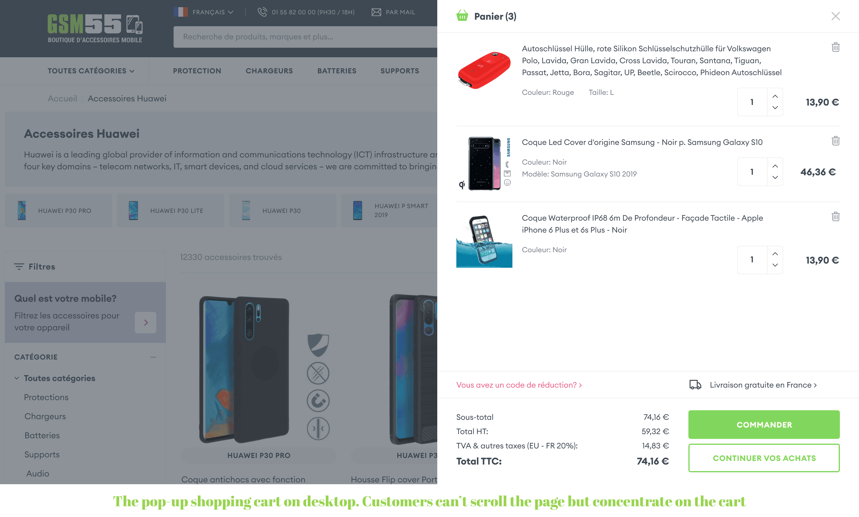
b) What if you have to squeeze much information into the cart, such as product descriptions, delivery terms, and payment options? You can create an extended pop-up covering the screen almost entirely. This is what our team did for the French IoT provider, . Below, we see a pop-up on the darkened background and a cross to close the window, indicating that we remain on the product page where we opened the cart.

1.3 A Standard Shopping Cart Page
Creating a full cart page is a standard pattern for online stores. These pages contain product lists, details, options, etc. (we'll take a closer look at the shopping cart UX design further). Unlike a pop-up, a dedicated page makes the customer's journey a bit longer. Such a variant is more convenient to accommodate more options, edit the cart with a lot of products, select items from different sellers, etc.
For instance, you can add checkboxes in the shopping cart so that users can select the products for their current purchase. Such functionality is more difficult to implement on pop-ups.
A full cart page is also mobile-friendly. As smartphones have less screen space, it would be harder to substitute the page with a pop-up unless it takes the entire screen.
Creating a pop-up or a page on mobile stems from the in your store. If you have the bottom menu (navbar) like in a shopping app design, you need a separate page for the cart with the icon on the bar.
[onilab_carousel name="cart page"]
1.4 A Mix of a Mini Cart and a Full-Page Cart
Many eCommerce websites create a hybrid variant with a full cart on a separate page and a mini cart on a pop-up. As seen below on ThingPark Market, a small pop-up (a mini cart) turns up without overlapping the page and has a link to view the full cart.
Such a combination will bring you the benefits of both solutions. Online shoppers requiring a fast customer experience will use the pop-up to review products and checkout. In the meantime, more deliberate customers will open the dedicated page to check all information before leaving their money in your store.
2. Adding Products to the Shopping Cart
How does an eCommerce website behave when users click the “Add to cart” button? The possible changes cover a cart pictogram, a notification, and a call to action on the product page.
2.1 Organizing the Cart Pictogram
Your icon should be recognizable and familiar to everyone. The pictogram can be a cart, a basket, or a shopping bag, which should be easily discoverable on any website page. Let's compare the difference between a mobile and desktop shopping cart icon and check how to ensure the best shopping cart UX on these devices.
Mobile App Shopping Cart Location
The icon placement depends on your navigation type. The lower tab bar should have a cart icon (in the center or on the right). Note that the bottom menu is a prerequisite for a positive customer experience since users don't have to reach up to tap the main controls. Many progressive apps adhere to these principles, as seen in .
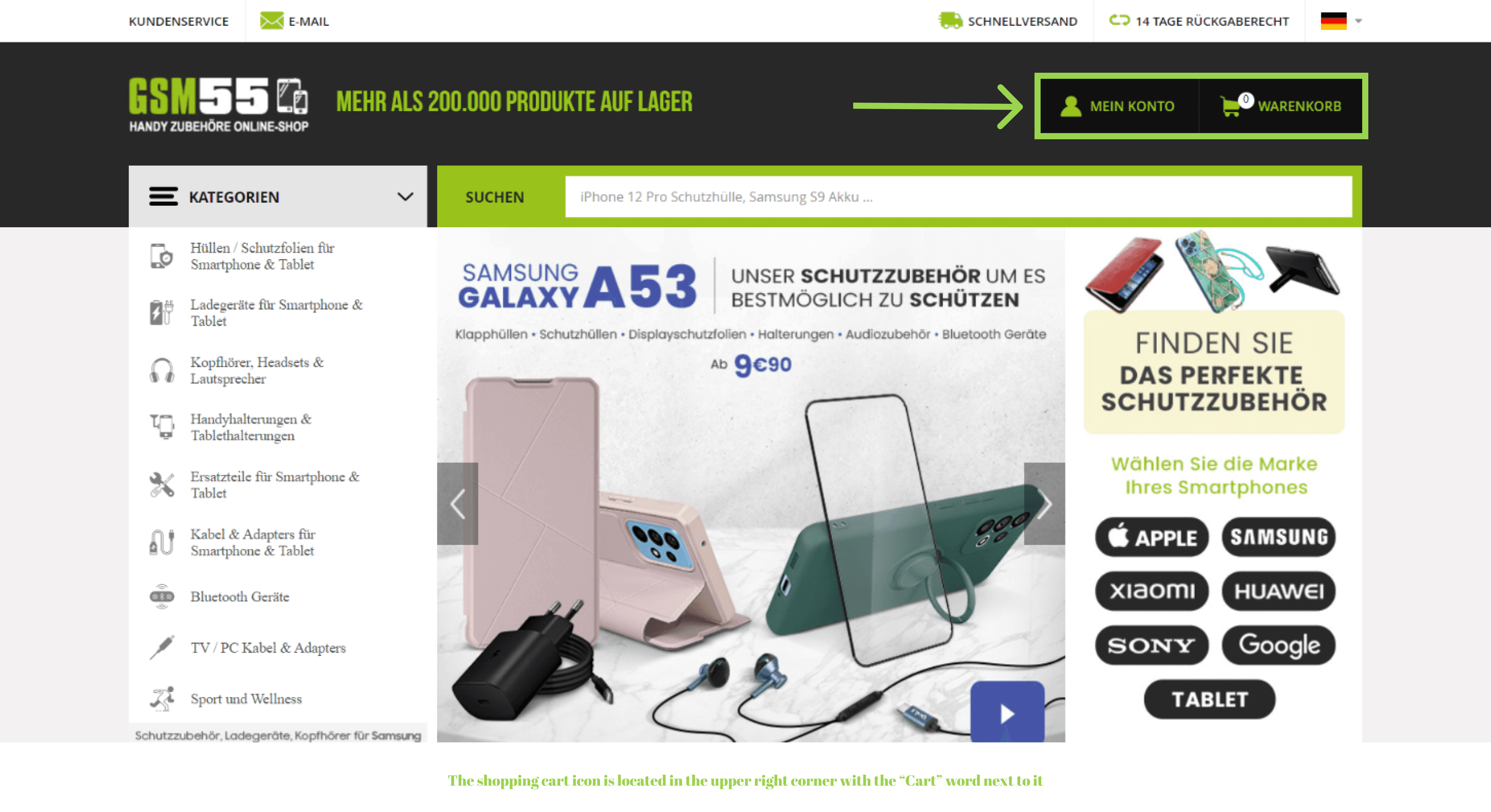
Does your store have conventional navigation with a hamburger menu? Then, a shopping cart icon generally takes the upper right corner, standing close to the account and search pictograms. The left corner is too far to be accessed with a thumb. Don't use this space.
The screenshots below visualize various options for featuring a shopping cart icon. The first three are Onilab’s custom design projects for a , a mobile accessories seller, , and a family-run business of customizable goods for children, .
Desktop Shopping Cart Location
Desktop screen space provides more space for your creativity. ECommerce business owners make the cart icon more visible and brighter so that visitors can instantly distinguish it from other pictograms. You can write the words like “My cart” or the total sum next to it to make it more noticeable. The standard location is in the upper right corner.
2.2 Showing Feedback
Feedback is the confirmation of adding products to the cart that also prevents people from putting something in the cart by error. A success message can appear as a small notification, a pop-up with a quick product overview, and an interstitial page. These variants cater to different product ranges and types of shoppers' behavior.
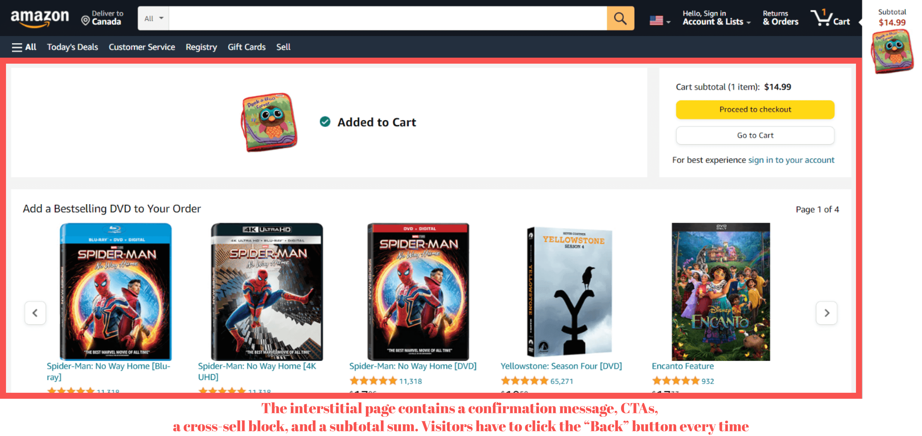
a) An interstitial page automatically opens when customers add items to the cart. It's the most noticeable way to validate the action, which we advise you not to employ. It works better for eCommerce stores with little product variety or when orders don't exceed one item.
Such a page requires users to take deliberate actions to continue shopping. They have to click the “Back” button each time, which may be slightly annoying to repeat in one session.
b) Another option is a pop-up with a product overview, buttons, and cross-sells. The pop-up can overlap the page content or appear unobtrusively at the upper part of the page (on desktops). As mentioned before, such solutions often perform the functions of a mini shopping cart.
An informative success message typically contains the following elements:
- Product name;
- High-quality product images;
- Details (size, color, etc.);
- Quantity selector;
- The “View cart” or “Checkout” CTA buttons.
Compare the examples of pop-ups from retail brands. The first image is from Onilab’s custom design project, , an American retail chain focusing on electronics and appliances.
As far as editing is concerned, we don't think it's reasonable to let people edit or remove the added product, as it's too early to delete the item upon moving it to the cart. We recommend showing thematic product recommendations in the confirmation message.
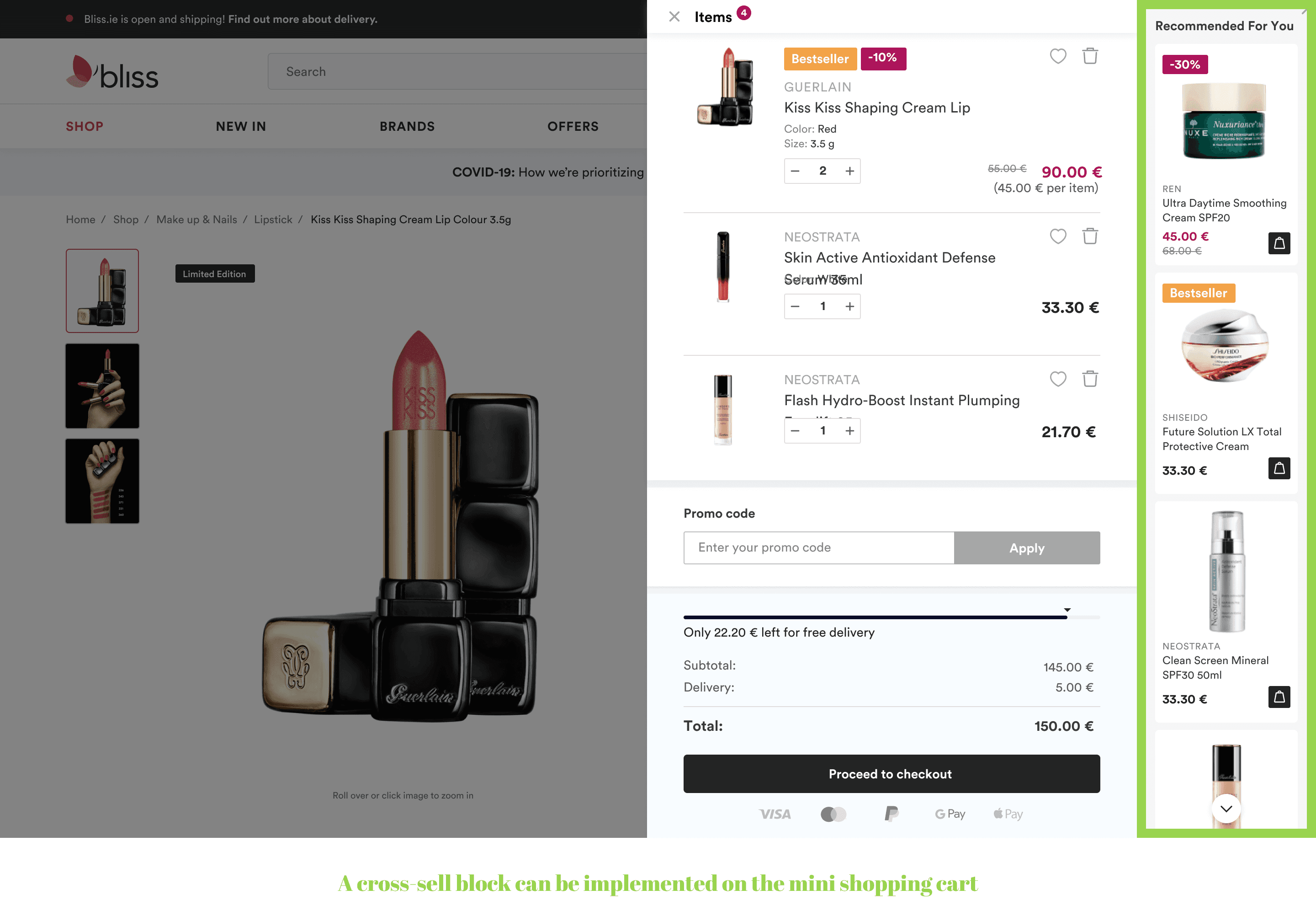
Such a section with high-quality images inspires consumers to buy more, but excessive elements may overwhelm the viewer. That's why a cross-selling block should be used in the pop-ups that restrict interaction with the page content, focusing the attention on the message. If visitors can interact with the page, this block is unnecessary.
Remember that multiple pop-ups (and the need to close them each time) may deteriorate the shopping cart experience. Display them in case your orders consist of one or several items. Or show a pop-up when adding a product for the first time, and the subsequent additions to the cart should appear as small notifications.
c) A success message. Suppose your customers buy lots of products in one order. Can you imagine closing a pop-up or a page every time they click on the product? Horrible. A subtly animated popover that appears and quickly disappears might fit better.
What Are the Options to Close the Pop-Up or Message?
- Clicking on the cross/arrow;
- Tapping on the page field;
- Swiping sideways/down (which is a better functionality on mobile because it's harder to reach the cross button with a thumb);
- Showing a progress bar (the pop-up disappears when the bar comes to an end);
- The message fading away by itself (it should linger long enough for users to read the information).
2.3 Reflecting Changes in the Cart
An empty cart icon may have a “zero” or nothing written beside it. But it's crucial to show the number of products after moving them to the cart, both on desktop and mobile. You may give a cart prominence by increasing the pictogram size or showing the total sum next to the icon if it fits in with the store specifics.
When can you display the total sum? Some businesses process or deliver orders of more than a certain amount. The order summary next to the cart icon helps customers understand whether they've reached a threshold for an order. But as a rule, there is no need to indicate the total sum. Especially if you have a mini shopping cart or a cart on a pop-up, and users can hover or click on the icon to get all the details.
2.4 Tweaking a CTA on the Product Page
Another indicator of moving a product to the cart can be changing a CTA on the product page. It's not obligatory but serves for better understanding. For example, the button can change to “Add another”, take a different color, or display a selector to increase the number of added goods.

Get a Free UX Audit Example
Read our demo UX report exploring the online store’s checkout issues.
3. Designing a Shopping Cart: Best Shopping Cart UX Principles
How much information and functions should you display in a shopping cart without overloading customers? Let's discuss the essential elements of a shopping cart, which features you should enable, and how to organize them.
3.1 Including Comprehensive Product Details
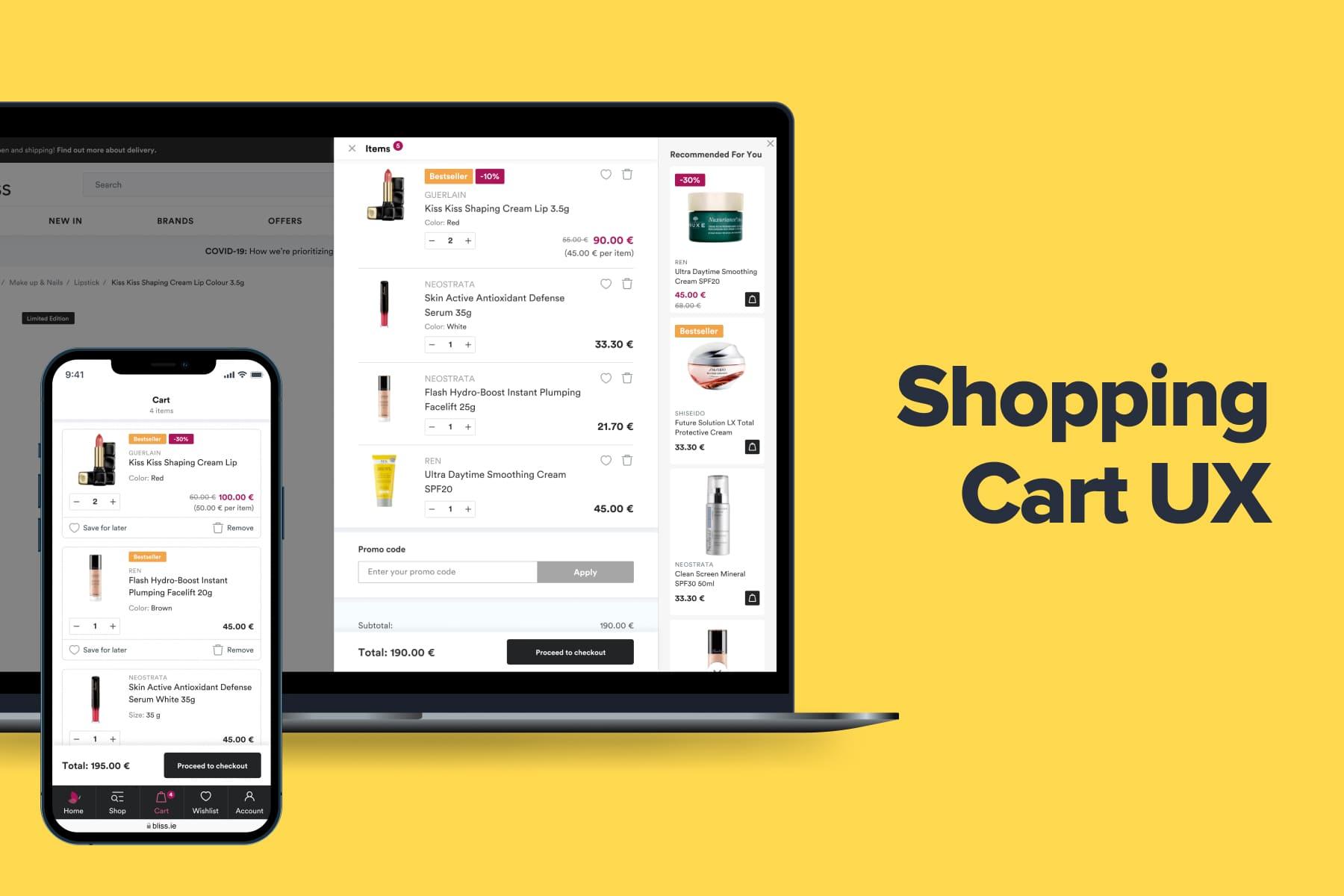
The shopping cart with products may contain the following elements:
- Quantity of items;
- Thumbnails;
- List of products with all parameters (price, color, size, volume);
- Quantity selector;
- A link in the product name to open the corresponding page;
- The subtotal/total sum with taxes;
- Accepted forms of payment (Google Pay, Apple Pay, PayPal, etc.);
- Delivery terms, including the shipping cost;
- Estimated delivery dates;
- CTAs to continue shopping and go to checkout;
- A discount code field (if you practice this promotional trick in your eCommerce store);
A wish list button or link; - Checkboxes to pick particular items for the order;
- A “Remove” button;
- An up/cross-sell section.
Take inspiration from Onilab’s client, . See for yourself how informative a shopping cart can be.
3.2 Editing the Shopping Cart
Let customers edit the cart contents, item quantity, or color right before going to checkout. One of the most common editable sections is the item quantity. But how do you enable editing in the shopping cart and ensure a better shopping cart UI/UX? There are three main options: inline editing, dialog windows in the cart, and editing on the product page.
a) Inline editing. This type concerns changing the product specs in the cart using drop-downs, steppers (plus and minus signs), and a quantity input field.
Steppers are considered to be more user-friendly than drop-downs. Why? A drop-down implies taking an extra action: opening a list of numbers and searching for the needed one. It's better to manually click on the “+/-” or arrow sign or insert the number from the keyboard.
owever, you also should look at your analytics here. If customers buy not so many items of one product, you can make a drop-down to save space, which is so pivotal for mobiles. But generally, steppers are more convenient, especially for orders with large numbers of goods. Indicate a quantity limit. In steppers, turn off the “plus” icon and show a message that adding more items is impossible.
b) A pop-up. In this case, customers can click on the “Edit” button next to the product. Then, a pop-up opens. It's a quick overview, sort of a mini product page where they can change the parameters: size, color, etc. It's better for the cart UX than going to the product page because it's faster and doesn't direct the client to another page.
c) A product page. You can provide editing functionality, but it isn't possible for every product aspect. Why do some stores not allow editing? For example, a product of a different color can have another product code.
From the development point of view, it's impossible to alter it in the cart. Customers will have to return to the product page and choose another item. That's why we advise linking the product with its page: it ensures faster access to edit the product.
Provide an intuitive UX when editing the cart. A case in point is Asos. While you may think you can't edit the cart, you can click on the dots and choose the needed aspect to modify. But it's not so obvious. Some may overlook the dots and go to the product page for another color or size.
Allow customers to delete products from the cart. Display a message with the “Undo” button to return the removed item. Ask the customer to confirm the action only if they:
- choose to empty the entire cart;
- lose gifts and bonuses due to removing the item;
- delete complex customized products.
There are also cases when the item has gone out of stock after spending some time in the cart. Clearly indicate that customers won't receive this product. For example, you can forbid going to the checkout until they remove the item manually. A wise move is offering them to pick similar products instead.
3.3 Defining Shipping Costs and Payment Options
If possible, specify estimated shipping costs in the shopping cart. According to our research, around 30% of customers abandon their carts due to hidden shipping fees. Shopping cart design best practices include:
a) Inserting delivery terms (a zip code or delivery destination) in drop-downs or pop-ups to pre-estimate the cost and date;
b) Automatically showing the cheapest shipping option. Customers who want a faster but more expensive delivery can change it at the checkout.
c) Mentioning that shipping is free of charge. We've found that free delivery stimulates about 90% of purchasers to buy more products online.
d) Setting a lower limit for free delivery. It's a mutually beneficial way to provide free shipping. Consumers will buy more products they didn't expect to purchase, increasing the average order value.
How can you organize it in the shopping cart? Configure a progress bar, which shows how much buyers need to purchase for free shipping. And when they reach the amount, the progress bar disappears or displays a success message. You can offer some products next to the bar, motivating customers to add more and get free shipping.
Don't forget to enumerate accepted forms of payment, such as PayPal, Visa, Mastercard, Apple Pay, etc. It's one of the essential UI/UX tips for online stores.
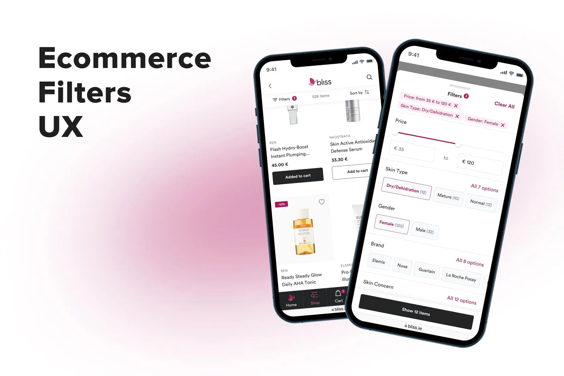
Some options may be more appealing to customers, so you'll increase the chances of conversion. Accepted payment badges usually find their place somewhere close to the checkout button, either below or above it or in the footer. To systematically assess and improve such elements for optimal customer response, consider conducting .
3.4 Choosing the Right Place for the Order Summary and CTAs
Placing CTAs and the order summary in the right place ensures the ability to assess the total cost of the order quickly and proceed to checkout without any friction. Let's look at organizing these critical cart page elements.
Calls to Action
A shopping cart should contain one or two buttons with CTAs:
- Primary: checkout CTA, such as “Pay Now” or “Go to Checkout”;
- Secondary: returning to the catalog, such as “Continue Shopping”, or payment options.
A pop-up cart may have only one CTA button as it's easier to close and return to the page. In any case, the checkout CTA should stand out: be the biggest, spaced-out, and boldest element. We also recommend highlighting it with color while making the second button less emphasized.
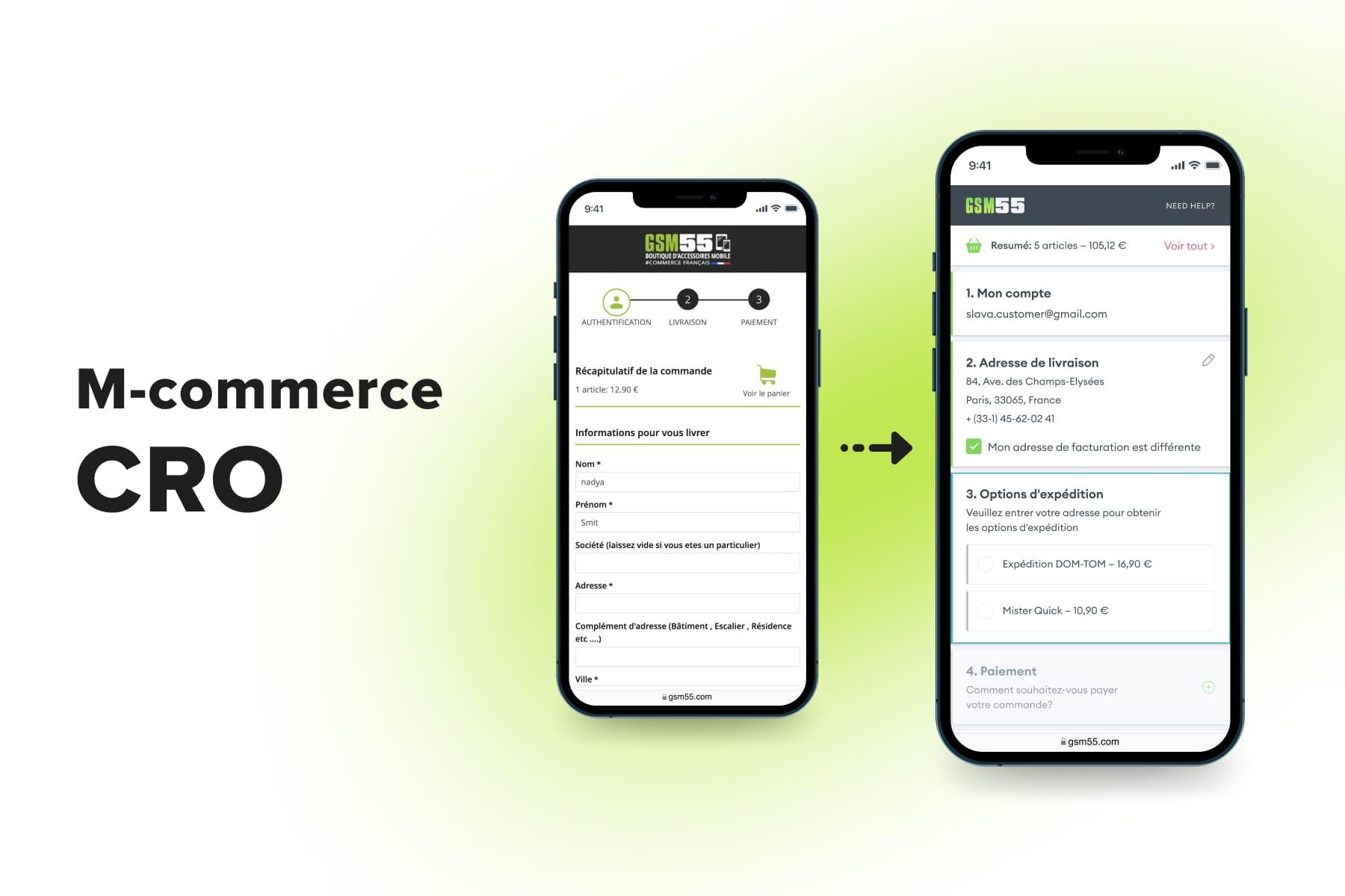
Mobile Order Summary
How do you ensure users won't have to scroll down the page each time to check the order summary? Make a sticky bar with the checkout button and a total sum: it will be visible regardless of the user's position on the page. Increase the button size when customers scroll to the order details. You can also add an arrow on this bar to quickly move to the order summary.
Both Onilab’s clients, beauty brand Bliss and IoT vendor , successfully adopted this approach to level up the shopping experience and customer satisfaction.
Desktop Order Summary
A typical place for the order summary on a desktop is to the right of the product list on the full cart page. It also should be above the fold. This position will let people see the total sum and click the button immediately.
Do you want to make it even more user-friendly? Configure a sticky bar for a summary block with buttons and the total price.
3.5 Saving Items for Later
A shopping cart is also a place to collect products people are interested in but may not be ready to buy at the moment. That's why you need to let them save these items and specify this function in the shopping cart UX design.
a) Long-term cookies let users see the products in the cart even after closing the website and accessing it later. However, customers may not know whether their goods will be saved and for how long, which is an unreliable way of reserving the cart.
b) The “Save for later” link. Below is an example of such a separation. If you click the CTA button, the item is removed from the order but stays in the cart below in a separate section. As you can see, it doesn't go to the “Favourites” list.
c) A wish list. It traditionally looks like a heart-shaped button, sending the item to the dedicated page and leaving it in the cart. In this case, customers will have to make an additional click to delete it.
You can implement the feature another way: by configuring the “Move to wish list” button. It allows customers to transfer products in one click. You can also consider a link to share the cart's contents with others.
[onilab_carousel name="wish list"]
3.6 Displaying Discount Options
Coupons boost sales because customers get an incentive to buy the product at a bargain price. However, coupon fields in the cart may decrease sales. It happens if shoppers see the entry field and go to another website searching for a discount code.
There is no guarantee that they will find it. People may get disappointed, change their minds, or discover a similar product on competitors' websites. That's why you need to be careful with coupon fields to avoid spoiling the shopping cart UX. How visible should such boxes be? It depends on the business type and promotional strategy:
a) A noticeable promo code entry field if discount codes are an essential part of your strategy;
b) A hidden field or a link if discount codes aren't actively promoted.
You may need to display the number of points awarded for a purchase or allow customers to spend them (entirely or partially) on an order. The same applies to gift card fields. Remember to automatically change the total cost in the cart when users insert the discount code, gift card, or points.
3.7 Making Use of Gift Options
The more your online store is aimed at presents, the more detailed this section should be. For example, allow customers to decorate presents with a personal note, customized gift wrapping, or a card. You can make it on the store's separate pages or in the cart itself.
Stores typically hide the opportunity to arrange a product as a gift in checkboxes. It's suitable for brands where this is an additional option, not the backbone of the business. When the checkbox is enabled, the functionality unfolds in an accordion.
3.8 Placing Motivators to Buy in the Empty Cart
Should you display anything on an empty cart page? We advise you to take it as an opportunity to implement additional entry points to sell. What should a visitor see when arriving on the cart page without products?
- A CTA to fill the cart;
- Frequently or recently viewed/purchased relevant products. Personalize the shopping cart experience and display what customers may like.
3.9 Keeping Elements from Other Website Pages
A shopping cart should preserve some sections from other pages. Customers may need the information or assistance before making a purchase. Your task is to eliminate their doubts by following the practices, such as:
- Displaying related products. We consider adding shopping cart recommendations as more of an advantage for your sales and cart UX. You can make this section on a full cart page or a pop-up.
- Providing a live chat functionality to assist customers in case of a problem. You can also leave contact details as an alternative to a live chat.
- Choosing the appropriate trust badges. These may be safe checkout badges, accepted payment options, third-party endorsements, money-back guarantees, and free shipping and returns badges. They indicate that clients can leave personal information without the fear of data stealing.
We advise you to limit trust badges to the only official, laconic, and helpful information that you can prove. These elements shouldn't overload customers or divert them from essential functions.
In the meantime, we recommend removing unnecessary buttons and sections users can easily find on other pages. One such example is return and refund policies and FAQs. Visitors can read it on the product page, so don't make special sections concerning return policies in the cart. Place these links in the footer and open them in a pop-up on mobile.
4. Three Ways to Tackle Cart Abandonment
The average shopping cart abandonment rate revolves around . If you strive to enhance yours, look into the ways to reduce the cart abandonment rate on an eCommerce site. See more specific tips in our guide “”.
4.1 Send Abandoned Cart Emails
Did customers abandon the cart? Send them an email if they're signed in. The best time for abandoned cart emails is within the first hour of abandonment when the interest in products is the highest. Remember to attach the correct link to the cart page to finish the order. Suggesting complementary products may also increase the AOV.
4.2 Leverage Push Notifications
Push notifications can remind users about cart abandonment on desktops and mobiles. They should be concise and deliver the most convincing CTA. Reengage customers to come back to the online store by instilling a sense of urgency or scarcity. For example, offering time-constrained discounts and using subject lines can strengthen the notification content and encourage customers to order soon.
4.3 Configure Remarketing
You can reduce cart abandonment by displaying ads on other channels, such as third-party websites and social media. Show relevant goods according to what online shoppers are interested in, which also boosts conversions. Read more about this and other strategies in our .

Explore our eCommerce portfolio on Behance
See how Onilab's designers and developers transform the UX and improve conversions for online stores across the globe.
Shopping Cart Page Design: Conclusion
Through various examples of eCommerce cart design, we've introduced you to the eCommerce cart UX design principles serving multiple purposes:
- smoothing a customer journey;
- clearing the way to checkout;
- lowering the cart abandonment.
We've described which cart type to opt for, how you can configure in-cart editing, organize the CTAs, and allow for saving items for later. For more ideas on improving the , see our article aimed at Magento store owners.
All these tips are heavily affected by the goods you sell and the number of items added per order. Perform usability and A/B testing of the cart page features, address customer pain points, and check the analytics and heatmaps. Our can assist you with shopping cart website design. Our developers can advise you on the best shopping cart software, connect it to your inventory management system, and provide general to spot problems with the checkout flow.