M-commerce, a mobile-first approach, an app-like UX/UI. These are three main commandments in web development for eCommerce since smartphones have become really smart and convenient, catching up and surpassing desktops in traffic and sales.
Adaptive and responsive designs are no longer on the agenda. They can’t ensure a decent mobile shopping experience because they’re anyway based on desktop themes. People are used to dealing with native apps; not ergonomically placed controls and jumping content irritate them. So they’d rather close a website than get frustrated while making purchases.
But mobile apps aren’t always a perfect way out. No doubt, they’re geared for cell phones: designed for these devices only, closely interact with the hardware, and work smoothly due to this. But not all companies can afford to make two apps for iOS and Android. Even fever players in the eCommerce industry can convince enough consumers to download an app that will be used just a few times a year. The brand must have an extensive clientele for this venture to be profitable.
In this state of affairs, the mobile-first approach and the app-like UX/UI design are a sought-for сompromise for mobile commerce. In this guide, we’ll analyze the statistics, discuss the core principles for designing mobile websites, and look at mobile eCommerce UX best practices.
Table of Content
1. Why Take Care of a Mobile-Friendly Store?
Leading marketing researchers keep a close eye on the m-commerce phenomenon. When it comes to numbers, they're fascinating:
- 5,22 billion people own mobile phones as of now;
- 234 minutes a day US citizens spent on their smartphones in 2021;
- 79% of cell phone owners use devices for online shopping;
- 72,9% of total eCommerce sales in 2022 are expected to go via mobile commerce;
- 90% of purchasers reckon their customer experience with m-commerce has room for improvement.
The last point is particularly important as it indicates some dissatisfaction with the UX mobile commerce provides. Firstly, consumers aren’t very enthusiastic about downloading a bunch of weighty shopping apps. And secondly, numerous mobile websites (even of world-renowned brands) are adaptive/responsive. Put simply, they are squeezed versions of desktop sites with some elements changed, added, and removed.
This desktop-first approach can’t deliver the best mobile eCommerce UX. When designers create desktop layouts first, they have much free space for experiments. They don’t think about a keyboard taking up to 50% of a mobile screen when users search for items or fill out the forms at checkout. They don’t bear in mind that user behavioral patterns on laptops diverge a lot from those on cell phones.
Therefore, designers often end up having magnificent desktop prototypes with loads of smart UX solutions that are absolutely inapplicable to mobile devices. To adjust such eCommerce design for mobile, they need to get rid of some functionality and rethink the rest. Otherwise, the pages will be overcrowded with elements, and there might be issues with loading speed.
In the meantime, crafting a mobile version first has at least two major advantages:
- During the process, designers think over essential features and don’t stuff pages with redundant elements. This approach guarantees a better mobile UX.
- Desktop templates look structured and tidy as well. In most cases, designers don’t need to add anything since they have thoroughly worked out the functionality earlier.
Remembering the share of mobile commerce in the total online sales, it doesn’t seem logical anymore to start with desktop mockups. But it’s not enough to just go mobile-first formally. We’ve also mentioned the third vital term: an app-like design.
UX/UI design for applications has been actively evolving, ideating new sophisticated solutions. When designers and developers borrow them for web apps, they become almost indistinguishable from native apps.
Still, a vast majority of retail sites remain outdated, hindering themselves from having higher conversions. But those properly applying mobile-first will have a head start over the competitors.
2. Core Principles for the Best Mobile Ecommerce Design
Let’s list the rules for designing mobile websites to fit the bill in terms of UX/UI, which will also answer the question of "". Onilab proved their efficiency many times while creating Magento PWA themes for clients. The point is to concentrate on the device capabilities and the peculiarities of using smartphones:
- People behave on cell phones and laptops in a different fashion;
- People perceive info on small and large screens differently;
- People interact with phones faster than with PCs.
2.1 Prioritize It
Given the short attention span of smartphone users, element prioritization becomes a top priority for UX/UI designers. We keep the main focus on the above-the-fold area: it’s the very first screen visitors see without scrolling. Strive to fit all crucial controls/elements here. This way, you’ll ensure that the main navigation, details, and CTAs will be visible to shoppers straight away.
2.2 Streamline Navigation
Navigation not only prevents customers from going astray but also directs them towards completing an order. It encompasses numerous elements: a header and footer, main controls (menu, search, cart, account, wish list), options to go back, and so forth. When planning navigation for mobile versions, designers take into account three aspects:
- A manner to navigate on smartphones. For instance, people are used to getting back to the previous page by swiping right, and designers should utilize that.
- A very limited space. As we said before, designers need to fit critical navigation elements above the fold. So they must be picky when choosing what to leave, what to shift below, and what to remove. The final templates should be well-structured, comprehensible, and minimalistic.
- The specifics of using smartphones. People often handle phones in one hand, operate (or try to) with a thumb, and make purchases on the go. That’s why one of the standards for native apps is a bottom nav bar (also called a tab bar or a bottom menu).
2.3 Make Use of Sticky Bars
When buyers explore a store on the phone, they make way more scrolls than on the PC. Such important elements as calls to action, a price, or filtering/sorting go out of sight. In order to keep them at hand and not force users to scroll back and forth, we add sticky bars.
2.4 Implement Pop-Ups
Onilab’s design team considers pop-ups the cornerstone of a flawless m-commerce UX. Instead of getting shoppers to new pages or expanding info in accordions, we open windows over current pages. Pop-ups can show filters, product details, success messages, a cart, and forms at checkout.
Pop-ups always appear for a reason and as a reaction to one’s actions, like tapping a button/icon/title. It’s also important to visually emphasize that users stay on the current page. We usually make the new window smaller than a standard mobile screen and darken the background page. Pop-ups must be easy to close: with a swipe/tap on the background.
Speaking of how reasonable the solution is, let’s outline its pros:
- Pop-ups concentrate people on one task. They understand what is needed in a jiffy.
- Pop-ups fit additional info that can’t be posted on the page due to space limits. As a result, the structure remains neat and well-organized.
- Pop-ups don’t cause annoying layout shifts: leads remain in the same position in a store.
2.5 Eliminate Layout Shifts
When people leaf through a menu or a product page, they may come across accordions. They expand the hidden details, shifting the rest content down. Then if users want to study another section, they have to scroll to find it. When they open the next block, the previous one either collapses or remains expanded, making the menu/page look messy.
So avoid accordions to relieve customers of the need to constantly scroll and see jumping content. Pop-ups are really good at resolving the issue.
2.6 Leverage Gestures
Let’s talk about how we perform basic actions on smartphones. They imply more possibilities for gesture control than PCs: zooming with fingers, vertical and horizontal scrolling, swiping up, down, left, and right. These gestures bring designers more flexibility:
- Swiping makes it simple to close pop-ups and go back to the previous page.
- Horizontal scrolling is useful for various galleries and sliders. For example, we can compactly organize the category section on a homepage and leave space for other blocks. If on the desktop version, sliders often require clicking on arrows, on mobiles leafing through these blocks is effortless.
- Zooming in and out by pinching with two fingers is a habitual gesture for mobile users. Online stores are removing zoom icons from photo galleries because these hints aren’t necessary anymore.
2.7 Add Phone-Related Features
Smartphones’ hardware and software make these devices more feature-rich than laptops, so use this benefit while creating mobile eCommerce UI/UX. By allowing prospects to engage apps, a camera, and other stuff while shopping, we can further improve the customer experience. Amongst features worth implementing, we’d highlighted the following basic and fancy ones:
- Visual search: uploading/taking photos to seek for similar items/exact matches in a catalog;
- Barcode scanning: reading price tags with the camera to find corresponding product pages;
- AR-powered try-on: using the camera to try on clothes, sneakers, beauty products, see pieces of furniture in one’s interior, and so on;
- Location tracking: requesting the current device location to auto-fill the address form at checkout or show the nearest offline store for picking up an order;
- Mobile payment services (Apple/Samsung/Google Pay and more): completing orders easier and faster;
- Voice search: using a microphone to make search requests;
- Push notifications: sending reminders about abandoned carts, sales, and special offers;
- Quick sharing: giving an opportunity to send links to social media and email.
2.8 Forget About Hovers
On desktops, hovering with a mouse or trackpad gives extra opportunities to UX/UI designers. They can add tooltips or showcase extra info when visitors hover over product cards on a category page.
On cell phones, it’s not an option. If designers transfer such functionality to a mobile website, customers will have to tap twice to get to the product page. But with the mobile-first approach, the problem of adapting hover-based features disappears.
2.9 Stick to Familiar Controls
Finally, familiarity brings comfort when it comes to mobile UX. When working on web projects, we follow Human Interface Guidelines for iOS and Material Design for Android. Turn to these guides when:
- You need a toggle/slider/input stepper or any other control. Why create something which has already been created, tested, and approved?
- You want to check the recommended icon/button sizes, spacing between elements, and font sizes/contrast.

Get a Free UX Audit Example
Read our demo UX report exploring the online store’s checkout issues.
3. M-commerce UX Dos and Don’ts
So, let’s get closer to the second-to-none usability of a mobile website. In this section, we’ll consider best practices for navigation and search as well as the home, product, cart, checkout, and account pages. We’ll also look at some controversial examples of web design for mobile eCommerce.
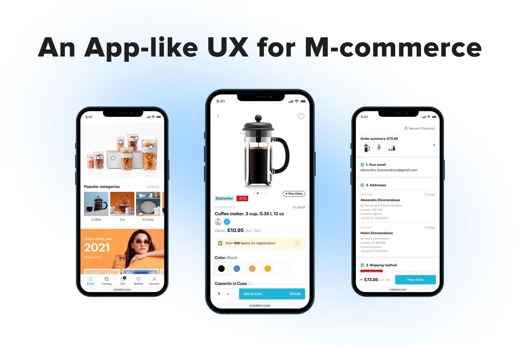
3.1 The Homepage
This page is all about acquainting leads with the store concept and directing them deeper into the site. To prevent the bounce rate increase, the main page should have lots of touchpoints with category and product pages. A well-thought-out homepage usually comprises the following sections:
- Popular categories;
- Bestsellers and/or items on sale;
- Promotion banners;
- Benefit bars;
- Enumeration of brands the store sells.
And the second is not making the most of this page. Take a look at Cos’s example: it mentions only several categories and shows very large photos. As a result, leads have fever possible directions to move further.
To emphasize how convenient shopping will be, many brands use so-called benefit bars located either above the header or right below it. It’s a perfect place to make announcements as visible as possible.
But it’s important to keep the message in this bar concise (two lines max) and very concrete: the threshold for free shipping or the discount percentage. Compare the benefit bars on Bliss and Douglas: the former looks neatly, and the latter takes up too much space.
3.2 Navigation
Navigation is like a circulatory system of any website; that’s why usability specialists spend so much time on it. Navigation can facilitate a customer journey or seriously complicate moving to the order placement.
As we said before, having the main controls at the screen bottom is a sign of an excellent . Do you recall how difficult it is to reach for the menu icon in the header each time you want to open it? On the contrary, it’s truly handy to access a menu, search, cart, account, and wish list/help center when pictograms are located right under your thumb.
Although some stores (including all projects by Onilab) have been implementing bottom nav bars for the last couple of years, an overwhelming majority of sites still opt for the hamburger menu. We hope one day it’ll be admitted as a big and become inappropriate.
Another widespread issue occurs when people start exploring the menu. They tap on a category to see subsections, and the menu expands. If there’re many subcategories, the rest titles move down, and users get lost a bit. On Stradivarius, we see exactly these accordions causing scrolling again and again.
We recommend allocating a separate window for subcategories in such cases. New windows are also vital when it comes to stores with large catalogs, including categories, sub-, and sub-subcategories.
3.3 Search
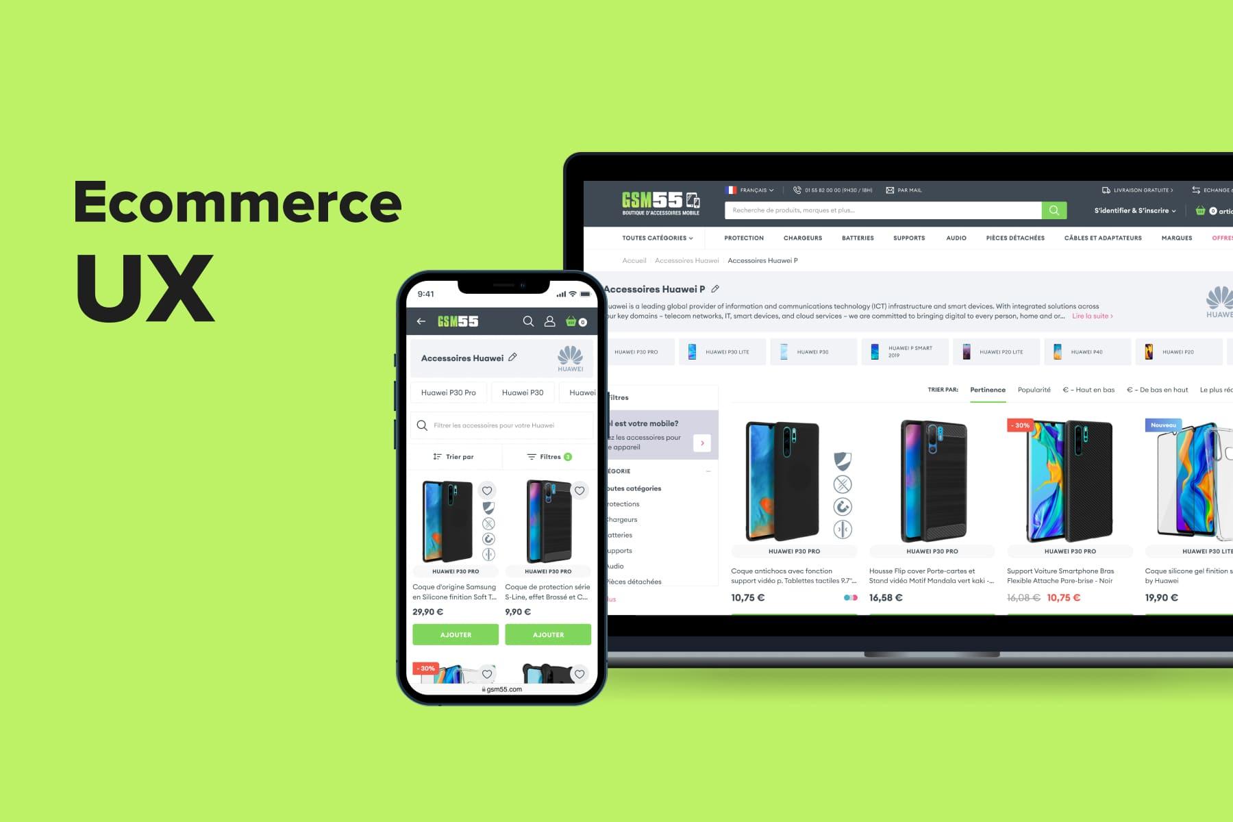
Among dozens of tech, design, and content-related tips on , there are a couple of critical ones. First and foremost, when users tap on the corresponding field/icon, open search in a pop-up. This way, you’ll hide the background page content (the header, banners, customer service pop-ups) and narrow down the person’s focus to the current task. Otherwise, you can’t make full use of the search functionality. Just compare the examples from our client, a mobile accessories brand GSM55, and West Elm.
Moreover, if there’s a whole screen at your disposal, you’re able to demonstrate suggestions, popular requests, and matching products with essential details like thumbnails and prices.
An advanced tip for improving the : instead of showing empty space, give prompts like top searches even before users start typing. The odds of matching customers’ requests will be quite high. Take a look at Onilab’s design for a beauty brands seller, Bliss, and the search area on ASOS.
3.4 The Product Page
An ultimate goal of any online store is to convert visitors into customers. To achieve it, there should be a smooth pathway from the homepage/search to a product page and then to a cart and checkout.
Calls to action are key links here; thus, aim to make them as noticeable as possible. Placing a CTA into a sticky bar pinned to the page bottom is a simple yet effective measure. Wherever the prospect is on the page, they’ll see the “Add to cart” button. And it goes without saying: CTAs on the product pages must be located above the fold.
Our prototypes for ThingPark Market comply with this rule, whereas the CTAs on Manolo Blahnik are placed below the fold. Wax Lyrical pinned the button to the top, which isn’t that comfy for mobile users. Apart from this, the bar is bulky and interferes with studying the page.
We’d advise writing a price on the sticky bar since it’s always a strong argument for consumers. Not to mention that the price should strike the eye as soon as prospects land on the product page.
Regarding the , we did a great job on the Overneed project. As you see, the sticky bar and price stay in sight throughout the page. Ikea, in turn, “hides” the prices: you don’t see them on the first screen, they’re almost invisible on the second and aren’t duplicated in the sticky bars.
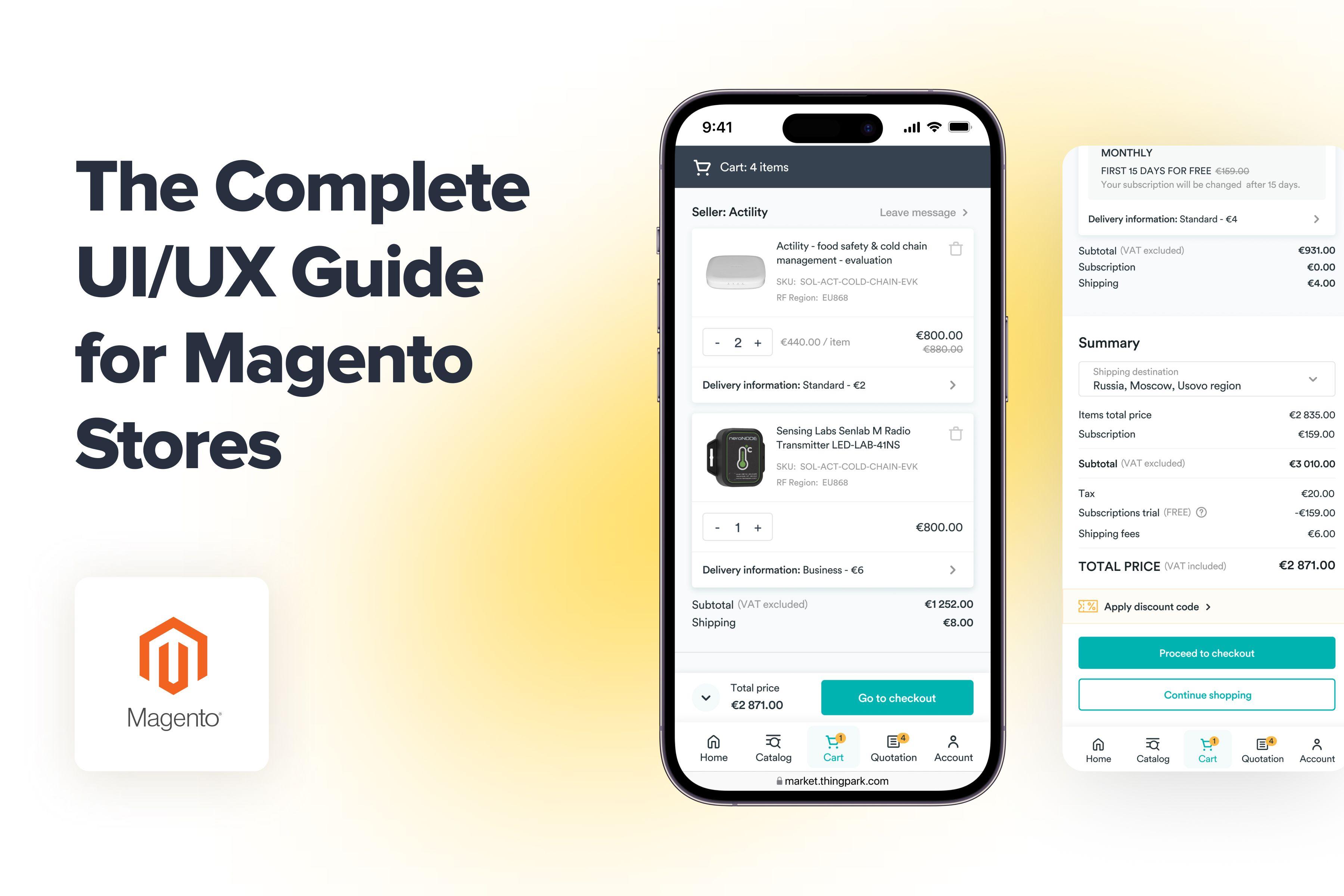
3.5 The Cart Page
A classic rule regarding cart usability is notifying buyers when the product is successfully added to their cart. Of course, we have a small quantity indicator near the cart icon, but its changes are so minor that are barely noticeable.
Most online stores now show success messages after pressing a CTA. Traditionally, they take a small pop-up form and disappear in a few seconds (like on Aliexpress). Another good solution is a mini cart with some details and buttons. But it should be possible to close this pop-up cart with a swipe/tap outside the window. We often turn to this solution (see the example below).
If the store most frequently sells just one piece (e.g., a laptop) it’s ok even to redirect a purchaser to the cart page straight away. But in other cases, it’s not a wise move. See the Lego store’s example: neither the buttons nor the cross can be reached by thumb. A swipe to the right seems an easier way to come back to the product page, but it actually brings you two steps back to the category.
In order to improve the , consider widening the editing options. Apart from a quantity selector and a bin, add a wish list accompanied by a title like “Save for later”. Customers will be able to move items to the wish list in case they change their minds about ordering now.
This feature’s presence improves the odds of buying products someday. Suppose one decided not to buy some products right now. Instead of just deleting them, many would prefer to save them for later. We implied this opportunity in the prototypes for Bliss, while most stores don’t provide it.
3.6 The Checkout Page
The apogee of a sales funnel is the checkout. It’s now or never: users either close the deal or bounce for some reason. So designers should streamline the checkout flow by all means. There are many ways to remove friction, but we’d start by revising the checkout type itself.
Moreover, some stores forget to clarify how many steps there are. For instance, Manolo Blahnik doesn’t give an idea of what the flow looks like.
What we do recommend is giving up these conventional checkout styles in favor of a contemporary one-page solution with forms opening in pop-ups. In this case, people instantly know the number of steps and don’t feel tired after seeing the number of fields to fill out. Being organized in pop-ups, the checkout looks clean, and the content doesn’t shift all the time.
One more golden rule for a pleasant is providing users with a guest checkout option. If it’s absent, a store just loses a portion of customers. Usability experts even advise making the guest checkout button a prominent/preselected option, while many brands try to hide it somehow.
3.7 The Account Page
There’s a lot of customers’ data here: personal details, address book, order history, loyalty program, and parcel tracking. The main goal is to organize these sections smartly in a sort of menu. Take care of easy and quick editing as well.
For one of our projects, we applied the same approach with pop-ups which we use for the checkout. It’s convenient to navigate there and amend credentials. The account page on Fenty Beauty is a bit confusing: we see a bar to choose a section and a list with the same titles below. The former requires two taps before customers get to the needed block. The latter doesn’t look like a tappable menu. Finally, the sections open on new pages, causing users to wait slightly longer.
Mobile Ecommerce UX: the Takeaway
With the rise of m-commerce came the need to seriously revise the shopping experience on smartphones. Without this work done, the marketing team's efforts, quality photos, and even competitive prices won’t bring a significant increase in mobile conversions.
Success hinges on whether people find the customer journey handy and seamless. We’ve guided you through mobile commerce UX best practices that help the store stay on the right track. There’s no other way than the mobile-first approach. If you want to deliver an app-like user experience to your customers, Onilab’s team is ready to bring your to perfection.