Optimizing user experience is about reducing friction, eliminating lousy design choices, and tailoring your Magento store based on user behavior. Launching an appealing and user-friendly eCommerce website is hard: you need a deep understanding of your audience. Even more, a perfectly optimized online store is one that not only meets but exceeds customer expectations. Check out these to see examples of Magento stores that excel in user experience. This article showcases over 10 of the biggest and most successful Magento online stores in 2024, providing valuable insights into effective UX strategies.
In 2024, the Magento store's user experience is among the decisive factors in increasing sales, customer loyalty, and overall satisfaction. Your website should be not only beautiful but also functional and efficient. It may sound enticing yet impossible, right?
But don’t panic; we’re here to make this process more manageable. If you need to do something about your website user experience, we present this all-embracing Magento design guide. We’ve analyzed crucial UX mistakes from online stores worldwide and now provide insights to help you outperform your competitors and achieve eCommerce success.
Table of Content
Building the Perfect Magento Store's User Experience
We know every Magento website is different, given that store owners may leverage different . But there are some mistakes in eCommerce that 90% of the online stores do. We’ve seen the same poor choices countless times. So, we’ve decided to make the most comprehensive list of common UI/UX flaws in top Magento stores and help Magento store owners avoid them.
There are numerous issues that hurt user experience, from a slow load speed to neglecting mobile UX optimization. Sometimes, it may be enough to make small improvements on the , shopping cart, or checkout to see a significant growth in user satisfaction and conversions. Sometimes, you’ll be required to delve deeper into Magento 2 performance optimization and learn . But what can benefit your Magento store particularly?
Of course, you can consider a complete overhaul of your architecture and build a headless commerce solution, such as a progressive web application. You can do this using as a faster alternative to developing from scratch, but customization remains important. However, if you're not ready to commit to such a significant change, you can stay with your current website and focus on improving the Magento UI/UX
Let’s outline the steps required to eat an elephant piece by piece. That is, to greatly enhance the Magento 2 user experience without compromising your budget or causing delays in the development process. We’ll go over the major sections of eCommerce websites and identify what you can do better based on your specific business needs.
1. Optimize Store Navigation
How should users move from one page to another? By thinking through this process, you can enhance the Magento UX and make sure people reach the desired destination, i.e., checkout. Let’s go over critical aspects of a store’s navigation and its influence on the user experience.
1.1 Minimize 404 Pages and Categories
Keeping the Magento store clean is your number one priority. You may remove products, or the link may be inactive. The "Page Not Found" is a common issue with websites that search engines are aware of.
But it can indirectly impact search engine rankings if you don't work on the optimization of these pages. The inability to find the desired product is frustrating, which signals a negative customer experience. 404 errors confuse users, disrupt the shopping process, create distrust towards your brand, and lower conversions and customer satisfaction.
Here's how we crafted the 404 page for a :

First things first. If something is broken in your store and you know it’s broken, get it fixed. Especially if it’s something your customers interact with every day.
Check the amount of 404 errors on your Magento site. The more you have, the worse the consequences. Fix 404 errors to repair customer trust and avoid Google penalties:
- create proper 301 redirects (permanently moved) to all the important links that are no longer valid but might have some traffic that you want to capture;
- create 410 redirects (gone) for unimportant links to help the search engine “forget” about these pages and discard them from the index;
- avoid multiple redirects in navigation menus.
1.2 Tone Down Your Required Fields
Your goal is to sell, not gather every possible detail about your potential customers. Focus on customer needs and provide useful answers accordingly. Offer alternatives.
Don't install roadblocks between your customer support and users. Consider our approach to organizing the navigation menu on the site. To manage the extensive assortment, we placed narrower categories under broader sections, easily expandable with the '>' sign.
If you need an email and a name, ask them after the live chat. This way, you provide swift service and indicate that you're ready to continue to be helpful after the conversation via email.
Most of the time, required fields create barriers to customer interactions, lowering your conversion rate. Get rid of them where you can.

Get a Free UX Audit Example
Read our demo UX report exploring the online store’s checkout issues.
2. Speed up Website Loading and Make It More Efficient
Without proper optimization, a Magento online store can quickly become a burden. Sluggish page loading never contributes to sales. In fact, it diverts users from browsing the store. In this section, we’ll discuss the connection between loading speed and Magento UX and how to marry them.
2.1 Boost Your Magento Site Performance
Page load speed can make or break the overall Magento user experience. You have the patience for your Magento store to load. Real users don't. Build a robust server environment and optimize the slow-loading website to offer them a fast and easy-to-use store.
Speed sells. Every second your users wait for your site to load, someone will leave. This way, if your store takes more than , you lose about half of your potential customers. Adding every new second to load times abates customer engagement and lowers the conversion rate even further.
For instance, these screenshots show the progressive loading of a mobile web page for the Tom Dixon online store. To be honest, it’s quite slow loading. The first screenshot reveals just a logo and search icon. A few milliseconds pass, and we see a tease of sale text. Yet, the actual product images are absent, stubbornly refusing to load and materialize.
There are many ways in which you can achieve quicker load times for your Magento site, both real and perceived. Refer to our comprehensive to improve your site performance. There, we cover everything from employing content delivery networks to removing unneeded plug-ins.
2.2 Fix Your Store
If something is broken in your store and you know about it, get it fixed. Especially if it's something your target audience interacts with every day. In this screenshot, we can see that product images can’t load properly, which is problematic for user experience.
It’s important to differentiate between minor aesthetic glitches, like a misaligned search bar, and more serious operational malfunctions. While the former may slightly spoil the user experience, the latter can significantly hinder a customer's ability to interact with your store and complete purchases. That’s why you should address them in the first place.
Magento provides great flexibility and customization options for designing intuitive and user-friendly solutions for your online shopping experience. Here are short tips:
- use maintenance mode to deal with major frontend and backend fixes;
- dive deep into the user behavior analysis of your target audience to understand what can confuse users, lead to cart abandonment, or, in contrast, result in higher customer engagement. Google Analytics may help with quantitative insights;
- even if your Magento store is currently bringing enough profit, refining the user experience is still important. It can safeguard your brand image, ensuring customer loyalty, user engagement, and even higher conversions;
- don't postpone. If key features of your Magento store aren't functioning properly, it could be costing you sales. The sooner you fix these problems, the quicker you can stop potential revenue loss.
If you've encountered problems with the Magento UX design of your current store, feel free to browse recommendations on how to start in our detailed Magento UX guide.
3. Mind UX Design Principles
A good Magento UX goes beyond aesthetics; it’s about how the store feels. In the next categories, we’ll zero in on major Magento UX design principles, providing strategies to achieve a harmonious blend of user-friendly features and clear, intuitive design.
3.1 Balance Functionality and Clarity
Every element of the UI must serve its purpose. For example, users shouldn't click twice to get to the main navigation menu. Hamburger navigation menus on desktop sites are a good illustration of a thoughtless UI.
That's why we avoid this approach in our projects. Check out the menu we created for , a renowned American multi-brand retailer.

Unlike mobile sites, desktops have enough space to accommodate the navigation menu, the search functionality, and symbols like a shopping cart or an account at the top of the page. And the UI/UX design experts should pay attention to that. Note: When you offer customers a clear view of your options, they also get a better overview of your entire inventory.
3.2 Visualize Your Menu
Get creative with what users can see and interact with within the store. If you've never seen bright UI elements somewhere, it doesn't mean it's a bad idea to add more colors! Liven up your menu to add new accents to your design.
For instance, you can build pictures, category icons, pictograms, thumbnails, and other visual elements into smaller menu lists. This way, you'll help visitors understand what's inside the section just by hovering over the dedicated button and not clicking it.
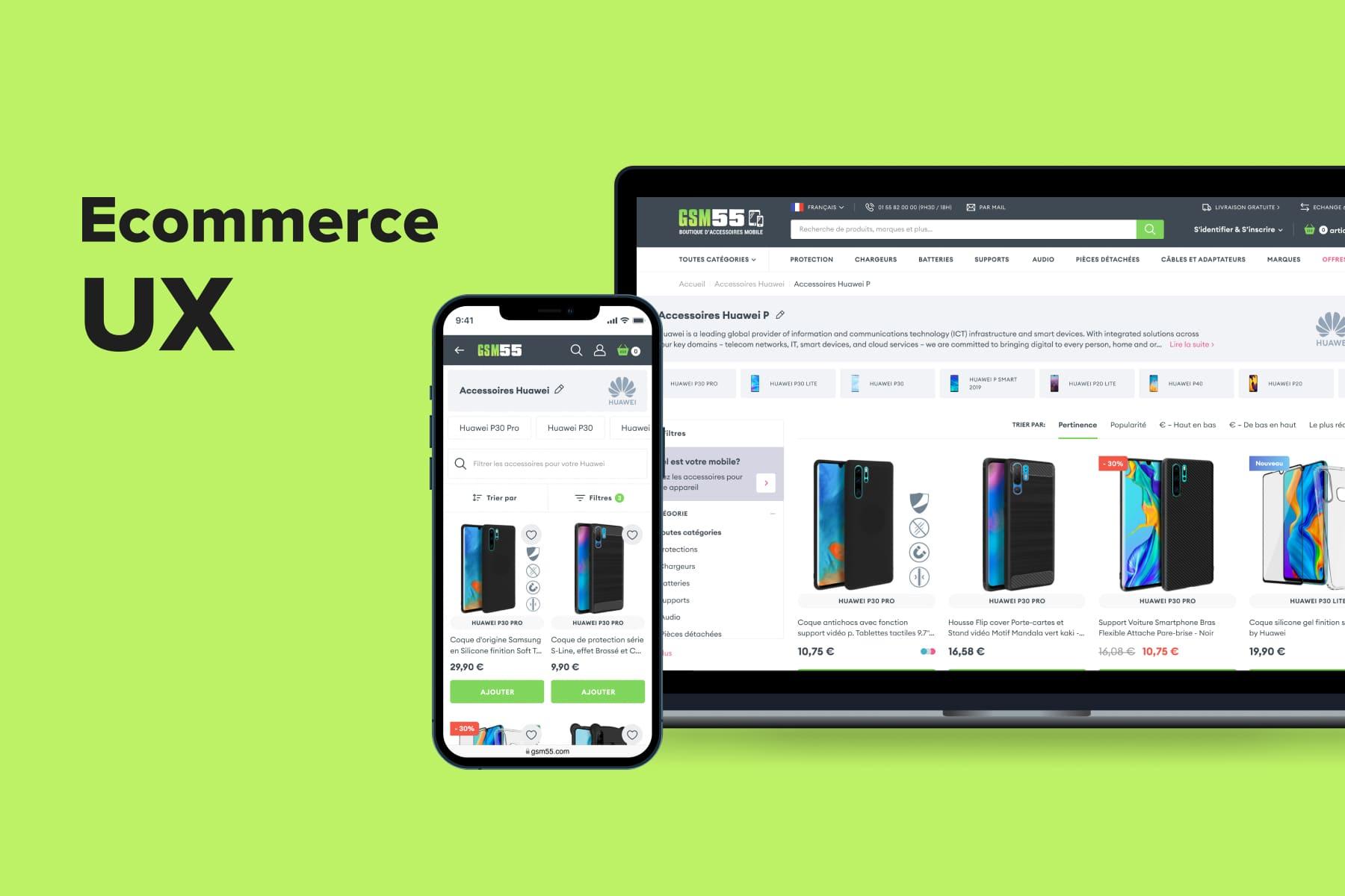
, an American electronics seller and one of our clients, has added some images to its categories, making the shopping experience more engaging.
4. Refine Product Categories
Product categories are another crucial aspect of Magento UX. You should adhere to some common principles of organizing them, and we’ll share some tips on streamlining navigation on your eCommerce platform.
4.1 Avoid Single-Item Categories
Store categories allow your potential client to shop by brand, room, or anything specific. A category containing a single item confuses your customers and wastes their time. Try a different approach if you have lots of single-product sections that never seem to grow.
4.2 Make Sure Your Categories Are Consistent
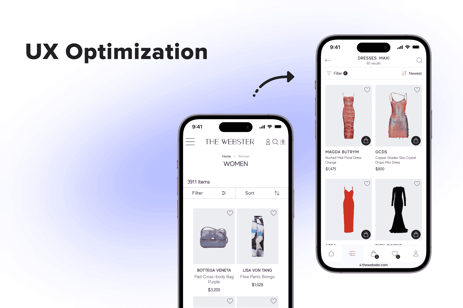
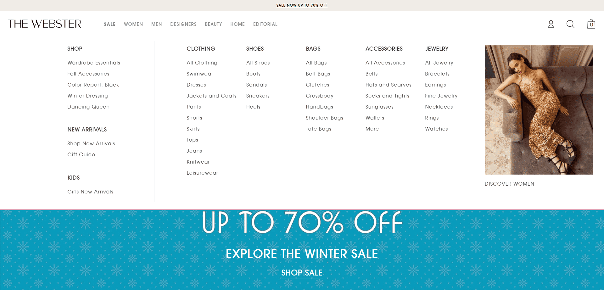
Your menu is something everyone will see at least once. Take care to make it attractive, consistent, and clear. If you choose to capitalize headlines, do it everywhere. What will it tell your customers if the company states it cares about even the slightest details of its user experience and then shows neglect in its menu? The Webster, understanding this need, preserves consistency in its navigation section.
4.3 Avoid Duplicate Content in Categories
This isn't a strictly UX challenge, but duplicate content interferes with Google ranking algorithms and can downgrade your rankings. Reduce it to a minimum in the top 5 most common places:
- roduct categories;
- product pages;
- search and filter results;
- different domains and protocols;
- Magento multistores.
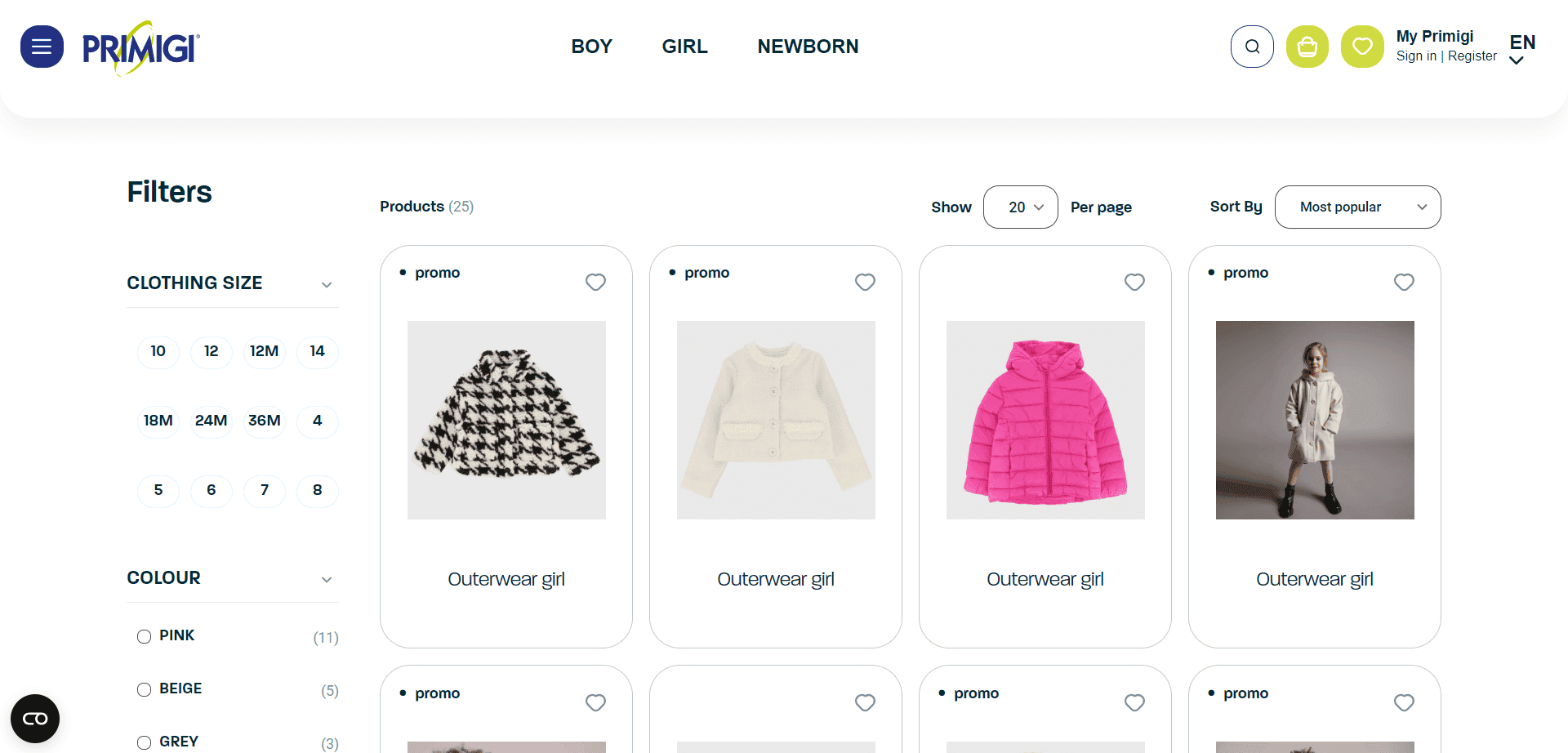
4.4 Don't Overcrowd Your Product Grid
Too many details on the page scatter user attention. A large amount of items interferes with what you need to accomplish: designing quality, natural user experiences to direct your customers toward the checkout.
Choose a single focus on each page that serves an individual goal. For example, the purpose of the product list is to offer the user enough products and product details. It should encourage them to click on something they like and read about the product in greater depth.
The goal of an individual product page is to offer informative descriptions so that the user decides to buy it or find an alternative that they like more. This way, each page is logically connected with the others. And you build a strong and concise path from the homepage to checkout.
5. Enhance Product Details and Display
This section is dedicated to elevating product presentation and information quality on your Magento eCommerce site. From product descriptions to cross-selling and user reviews, product pages provide a wealth of opportunities to convert prospects into buyers.
5.1 Offer Rich and Detailed Product Images
You can't expect an adequate selling process without good photos. The customer needs multiple pictures from different angles, real-life product settings, dimensions, or material close-ups, if necessary.
Media plays an important role in selling your product for you. Photos remove the guesswork for customers requiring additional visual aid to complete the purchase. They capture user attention and support the customer fantasy of owning your product. A prospect may take a look at the model on the picture and judge whether the goods will fit them, too.
However, not all online stores provide such an opportunity, as in the screenshot below. Seeing the clothing without a child model, can you truly gauge fit and style? Probably, no. It’s a curious UX choice, indeed.
That’s not true of , one of our clients. Its website features myriads of product photos, showing the goods both against the white background and in real settings.

5.2 Make the Copy Shine
Product titles and descriptions are among the first things a shopper notices on the page. So, it's crucial you invest some time and effort into creating an engaging and fresh copy.
Product Title
The main goal of a product title is to inform the user about the product and its features. For that, follow a simple format:
- product type;
- brand name (if applicable);
- color;
- size (if applicable);
- quantity or size (a set of items, unit of length);
- keywords (if relevant).
Example of a title for a set of tableware: Harrison Champagne Glasses, Set of 4.
Product Descriptions
Did you know that don’t happen due to confusing product descriptions? Luckily, writing a good description is a smooth sailing once you have the most important aspects covered.
First, get to know your target audience and find the right tone. Develop user personas and define their pain points, desires, and habits. Do your shoppers like humor, slang, or formal business language? By knowing all that, it'll be easier to create a copy that causes a response from real users. Remember: you're writing for people, so don't go for an ultimate sales pitch.
Second, include the core elements:
- product features;
- product benefits;
- keywords.
The main point of writing informative descriptions is to offer value to shoppers and answer their question, “Why do I need this product, and how will it benefit me?”
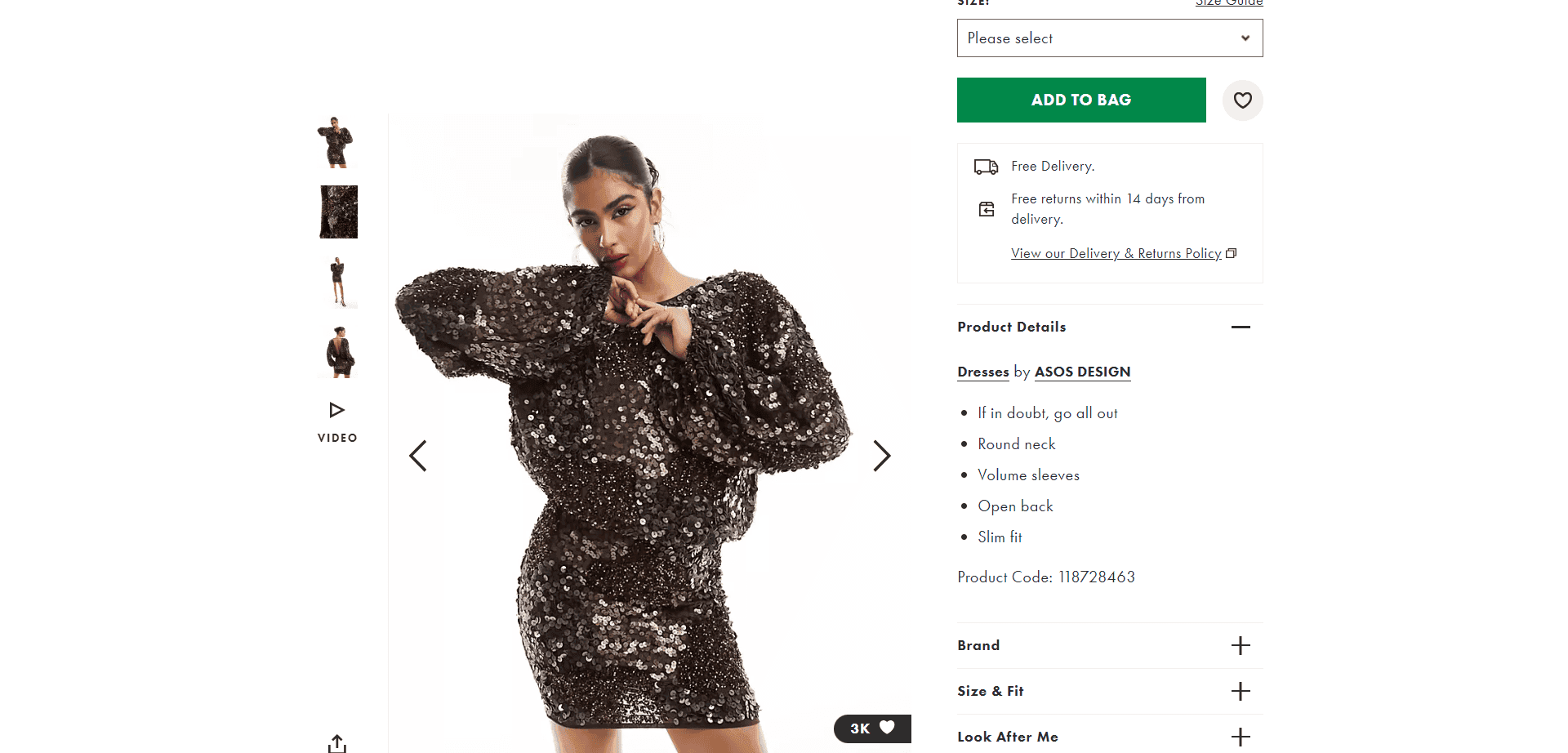
In the screenshot below, the online merchant presents a too-general product description lacking specific details. The phrase “If in doubt, go all out” is catchy but subjective and doesn’t convey concrete information about the dress. No unique selling points, no keywords, no benefits. Just features.
Information such as materials used, care instructions, or sizing is available under the categories “Look After Me” and “Size&Fit”, which may be not so obvious. A hectic buyer may just miss these sections, thinking that the seller doesn’t mention such details at all.
Tip: For better user engagement, place a short product description and then add the “Learn more” option below. This way, you'll serve people who don't like lengthy copies and those who want to learn everything about the product. That’s what we find on the website, representing one of our projects.

5.3 Remove Weird UI Choices
Do you want your store to look unique and inspiring? We highly encourage you to beat competition in every possible way! Just don't try to stand out by using outlandish interface components that disrupt user experience instead of improving it.
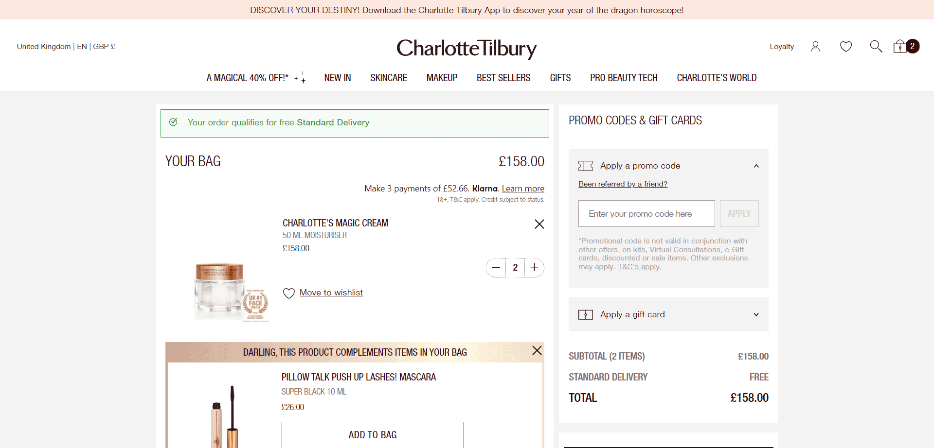
Here’s a quantity menu that has potential. You can change the number by clicking “-” or “+”. It’s a good practice. Yet, it’s the only option. It’s hard to use. It raises questions. What if you wanted to add eight items? You’d have to click eight times.
Is it necessary? No. You can organize the quantity selector in a more elegant way. For example, provide the ability to insert the desired number from the keyboard.
Is it convenient? No. It's a pain to use. Plus, it’s bad from the UX perspective, as the cart page reloads every time the quantity changes, which takes time.
Being consistent in UI elements with your competition isn't a bad thing. Users like the stuff they are familiar with. Innovate in other areas that are more ambiguous than a simple input field.
5.4 Avoid Excessive Use of Pop-Ups
Unnecessary pop-ups are never a good idea. Even Ethan Zuckerman, who invented pop-ups for advertising, publicly apologized for their use. 99% of the time, pop-ups are overused:
- visitors on mobile devices often have issues with pop-ups (what looks well on a big screen can become completely unusable on a small display);
- they block all other content on the page from the user;
- most people close pop-ups without reading them;
- pop-ups don't have URLs, which means content can be hard to reach later.
You can always replace a pop-up:
- Create dedicated pages for delivery info, refund policy, and any other key locations you want to link to. When you carry this data out of the page, you reduce the amount of duplicate content and improve SEO.
- Build the required information right into the product page. Take pity on people who visit your store from mobile devices.
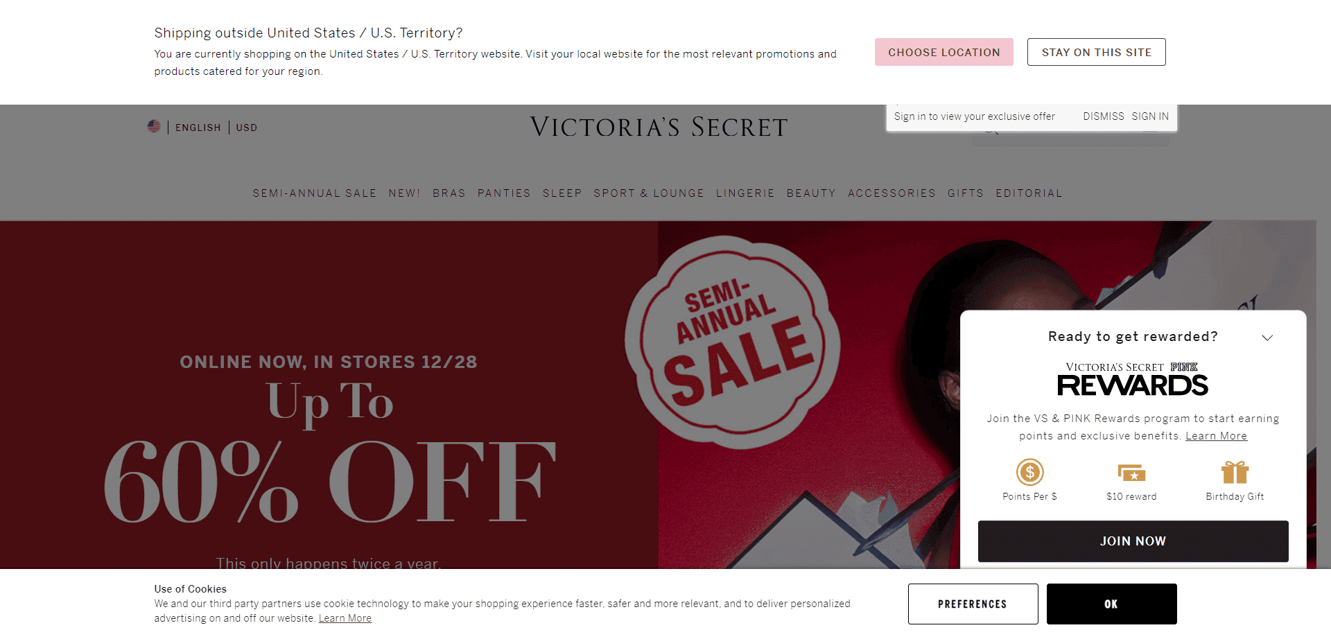
What's a good example of a pop-up? Live chat windows, a shopping cart, region selection, and subscription discount pop-ups are helpful and bring a lot of value to the customers. Everything else? Not so much.
Take a look at this store. The topmost geo-location navigation bar takes up a portion of the screen and requires some action before allowing a visitor to access the website. Add to that a Rewards pop-up and a Cookies Policy notice at the bottom. Not a great user experience.
5.5 Don't Be Afraid to Cross-sell and Upsell
Upselling and cross-selling are great for boosting sales and providing personalized offers to shoppers. The most popular way to use these methods in eCommerce is in the form of product recommendations.
Luckily, Magento already has built-in options for cross-selling and upselling that you can configure as needed. But remember the golden rule: always bring value to the user.
When cross-selling, make sure the offered product complements the initial customer's purchase and increases its value. If you upsell, justify your offer and point out all the advantages of paying more.
Tip: Don't impose your opinion. Many online stores write messages like “We recommend you try this…” but that's less efficient than the “Other customers love…” statement. The secret lies in the fact that shoppers want to make independent decisions. So give them a choice instead of deciding what's best for them.
For example, , one of our clients, provides a gentle recommendation section titled 'We found other products you might like!' This approach respects customers' independence by offering suggestions without being overly assertive, giving them the freedom to find their ideal option..

5.6 Make Your CTAs Visible
CTA buttons encourage users to buy your products, so you want to make these elements extremely visible and interactive.
The main rules for the CTA button design are:
- make them bright and easily spotted;
- place them where users will see them (at the top of the page, near the product image);
- personalize the titles.
Even though there are certain rules to follow, we recommend you do the A/B tests to see which option works best for your site. Unconventional design decisions may deliver better results.
A case in point is . On its website, we can observe a large and prominent button placed on a sticky bar. As such, you can always reach the CTA, even as you scroll. So it’s unlikely that you’ll get lost on the product or any other page.
5.7 Always State the Price
Visible and understandable pricing is the number one rule if you want shoppers to buy from you. For example, displays the price above the fold, which is considered a great solution for informing customers.

A confusing price or different numbers on the product page and in the cart will immediately lead to cart abandonment and drag your sales down.
Here is what you can do to avoid such problems:
- use a large font;
- leverage a bright color;
- always inform users about additional fees (i.e., shipping or taxes);
- place the price near the essential elements (product title or CTA button). Read our dedicated article for more tips on organizing .
5.8 Add User-Generated Reviews
Over rely on reviews when choosing a product, and displaying them on the product page can boost your conversions by . User-generated reviews increase the store's credibility and help consumers make a buying decision. So don't forget to use this element in your product page UX design to raise conversions and build shoppers' trust in your store. Here is how presents its review section. It contains ratings, size advice, sorting, and other functionality.

Don't be afraid to display negative reviews alongside positive ones. Mixed reviews cause better responses because shoppers see them as more reliable and honest.

Explore our eCommerce portfolio on Behance
See how Onilab's designers and developers transform the UX and improve conversions for online stores across the globe.
6. Check Your Search
You can't even imagine how often eCommerce websites add a store-wide search without a second thought. They neglect testing it. They never use it.
For instance, the website may return product results when you write the term correctly. It's a perfect user experience. But, not all stores can proceed once the client attempts to search for goods but misspells the product name. Some display the "Nothing found" message. It immediately spoils the website user experience.
Such an oversight may lead to shoppers never even trying to search for stuff anymore. Yet, experienced users are more than happy to utilize search to get fast access to the needed products without browsing the website.
As you can see on , it accepts queries in another language. The store is in Greek, but I inserted a collocation in English and even deliberately misspelled it. Despite this, the search results contain exactly what I intended to see.

There are dozens of Magento stores that make customers fill in endless forms to complete the purchase. Instead of retaining a new customer, they might end up losing a sales opportunity because of this requirement.
What makes the search UX design efficient? For example, placing the search bar in the right place or configuring the search function to understand typos. We've collected all the tips in a dedicated Magento UX guide with .
It's sad to see a slow or broken on-site search. Luckily, Magento supports seamless integration with smart search options such as Elasticsearch engine, which we cover in another article about improvement. Don't disregard this opportunity to significantly enhance your Magento store user experience.
7. Stop Asking Users to Sign Up
Imagine you're browsing an interesting collection, and you'd like to add a few items to your wish list. You click the "Heart" button and get instantly transferred to the "Register" screen.
It's a bad idea to spoil the Magento website user experience with a sign-up request. Your goal is to convert users. But it doesn't mean they want to buy the first thing they put into their cart or wish list. Being pushy will make users suspicious. Any trust you've already built with a prospective customer will be gone.
Give them some breathing room. Let them take their time. Instead of asking to sign up, use cookies and Magento eCommerce platform capabilities to work with first-time customers on their own terms.
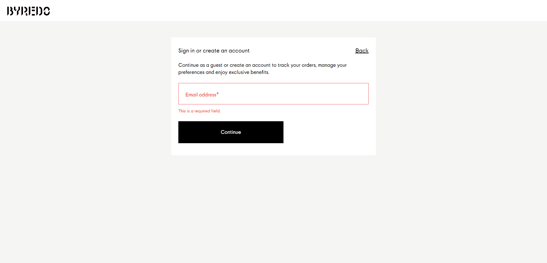
If you have to ask users to create an account, speed the process as much as possible. Social networks offer a nice alternative here. Unfortunately, the store in the screenshot below doesn’t follow this advice.
8. Streamline the Checkout
The checkout is the last stage before a person becomes your customer. While they’ve taken a long way from the landing page to checkout, there is a lot that can go wrong. You may scare them away with excessive fields or require them to sign up where they could’ve continued as a guest. In short, this section will teach you how to minimize friction at checkout.
8.1 Reduce the Number of Steps
There are dozens of Magento stores that make customers fill in endless forms to complete the purchase. Instead of retaining a new customer, they might end up losing a sales opportunity because of this requirement.
One of the reasons for soaring cart abandonment rates is the long checkout process. Here's how you can significantly enhance your checkout conversions:
- place all checkout forms on a single page;
- remove unnecessary fields from your checkout;
- make checkout as fast as possible to avoid shoppers second-guessing their decision.
Yes, there are some sectors where it’s hard to efficiently organize the checkout process. For instance, on travel websites, users have to complete various fields and choose accommodation, additional activities, a departure point, etc. A standard online store wouldn’t typically require so much info.
We had a client from this field, . To improve the checkout, we settled on a multipage solution. We added a clickable progress bar and sped up the loading of subsequent pages.

8.2 Incorporate More Payment Options
Making a good checkout page isn't as difficult as you might think. We've explored in detail in one of our recent posts. Your first and most important goal is to close a sale. As a business, you want to make the payment process as accessible and easy as possible. Everything else is secondary. So, add more payment options and reduce the number of fields. That's it.
Another great way to improve conversions is to indicate all payment methods you offer on the сart page. This way, the users will always know what to expect and whether your store has their preferred payment method. The more you offer, the more they trust you.
9. Improve About Us and Contact Us Pages
At last, let’s talk about the importance of creating an ‘About Us’ page and providing clear information about how to connect with you. This section aims to guide you in transforming these pages into more engaging, informative, and user-friendly resources, ultimately strengthening the credibility of your brand and improving customer relations.
9.1 Make Yourself Transparent
Intentionally or unintentionally hiding your contact information leads to fewer sales:
- Google improves the rank of stores with a visible address;
- customers trust stores with a physical address more than those without it;
- customers can see such stores on Google Maps through Google My Business.
All this is beneficial even for an online-only seller where you never expect visitors to come to your location.
Make every effort to convey trust and build close relationships with your users. Create an image of transparency and honesty. Add address, contact phones, and as many alternative ways to communicate as you can manage: Facebook page, X, LinkedIn, or other social media.
The example below demonstrates decent online store UX. Yet, the “Contact Us” feature could be more accessible than having to scroll down and search for the corresponding button. A small icon somewhere to the right or left of the screen could be more convenient.
9.2 Offer Customers Live Chat Options
Live chat is a powerful communication channel. Don't underestimate it. Done right, it can be a massive boost to your conversion rates and sales.
For some customers, it's more convenient to call, for others – to text or email. Limiting your options cut off opportunities that would have otherwise resulted in a closed sale.
Live chat captures those users who, for one reason or another, can't call you directly but still need to ask a question and get an answer fast. Email inquiries imply a slower response time, which is not equivalent to a live chat.
However, your store may not always respond immediately. It can spoil the user experience as well if a person has to wait until you become available. Introducing a chatbot may reduce frustration.
Modern chatbots, particularly those powered by artificial intelligence and ChatGPT technologies, are all about a deeper understanding of your shoppers’ requests. With them, you don’t have to tie your customer service to the business hours. Those chatbots communicate like humans without holidays and rest. At Onilab, we stay abreast of emerging trends and develop state-of-the-art ChatGPT-powered chatbots as part of our .
Boosting Customer Satisfaction: Final Thoughts on Creating a Better UX
Magento UX design is hard, but it's not rocket science. You can validate any design choice with a simple analysis of your user behavior. Most of the time, you don't even need thorough months-long interviews or A/B testing to find out what users hate:
- long drop-down menus;
- lengthy checkout forms;
- or annoying pop-ups.
The solution? Employ common sense and experience to remove bad Magento UX design choices. A slow-loading website harms user satisfaction and Magento user experience. Reducing friction when moving from product pages to checkout lowers cart abandonment and improves Magento store metrics.
Evaluate your product descriptions. Do you provide enough product details? Before approaching more demanding UX challenges, fix the ones that are easy, obvious, and have a bigger impact on your Magento store.
And if you've already dealt with the most glaring issues, the Onilab team will be happy to assist with various :
- do a thorough Magento UX audit;
- create wireframes and solutions from scratch;
- work on the web development project in line with your business requirements;
- and build a user interface that exceeds customer expectations.