In 2022, three-quarters of traffic and approximately 6 out of 10 online retail orders came from smartphones. It seems like a huge achievement for mobile commerce! Yes, but. The mobile conversion rate still lags behind the desktop one; it’s 1,5-2 times lower. So m-commerce can’t afford to be complacent.
The desktop store versions still leverage incoming traffic better than mobile ones. As usual, the reason behind this is an unsatisfactory user experience on mobile devices. People would be happy to order more from their phones, but often it’s just not handy.
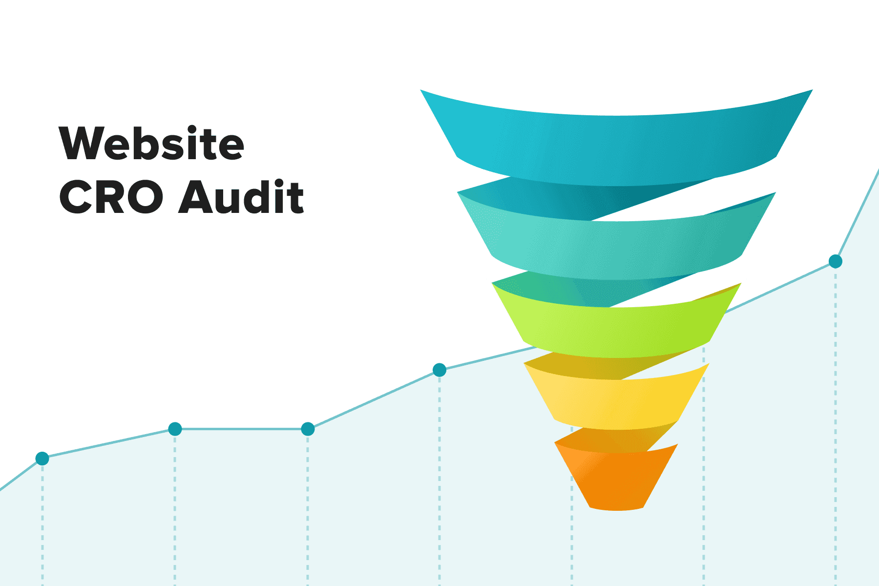
In this guide, we’ll zero in on mobile-specific conversion rate optimization (CRO) tactics and consider one of Onilab’s cases from analysis to the result stage.
Table of Content
1. Why Conduct Mobile E-commerce CRO?
The mere prospect of mobile conversions rising is significant and encouraging enough to start CRO. But indeed, these measures not only improve eCommerce conversion rate on mobile. Let’s see some fascinating statistics and draw a bigger picture of how mobile CRO impacts the overall well-being of your business and customers.
1.1 Tackling the “More Traffic, Fewer Conversions” State
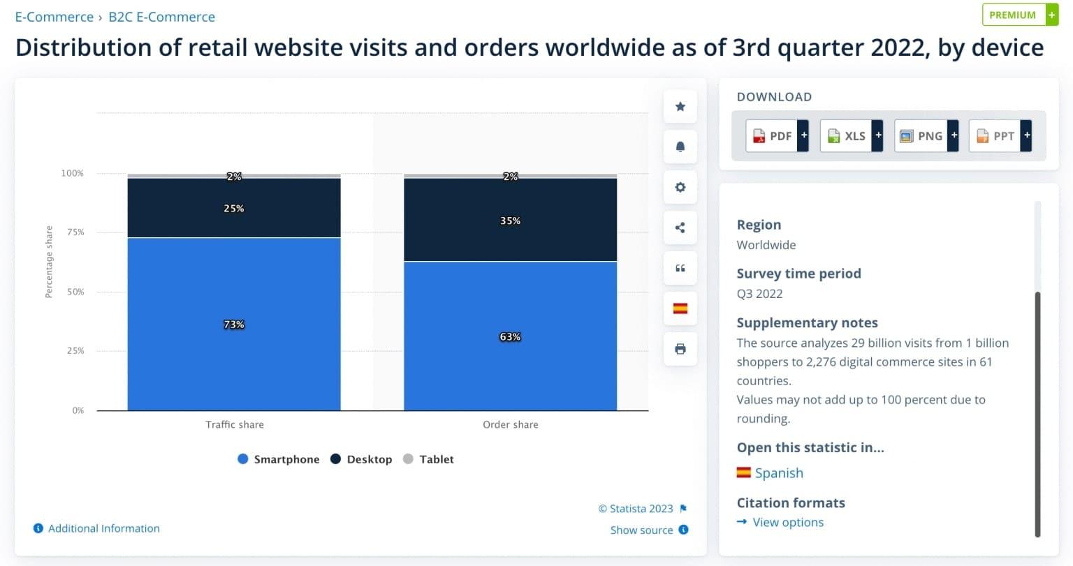
The latest analytics (3rd quarter, 2022) by Statista shows the following state of affairs in online retail globally:
- Traffic share: 73% mobile, 25% desktop, 2% tablet;
- Order share: 63% mobile, 35% desktop, 2% tablet.
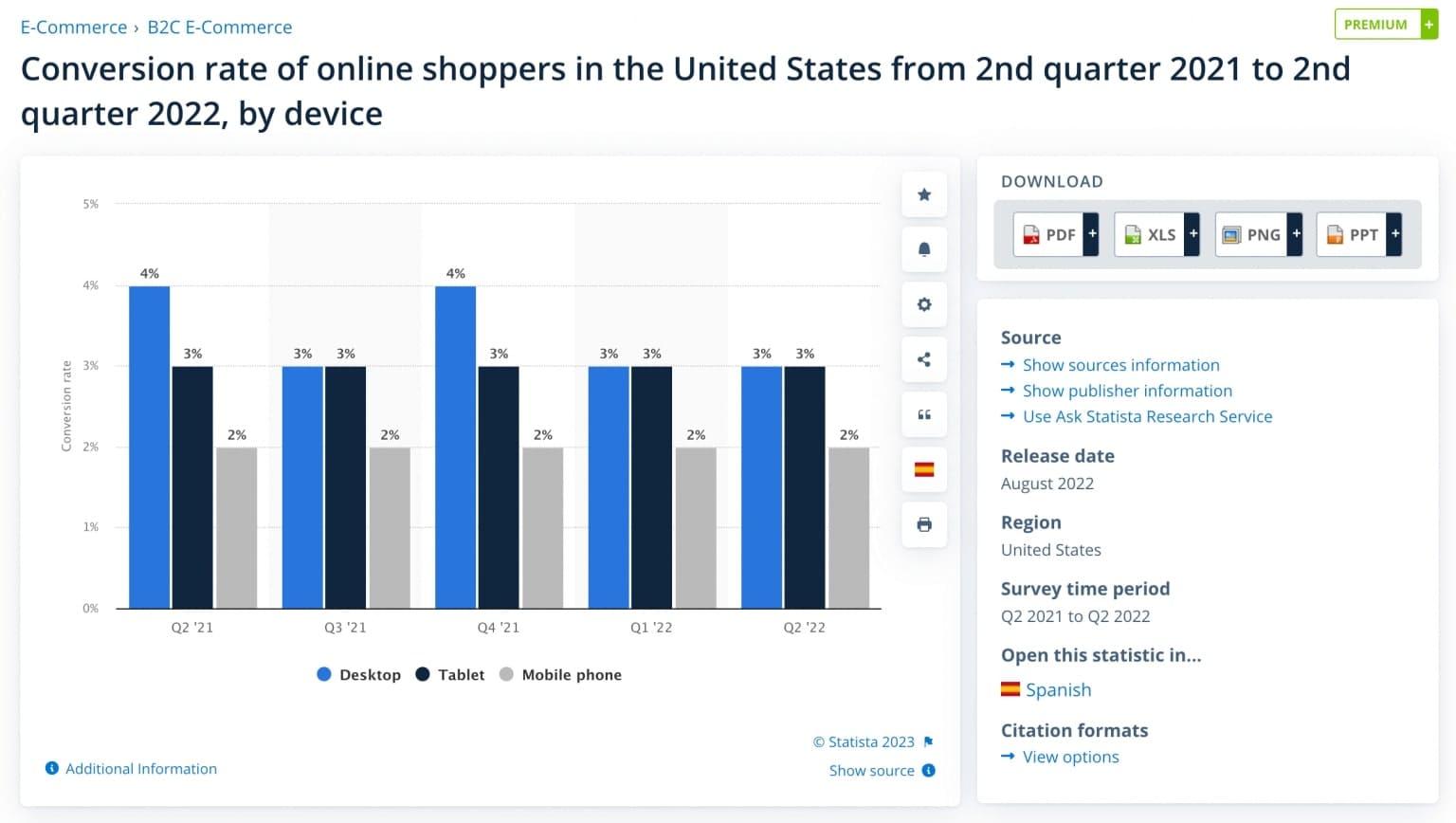
Looks quite favorable for m-commerce until we turn to another crucial metric: the conversion rate. According to another Statista report:
- In the US, the desktop conversion rate in 2021-2022 fluctuated between 3% and 4%, while on mobile, it didn’t excess 2%;
- In the UK, within the same time span, desktop conversions ranged from 5% to 7%, and mobile ones from 3% to 4%.
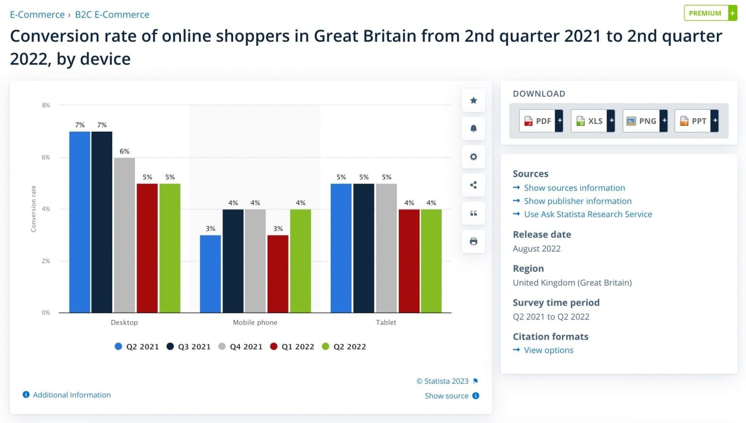
The average mobile eCommerce conversion rate isn’t so impressive. We can conclude: the smaller the device screen, the harder it is to complete the order. Despite outperforming desktop stores in other KPIs like the number of visitors, mobile ones struggle to make the most of this abundant traffic. If your team detects the same pattern in Google Analytics, then mobile CRO must be on the agenda.
And what is a good mobile eCommerce conversion rate? Actually, anything above the average for your industry is quite good.
1.2 Enriching the Omnichannel Experience
Unfortunately, we can’t say mobile CRO is easy-breezy. As with any optimization, it implies a bunch of voluminous tasks:
- Identify and scrutinize the issues;
- Come up with data-backed hypotheses;
- Create solutions and test them to prove/refute the ideas;
- Analyze the results.
No wonder many stores postpone such processes. But some positive side-effects of CRO on mobile make the whole undertaking more worthwhile.
One of them is enhancing the omnichannel customer experience. People tend to mix different touchpoints while purchasing, and omnichannel is all about making the whole process seamless. Surveys by Google and Statista revealed:
- 60% of internet shoppers start a customer journey on one device and finish it on another (Google).
- 82% of mobile users turn to their cell phones before going to offline stores. They learn more about the goods they’re about to buy (Google).
- 46% of customers in the US said they used phones to check the products while being in physical stores (Statista).
Prospects may read product details, reviews, compare prices, save items for later, or even buy online while in an offline store. All in all, a convenient mobile website is potent to boost desktop and brick-and-mortar sales, let alone a good UX fosters customer loyalty.
1.3 Improving a SERP Position
At last, some mobile-specific conversion rate optimization practices can affect your visibility in organic search results. Why? Because a number of search ranking factors touch upon mobile websites.
Mobile-first Indexing
It means Google mainly uses sites’ mobile versions for ranking purposes. Although it prioritizes content value and relevance over usability, Google’s guidelines highly recommend creating a mobile-friendly site.
First of all, it implies having a responsive (or adaptive) design so that it’s convenient to explore the content from mobile devices of different sizes.
The Page Experience
A corresponding Google Search ranking update focuses on the user experience while browsing mobile and desktop sites. Algorithms consider the following signals:
- Mobile-friendliness;
- HTTPS (site security);
- Absence of intrusive interstitials: windows that pop up as soon as users open a website (if pop-ups appear after visitors viewed some content, it’s fine);
- Core Web Vitals: the metrics assessing sites’ loading performance (Largest Contentful Paint), interactivity (First Input Delay), and visual stability (Cumulative Layout Shift). Read more about the matter in the guide.
And that’s how it works. Websites optimized with all these aspects in mind get a boost in SERPs (given their teams took good care of the rest essential ranking factors too). Other sites aren’t punished, but they naturally lose ranking positions to more modern sites with similar content quality and relevance.
The essence of many mobile CRO measures is exactly enhancing the UX on smartphones. This qualitative change allows us to ratchet the conversions up. Starting with , we also improve the store's overall "health index" score. That’s why we champion mobile conversion rate optimization.
2. Nine Mobile E-commerce Conversion Rate Optimization Best Practices
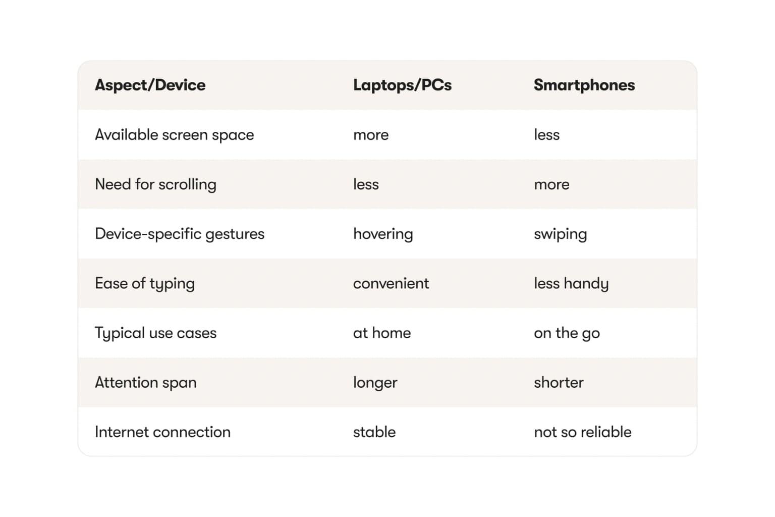
Although some CRO tips apply to both mobile and desktop websites, in many cases, there should be two separate procedures. It’s conditioned by typical behavior patterns on cell phones and laptops, sometimes drastically different.
The set of CRO practices depends on the industry the store represents, customer segments, the concept, and individual performance indicators. Without proper research, optimization efforts aren’t doomed to fail but may yield marginal results.
The very first thing on the to-do list is to take a closer look at the shopping behavior analytics in GA. How would you determine the mobile eCommerce conversion rate? Make segmentations by different attributes like devices. Then you can see what the conversion funnel on smartphones looks like and at what stages the performance is subpar. Pages where more visitors bounce than expected are the areas to optimize in the first place. Check our guide on for more about the analysis phase.
Onilab’s designers, developers, and marketers picked the most powerful and more or less versatile recommendations for the store pages, individual features, and general aspects influencing the CR the most.
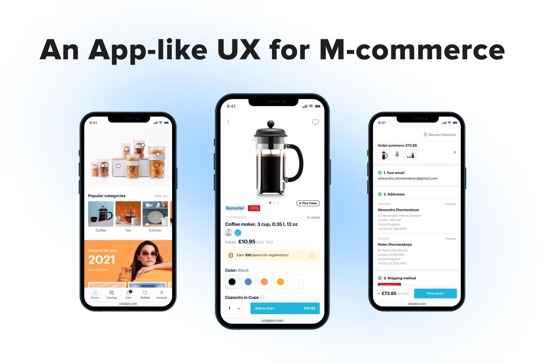
2.1 The Homepage: Engaging & Guiding
For customers starting their journey here, the main page serves as a lodestar prompting where to go next. For a business, this is where you lay the foundation for future mobile eCommerce conversions. Then connect the homepage to touchpoints that are likely to attract users’ attention:
- Promotion banners: sales, promo campaigns, and other beneficial offers;
- Popular categories;
- Individual products: bestsellers, discounted items, new arrivals.
Given mobile devices have a smaller viewport, we aim at creating more compact blocks. For instance, we utilize the easiness of swiping left and right by placing the categories and products into sliders. This way, we can showcase more content blocks.
Here is our latest article on mobile and desktop .
2.2 Navigation: Logical & Handy
Navigation comprises links to key pages: a menu, cart, search, account, and wish list. is all about making it effortless to find and use these features.
The Menu
Customers may turn to a store’s menu multiple times during shopping. Then it should have a flawless structure. The larger the store is, the more meticulously you must approach the menu not to lead people astray:
- Identify the most and least popular categories and subcategories. This information determines the order of sections as well as the sub- and sub-subsections to feature in the menu.
- Sort the items into categories logically and give them clear names. Users should recognize the sought-for groups in milliseconds.
Navigation Usability
Do your best to provide instant access to essential controls, from the catalog and search to the account. App-like navigation (with a lower tab bar) may not affect final conversions directly, but it definitely levels up the overall user experience on cell phones.
This, in turn, increases the mobile conversion rate and boosts many crucial KPIs. Learn more about the navigation types on mobile and their pros/cons
in our article about .
2.3 The Search: Ubiquitous & Predictive
Buyers use the search when they know a model name. Or if they want to see a selection matching particular attributes (like “black faux leather blazer”). Or if they just think it’s faster to type a keyword into the search bar rather than seek the category in the menu.
The search feature living up to users’ expectations, has the following characteristics:
- It’s accessible from whatever page a person is browsing at the moment (except for the checkout, where we get rid of any distractions). Not only must the header contain the search icon/field, but you need to duplicate it inside the menu. Find more about this matter in the dedicated article.
- It displays popular requests/sections in this area even before users start typing anything.
- It works as fast and accurately as possible. Since few of us are happy to type on the phone, instant and relevant autocomplete suggestions are a must. The best case is when people see not only keywords but also product cards (with thumbnails and prices) in the search area.
Check what our developers recommend on accuracy and speed.
2.4 The Category Pages: Manageable & Informative
Let’s say you run a multi-brand apparel store offering thousands of products. Or you produce and sell bags only, but the assortment is relatively wide. In either case, the category and search results pages turn out quite sizable. In fact, this is a potential threat to your CR.
The Filters
Filtering is indispensable on such pages as it helps find the most suitable items and reduce scrolling. A couple of tips in this regard:
- Put filtering and sorting into a sticky bar. When prospects understand they want to narrow down the selection, they can open filters from any position on the page.
- Make filtering interactive. As users opt for each filter, the whole set updates, and some options disappear. It guarantees users won’t create combinations with zero results.
- Ensure it’s easy to collapse the filtering pop-up: provide a possibility to swipe it down.
You can find more advice on for mobile and desktop designs in our latest guide.
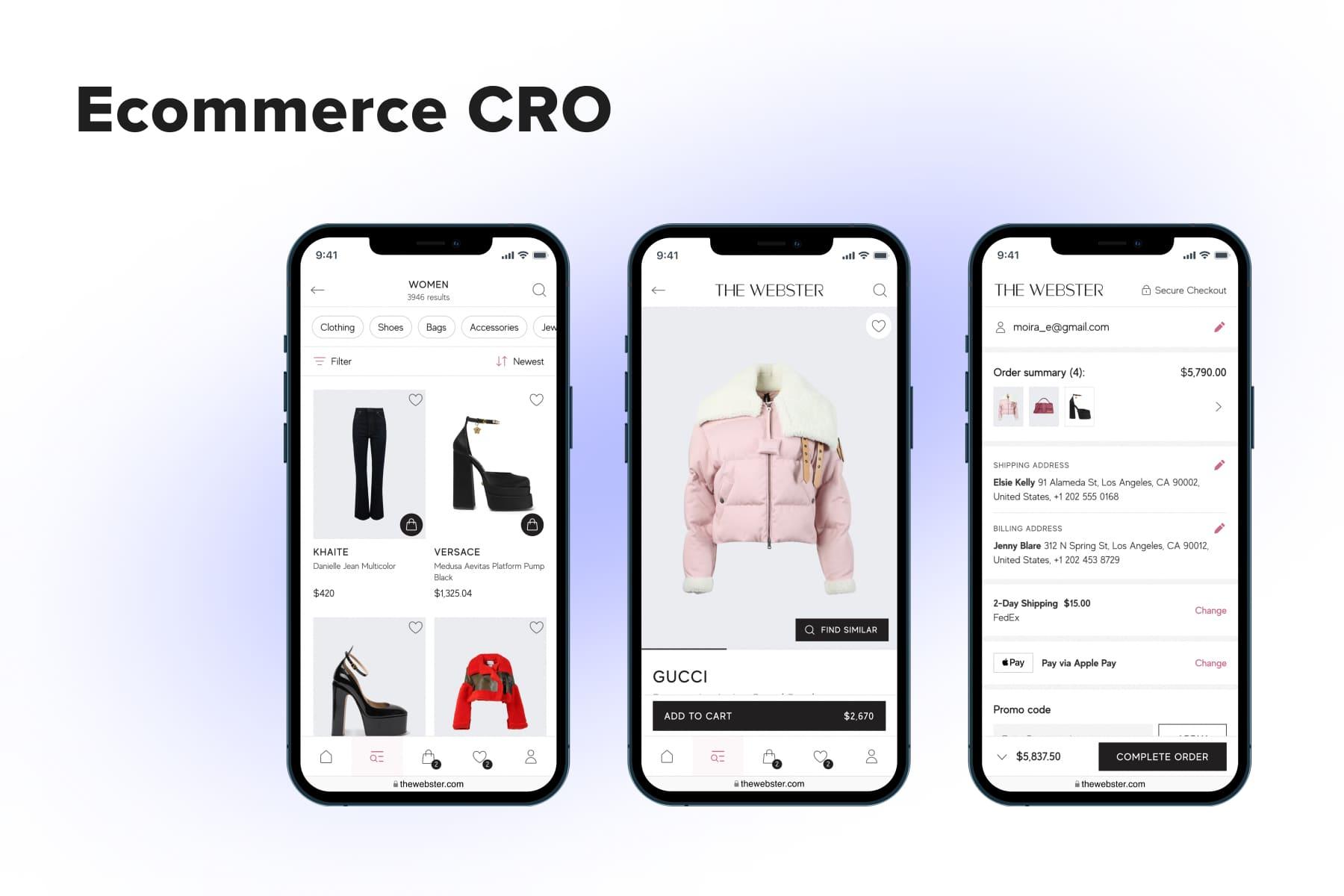
The Product Cards
They can convince visitors to add goods to the cart right from the catalog, bypassing product pages. Not every online store and product type is eligible, but it can be your case. Not to miss such an opportunity, configure the listings like this:
- Allow leafing through photo galleries from the category page;
- Besides the prices and product names, demonstrate available options for each item;
- If there’re too many of them, don’t shoehorn them into the cards. Instead, open the options in pop-ups;
- Place the “Add to cart” buttons/icons on the cards.
2.5 The Product Pages: CTA-focused & Helpful
Striving for a good mobile eCommerce conversion rate, you can’t avoid making changes to the product pages. The configuration and extra features for product pages (like size guides or how-to videos) depend on the store specifics. Here, we’ll name a few design patterns we’d recommend using for almost all retail websites.
- Place the “Add to cart” button into a sticky bar. We’re talking about one of the lengthiest pages on the site. If the sticky bar is present at the screen bottom all the time, you eliminate additional scrolling to the top. Multiple usability analyses indicate: people actively click on sticky bars on mobile sites.
- Highlight the price. Prospects in your market segment may not make much of prices while shopping (say, in high-end stores). But most frequently, these figures do influence the decision. We add the price either to the sticky bar or to the CTA button itself.
- Emphasize the benefits for buyers. Free shipping (or an adequate threshold for it) and fast delivery (especially with an exact date mentioned) contribute to positive decisions about purchasing. You have this info on the homepage, on dedicated pages, and in the benefit bar(a narrow stripe at the very top of the screen across the website). Duplicate these incentives on the product page too. There can be other hooks: guarantees, easy returns, and payment by installments.
- Include the customer reviews section.
Check our fresh guide with dozens of tips to achieve a better .
2.6 The Visuals: Diverse & Enticing
A large proportion of eCommerce websites is dependent on quality visual content. It provides information about products users can’t touch and try on. Another purpose is to connect emotionally with prospective customers.
For mobile websites, photos and videos mean even more: they help estimate goods even without attentively reading about their properties and benefits. Bear in mind that mobile users may have less time to read and more chances of being distracted. Visual data in such circumstances is perceived far better than textual.
To fully represent products, consider having these types of multimedia on the website:
- High-quality photos, including close-ups (to see the details/textures better) and images showcasing items on models (to understand a real object size);
- Videos to see products in motion or in use;
- 360-degree images to get an idea of how items look from different angles;
- User-generated content (UGC) to instill a desire to buy exactly this item. Atmospheric photos or videos by other customers create a sense of trust in the product. And if these photos aesthetically match one’s taste, USG will amplify the willingness to follow suit and buy the depicted product.
You’ll find even more tips for each of the pages we’ve discussed above in an guide.
2.7 The Cart: Noticeable & Flexible
Even when prospects add items to the cart, it’s actually unlikely to result in a purchase: the average cart abandonment rate for eCommerce in 2022 was about 70%. Nevertheless, some cart best practices raise the odds of completing an order.
Does the store display success messages after adding goods to the cart? If it doesn’t, choose one of these variants:
- If the average order includes up to five units, show pop-ups. This small window contains the ”Continue shopping” and “Go to cart” buttons. In this case, visitors can immediately proceed to the next stage in the funnel. But make this pop-up small enough to close it by tapping on the background/swiping down.
- If customers tend to add more than five items per order, a disappearing message will suit the store better. It explicitly tells that the item is added but doesn’t require any reaction from users. We also advise adding the “Go to cart” link to provide instant access to the cart page.
Many people use the cart page as a wish list or a comparison feature. Many add a number of units and then look at how much such an order would cost. Thus, users want to easily edit this list: alter the quantity and delete (and undo this action).
A pro tip: allow moving items to the wish list. Those who liked the product but decided not to buy it yet will appreciate this feature. And you’ll get higher hopes for customers coming back sooner or later.
2.8 The Checkout: Effortless & Modern
Completing an order on a smartphone is where many new customers feel a natural desire to give up. Not only does the task is mind-numbing and requires concentration, but also the checkout flow itself is often not well-thought-out.
What could you do to improve mobile eCommerce conversions at this stage? The first path is a “cosmetic renovation”:
- Add sign-up via social media or a Google account;
- Сut down the number of fields in forms: e.g., unite fields like “Name” and “Surname”;
- Pre-fill as many fields as possible: implement an address finder that auto-fills a country, region, city, street, and zip code when users type the first letters/digits;
- Simplify the payment process with digital wallets like Apple/Google Pay and services like PayPal or Amazon Pay.
The second path is an “overhaul”. It entails a whole redesign of the checkout page. In 9 cases out of 10, we pick a one-page checkout. But it’s not that conventional and a bit scary template that seems endless. It’s fully geared for smartphones:
- The checkout page is compact: it takes up just two mobile screens. The forms are collapsed, while the summaries are visible. Nothing hinders users from observing the whole flow;
- The forms (often automatically) open in pop-ups: more fields fit in a viewport, and users can easily return to forms and close them.
We made a full analysis of on our blog.
2.9 Store Performance: Fast & Smooth
We all made purchases from smartphones with unstable mobile internet and lots of distractions, both internal (push notifications) and external (surroundings). But what if we add one more exacerbating (and quite widespread) factor: website speed issues? As we’ve mainly dealt with Magento 2 stores, we understand the importance of for the user experience and conversion rates.
If classic is insufficient or you’re ready for a substantial investment and a qualitative leap in performance, then switching to a headless commerce architecture may meet your needs. Learn more about this matter and progressive web apps (PWAs) as one of the in our introductory article.

Get a Free Mobile CRO Audit Checklist
Are your mobile conversions low? See what to do about it with a comprehensive mobile CRO audit checklist.
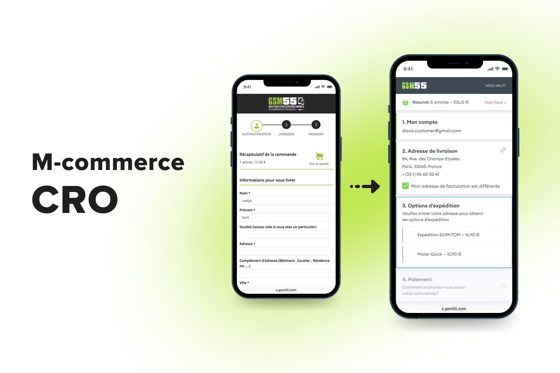
3. Mobile CRO Step by Step: GSM55 Case
We at Onilab advocate a comprehensive approach to improving customer experience and, as a result, CR. No hasty actions, no repainting buttons. We experienced the power of systemic changes firsthand. Let’s see what led , a major French mobile accessories retailer, to a 55% increase in mobile conversions.
3.1 The Hypothesis
The primary issue GSM55 had was its website mobile conversion considerably lagging behind the desktop one. Some roots of the problem were obvious even prior to the analysis:
- Designers marked non-intuitive navigation, non-optimal product page structure, and inconvenient checkout as troublesome points.
- Developers saw the need for and recommended building a PWA.
The hypothesis was that mobile users make fewer transactions than desktop ones because of these obstacles:
- It was difficult to find products in the catalog;
- It was inconvenient to study product pages;
- When the most determined prospects got to the checkout, its complicated scheme of registration and multipage structure scared away many;
- And on top of that, the website wasn’t fast enough.
3.2 The Research
To prove these assumptions, we first turned to Google Analytics reports. We looked at the percentage of users that abandoned the store at the main customer journey stages. For instance, the higher-than-expected bounce rate indicated: visitors experienced problems at the very beginning of the conversion funnel.
Of course, GA insights couldn’t tell us what the issues were, they just highlighted the problematic steps. Could people bounce because they were irritated with the ill-conceived menu? Yes. Could they close the store because of a bit dated design that seemed untrustworthy? Probably.
To further investigate the “suspect pages”, we analyzed recorded sessions, heatmaps and conducted usability testing with people interacting with the store in real time. Based on these insights, we created user personas and then the customer journey map (CJM). It documents user behavior at each step in great detail, describes issues, and offers ideas on how to increase mobile conversion rate and other KPIs for both desktop and mobile.
3.3 The Solutions
The research results convinced us to concentrate on navigation, product, and checkout pages on mobile. However, other pages also underwent design changes both on mobile and desktop layouts.
Navigation
GSM55 sells an enormous amount of accessories and gadgets for almost every smartphone model one could have imagined. It’s fair to consider the store’s menu its cornerstone. But the older version of the website couldn’t boast its menu:
It was located in an unusual place: not in the header but under the search field (BTW, the search wasn’t marked with a magnifying glass icon). We moved the hamburger menu to the header and added the loupe pictogram to highlight the search.
- It contained only the categories. We reorganized the catalog and introduced a several-tier menu.
- There were no links in the menu to the pages with important info for customers: delivery, returns, FAQs, and country/language selection. They were hidden in the footer. We duplicated vital service links in the menu.
- After choosing a category, visitors were directed to the corresponding page. They saw another collapsed menu under the same title: “Categories”. It opened the subcategories in an accordion. It was neither logical nor handy.
- All these menus took up almost the whole above-the-fold area on mobile. Instead of clumsy navigation elements, this precious space now attracts attention to products.
The Product Page
This part acutely needed reorganization:
- Space was used inefficiently: breadcrumbs took up much room and created visual noise. We got rid of these rudiments;
- The CTA was located below the fold. We made a sticky CTA which is always at hand;
- We added some useful features: the product comparison and wish list;
The whole template looked cumbersome and poorly structured, with too much white space, too many fonts and styles, and strange links/checkboxes. Chosen options looked similar to buttons. The list of benefits could have been two times smaller. We redesigned the whole UI part.
- Product details opened in accordions, but the content was still hidden under the “Read more” link. Now product descriptions open in easily expandable/collapsible pop-ups.
The Checkout
Many visitors bounced on previous pages, but those who got to the checkout encountered the last and the biggest nuisance. The flow was really challenging, and the worst hit customer segment was newcomers:
- When unregistered users proceeded to checkout, they needed to sign up: fill out many fields, go to email, and confirm the registration. They ended up on the home page again and had to go back to the cart to continue. The new checkout doesn’t send users out of the flow.
- Those who survived this quest then saw a multipage checkout with long forms that seemed overwhelming. We implemented a one-step checkout with long forms carefully structured and appearing in pop-ups.
- With the multipage checkout, users didn’t know till the end if they could pay a preferred way. Currently, customers see the whole process and the list of available payment methods right away.
We’re currently developing a few more checkout improvements: adding modern options to sign in (like via PayPal) and integrating GooglePay and ApplePay.
3.4 The Results
As we’ve told earlier, all measures aimed at elevating the conversion rate have many favorable side effects. After deploying all upgrades, we saw:
- A 55% increase in the mobile conversion rate;
- A 30% increase in the overall conversion rate;
- A 25% increase in the add-to-cart rate;
- A 25% decrease in the mobile bounce rate.
What Do You Make of Mobile CRO Now?
M-commerce traffic is steadily growing, but it doesn’t automatically mean rising conventions. Each and every store page can either facilitate or impede the customer journey. So it’s a systemic conversion rate optimization that makes a notable boost in mobile CR.
Whether you want to introduce major/minor changes to the theme, speed up the store, or move beyond these measures, our will assist in finding the best-fitting solutions. With 10+ years of developing online stores, we’ve become pros in all sorts of eCommerce optimization.