


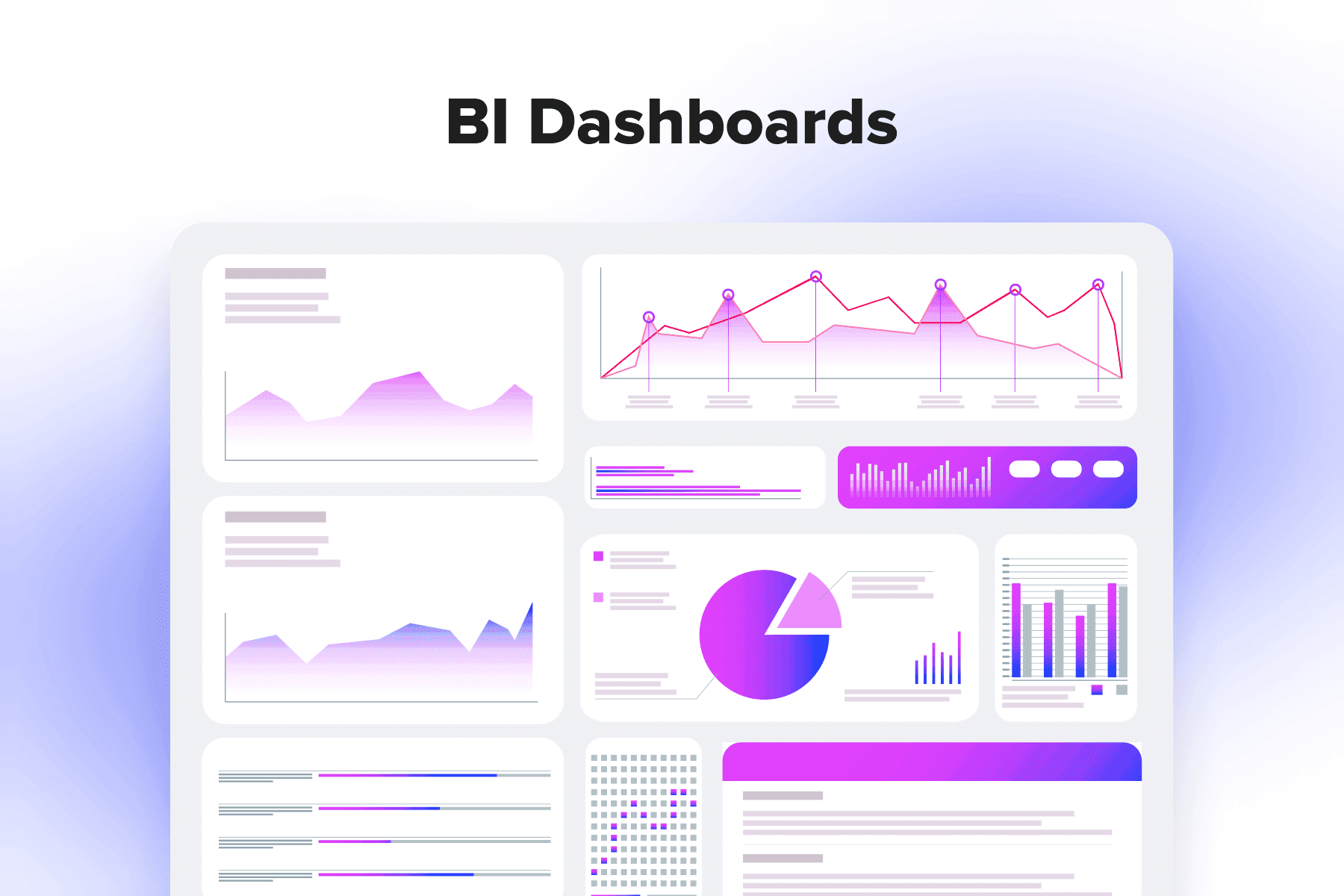
BI dashboards are available in all BI systems, from self-service BI to custom-made platforms, or offered as integrateable tools. They’re interactive and customizable, user- and increasingly mobile-friendly. Dashboarding capabilities have made tracking KPIs, compiling reports, answering business questions, and making data-informed decisions accessible for any employee, regardless of their proficiency in data analysis.
BI dashboards transform business processes, but only if configured correctly and designed smartly. In this guide, we’ll discuss what features useful BI dashboards contain, which advantages they bring, where the pitfalls may hide, how to perfect their interfaces, and who can benefit the most from utilizing BI dashboards.
Table of Content
1. Business Intelligence Dashboards: Main Features
Dashboard creation and modification capabilities are an industry standard. All major BI players offer dashboards as an integral component of their BI tools: Microsoft Power BI, Tableau, Qlik (all named Leaders in the 2023 for Analytics and BI Platforms), Looker, Domo, Sisense, SAP, IBM Cognos Analytics, Zoho Analytics, MicroStrategy, and others.
Plus, there's a cluster of vendors specializing in dashboarding and data visualization, like Dasheroo, Databox, Datapine, Geckoboard, Grow, Idashboards, InfoCaptor, Klipfolio, and Target Dashboard. Moreover, many business applications, such as CRM, ERP, HRM systems, marketing automation platforms, eCommerce CMSs, project management, and BA tools, have their own dashboards.
Here, we'll focus on dashboarding in more sophisticated and centralized business intelligence tools. First, let's outline what traits and functionalities we can expect in the best business intelligence dashboards.
- User-friendliness
By definition, modern dashboards are approachable and comprehensible. So, your BI dashboard software of choice must be comfy to utilize for any employee, from trainees to C-suite executives to data scientists.
- Customizable interface
Typically, these are developers and data analysts who integrate BI software with data sources and make major customizations. But then, staff members should have a drag-and-drop interface to tailor BI dashboards to their role-specific needs.
- Standard templates
Pre-built templates (sales, marketing, financial, customer service, and other dashboards) are a huge plus, particularly for less seasoned specialists. Having a basic dashboard at hand, one can adapt and start using it quicker.
- Rich data visualizations
Go for dashboards providing more ways to visualize data both for day-to-day tracking and compiling meaningful reports. Modern dashboard tools expand the possibilities of data visualization, not limiting users to bare bar/pie/line charts and allowing building scatter plots, bubble charts, maps, heatmaps, and so forth.
- Data source connections
Quality BI software plus professional IT support at the implementation stage ensures the tool will make the most of the data. It's possible to pull data from data warehouses, data marts, data lakes, and business applications to then have a holistic picture of the org's performance.
- Near real-time insights
Monitoring the situation almost in real-time is one of the essential business intelligence dashboard features. It's indispensable for cases when an immediate reaction or quick adaptation to changes is required. Besides, users can set automated alerts and notifications for important events and trends like monthly sales exceeding the target by X% or inventory levels for item N dropping below the threshold.
- Interactivity
Advanced DI dashboards facilitate diving deeper into data insights. At the same time, complex data doesn't overwhelm users like some old-school spreadsheets. If one needs to analyze data on a more granular level, they can use drill-down capabilities (giving more info on a particular metric or graph), data filters (allowing to weed out some data chunks and focus on certain time periods, regions, branches, etc.), and tooltips (providing more context).
- AI-driven analytics
Renowned BI systems have features powered by natural language processing (NLP) and machine learning (ML). Typically, they aid in extracting accurate insights from vast datasets (e.g., identifying trends) faster. They're getting better not only at descriptive and predictive but also at prescriptive analytics, giving smart suggestions or recommendations.
- Accessibility
Finally, all these cool business intelligence features must be available in a snap, no matter what devices personnel use, how complex the dashboards themselves are, how many data sources are plugged in, or how many people use the tool simultaneously. Some signs of a go-to BI system are access from a desktop app/web browser, handy use on mobile devices, high loading speed, and sharing capabilities to present data and collaborate with colleagues at ease.

Get a BI Dashboard Optimization Template
Maximize your use of BI dashboards. Discover hidden opportunities to capitalize on the tool’s capabilities.
2. Major Benefits of BI Dashboards
Given multiple business tools already contain analytical dashboards, it's okay to ponder whether your organization needs a full-fledged BI platform with its dashboards. We'd say it makes sense to invest in BI systems if you're a middle- to large-size company or an actively scaling one. It means the amount of data to process is enormous, so the org needs a more robust and flexible business intelligence tool. So, what are the advantages of utilizing BI dashboards?
Accelerating Business Processes
Business intelligence dashboards streamline workflows by automating many data analysis tasks, therefore lowering dependence on dedicated data specialists. Business users (managers, sales reps, marketers, administrators, etc.) can utilize the whole spectrum of BI dashboard capabilities themselves: track target KPIs, build predictions, search for actionable insights, and act on them.
AI-enabled BI platforms open even more exciting possibilities to optimize processes. For instance, Gartner, in its "", suggests that, by 2025, "organizations using AI in marketing will shift 75% of their staff’s operations from production to more strategic activities". Or, by 2026, "AI-driven product and customer experience analytics tools will be the primary source of insight for 40% of digital product enhancements, up from 10% today".
But surely, to make this real and sustainable, teams need well-organized training because BI dashboards are so feature-rich that it's easy to become overwhelmed and scared away by their capabilities. Never skip the educational part, and you'll see the results of process optimization: better staff performance and time/cost savings, especially in the long run.
Fostering a Data-driven Culture
BI (especially self-service BI) makes data widely accessible, understandable, and manageable across an org. Yes, you still need data and dev pros to customize and deploy the platform. But then, other teams can take over, building their own BI dashboards, choosing handy data visualizations, and creating comprehensive reports without coding, writing SQL requests, and wading through tons of gigantic spreadsheets.
Intuitive dashboards, therefore, are much more than just great data visualizers. They're conducive to embracing data analysis basics and a data-informed mindset at all levels by all stakeholders.
With such flexible tools and straightforward presentation of KPIs, it's far easier to understand each other and collaborate with more efficiency. For instance, an eCommerce sales team keeping tabs on how the latest drop is doing can quickly see and share concerning downward trends with marketers so that they start generating new ideas for promoting the collection.
Revealing More Insights
BI, especially reinforced by AI, get increasingly better at turning raw data into business insights. BI tools analyze data from the past, show current KPIs, detect patterns, build forecasts, and even give suggestions on what's better to do next.
These capabilities translate into more meaningful relationships with org's key performance indicators. Not only do BI dasboards perfect insights' accuracy, but they also help to profoundly understand data interconnections, find dependencies, highlight discrepancies, see issues, and identify opportunities.
Enhancing Decision-making
Scattered data isn't much better than raw data. If we have just some info, our assumptions and decisions may turn out to be inaccurate. To really tap into data potential, let alone base choices on it, having a single point of truth is a must.
Again, modern and aesthetic data visualizations are just the tip of the iceberg when it comes to business intelligence dashboards. Behind the scenes are complex integrations and constant data processing, allowing us to see the real state of affairs at any given moment.
Being constantly collected and analyzed by a powerful business intelligence tool, data becomes reliable enough to make decisions and take action. And such data-driven decisions are more likely to prove right. It's nice when it comes to small day-to-day decisions, and it's a game changer when we're talking about strategic planning or resource allocation. A 2019 survey by Deloitte showed that companies where CEOs champion analytics are to surpass their business goals.
3. Some BI Dashboard Pitfalls
One more reason to adopt a business intelligence platform ASAP is competition, of course. With more and more companies getting on the bandwagon, those refusing to upgrade their BI ecosystems will inevitably fall behind.
However, when implementing business intelligence and BI dashboards, many things may go awry. You should be prepared and know how to prevent/address these issues. Let's consider three potentially problematic aspects: user adoption, data quality, and BI dashboard design.
Data Literacy Issue
A 2020 survey by Accenture and Qlik revealed that a staggeringfeel overwhelmed or even unhappy when working with data. 61% stated their data overload added to workplace stress, and 36% admitted they try to avoid using data when completing tasks.
But how so if BI dashboards are presented as extremely intuitive for non-technical users? The thing is, even the most user-friendly self-service BI tools are filled to the brim with features, templates, data visualization options, settings, and whatnot. An average end user with a long tail of tickets in the task manager and a bunch of emergencies popping up each day might have little enthusiasm for exploring such a toolkit on their own.
Besides, there is more than one way to reflect data relationships, comparisons, composition, and distribution. It might be quite hard to select optimal visualization methods for different data types.

That's why company-wide training on how to build BI dashboards and uncover insights is key. As employees gain the needed skills, they become confident BI users who clearly see how advantageous and handy these dashboards are.
Data Quality Aspect
Beautiful visualizations, but incorrect data is a truly nightmarish scenario. To reduce the likelihood of getting misleading graphs and reports, the data itself must be clean. All the data sources, ETL pipelines, and integrations should be configured and managed correctly.
In the case of SaaS BI, vendors partly take care of data cleansing and quality assurance, but you still need data analysts and developers to integrate data sources, define data cleansing/validation rules, and implement the overall data governance policies.
Troublesome BI Dashboard Design
A BI dashboard is basically a snapshot of an org's/department's/employee's performance. It contains a main single-screen overview and often a couple more additional tabs for in-depth exploration of some datasets. The best thing about good dashboard examples is their smart structure with essential KPIs at the forefront, helping to focus on high-priority metrics.
Therefore, typical obstacles on the way to an impeccable BI dashboard are its cluttered interface, lack of relevant info, subpar UX design, and poor UI design. We'll discuss these issues and ways to tackle them in the next chapter.
4. Business Intelligence Dashboard Best Practices
All of the business intelligence dashboard issues we'll talk about are prevenable and curable, especially with professionals in data analytics and usability on board. So, we definitely recommend inviting data analysts and UI/UX designers during the implementation stage as well as testing BI dashboards involving not only QAs, but end users too.
Tailor BI dashboards to the Target Audience
When choosing key performance indicators to display and ways to visualize them, there are a few major factors to bear in mind:
- Who will use the dashboard on a daily basis? Different business users (agents, managers, executives) have different tactical and strategic KPIs to keep tabs on.
- Who the insights will be reported to? A dashboard also needs to consider internal and external stakeholders' interests.
- What business questions does the dashboard answer? Multiple data visualizations will only make sense if they allow for extracting valuable insights and using them in decisions.
- Does the dashboard help in data-backed storytelling? When the selection of graphs helps to grasp the overall situation in a team or department, and any relevant stakeholder can do so, it's an excellent BI dashboard.
Declutter BI Dashboards Interfaces
A desire to shoehorn as many visualizations as possible to better control the situation is likely to have the opposite effect. There will be too many distracting figures and elements, making it harder to concentrate on what really matters. There is some practical advice to underpin the most relevant data and get rid of less meaningful:
- Use the inverted pyramid. The approach to structuring information used in journalism fits well when it comes to building effective dashboards. It's about putting the utterly important data chunks at the very top, followed by less and less crucial blocks. Plus, remember that people are used to scanning any documents/texts/interfaces left to right and top to bottom.
- Single out core data. Good BI dashboard examples clearly convey vital information to stakeholders within the first several seconds of seeing them. Strive for this effect when selecting KPIs, visualization types, block sizes, and their placements.
- Prioritize core metrics. There are plenty of KPIs to monitor, but employees must be very picky about what to include in their BI dashboards. Don't overcomplicate the interface with many small charts and graphs.
Provide Enough Context
Visualizing data demands additional relevant information so that each and every colleague seeing the charts or a dashboard-based report comprehends it. When non-technical users build their first BI dashboards, missing something is almost inevitable.
Always check context data like time periods, scale, currency, year-to-year comparisons, total numbers, concrete numbers at each point of the graph, legends, notes, and so on. Past reports at hand, publicly available samples, vendor's educational materials, and, especially, help from data pros are key to success here.
Also, think of displaying this extra data in a smarter way. For instance, utilize pop-up information tooltips not to overfill all these bar charts and graphs with information.
Draw Attention to UX Design
BI dashboard best practices absolutely have to take into account the usability aspect of building and using dashboards. If business users constantly experience inconvenience while performing these tasks, both their productivity and motivation will suffer.
If you build a custom BI system, take good care of the UX: navigation and filtering logic, convenience of interactions with the tool, available options/features, and more. If you opt for a system with ready-made business intelligence dashboards, make sure the vendor takes usability seriously: the tool must be intuitive and highly customizable.
And what about mobile design? Test drive it thoroughly to understand whether it's actually a feature and not a bug. If mobile dashboards are cumbersome and slow, employees simply won't open them.
Rectify UI Design
The visual hierarchy, color palette, font sizes, the amount of white space, and other "cosmetic" elements affect data perception more than they may seem. For instance, data visualization in too vivid colors is as tiresome for BI users as a BI dashboard designed in very similar hues. Both require extra effort to read.
BI Dashboard Examples and Use Cases
BI systems can visualize almost anything and everything. The possibilities of BI reports and dashboards to translate and communicate business data are impressive, no matter what industry you represent, how the raw data looks, and which level of granularity you need.
Each case is highly individual, and there won't be two identical dashboards, but let's discuss common use cases and take a look at a few operational dashboards. The business intelligence dashboard examples we'll showcase are publicly shared on , , and pages.
Executive Dashboard

This type of BI dashboard is a must-have for C-level management and team leads as it gives a snapshot of the overall company/department performance. Basically, executives don't need to see all the details on a daily basis; they want a high-level overview to keep an eye on strategic metrics.
For, let's say, a CEO at an eCommerce company is most likely to need the following visualizations on their executive BI dashboard:
- Total Revenue
- Total Profit
- Profit Margin
- Conversion Funnel
- Average Order Value (AOV)
- Market Share
- Revenue Trends
- Sales by Product Category
- Geographic Sales Distribution
Marketing Dashboard

Each marketer can customize such a dashboard to reflect their priority metrics and uncover insights relevant to their area, be it social media activities, campaigns, email marketing performance, or something else. Detailed analyses make it far easier to pitch ideas, explain the rationale for planned collaborations, and make fewer mistakes along the way.
For instance, an influencer marketing manager in a digital marketing agency might want to keep tabs on this data:
- Engagement Rate Over Time
- Top Performing Influencers
- Campaign Reach and Impressions
- Click-Through Rate (CTR) by Influencer
- Conversion Rate by Campaign
- ROI of Influencer Campaigns
Sales Dashboard

Quality sales insights and accurate forecasting are vital for the org's financial health, so modern and flexible BI dashboards (and BI reports based on them) will help make more smart data-informed decisions while avoiding many based on a hunch.
A business analytics dashboard of a regional sales manager in a car manufacturing company may focus on the following data points:
- Monthly Sales Volume
- Sales Volume by Model
- Revenue by Region
- Market Share by Region
- Dealer Performance
- Inventory Levels
- Sales Forecast
- Demand Prediction by Model
Healthcare Dashboard

Truly, any org, from businesses to non-profits to governmental institutions, will benefit from a well-established business intelligence strategy. In healthcare, the predictive analysis capabilities of business intelligence (BI) platforms are especially valuable, notably optimizing resource management, from beds to doctors' time.
A dashboard for a hospital administrator can include blocks like these:
- Patient Admissions and Discharges
- Bed Occupancy Rate
- Average Length of Stay (ALOS)
- Length of Stay Prediction
- Resource Utilization
- Patient Satisfaction Scores
- Patient Admission Forecast
- Resource Demand Forecast
Warehouse Dashboard

High overall business performance depends on how thoroughly the warehouse data is calculated and monitored. So, logistics, inventory, and supply chain management are the areas heavily relying on business intelligence (BI) in data tracking and getting reliable predictive analysis.
For example, an inventory manager in a pharmaceutical company may build their BI dashboard around the following data points:
- Current Stock Levels
- Expiry Date Tracking
- Temperature and Environmental Monitoring
- Demand Forecasting
- Expiry Risk Analysis
- Order Fulfillment Rate
A Surefire Way to Effective BI Dashboards
A modern business overflowed with data can't thrive without a robust BI platform and well-thought-out BI dashboards. We know how discouraging adopting BI can be, even with cutting-edge self-service tools, and we're ready to step in at any stage, be it customizations, integration, dashboard UX design, or deployment. Learn more about Onilab's and schedule a meeting.