PWA building is a relatively new approach to web development in eCommerce. It’s about creating progressive web apps that look and perform like mobile applications, providing an excellent user experience.
We’ll give a brief overview of techniques for creating PWAs and consider applying ready-made Magento PWA themes. In a nutshell, the theme is a set of pre-designed web pages and programming tools that turn a store into a PWA. It’s a frontend on a common code base for mobile and desktop, with a ready-to-use Magento template that you can customize to the store’s needs.
How do you know if adopting an out-of-the-box PWA theme is the right path for you? We'll discuss this method's main advantages and disadvantages and analyze a mobile UX of 7 popular themes.
Table of Content
Why Should You Switch to a PWA?
PWAs offer four significant competitive advantages to online store owners.
- Enhanced site’s loading speed and performance
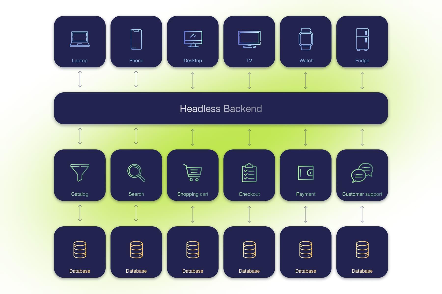
Switching to a PWA implies separating the frontend from the backend. That means your store becomes a headless commerce website. Its speed and performance increase immediately.
Why? When the frontend and backend are split, they communicate via API. Using API allows bringing back from the server only the data needed to display the dynamic content. Thus, no network power is wasted to pull static data (HTML, JS, CSS) from the server.
There are some other reasons why headless sites perform better than traditional. We’ve covered this matter in the article on . - Two frontends combo: for mobile and desktop devices
PWAs provide a significantly enhanced UX/UI, which, in turn, guarantees a boost in conversions. The design is based on modern , which differ significantly for mobile devices and desktops. - The store's mobile version looks and behaves like a native app without installation
PWAs have many features similar to regular apps (e.g., push notifications and adding to the home screen). The design resembles native apps (tab bars, pop-ups, swipes). At the same time, PWAs don’t occupy huge storage space on the device. Besides this, PWAs work in a browser, so they’re visible to search engines and available for SEO. - Switching to PWAs is cheaper than developing a native app
There’s no need to create two versions: for Android and iOS, so you save the budget. By employing a Magento iPhone theme, you can further enhance the store mobile experience, providing a unified solution for different platforms.
Two Ways of PWA Creation
How do you transform the store into a cutting-edge PWA? The main options to are as follows:
- Building from scratch via a progressive framework (React.js, Vue.js, or Angular.js) or using the official toolkit.
- Implementing a Magento theme template, often with further customization.
Let's discuss both methods briefly.
1. Building from Scratch
The option of building a PWA on or another framework means developing it at zero. So if you decide to follow this scenario, you must manually create the architecture and interface elements. On the other hand, it’s worth considering that building from scratch is the best option if you want to create a complex PWA.
So when is it worth it to opt for developing from scratch?
- If coders providing are experienced and proficient in using progressive frameworks.
- If you're not satisfied with the functionality of ready-to-use solutions, the range of features they offer, and need a customized store with non-standard capabilities.
- If you’ve tested the theme's demo version, and it doesn’t work as smoothly as you need.
2. Using the Ready-made Magento PWA Themes
As we briefly explained above, the PWA Magento theme is an all-in-one package solution for converting the Magento store into a PWA. It’s a set of ready-made components and mechanics for interacting with the backend via API that you can implement into the store. In other words, it's a frontend written in JavaScript.
What does the process of turning a store into a PWA using a Magento website template look like? First, the customer or developers choose a suitable theme. Then, the developers install it on the site and make the necessary changes to the design and functionality in the Admin panel.
Now, let's review the pros and cons of applying such themes.
Main Benefits
a) Cost reduction
The with a premade theme will be initially lower since there’s no need to develop the frontend from the ground up. So it's a good option for those who have a limited budget.
b) Saving time
Development time might shorten up to 30% on average. This means you can launch the site faster and then upgrade it gradually to meet the needs of the business.
c) Easy implementation
Magento 2 PWA theme setup doesn’t require high development skills, as it’s a ready-made functionality. If you don’t need significant changes in the theme's design and functionality, you won't waste much time and effort installing it. And right after installation, you get a functioning PWA.
Disadvantages
a) Need for customization
Versatile themes can't perfectly fit all of your goals, and it will take time, effort, and money to refine and customize them. For this reason, using a ready-made solution in some cases is irrational because it may contain a lot of extra code that can slow down the site. As a result, you will have to do additional work, which isn’t always that easy.
Any ready-made theme customization will require the help of experienced specialists (React.js, Vue.js, or Angular.js developers), even for adjusting theme colors and other insignificant changes.
b) Possible lack of functions
Each out-of-the-box theme includes basic functionality (catalog operating, add-to-cart feature, stock options, etc.). But sometimes, you need additional modules and functions not yet implemented in the PWA theme. In this case, you'll either have to wait for the vendor to update it or craft the required features by yourself.
c) Need for regular updates
Regardless of the chosen theme, you will have to make adjustments to it in any case. There’re two algorithms to follow when Magento updates are released (for example, if some query types are changed):
- monitor theme updates made by a vendor and regularly apply them;
- make the changes to the code on your own to incorporate innovations from Magento.
d) Bugs and errors riskAny theme’s code is developed by third-party vendors. It’s in ongoing production and isn’t perfect. So not all theme components are properly tested. That’s why developers often encounter unforeseen challenges when applying themes, and there’s a risk that not everything will perform as it should.
If you don’t have developers to fix the issues, you’ll have to wait until the vendor eliminates them. So, when choosing a ready-made theme, it’s crucial to ensure that you’re satisfied with its technical performance.
e) Lack of documentation
Themes from third-party vendors don’t always come with comprehensive documentation. Therefore, developers can waste time studying its structure if customization is needed.

40 Hours of Magento Services. FOR FREE
Try our custom development, optimization, support, and design services. One week, free of charge, no strings attached.
7 Popular Magento 2 PWA Themes to Consider
If you decide that using a ready-made PWA theme is the best way, it's time to choose the one that suits your needs. Below we’ll review 7 of the most popular (both paid and free).
We'll explore the mobile UX of each theme on real-life or demos if there’s no portfolio on the vendor’s website.
1. Venia by Magento PWA Studio
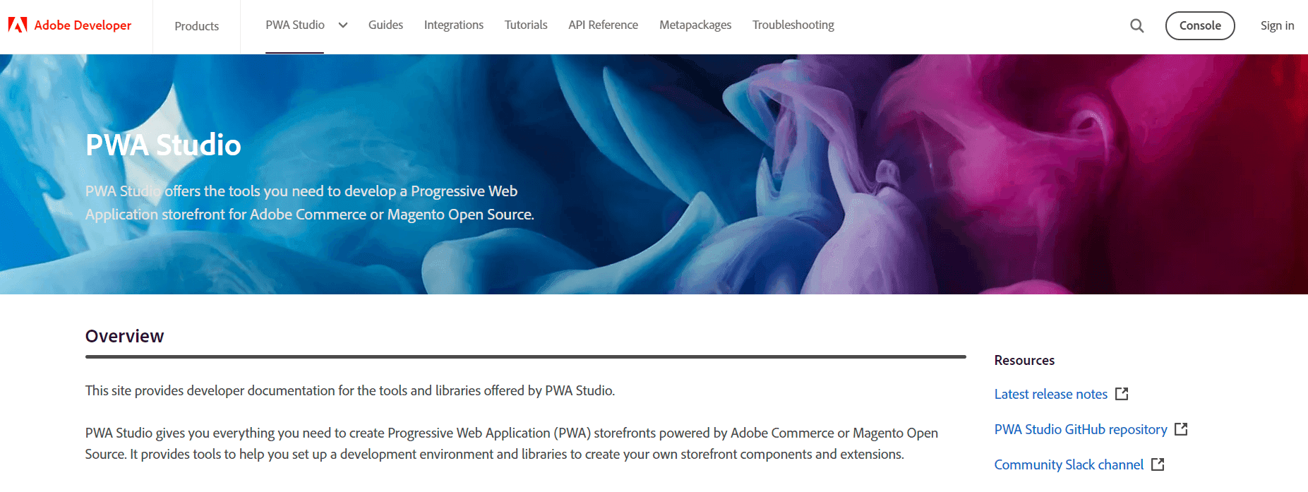
Price: FREEMagento PWA Studio is a free, robust framework from the official Magento vendor. Based on ReactJS, it uses React code blocks and provides ready-made components and frontend architecture for the PWA storefront. This toolkit helps save developers’ time on the manual creating standard PWA elements.
To put it simply, Magento PWA Studio is a set of tools you can use to implement PWA features on Magento 2.3 (and higher version) to turn the store into a PWA. It’s a kind of core responsible for the backend-frontend interaction plus a standard frontend, based on which it’s possible to create a customized Magento 2 PWA theme. By the way, most PWA themes are built on the PWA Studio core (Tigren, Siminia, etc.).
| Pros | Cons |
| 1. Access to the latest development toolkit with detailed documentation 2. Plenty of successful projects based on the PWA Studio core 3. Simplicity and reliability of the development process 4. Support team and a large community of developers 5. as an API ensures minimal over-fetching and better processing of a large number of users from different channels 6. A wide range of tools for building customized stores | 1. Limited platform compatibility (only suitable for Magento 2.3 and higher versions) |
| 2. Updates are released quite slowly | |
| 3. Lack of comprehensive storefront features. For example, bottom navigation on mobile, product comparison, price range slider, and others are still not implemented |
UX Overview
To help business owners visualize what they’ll get after creating a PWA, Magento offers its basic ready-to-go PWA theme called . However, this basic Magento 2.3 PWA theme is rarely used. For this reason, it’s hard to find live store examples based on the bare Venia theme. So we’ll take a look at the demo’s UX.
Homepage
- The homepage style is minimalistic. The colors are non-distracting.
- The sticky header is poorly implemented: a customer sees only a part of it when scrolling.
- The slider with bestselling products allows extra advertising of certain products, which boosts conversions.
- The layout looks untidy: buttons on the banner and slider aren’t aligned, product photos are badly cropped.
Menu
- The theme has a standard hamburger menu with inconveniently closed navigation, while it would be smarter to implement a more advanced bottom menu. The bottom navigation bars display three to five site sections at the screen bottom. It’s visible from any page to quickly and comfortably navigate through the store.
- Due to the unadapted layout, users need to scroll down the main menu to access the account link.
Filters
- Filter options are hidden in accordions. Better to arrange the filters in a way that the options aren’t hidden, and the menu is closed by a swipe.
- When you apply filters, there’s no indication of how many results will be shown.
Search
- The search doesn't show any results unless you enter the whole word. If there’s a typo in it, the search doesn’t offer a correction.
- The search doesn’t open to the full screen. The catalog page in the background distracts the visitor's attention.
Category pages
- Buttons and other elements aren’t aligned on the page.
- No product comparison functionality is offered.
Product pages
- The product page displays all the necessary information at once: colors, sizes, quantity. It’s easy to use since there’re no drop-downs or scrolls.
- When you choose a certain color, the product photo is replaced automatically.
- On the product page, the “Add to Cart” button is placed at the below-the-fold screen, so the buyer has to scroll a bit to find it. The button should have been placed on a sticky bar at the bottom of the page to always be displayed. In addition, it’s quite small and doesn't reflect the price.
Cart
- After adding an item to the cart, the button doesn’t change its color, and the user doesn’t get any confirmation.
- Products aren’t saved anywhere if they’re removed from the cart. It’s worth equipping the cart page with the section displaying recently viewed items.
Checkout
- The checkout has an accordion design which forces the customer to make a lot of extra clicks. It would be better to show all the fields at once.
2. The PWA frontend for Magento by Vue Storefront
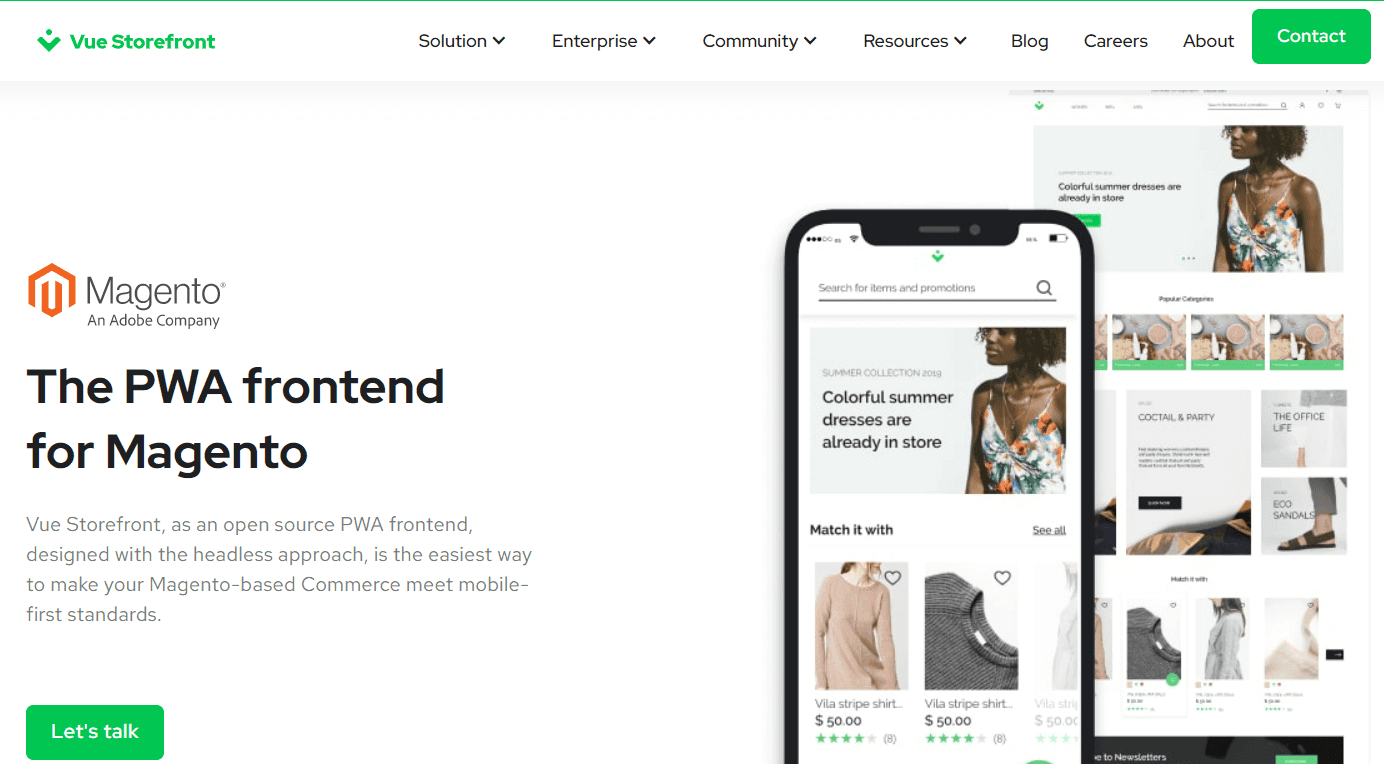
Price: FREEVue Storefront is an open-source Vue.js-based PWA framework. Like Magento PWA Studio, it’s rather a core provided for creating your own theme. But a basic frontend is also available, and it’s possible to check how it works on the .
| Pros | Cons |
| 1. Open-source solution 2. Magento 1 and Magento 2 support 3. Doesn’t require a specific type of backend to implement the full functionality. Works on different eCommerce platforms (Shopify, Spree, Vendure, Spryker, PrestaShop, Odoo) 4. Active contributor community | 1. Lack of documentation and associated complaints about installation issues |
| 2. Support for not all payment systems | |
| 3. Uncertainty about how Vue Storefront will behave after the Magento upgrade |
Store examples:, , , , , , ,
Let's check out the Vue Storefront theme’s UX on the Thomas Kent online store’s example.
UX Overview
Homepage
- The color scheme is pleasant and non-distracting. However, the light and low-contrast text is lost on the white background.
- The above-the-fold area is used irrationally. There’s no slider and the photo isn’t clickable.
Menu
- The theme implies using an outdated hamburger menu.
- The “Log in/Register” page functionality is user-friendly: several options are available, including via Google, Facebook, and Amazon.
Filters
- Filters are hidden in accordions, while it’s possible to show all parameters straight away.
- Color filters are indicated only by text; if there were icons, it would be handier and faster to choose.
Search
- The search works correctly only if you enter 4 or more letters.
- The results display not only relevant products but also appropriate categories.
Category pages
- Prices written in beige are barely visible against the light background. The same applies to the category name.
- Products can’t be added to the cart from the catalog page.
Product pages
- It’s impossible to enlarge photos. There’s a need to implement a convenient zoom.
- Details about the product are hidden in an accordion. It’s preferable to show some info and the “View More” button that opens the full text in the pop-up. The same goes for other page sections, including “Similar Products”. Here a user-friendly slider would fit better.
- There’s a sticky bar with the "Add to Bag" button. Adding a price tag to it would improve the UX.
- The “In Stock” label is unnecessary. It’s worth doing the opposite: indicate the stock status when items are sold out.
- When an item is added to a wish list, the client receives a notification. However, the button doesn't change its appearance.
Cart
- When clicking “Add to Bag”, the visitor is immediately redirected to the cart. It’s poor practice because it forces the buyer to reach for the cross at the top and close the cart to continue shopping. But in the case of watches, it might work since most clients are likely to buy one thing at a time.
- When deleting an item from the cart, the purchaser is asked for confirmation. Besides, the browsed items are displayed in the “Viewed Products” section after removal.
Checkout
- The checkout is quite convenient: you can see all the fields you need to fill right away.
- There’s an order summary. When you press the “Place Order” button, errors are highlighted.
3. Magento 2 PWA theme by ScandiPWA
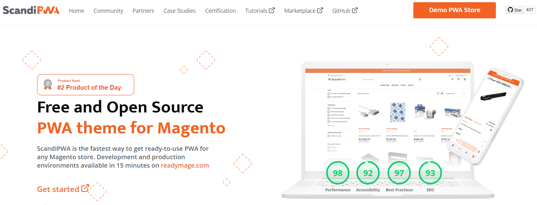
Price: FREEWritten in React, the theme supports more than 350 Magento features and offers an enhanced UX. ScandiPWA currently offers a broader range of features compared to PWA Studio. Therefore, this theme can be a great solution if you want to speed up the development process and reduce costs when creating a more or less standard PWA.
Store examples:, , , , , , , , , , , , , , , ,
UX Overview
Let's explore the UX of this PWA theme based on the store.
Homepage
- Some page elements are shifted. For example, in the slider, the swiping indicator partially covers the button.
Menu
- The bottom menu is easy to operate with the thumb. Among the 7 themes we reviewed, this menu type is present only in two cases. However, it's implemented incorrectly in the second case (the Cenia theme).
- Subcategories open in new windows. To return to the previous nesting level, users press the arrow.
Filters
- The filter options are placed in accordions.
- Items in the store have approximately the same price, so the price filter isn’t necessary. Especially considering there’s no possibility to set the range manually.
- When clicking on the icon in the color filter, a title appears. This is important for people with vision problems, such as color blindness.
- When applying filters, the number of matching items isn’t shown.
- The chat button overlaps the “See Results” one.
Search
- It’s convenient that the search opens to the full screen.
- The function itself doesn’t work correctly, showing irrelevant products instead of matching items and categories. In addition, the results don’t show the price.
Category pages
- Products can’t be added to the cart from the catalog.
- Adding to the wish list is available only for registered purchasers.
Product pages
- Product photos can be easily zoomed in and out.
- Product description and details are fully hidden in accordions, which is inconvenient.
- Product pages have the “Featured Products” slider at the bottom. This block helps boost sales.
- The “Add to Cart” button is fixed as a sticky bar at the bottom, but it doesn't have a price tag.
- When the “Add to Bag” button is clicked, its appearance doesn't change. But the user is notified that the item has been added to the cart.
Cart
- It's convenient to adjust the number of items in the cart.
- When removing items from the cart, the buyer isn’t asked for confirmation. Goods just disappear without being saved in the list of recently viewed items or elsewhere.
Checkout
- The checkout is divided into 2 sections: “Billing” and “Payment”. Inside the sections, it’s possible to fill the fields in any order, which is handy.
- When clicking the “Proceed to Billing” button, the mistakes made while filling out the fields are highlighted.
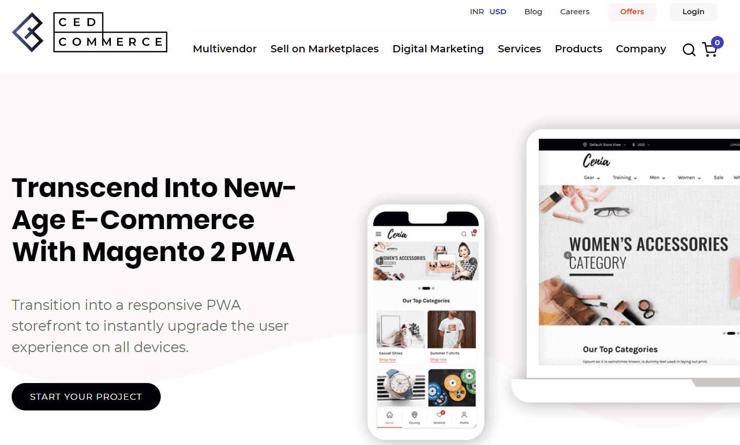
4. Cenia PWA theme by CedCommerce
Price
- - Pro - $499
PWA Studio, ReactJS & GraphQL-based Cenia theme helps in the transition into a responsive PWA storefront for instant improvement of UX on all devices. Cenia theme is compatible with Magento 2.4 and above. CedCommerce provides a free version and an upgraded Pro one with additional features. The vendor offers a free installation of their paid PWA theme and exclusive support for 3 months, as well as lifetime upgrades.
Stores examples:, , ,
UX Overview
Let's take a look at the store's UX.
Homepage
- The theme has a bright but well-matched color scheme, a neatly made slider, and the “Top Categories” section.
- In the “Trending Products” slider, buttons and other elements are at different heights.
Menu
- The site has a bottom menu, but it's not properly implemented. It has no main menu button, which is made as a hamburger. Moreover, the bottom menu disappears when you open the hamburger.
Filters
- The filtering is placed in the pop-up, and its options are placed in accordions, so people can’t quickly assess and tick boxes.
- It's impossible to adjust the price range manually.
- The client can see which filters were applied, but the number of results relevant to the selected filters isn’t shown.
Search
- The search works even if you enter 3 letters.
- The search results show the total number of relevant products, suitable product categories, and item photos with prices.
- Category pages
- Goods can be added to the cart directly from the category page.
- Next to the photos, there’re prices and short product descriptions.
Product pages
- Information blocks on the page are fully hidden in accordions, which is uncomfortable for clients.
- There’s no possibility of zooming in photos.
- It’s convenient to adjust the quantity of the goods one wants to purchase.
- When you click the “Add to Cart” button, there’s no indication of this action.
Cart
- The checkout fields are hidden in accordions, which forces the client to make a lot of extra moves.
- When removing an item from the cart, the visitor is offered to add it to favorites.
Checkout
- The checkout as a guest option is available.
5. Siminia by SimiCart
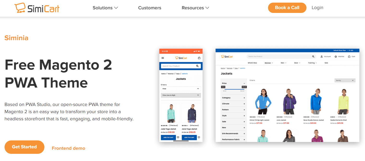
Price: FREEMagento PWA Studio-based open-source theme helps easily switch a store into a PWA. The provider notes that the theme gives an app-like experience, a great UI/UX look, and a range of similar to native app features.
Store examples:, , ,
UX Overview
Let's review the UX of the SimiCart theme on the example.
Homepage
- The homepage design is quite simple and stylish.
- At the top, there’s a clickable slider leading to the popular category pages.
Menu
- An out-of-date hamburger menu doesn’t open to the full screen. The background is still seen on the right side.
- The menu has tabs inside where users can change currencies and log in to the account.
Filters
- The color options in the filtering section have no icons, so it’s preferable to add them. The price range is easily adjustable.
- When selecting filters, there’s no indication of the number of relevant items found. The full selection can only be seen after pressing the “Apply” button.
Search
- The search starts to work after entering 3 letters, but suggestions aren’t accurate.
Category pages
- From the category page, items can be added to the wish list (for registered shoppers) and the cart.
- There’s also a comparison function, but the meaning of the icon isn’t clear.
- When clicking on the cart and comparison buttons, the customer gets corresponding notifications, and the buttons change color to red.
Product pages
- There’s no zoom function - when you click on the photo, it just opens to the full screen.
- The “In Stock” label is unnecessary.
- When clicking the “Add To Cart” button, the buyer receives a notification, but the button itself doesn’t change the appearance.
- Product info and reviews are hidden in tabs that are easy to switch between.
Cart
- When deleting items from the cart, the client is asked for confirmation. But removed items aren’t saved anywhere.
- In the cart, there’s a handy calculator to estimate the final cost depending on the shipping address.
Checkout
- The fields aren’t divided into sections, and it’s possible to fill them out in any order.
- There’s an order summary section at the bottom of the page so that the purchaser can make sure the order is formed correctly.
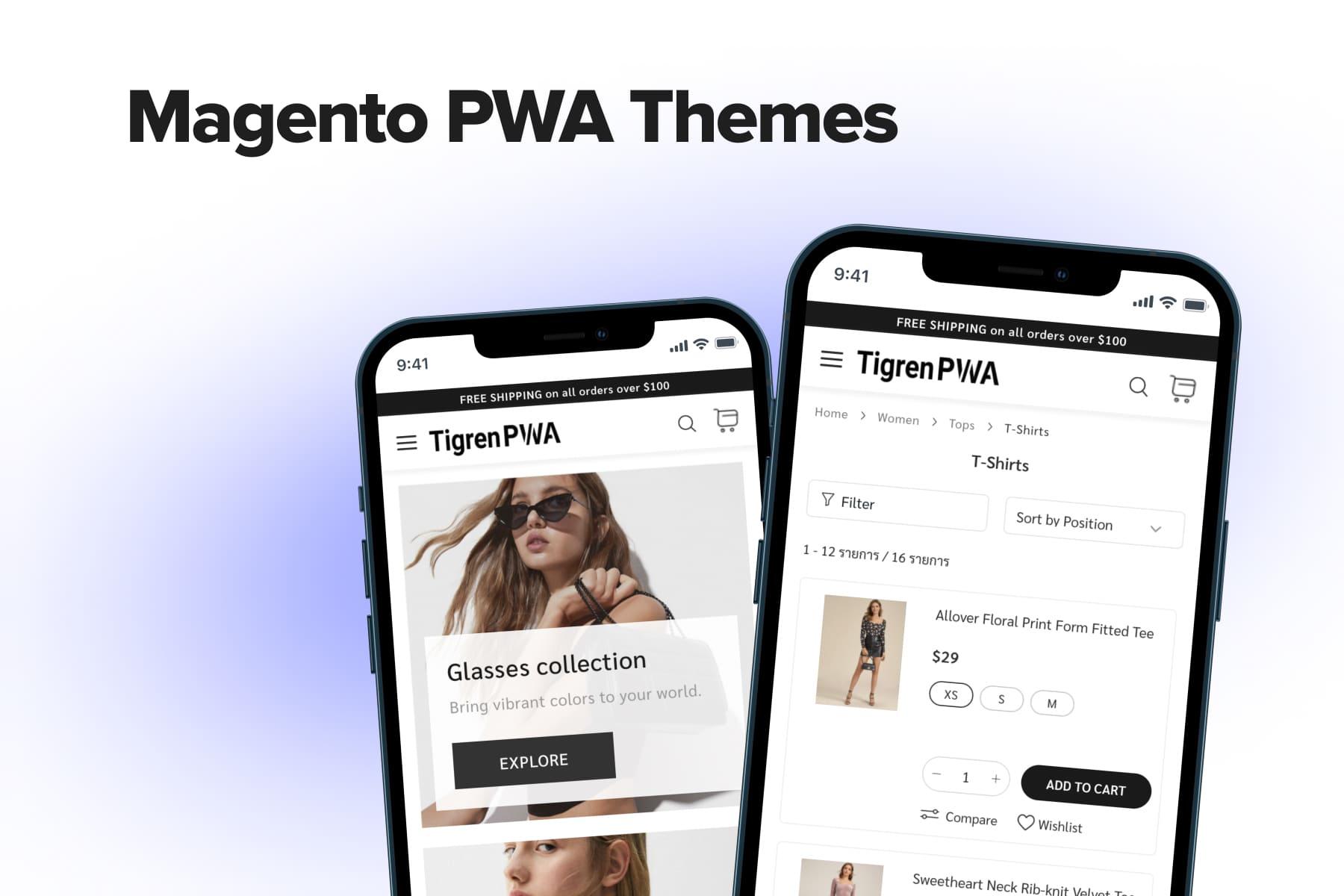
6. TigrenPWA by Tigren
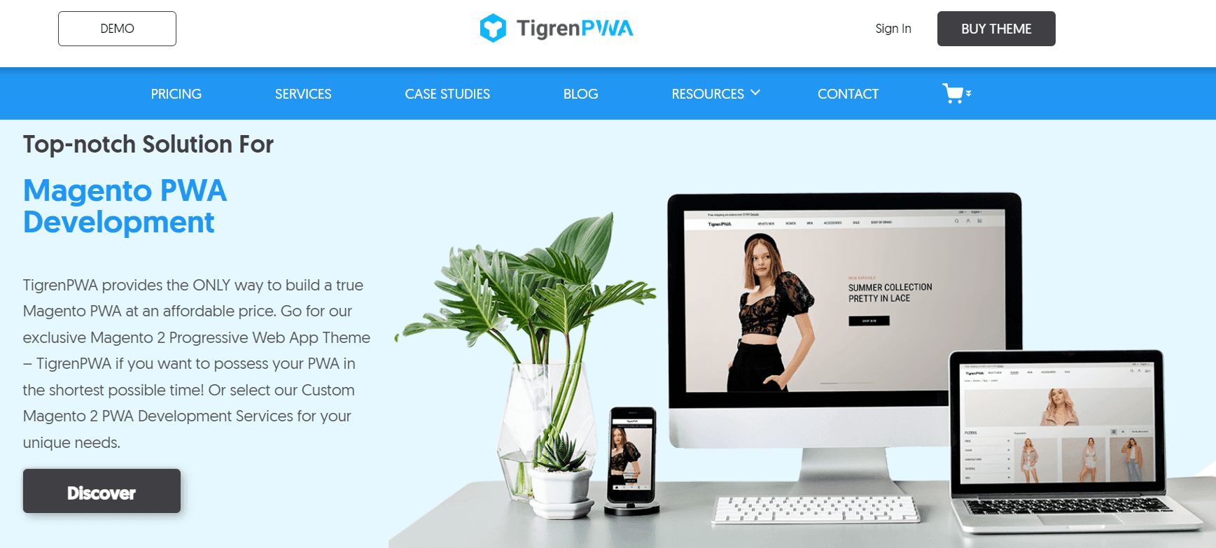
Price: $799
is designed for building PWA stores in the shortest possible time at an affordable price. It provides a wide range of built-in features and options for storefront design. It’s based on the Magento PWA Studio, which means it will be updated every time Magento updates, and buyers aren’t supposed to face any compatibility issues.
As Tigren claims, its theme meets 5 crucial requirements for outstanding design: simplicity, consistency, readability, mobile-friendliness, and easy navigation.
Store examples:,
UX Overview
Now let's get a glimpse of the UX theme on the store example.
Homepage
- The above-the-fold space is occupied by a slider with large photos that don't fit the screen.
- There’s a pop-up with a discount offer at the bottom, but it’s poorly made and cropped at the bottom. In addition, it chases the customer through all site pages.
- A big part of the page is taken by the “Recommended For You”, “Popular Products Right Now”, and “Our Best Sellers” sliders with too big photos. This makes the page look cluttered.
Menu
- The standard hamburger menu would be better replaced by a more convenient bottom menu. In addition, the menu doesn't open to the full screen: you still see a distracting background.
- The menu has many subcategories placed in accordions, which forces the purchaser to constantly expand them.
- The menu also has quite handy “Account” and “Settings” tabs.
Filters
- It's impossible to apply several criteria at once. When selecting one, e.g., color, the user is immediately redirected to the results page.
- The window containing filters doesn’t open to the full screen, so you can see the background.
Search
- The search starts to suggest results after entering three letters.
- Relevant products are shown along with the prices. However, there’s no total number of search results.
- The search doesn’t open to the full screen. The catalog page in the background distracts the customer's attention.
Category pages
- On the category pages, product cards aren’t aligned to the grid.
- The site doesn't allow adding items to the wish list, only to the cart.
Product pages
- The text description of the product partly covers the photo. It duplicates the product caption located just below.
- Photo zoom opens on a new page, forcing the visitor to go back and forth.
- When an item is added to the cart, the client gets a notification, but the button doesn't change its appearance.
Cart
- There’s a calculator on the shopping cart page to estimate the final cost.
- The cart is updated only manually by pressing the “Update” button. Otherwise, when you change the number of goods, the cost doesn’t change.
- Part of the text is pale and hard to read.
- The “Go To Checkout” button gets lost on the page. It should have been fixed at the bottom as a sticky bar.
Checkout
- The checkout layout is messy. There’s a lot of free space, the page elements aren’t arranged well.
- The checkout process is too complicated: there’re many unnecessary fields to fill in. The “Place The Order” button isn’t fixed in the sticky bar.
7. Magento 2 PWA theme by GoMage
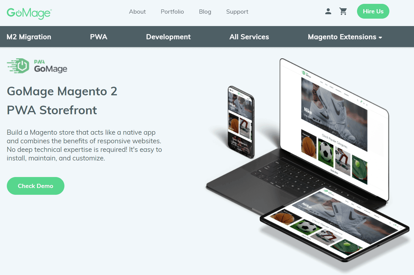
Price
- Open source - $1,799
- Commerce - $2,299
theme is developed on the official Magento PWA Studio so the store will be fully compatible with Magento updates and official security patches. It allows creating a store that is as user-friendly as a native app and also combines the benefits of responsive sites.
GoMage claims that creating a store with its theme doesn’t require advanced technical skills: it’s easy to install, maintain and customize to the needs of your business.
UX Overview
Unfortunately, GoMage doesn’t provide cases of stores built on its Magento 2 PWA theme in the portfolio. Therefore, let's consider its features based on the demo.
Homepage
- The theme colors are nice and not distracting. However, the “Shop Now” CTA on the slider is hardly visible.
- There’s the “Customer Favorites” slider at the bottom of the page for boosting sales.
- It's possible to add products to the wish list, comparison, or directly to the cart. However, the “Add to Cart” button appears only when you click on the product, so it's not obvious that it’s possible.
Menu
- An outdated hamburger menu.
- The menu doesn't open full screen.
Search
- The search works by entering at least three letters. However, the total number of results isn’t shown. Also, no relevant categories are displayed.
- The search has a useful filter feature, but its implementation is poor. It's possible to select only the item’s color.
- The colors have no graphic icons, only text titles.
Filters
- The filtering feature shows which parameters were applied but doesn’t display the total number of relevant results.
- There’s the “Clear All” button to reset the filters.
- The price range can be set manually.
- Color options have no text captions.
Category pages
- The “Add to Cart” buttons are at different heights.
- Buttons for adding products to the wish list and comparison are barely noticeable.
- When an item is added to the cart, the shopper is notified accordingly, and the button changes its color.
Product pages
- Product photos are large enough, but there’s no zoom feature.
- The customer must scroll to see the “Add to Cart” button. It’s more convenient when it’s pinned to the bottom. When the client clicks on the button, it changes color.
- The photos are quickly replaced when users select different colors.
Cart
- The item is added to the cart in the chosen color, but the thumbnail displays the wrong one.
- The “Checkout” button isn’t visible on the first screen.
Checkout
- It’s unclear that the “Login and Checkout Faster” link is clickable.
- The checkout process is divided into three steps, and you can’t go to the next step without completing the previous one.
- The “Continue to Shipping Method” button is unnecessary.
Magento Theme by Onilab
Price: A proprietary theme from Onilab is a go-to solution if you want to speed up development and avoid coding from scratch. In our out-of-the-box product, we’ve addressed common design issues most eCommerce businesses face. Therefore, you don’t need to reinvent what has already been perfected.
Compared to other options, Onilab’s theme boasts a mobile-focused UI/UX and enhanced caching features for lightning-fast website performance. On top of that, it’s highly customizable. We can tweak the theme’s functionality to fit any business needs.
What if a complete website overhaul isn’t necessary? In this case, we can apply the theme to improve specific areas of your site, even if it is monolithic. Pricing will vary based on your customization requirements.
Store examples: A Greek online store selling goods for an active lifestyle, , was among the many clients that greatly benefited from our ready-made solution.
UX Overview
Let’s analyze the UX of Onilab’s PWA Magento theme using the above-mentioned brand.
Homepage
- The homepage design is devoid of visual clutter.
- The color palette comprises soothing shades of blue and green.
- The clickable slider at the top directs visitors to the category pages.
- There are sliders with “Popular Categories,” “Popular Products,” “New Products,” and “Offers.”
- Information about delivery and return policies is available directly on the homepage.
Menu
- An app-like bottom menu makes it comfortable to navigate with a thumb.
- The main controls like the homepage, products, basket, wishlist, and account are easily accessible.
Filters
- The filtering menu opens in a pop-up.
- The customer can sort items by price, type of product, material, brand, stock availability, and other relevant criteria.
- Once the filters are applied, you can see the number of products matching the specified criteria.
Search
- The search function is highly responsive, even with one-letter inputs.
- The search covers the whole screen, showing detailed results as well as featured products with images and prices.
Category pages
- There’s an “Add to cart” button,” which is extremely convenient.
- Below the product photo, one can find a short description and the pricing of the item.
Product pages
- Product photos open in a pop-up, partly covering the page.
- The full product description, along with delivery and return info, appears in a pop-up as well.
- There’s a sticky “Add to cart” button with a quantity selector.
- The slider with “Similar Products” is placed closer to the bottom of the page.
Cart
- Customers can change the number of products in the cart, remove an item, or save it for later.
- Right below the checkout button, customers see information about the payment options.
- There’s a cross-selling section at the bottom.
Checkout
- Customers can create an account or go for a guest checkout.
- The checkout fields follow a pop-up logic.
- The cross-selling section is also available on the checkout page.
Final Word
We've briefly discussed the main ways of PWA creating and strived to help you figure out which method is the best in each particular case. As you know now, in some cases applying a premade theme is a handy tool to turning your store into a PWA.
We've introduced the seven most popular PWA themes for Magento and explored their UX pros and cons. It should help you choose an appropriate theme for your business. As you see from the themes' review, none of them are perfect, and each requires certain improvements. If you need help with theme customization or any other aspect of the , don't hesitate to contact us.