Seamless, pleasing, great, flawless. Unsatisfactory, poor, bad, irritating. That’s how people can describe their user experience or, in other words, how they feel during and after interacting with an online store.
The user experience is a multifaceted notion. When it comes to eCommerce best practices in UX terms, they encompass an excellent website’s loading speed, carefully thought out design, intuitive navigation, exhaustive product presentation, convenient payment options, and thoughtful customer service. There are also many smaller aspects that can either level up the online shopping UX or spoil it.
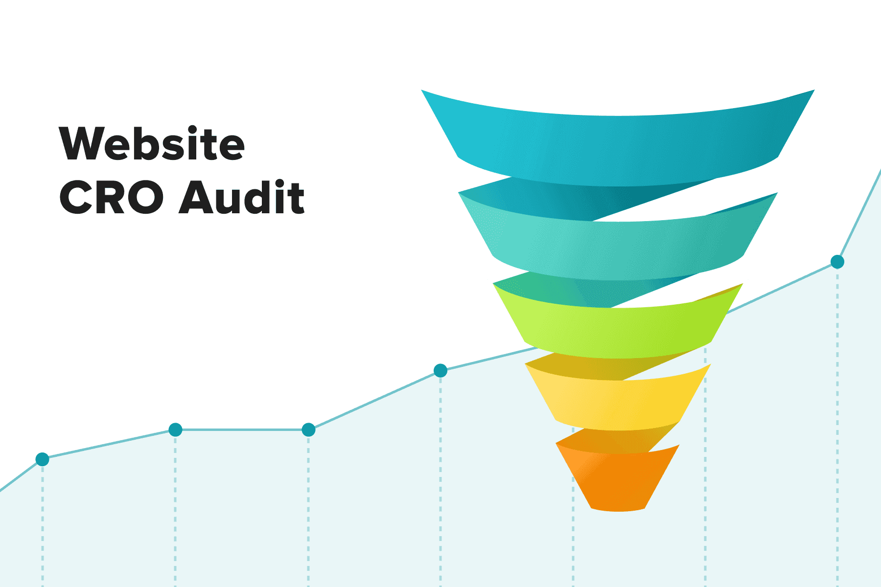
How will your team work on the store’s performance, design, content, and marketing to reach a polished user experience? Let’s move through an eCommerce sales funnel and plan customer experience upgrades based on people’s feelings, needs, and expectations at each stage.
Table of Content
1. The User Experience and Your Profit
Facilitating a customer journey is a neverending process. Technologies and fashion change, and so do public tastes, receptivity to marketing hooks, behavior, and preferred touchpoints. To not only sustain an existing customer base and revenues but also increase vital KPIs, businesses need to keep up with ever-changing trends.
However, many brands fall short of even basic consumers’ expectations related to website performance, usability, and customer support. Here’re some stats from Forrester, Salesforce, and other industry researchers:
- 79% of customers are likely to turn to other stores in case of a bad user experience on an eCommerce website;
- 79% encountered problems with navigation and search;
- 75% found information on product pages to be insufficient;
- 53% bounce if pages load for more than 3 seconds;
- 79% will probably tell friends and relatives about a poor UX they had;
- 53% would like to share a negative experience through reviews;
- 94% are inclined to place new orders after a positive customer experience;
- 83% state a seamless shopping experience across all touchpoints is vital;
- 74% are likely to revisit an e-store if it’s mobile-friendly;
- 33% say they’re happy with a shopping experience.
Given these insights, we can ascertain: there’s much room for eCommerce website UX improvement.
2. Improving eCommerce UX/UI Based on a Sales Funnel
Each enhancement, whether it be a design, marketing, or tech one, has its ultimate goal: to convert prospects into customers. Ideally, into returning ones. And since the UX in eCommerce is tightly linked with the sales funnel (pipeline), taking it into account is logical.

Explore our eCommerce portfolio on Behance
See how Onilab's designers and developers transform the UX and improve conversions for online stores across the globe.
An eCommerce sales funnel is a schematic representation of a customer journey. Basically, it consists of 6 stages: “Awareness”, “Interest”, “Evaluation”, “Decision”, “Purchase”, and “Loyalty”. Although the names and the division itself may vary, and the boundaries between stages might not be clear, the essence remains the same.
Below, we’ll go through all these phases and specify users’ needs, pain points, and behavior. Then we’ll look for eCommerce user experience best practices for each step.
2.1 Awareness: All About Marketing
Modeling a typical customer journey for an online store starts with the Awareness stage. Let’s say a prospect named Caroline wants to purchase a modern yellow sofa. She might google something like “yellow sofa buy”, come across lovely pieces on social media, or ask friends to recommend a store. Most likely, she’ll do it all at once.
At the awareness stage, brands endeavor just to be noticed; users don’t interact with a store yet. So businesses should meticulously work on the touchpoints preceding landing on the site. A whole lot of brands and marketplaces offer sofas, so an elaborated, overarching, and consistent marketing strategy is a must to raise the odds of drawing attention.
Good Visibility on SERPs
Appearing on the first SERP is a challenging but worthwhile undertaking. A successful plan includes on-page and off-page SEO as well as direct advertising. We’d outline some measures to improve the store’s position in search results.
- Revise on-page SEO to be higher in organic results. In particular, SEO experts recommend not overlooking long-tail keywords with lower keyword difficulty (KD). They’re more likely to bring the pages to the top compared to the most popular short ones. Besides, they can match specific user requests: if a person types a very concrete query, they’re often more ready to place an order than users with general requests.
SEO tools like Semrush and Ahrefs aid in determining prospective keywords for your industry. - Utilize Google Ads opportunities, especially the Product Listing Ads (PLA). When people input something product-related (e.g., “yellow sofa buy”), they see a gallery with relevant items at the very SERP top.
The product cards comprise photos, titles with some enticing details, prices, discounts, and links directing to the product pages. There also may be ratings and pick-up options. Google shopping results might become an additional selling channel for your store.
[onilab_carousel name="Product Listing Ads""]
- Finally, don’t forget that the loading speed and mobile friendliness do influence the website’s ranking. One of the modern means to enhance both parameters is transforming a store into a .
Well-developed Social Media
Instagram, Facebook, and other social networks give many possibilities to meet, engage, and convince prospects to take a closer look at your products. On Instagram only, you can build a full-fledged marketing campaign, provided you have the target audience there:
- The feed. Quality photos and videos can present your products. Stories, Viral Reels, useful live streams, and various contests raise brand awareness and engagement.
- Shoppable tags on photos and videos lead users to an Instagram shop. There, visitors can see product photos, details, a price, and a CTA to view items in the store.
- Targeted ads in the feed and Stories.
- Collaborations with bloggers of different audience sizes.
All in all, at the Awareness stage, people learn that a particular brand or product exists on the market.
2.2 Interest: Navigation and Search
We assume that Caroline lands on the store’s home, category, or product page from a laptop or smartphone. She expects to find a needed item (= a solution to her problem), so she starts interacting with the website and forming a first impression about its UX/UI. So it’s time to discuss and see eCommerce examples with good and bad design solutions.
Impeccable Navigation
If our prospect is a newbie, it will take a little while to get their bearings on the site. Navigation here becomes either a guiding light or an obstacle. In other words, you can’t provide the best eCommerce user experience without smartly organized navigation. This short checklist will help to identify whether you need to rebuild it.
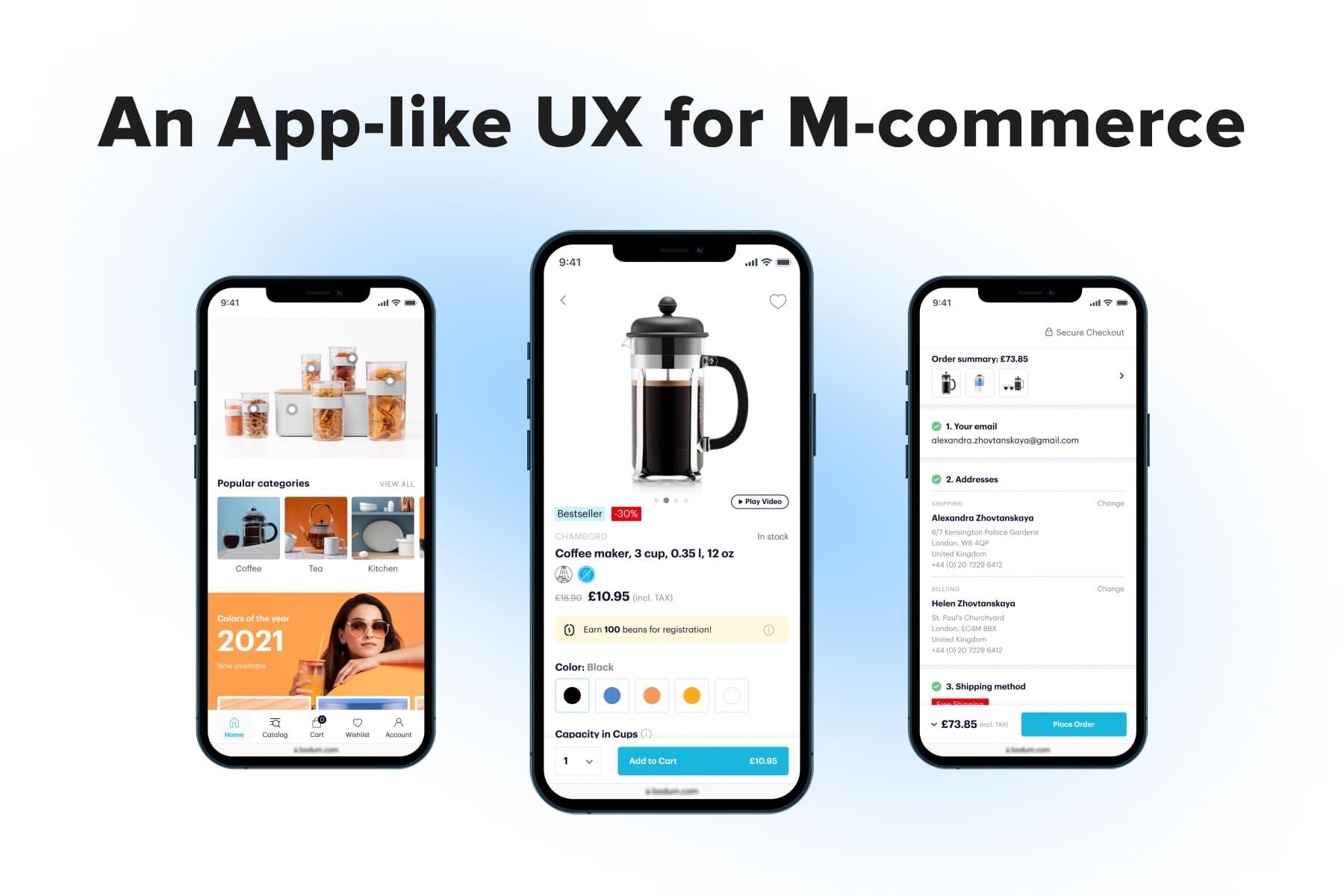
- The mobile version has a bottom menu. This element is a centerpiece of an delivering the best UX. Why? Just because all the critical controls are under one’s thumb.
In comparison, a typical hamburger menu is situated non-ergonomically and may hide an account, wish list, and other important icons. In a situation when mobile commerce is gathering momentum, it’s not wise to neglect the usability on cell phones. Below, you can see several online store examples, including . We optimized its eCommerce website, including the navigation menu.
- The menu is thoroughly structured. The more sections and subsections the store has, the harder gets the organizing task. A preferable option for desktop websites is a mega menu that takes up a significant area on the page and demonstrates a maximum number of subcategories straight away. That’s what we did on a website at one of our project stages.
Unlike it, the hamburger and drop-down menus hinder users from exploring the store’s assortment, although there’s much free space to utilize.
For mobiles, we’d warn you against using accordions in the menu since they provoke too much scrolling back and forth. Instead, consider opening subsections (especially if there’re many of them) in the new windows. For more information on what it may look like, take a glance at the screenshots below or read a case study about .
[onilab_carousel name="Mobile menu"]
- The search feature is optimized in design, speed, and relevance terms. Search is one of the most valuable navigational elements in the store. From the technical perspective, it’s worth accelerating the data retrieval as well as improving the accuracy of autosuggestions and search results. For more details, read our guide on tackling the issues with .
From the UX/UI viewpoint, the search ideally displays top requests, autocomplete prompts, and matching items. For example, the website search displays related products and suggested categories.
We recommend opening the search area in a full-screen pop-up on mobile and approximately a half-screen one on the desktop. This way, you allocate a wider area for instant results and simultaneously cover a distracting background. We profoundly discuss in a recent article.
Polished Home and Category Pages
When people don’t know the brand and need to get acquainted with it, their attention will first revolve around these sections. There are several eCommerce UX design rules that positively impact the user experience.
- The homepage must be connected with many product and category pages to take users further. In general, it needs to reflect what the store sells, what its USP (unique selling proposition) is, and why it’s beneficial to shop there.
- The category pages should have sticky bars/blocks. When exploring a catalog, visitors should be able to adjust filters and change sorting from any position on the page. This recommendation touches upon both desktop and mobile versions.
- On the category pages, mix infinite scroll with classic pagination pinned to the page’s bottom. Why so?
Firstly, people will have an idea about how large the selection on the page is.
Secondly, they can quickly switch between pages and return to the top without scrolling a lot. At the same time, you won’t force them to tap to see the next page.
- Always mention the number of search results, items in a particular catalog section, and how many products users will see after applying each new filter. This little improvement aids in avoiding cases when shoppers narrow down the request too much and end up having just a couple or even zero fitting products.
Quite often (and competent advertising on socials and in Goole contributes to that), buyers start on product pages. In this situation, the Consideration (Interest) step is less pronounced, and users begin to analyze the given details.
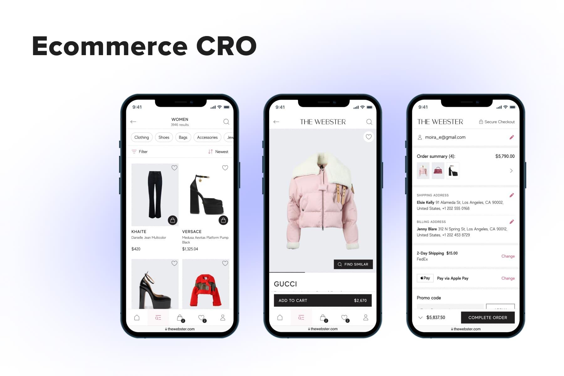
2.3 Evaluation: Product Pages and Item Comparison
When designing a frictionless user experience for eCommerce projects, our team put much effort into the product page as a cornerstone of the Evaluation (Analysis) stage. Largely based on its content, leads decide on placing an order. There’s an endless list of critical traits that make such a page and reinforce a desire to buy. We’ll zero in on a few.
All-encompassing Content
While choosing the sofa, Caroline is worried about many things:
- What will the sofa look like in reality? Will it live up to my expectations?
- If not, how and when can I return the piece?
- What about the warranty?
- When will my purchase be delivered?
- What about assembling the sofa?
The sooner the store addresses these questions and dispels doubts, the better the chances Caroline will convert into a customer. It’s perfect if she finds all the answers on the product page: quality photos and videos, delivery terms, a return policy, assembly instructions/an option to arrange an assembly master’s visit, and so on.
Conveniently Organized Content
While choosing an item, shoppers need as much data as possible, so product pages are loaded with textual and visual information. It goes without saying that the content itself must be of excellent quality. So the main question is how to fit all these descriptions, technical details, options, photos, and videos into the page in a handy way.
Here are a couple of principles Onilab’s designers stick to in the projects:
- Displaying all the options: colors, sizes, volumes, modifications, etc. This way, users instantly estimate whether the needed configuration is in stock. If there’re too many variations, you can place them in sliders.
Besides this, when users are forced to open multiple menus, they get a bit annoyed. In turn, designers must aim for the opposite: to make studying the product effortless, requiring fewer actions.
Below you can see a store that hides the options and exacerbate the situation by opening them in drop-down menus. When opened, such a menu still doesn’t give enough info about what’s available and what’s not; users have to scroll.
- Opening long descriptions in pop-ups. Don’t display these large chunks as is because they will make the page endless. Instead, structure the data into a sort of menu for faster navigation.
Brands frequently organize the info in expandable-collapsible accordions, but we’ve explained earlier why it’s not the best idea. By the way, the tip is applicable both for mobile and desktop store versions.
Streamlined Product Comparison
As the name suggests, the Evaluation stage implies analyzing and often comparing items. Prospects can do so both on competitor websites and on yours. If the store sells electronics, home appliances, and other complex goods, having the product comparison feature is essential.
- Make the comparison option visible on the catalog and product pages. There could be an icon or button. Some brands place a link somewhere on the page, lowering the chances for it to be noticed.
- Notify users that items are added to the comparison. People need a clear sign of a successful action. We prefer to use pop-ups for this matter. There you can mention how many products users can add and place a button to go to a comparison page.
- Implement the “Add to cart” button on the comparison page. Cutoffs are one of the core principles leading to a positive UX. Let’s say Caroline obtained the needed arguments in favor of item X and decided to buy it. You can force her to go back to the product page, or you can omit this redundant step.
Omnichannel Traits
The eCommerce industry is striving to make the UX frictionless, and omnichannel is a sure way to get closer. It unites various touchpoints (online and offline stores, social media and a website, and so forth), making interactions with a brand consistent and seamless.
Most often, eCommerce UX best practices in omnichannel come down to adding BOPIS (Buy Online, Pick up In Store) and BORIS (Buy Online, Return In Store) shipping options. When people get a glimpse of the available delivery options on the product page and see the handy ones, it can become one of the decisive factors for them. We meticulously crafted this page for , implementing all the possible shipping options.
Thus, the overall meaning of the Analysis stage is simplifying the assessment process and convincing prospects that the piece is suitable for them.
2.4 Decision: CTAs and a Cart
This stage is also called “Engagement”. It means Caroline is acting toward closing a deal: she taps on the “Add to cart” button, gets to the corresponding page, and observes her order. Surely, there can be cases when prospective customers skip the cart stage and go straight to the checkout. But let’s consider a more common customer journey and eCommerce UX design best practices for it.
Noticeable Calls to Action and Clear Feedback
Let’s briefly enumerate the main requirements for CTAs on the product page:
- It’s placed into a wide and vivid button;
- The price is duplicated on the button;
- It’s pinned to the page’s bottom in a sticky bar so that it remains in plain sight all the time;
- The sticky bar contains a quantity selector;
- There can be more than one button: “Add to cart” and “Buy now”/”Add to quote”.
After pressing the CTA, users must see that the operation was successful. There’re a couple of popular ways to showcase it:
- A pop-up with a success message. It usually takes up half the screen (on cell phones) and displays core product details and CTAs like “Go to Cart” and “Continue shopping”. Basically, this window can be closed by pressing on a CTA, swiping down, or tapping on the background.
Sometimes it has some controls (quantity selector, a bin) and a cross-sell section. In this case, a store can even substitute a full cart page with this mini one. - A disappearing success message. While users need to close the previous option, this one doesn’t require any action. So usability experts prefer applying this type to stores that sell a large number of items per order.
A Handy Cart Page
There can be variations based on the industry, the complexity of the goods, and the average quantity of items in orders. The configurations might be different for mobile and desktop templates as well. Here are two popular variants as of now:
- The store has a mini cart on the desktop and a separate cart page on mobile. The desktop format allows it to show vital content without sending visitors to a separate page. So, shoppers can open and check the cart while staying on the current product, category, or any other page.
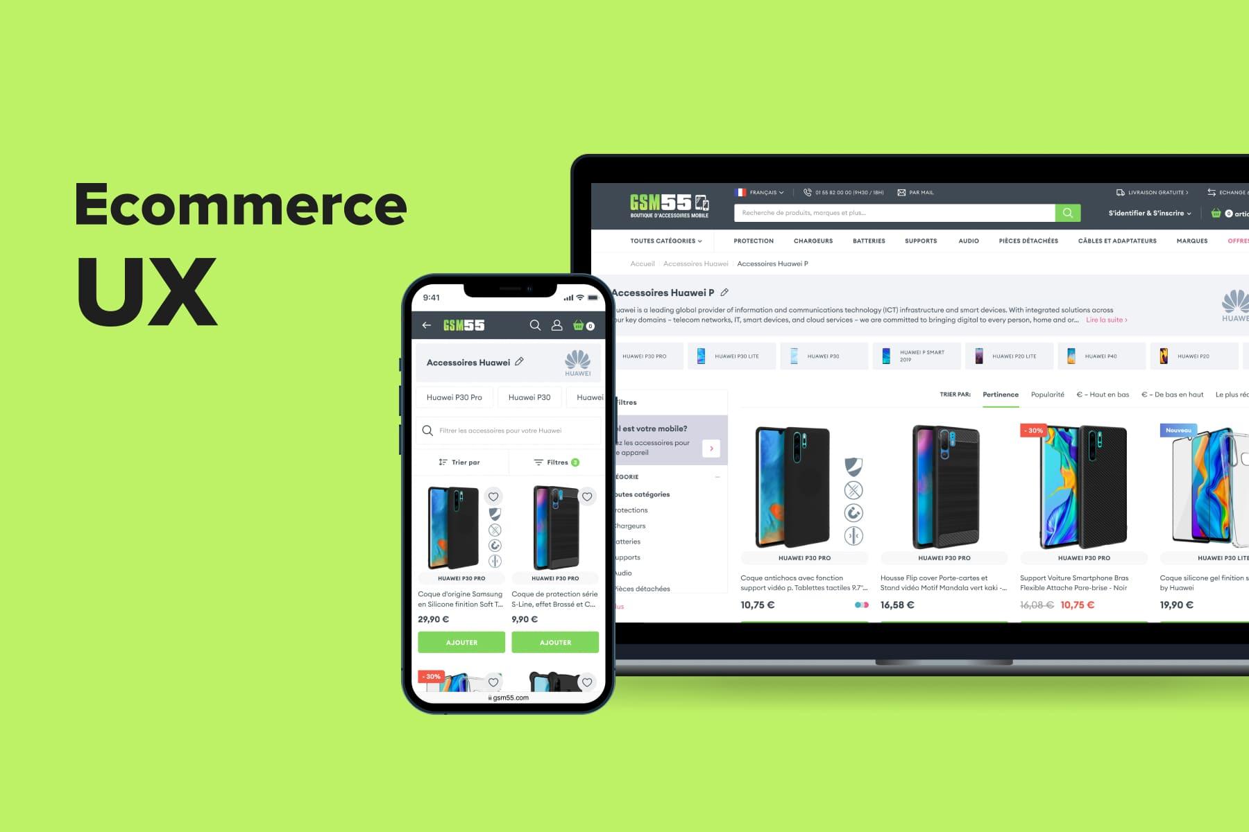
- The store has full-fledged carts both on desktop and mobile. We’d say it’s a preferable option if your store has some non-standard functionality. For instance, it’s a marketplace that sells goods from various merchants: it simply needs to fit more content on the page. This option turned out to perfectly fit , a French accessories seller.
And here’s the primary recommendation for the cart: don’t hide the editing functionality at this step. It must be easy for the user to change their mind: add more units, delete, or move to the wish list.
Read our dedicated guide to learn more about for eCommerce.
2.5 Purchase: a Checkout
At last, Caroline lands on the checkout page. The sales funnel is almost passed, but the chance she will abandon the order is high. It’s just because checkout is the most tiresome part of the journey, particularly for a newcomer. So while searching for how to improve the user experience on an eСommerce website, you’ll surely find many tips relating to the checkout process.
The Checkout Structure
Among several checkout types, one that employs pop-ups really singles out in terms of the UX. Here’s how it works:
- It’s a one-step checkout where the forms are organized in a menu. This structure informs visitors about the number of steps as soon as they land on the page. A classic one-step checkout is inferior in convenience because all its fields are expanded, making the page lengthy. Also, users don't know what steps will be next and how many of them are ahead.
- Address, shipping, and payment forms are opened in pop-ups. Unlike the case with accordions, there’re no significant content shifts that are so irritating, especially on smartphones. When a customer finishes one form and presses a CTA, the next can even appear automatically to ease the flow for users.
- It doesn’t imply delays due to loading the next pages. It’s a huge advantage over a multipage checkout because users don’t have to wait extra seconds.
The Forms Structure
Another important task is working on numerous fields that users need to fill out. We’ll share several tips that help to improve checkouts on our projects.
- Locate labels inside fields. This move enhances the user experience in two ways. Firstly, you save precious space, which is always good news for mobile layouts.
And secondly, it prompts shoppers where exactly they need to put their data and eliminates possible confusion. Again, it’s a must for the store’s mobile version, where it’s harder to keep all fields in sight. For more insights on optimizing your mobile e-commerce experience, visit our detailed guide on . - Ensure each field is connected with the right keyboard type on phones. It’s an easy task for developers, and customers will be glad to see a special keyboard on the email field and a numeric one when inputting the card details and zip code.
- Make errors as vivid as possible. When fields are filled out incorrectly, you can make their frames red and mention the type of mistake somewhere near the corresponding field.
- Add contemporary payment methods like PayPal, Amazon, and Apple Pay. They will be the most convenient and fast options for a considerable part of your clientele. Anyway, the more variants you offer, the higher are chances of successfully closing a deal.
You’ll find more actionable recommendations in our article on the .
2.6 Loyalty: Everything Matters
Also called Retaining, this stage implies that if satisfied with the shopping experience, people will return and eventually become regular customers.
As she went through the cycle, Caroline formed a holistic picture of her customer experience. Based on this evaluation and main sentiments, she’ll decide whether to return to this shop next time.
The Overall UX/UI
Apart from the eCommerce UX tips we’ve already discussed, there’re more ways to foster better customer attitudes towards an e-store.
- The website loading speed. Everybody detests waiting, and when it comes to sites, irritation only escalates: visitors don’t forgive even several seconds of delay. Just imagine it happening each time people go to the next page.
And as we mentioned in the beginning, speed is an important ranking factor for Google. So, top-notch performance is mutually beneficial for purchasers and businesses. One of the best solutions to achieve it is creating a headless commerce website: for instance, a progressive web app (PWA). Owing to its architecture and modern technologies behind it, this type of site boast lightning-fast speed.
Obviously, transforming a regular website into an is both a laborious and costly process, but it will pay off in short and long-term perspectives. The new level of flexibility will allow businesses to swiftly adapt the store to changing conditions and emerging trends. Enhancing the interface becomes easier, as well as designing and connecting the frontends for new touchpoints. Our article will acquaint you with . - Customer service. A lead may interact with your personnel on social media, via a live chat, and in the store. All these episodes contribute to forming (or not forming) a sense of trust and loyalty. People will take note of everything: the speed of response, the tone of voice, the dedication to tackling an issue, and, surely, the outcomes.
Besides team building and training, technology comes in handy. Consider adding a chatbot to the website and Facebook Messenger to relieve the pressure from live agents. Chatbots can’t resolve complex problems, but they’ll handle many typical (and boring) ones. In addition, they don’t have working hours limits. - Customer feedback. Buyers always seek reviews and want to be able to leave feedback. If you don’t have a dedicated section on the product pages, people will probably go google reviews on other websites. It makes the likelihood of not returning back extremely high.
Retaining Best Practices
Marketing plays a great role in re-engaging customers. We’ll mention only a few actionable tools.
- Discounts for subscribing to email send-outs. It’s a one-time trick, but it has significant potential. Basically, stores show new visitors a pop-up with an offer. But if they opt for guest checkout, the site can duplicate the proposal while completing an order.
- Send enticing newsletters. Subscription expands room for maneuvering in customer retention terms. Yes, people won’t open each email with a new drop or selection, but they’ll definitely be interested in seasonal sales, promo codes, and notifications when something gets back in stock. You should also utilize email marketing to send customers their abandoned carts.
- Create a loyalty program. Finally, bonuses are a perfect motivation for continuing to shop with a particular brand. Most customers won’t seek another store if they are accumulating discounts in a current one.

Get a Free UX Audit Example
Read our demo UX report exploring the online store’s checkout issues.
Improving Ecommerce User Experience Doesn’t Tolerate Delays
Ecommerce is replete with offers. It’s self-evident that if one store doesn’t meet the crucial UX requirements, a prospect will find another in a few seconds. Only by constantly analyzing UX/UI, tech, and marketing trends and testing and applying new features and approaches can online stores boost their bottom line. That’s where you may need outside assistance from a . The investment will surely pay off.
We picked apart some constituents that deliver the best user experience for eCommerce websites: usability and performance vitals, design and content best practices, SEO and marketing strategies, social media, and customer service tips.
It’s the quality of in-store interactions that largely determines the successful moving through the sales pipeline. If your store is in need of a user experience revamp, the Onilab team is here to help with a truly customer-centric across devices.