Conversions are what all online stores strive for day by day. Each and every team knows how challenging it is to increase the eCommerce conversion rates even by fractions of a percent. Marketers and store owners are also aware there can be plenty of reasons for CR drop-offs.
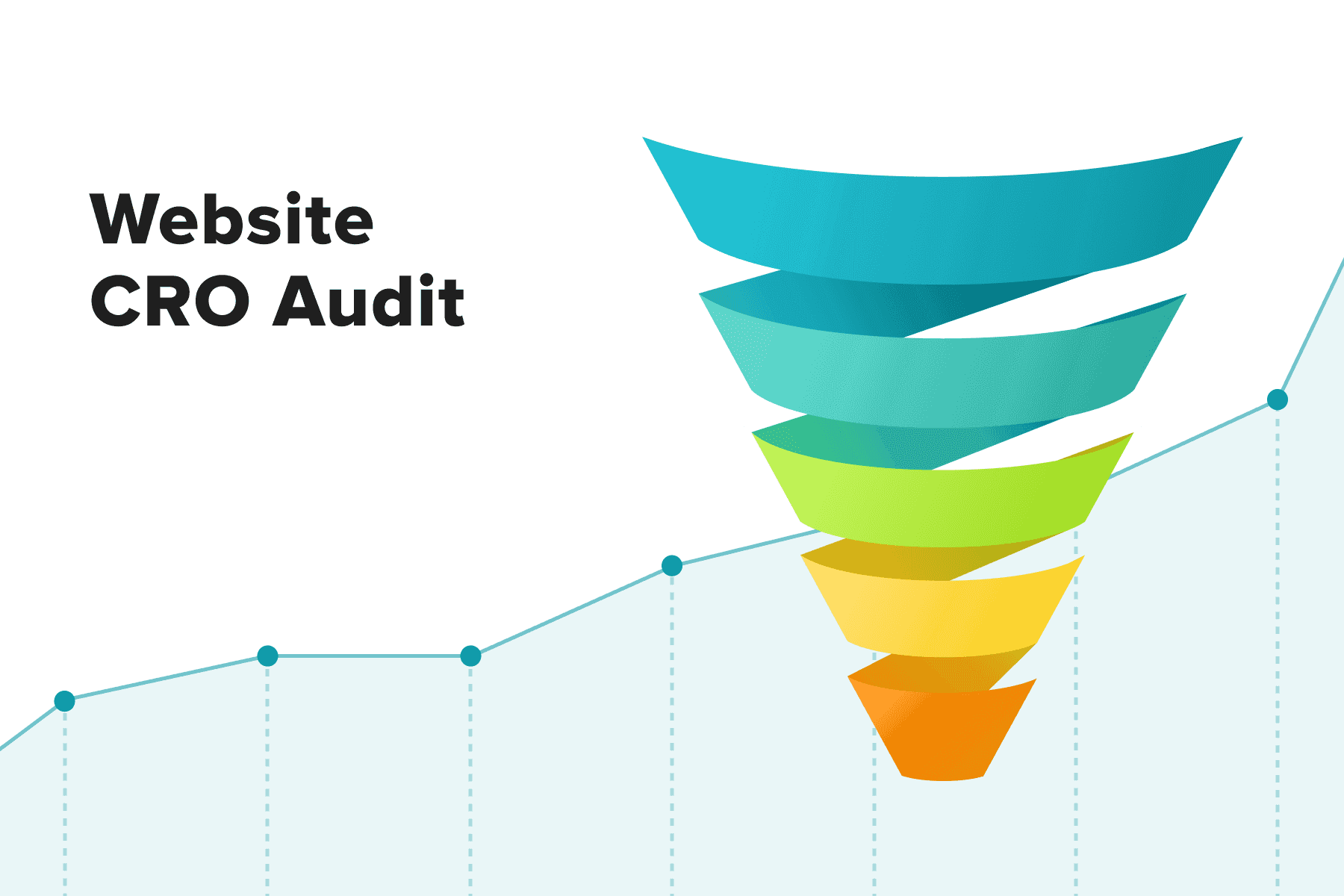
Fortunately, a bunch of conversion rate optimization (CRO) measures are at our disposal. CRO is a multifaceted "toolkit". It's about tweaking a website's UX in many ways: adding and removing features, optimizing performance and design, and revising promotional and personalization strategies. It's all about making a customer journey smooth and fast so that store visitors turn into customers. This conversion optimization blog post focuses on typical reasons behind unsatisfactory CR, shares tried-and-true eCommerce conversion best practices, and discusses data-backed CRO and A/B testing.
Table of Content
1. Prepping for E-commerce Conversion Rate Optimization
To calculate the conversion rate, we divide the number of people who performed desired actions on the website by the overall number of visitors and then multiply by 100%. For instance, if 100 000 users visit your online store monthly and 2000 place orders, then the CR is 2%.
1.1 The Types of Conversions
While the average eCommerce conversion rates revolve around 3%, the CR may fluctuate depending on a region, device type, industry, and channels users come from (ads, organic traffic, email, social media).
For instance, the UK's online shop conversion rate in 2021-2022 exceeded 4% (according to the conversion rate optimization statistics 2022 provided by Statista). In the same period in the US, the average conversion rates stayed at about 2.3-2.6%. Other countries had even more modest eСommerce conversion rate benchmarks: 1.2-1.6%. It's crucial to take it into account and measure conversions from each source.
Apart from that, numerous so-called micro conversions happen during a customer journey. Each of them raises the odds of reaching the main conversion, which is obviously a transaction. Talking of eCommerce, here they are:
- Newsletter subscriptions;
- Creating an account;
- Adding items to a wish list;
- Sessions with product views;
- Sessions with adding products to a cart;
- Sessions with moving to a checkout page.
Tracking and comparing data on micro conversions is also among the top priorities for store marketers and data analysts. It helps obtain valuable insights and plan efficient CRO measures, let alone you'll be able to gauge their impact accurately.
1.2 How Is Conversion Rate Optimization Beneficial to the Business?
Conversion rate optimization raises businesses' profits by transforming more curious passers-by into customers. But while the main aim is to improve the eCommerce conversion rate, the web conversion optimization brings many more positive outcomes
- CRO refines the user experience. By eliminating roadblocks, you make the customer journey frictionless and quick. It, in turn, is good for the bottom line and your store's ranking in search engine results pages (SERPs).
- CRO helps enhance other critical KPIs like bounce rate, average order value, customer lifetime value, and so forth.
- CRO gives a profound understanding of the target audience since it implies constant analysis and testing of hypotheses.
- CRO might help reduce customer acquisition costs and allocate digital marketing expenditures smarter. Conversion rate optimization tips are focused on already existing traffic, making the most of it. And sometimes, it's better to optimize particular elements and content in the store rather than launch a new promo campaign.
1.3 Data-Driven CRO 101
All the benefits above are closely interlinked. However, the extent of improvements after every web conversion optimization iteration hugely depends on how deep the analysis is prior to and after each step. The role of data analysis is hard to underestimate, as it helps to:
- Learn more about the leads, new customers, and regular ones;
- Spot particular issues on the website to tackle them;
- Gather information for comparison after eCommerce conversion rate optimization.
We can collect data from a few channels. Let’s talk about the ones we at Onilab use most frequently when providing .
A Shopping Behavior Analytics Report
Online stores actively use Google Analytics as a comprehensive, reliable, and free service for tracking their KPIs. One of the most valuable sources of insights there is the shopping behavior analytics report. It reflects the website’s conversion funnel:
- All sessions;
- Sessions with product views;
- Sessions with add to a basket;
- Sessions with checkout;
- Sessions with transactions.
You can explore this and other reports from various sides:
- Identify the best and worst-performing traffic channels. Let's say you see the Facebook ads bringing few leads, or they're reluctant to become customers. Then it prompts you to revise the activities: change the target audience or even give up this channel as less relevant for the business.
- Compare this month's figures to the ones from the month before, the same period of the last year, etc., and look for differences or patterns. For instance, you notice more users have visited the store for the previous 30 days, but the order amount dropped. It means the team might have performed well at the user acquisition stage, but something on the website deterred shoppers from taking action. Then it makes sense to dig deeper into reports at the middle of the funnel and further.
- Do the cohort analysis. Cohorts are groups of users who landed on the site in a given timeframe and/or have a common trait (e.g., they came from the same channel). The goals are a) to track key metrics (conversions, average revenue per user, customer lifetime value, etc.) for these groups over time, b) find out what happens to them further, c) compare them with each other, and d) estimate the effectiveness of particular touchpoints, marketing spending, and other steps (like CRO).
Data analysts recommend, though, to always start analysis and tweaking in reverse order, from sessions that got to a checkout but then ended. Why so? Firstly, it's vital to find and root out the issues hindering potential customers with the highest buying intent from closing deals.
Secondly, the checkout with all its forms and adding lots of personal data is deemed by usability specialists as the most troublesome part of the customer journey. That's why almost every store has some work to be done checkout-wise.
Related Metrics
Other popular KPIs can provide potent ideas on how to improve the eCommerce conversion rate. If some of them are far from perfection, they're indicators of issues deserving attention in the first place. We recommend keeping tabs on the bounce rate, exit rate, click-through rate, average session duration, page depth, and more.
Heatmaps, Scroll Maps, and Recorded Sessions
By utilizing these tools, you'll be able to analyze users' behavior with more precision. Heatmaps reflect the highest and lowest engagement spots on each page and give an idea of rearranging or changing some elements. We recommend opting for the tools with more advanced interactive heatmaps to view hot and cold areas inside accordions and pop-ups as well.
Scroll maps showcase how deep visitors dive into the page content. Session videos aid in spotting behavioral patterns and barriers visitors face while browsing the store and making purchases.
Customer Journey Maps (CJM)
If done by professionals, CJMs give a clear idea of users’ behavior, emotions, wishes, and pain points as people move toward placing an order and further. Therefore, it's more understandable what you need to level up the user experience (and eventually CR).
Onilab’s designers perform customer journey mapping this way:
- Interview a client to get acquainted with a business, its introductory data, problems, and expectations.
- Analyze GA reports (in tandem with a data analyst) with an accent on traffic sources, types of devices and OS, screen resolutions, conversions, shares of new and regular customers, average value/number of items per order, popular categories/goods, and more. Abnormalities draw special attention. If it's an existing store, the team usually takes a yearly dataset.
- Conduct UX research: user interviews, surveys, and video sessions.
- Collect customer feedback: examine info provided by regular buyers and customer support to identify needs and typical problems.
- Personally go through the customer journey. This type of audit helps change the perspective and detect more issues shoppers may encounter.
Based on all this information, UI/UX designers create personas. These are two or several largest customer segments with similar traits and behavior. By the way, customer segments for new projects with no real-world data available are called proto-personas. They're based on the overall market and competitor research.
For instance, one of our clients has two major personas. The first is existing customers, who mostly come from the company's newsletters and land on product pages right away. Their journey is rather fast because they know the site well, are logged in and have account details saved. The second is newcomers who found the store on Google and don't know anything about the brand and its goods. Their journey is lengthy.
In our approach, we tailor strategies individually for each client, depending on their business type. This includes applying conversion rate optimization for luxury eCommerce for high-end clients and equally effective tactics for our regular clientele. We made two partially different CJMs because these personas have their own shopping experiences, face different obstacles, and need specific features. Conversion optimization for luxury online retailers would probably entail speeding up the ordering process: having direct access to the checkout from product pages and the “Add to cart” buttons in the catalog. The latter group needs top-notch navigation and a comprehensive idea of why this store is better than others. The latter needs top-notch navigation and a comprehensive idea about why this particular store is better than others.
Importantly, in this case, regular customers account for 15% of the traffic but striking 87% of the revenue. But anyway, we have a double goal: to retain existing purchasers (and keep them happy) and encourage new visitors to order (and come back).
CJMs contain lots of design, technical, marketing, and content ideas to facilitate the customer journey, including the implementation of the best-rated content conversions for eCommerce. Often there’re dilemmas and hypotheses to prove or refute. And the best means to do so is A/B or multivariate testing.
1.4 Do You Need to Perform A/B Tests?
It's a well-liked solution when designers or marketers come up with more than one perspective idea or it's not obvious how users will interact with one or the other version.
Basically, the team prepares the versions of one page and then utilizes a dedicated service to show v1 and v2 (or a few) to equal groups of random site visitors. Such tools then collect analytics and make heatmaps helping to identify the best-performing version.
Frankly speaking, clients often refuse to conduct split tests. The reasons are pragmatic and understandable: time and money. While introducing two versions of control (like button colors) is easy, designing and developing two features with drastically different logic can be quite costly.
However, often testing is worth extra spending as it aids in finding a solution that will bring more fruitful results like transactions. Eventually, a seamless user experience always pays off.
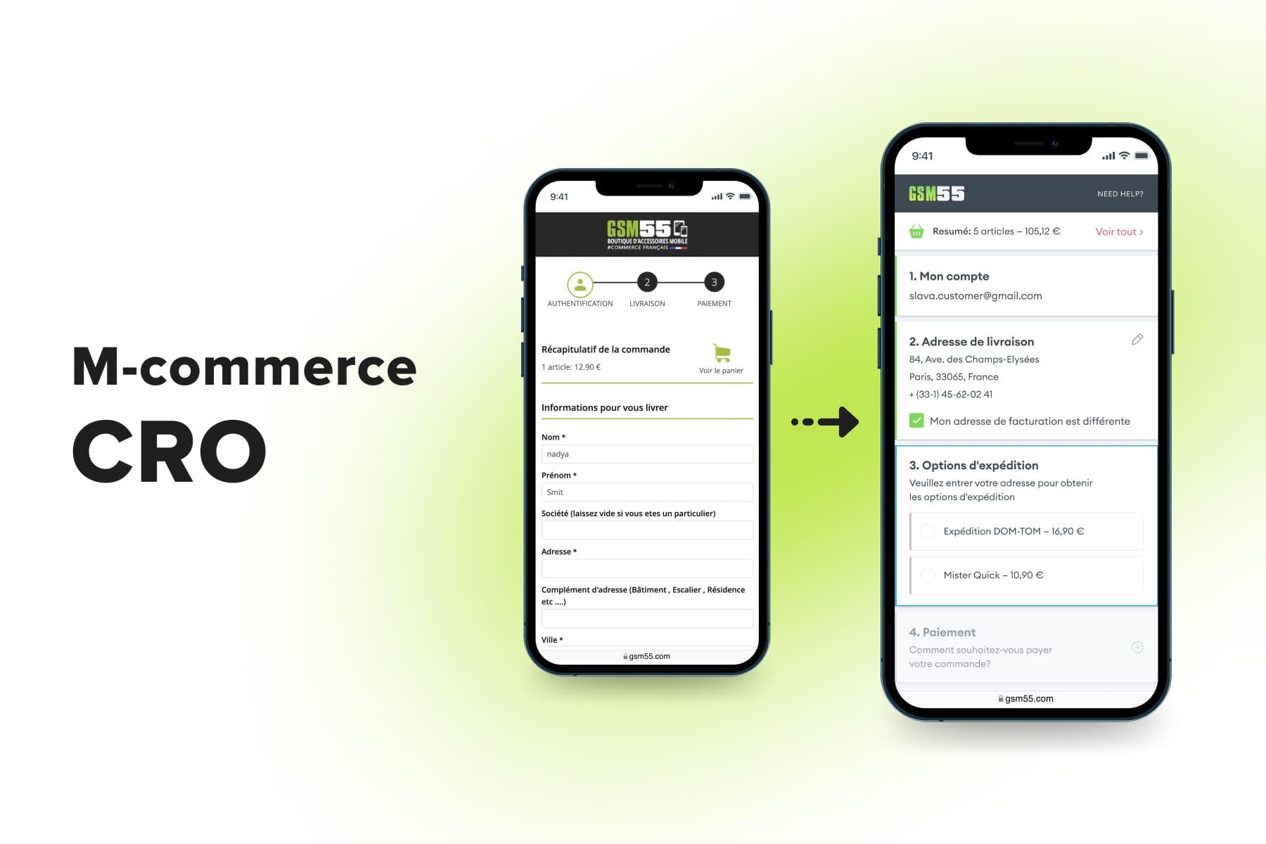
Look at the examples from , one of our clients selling device accessories. You can delve into the comprehensive case study, while here, we’ll zero in on several key decisions we’ve made when working with this store. In the first case, we searched for an optimal place for the final CTA on the checkout page. Initially, it was implemented at the bottom of the page. But as users opened and filled out the forms, the button lowered and disappeared below the fold. The page looked a little baffling, with no button to finish in plain sight.
So we decided to test a side button that is fixed and always visible. It might even serve as a prompt: when people press the CTA but haven't finished with fields yet, it highlights the step that needs one's attention.
Later we added a scrollbar to the product list not to alter the block size and keep the summary and the “Complete order” button in the same place all the time. Analytics confirmed this second version performed better, so we picked it.
The second case was about wrong device model choices. Initially, we had a model name at the top of the page. But some users overlooked it, confused the given model with similar ones, and ended up with non-compatible items. We developed a feature to double-check the model while browsing products. These pop-ups help to reduce the number of returns (and customer irritation).
To gain the most reliable results, test one feature/element per iteration. The rest of the page should be identical; otherwise, it'll be harder to say what exactly made a difference in the page performance.

Get a Shopping Cart Optimization Checklist
Learn what issues on the shopping cart page prevent your visitors from becoming customers and how to fix these problems.
2. E-commerce Conversion Optimization Best Practices
In fact, each store optimization, be it marketing, technical, design, or content adjustments, directly or indirectly affects conversions. In this guide, we've opted for the most relevant methods. Some eCommerce CRO recommendations will be less, and others more challenging to implement. But, as we mentioned in the beginning, every tenth of a percent matters and is worth endeavors.
We'll go through the conversion funnel, which is characteristic of online retail, and emphasize what can be done to optimize conversion rates for an eCommerce site at each stage, from landing pages to checkout. We'll skip the very first stage (“All sessions” in GA), which is more about lead generation; you can find some advice in the article about . Here we’ll focus on the user interactions with the website.
2.1 Conversion Optimization for an E-commerce Website: General Advice
The following upgrades touch upon the whole website, and they're a fundamental answer to the question, “How do you boost the retail conversion rates?” These are deep performance optimization and switching to the mobile-first approach in design. Of course, these improvements require painstaking work and significant funding. Still, eCommerce businesses must undergo such “treatment” sooner or later.
Go Mobile-First
Now marketing and sales experts observe a startling trend. Statista says that in 2022, 73% of all eCommerce traffic and 63% of orders came from mobile devices. At the same time, desktops are still holding first place regarding the conversion rate, followed by tablets and smartphones.
What does it mean? Actually, missed opportunities. These figures indicate that people tend to browse stores from their phones rather than PCs, but something deters many shoppers from completing orders. Something is wrong exactly with the stores' mobile versions. And usually, it's a poor mobile UX that causes irritation and cart/checkout abandonment.
The issue's roots partly lie in the desktop-first approach to designing websites. A squeezed and slightly altered desktop version can't work well on much smaller screens of smartphones with a completely different interaction logic.
That's why shifting the focus is one of the top web conversion optimization tips. When redesigning stores for our clients, Onilab's team starts with a mobile version with all smartphone-specific usability principles in mind and then modifies it for PCs. You can compare the previous and current store versions of , an online store we worked with, and read the full case study on our website.
Interestingly, it's beneficial for both themes in usability terms. Going mobile-first helps to create well-thought-out and decluttered layouts since designers have very limited space and need to provide all the needed functionality. The article on is fully dedicated to the advantages of this approach.
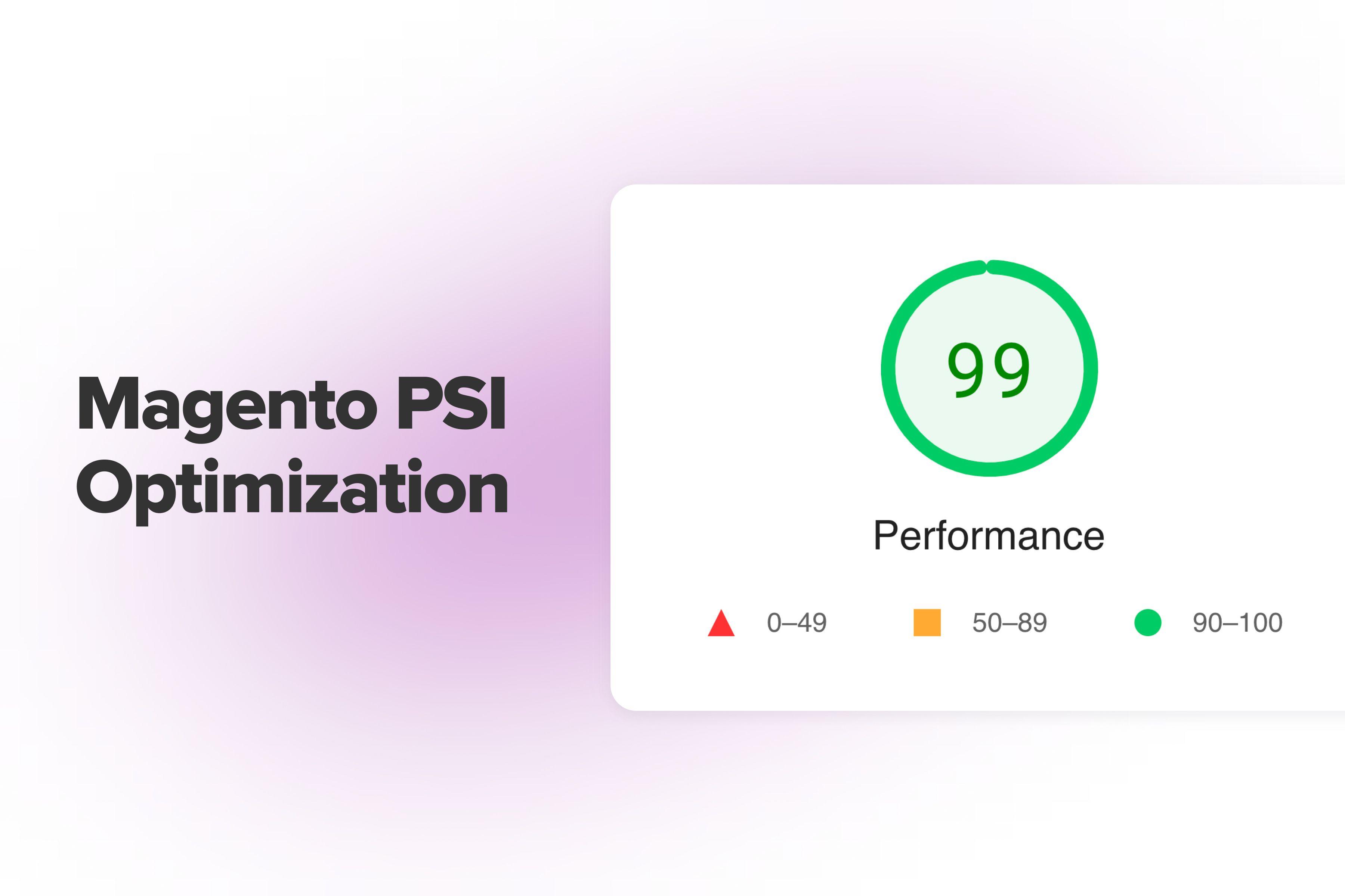
Conduct Performance Optimization
It's not one of pure eCommerce conversion-wise tips: website speed also greatly impacts the UX and SEO rankings. Anyway, it's in your best interest to do whatever it takes to keep both mobile and desktop versions of the store in the green performance score area in PageSpeed Insights.
Constant performance tests and fixes are inevitable for running a successful store. Here is a sort of checklist you can use for performance optimization:
- Upgrade the CMS and the third-party modules to the latest versions;
- Check your hosting solution; you might need more server capacities;
- Revise the extensions, make the needed updates, and get rid of redundant ones;
- Optimize and minify static content (CSS, JS, multimedia);
- Integrate a more refined search engine;
- Improve a caching strategy;
- Consider rebuilding the whole website architecture as a headless commerce solution, e.g., a (PWA). This type of application unites the best traits of websites and mobile apps. On the one hand, it's installed on one's smartphone (and accessed via an icon on a home screen), provides an app-like user experience, and operates really fast. On the other hand, it occupies tiny storage space on the device, unlike native apps.
You’ll find an in-depth explanation of these tips in the and guides.
2.2 More Sessions with Product Views
Focus pages: the homepage, categories, and landings.
Now let's talk about how to improve conversion rate in eCommerce from page to page. Prospects often start browsing your store from a home, promo, or category page. The website should persuade people that it's worthy and direct them further, namely to the product pages. Learn how to improve from our article.
Rethink Desktop and Mobile Navigation
Many potential customers see your store for the first time. For them to not bounce and continue shopping online, it's critical to have comprehensible, intuitive navigation. The primary aspects to consider are as follows:
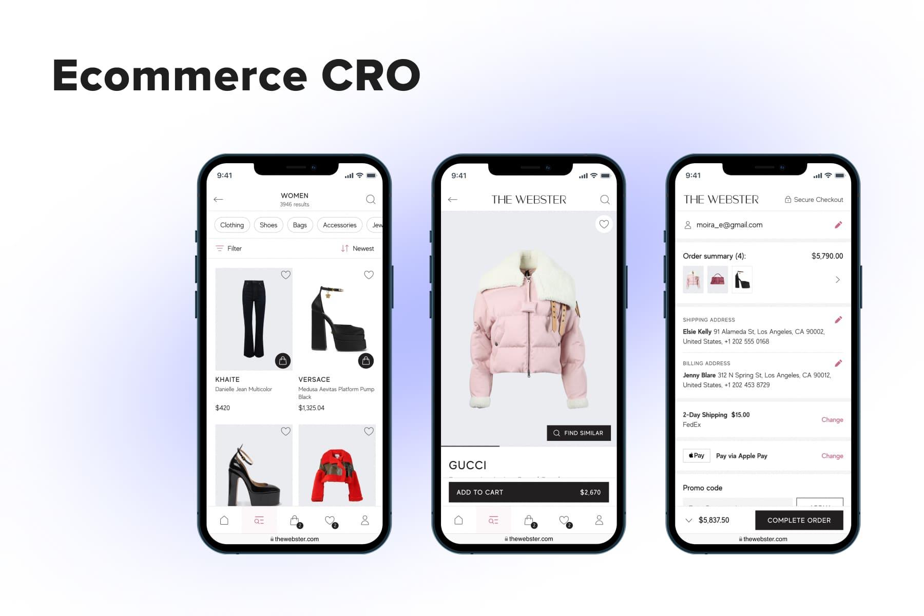
- The main controls should be conspicuous. It's a poor UX if the cart, account, wish list icons and search field are hidden somewhere. Compare the home page of , one of the from our portfolio, with Estee Lauder’s one.
- The right menu type makes a difference. For the desktop templates, we pick variations of a mega menu as the most user-friendly design. For the mobile ones, we highly recommend adopting an app-like tab bar fixed at the bottom of the screen. Read more about the menus for desktop and mobile in the article.
- In search, both technical and UX sides matter. It needs to be speedy and highly accurate when showing autocomplete suggestions, autocorrections, and results. Here is more on . On the other hand, smart design will make looking for items handier for users as well. A large search area opening in a pop-up atop the current page, popular requests and products shown before users even start typing, and a notable “Clear all” button are amongst the basic .
- Filters should catch more attention. Well-tuned filtering saves customers a lot of time because it eliminates irrelevant items and narrows the selection to a manageable size. But many eCommerce websites seemingly don't care whether their filters are convenient to use on smartphones/laptops. We dedicated a separate article to the . Below, there are a couple of screenshots from , one of our clients. You can observe our design solutions for organizing filters and explore the full story on our portfolio page.
Add an Engaging Benefit Bar
As we've said earlier, it's also vital to entice website visitors, especially newcomers. Let's first talk about the essence: what are these “baits”? Nine times out of ten, they're all about bargains and convenience:
- Discounts: seasonal sales, Black Friday, Cyber Monday, promo campaigns for particular brands/categories, and so on.
- Advantageous shipping terms: free of charge; a relatively low threshold for free delivery; fast.
- Extended return terms: 30 or 60 days instead of the typical 14 days.
- Special offers with several benefits: “Extra 20% off, plus free shipping | Ends in 0d 2h 35m 10s”.
- Extra guarantees: “2-year guarantee on parts, repairs, replacements, and exchanges”; easy refund.
You got the gist. The message may contain several benefits, but it must be concise. And what about the form? Benefit bars are good at making important announcements visible as soon as people land on the website, given the customer journey might not start from the homepage with promo banners. A perfect benefit bar meets the following requirements:
- It’s a stripe above/beneath the header: people have accustomed to seeing such messages in this area.
- It occupies a tiny part of the page: it's critical for mobile layouts not to make the bar too wide and show more content in the above-the-fold area.
- It’s persistent: as shoppers go from page to page, the bar remains a reminder of the store's perks. The only exclusion is the checkout: it must be free of distractions.
- It contains a link to the discounted selection or delivery terms (preferably opened in a pop-up so that users don't leave a current page). There can be more than one link.
- It doesn’t look aggressive. Some brands like vivid benefit bars or add alternating ones with different background colors for a flashing effect. They're more visible than black or gray and static, but there's a risk of annoying people. You can still opt for a color that contrasts with the layout.
Offer an Extra Discount for Subscription
Basic and familiar as it is, this trick still effectively kills two birds with one stone. It improves the odds of closing the very first deal and collects emails for promotional send-outs. It's hard to recall something quite as actionable as this move for attracting new customers.
Traditionally, it's a pop-up with one field for inputting an email address, accompanied by a short message. It promises a promo code for 10 to 15% off the first order and says that by subscribing, a person will be the first to receive newsletters with exclusive offers (sales, new arrivals).
2.3 More Sessions with Add to Basket
Focus pages: category and product pages.
To boost website sales fast with eCommerce conversion rate optimization, we need to bring changes at each stage (and page). Suppose potential customers got their bearings in the store, saw your attractive offerings, and are ready to move further: choose items. But numerous nuances could hinder them from adding products to a cart. What can we do to resolve this next challenge?
Organize Category/Search Results Pages
The fever steps the customer journey consists of, the better. At this stage, it's possible to provide a cutoff in addition to the classical “category-product page-cart” path. Product cards, in this case, should be feature-rich, containing:
- Items’ names;
- Prices;
- Tags (“-30%”, “new”);
- Wish list icons;
- Options (colors, volumes);
- “Add to cart” buttons.
Indeed, the desktop and mobile designs will differ to a certain extent. For instance, displaying listings with product options on smartphones isn't the best idea. Too much info and buttons on a small screen look messy. So, when one taps “Add to cart”, a pop-up with available options appears.
In general, adding products to the basket right from the category or search results pages is likely to be in demand. It's handy for regular customers, those knowing the products they want, and stores with simple goods (like food).
You can further streamline the shopping process:
- Show a pop-up with the cart content (aka mini cart) as users add something there;
- Add the “Proceed to checkout” option. It's more applicable for desktops because, on the mobile cart pop-up, you'll need to place two buttons: “Continue shopping” and “Go to cart”. It's simply not enough space for an extra CTA.
This advice doesn't apply to every store, though. If your average orders contain 1-2 units, it's reasonable. If it's, let's say, an online grocery, people will be annoyed by the constantly popping up windows.
Enhance Product Pages
Since online shoppers can't touch, test, or try on the goods, all-encompassing product pages addressing any question and showcasing every angle are a necessity. It goes without saying that the photos and videos must be of excellent quality, and the product info has to be accurate. We'll discuss other focal points convincing people to add products to the cart and potentially reducing the number of returns.
- Add the reviews section. It's a fantastic tool for online stores. Firstly, it indicates the website's and products' popularity: prospects see ratings and reviews and start reckoning the site is reliable. Secondly, genuine customer feedback helps others better understand whether the product suits them. Overall, reviews presence is one of the important eCommerce conversion factors since they make people more confident in their choices and act as a nudge to press the needed call to action. Reviews themselves are located closer to the page's bottom, but be sure to place the link to them above the fold so that people see it right away. Besides the average rating, mention the number of reviews. An extra tip: allow uploading user photos and videos to enhance the quality of reviews and raise customer trust.
- Mention the delivery/return options/conditions. If you're good at shipping (it's free and/or superfast), highlight it once again on the product page. Everybody loves quick and effortless service, so it's one more argument for prospects in favor of your store. It can be a message near the CTA like "Free shipping* & 60 days return policy" in the screenshot below. However, this example has a substantial flaw. You might have noticed an asterisk meaning there're some limitations. But why not mention the threshold sum or eligible regions right there? In the given instance, the store forces users to look for terms and conditions and leave the current page. Less attentive prospects may reveal an unpleasant surprise on the cart or checkout page. Some will feel deceived and never make it to the order completion. In UX/UI design, such tricks are called dark patterns. For one of our clients, , we included a separate block with delivery options on the product page. Why? Because there are many of them, and the delivery matter is among the decisive factors for this brand's customers.
- Provoke FOMO (fear of missing out). There are a bunch of methods encouraging users not to postpone buying. For instance, a message like "Delivery on time before holidays" hints that later there can be delays (so it's better to complete the order now). "Order till X for delivery by Y" urges to proceed further for the sake of the fastest delivery. Labels like "N people are viewing right now", "N items remained", "Selling fast" create a sense of scarcity. People start to think, "What if the product I want is sold out?" Finally, sales with a countdown motivate users to take action immediately. Utilize such tricks cautiously: choose no more than 1-2 of them, and don't overuse creating a rush because people get tired of such marketing methods.
We also recommend our guide, which considers peculiarities in mobile/desktop designs for different product niches.
2.4 More Sessions with Checkout & Transactions
Focus pages: the cart and checkout pages.
We can't fully address the question of how to increase conversion rates in eCommerce without discussing the cart and checkout pages. Being a climax in a conversion funnel, the checkout is also a centerpiece of various conversion rate optimization strategies since it's a serious bottleneck in the customer journey. If regular buyers have their log in details and personal data saved, inputting this amount of data for new website visitors feels tiresome even before the start.
Nevertheless, good UX/UI designers are mindful of the most frequent issues and have eCommerce conversion-raising tactics to facilitate the process.
Check the Cart Page
Before we dive into the checkout process, let's briefly discuss the cart. Two things are essential:
- Users should get a clear signal after adding items to the cart. Some stores display pop-ups in the center of the screen after each tap on the button (as we've said, it's not an option for stores with large orders). This new window has controls to continue shopping or go to the full-fledged cart page. By the way, add a swipe option on mobile to close these pop-ups faster. On desktops, the cart can be shown as a small pop-up near the cart icon that disappears if users don't interact with it. It's an excellent way to draw attention and say the action was successful. Another variant is success messages: a button changing its color and title or a tiny pop-up confirming adding to the cart. Some brands just change the button title and cart icon (add numbers), but it's not enough to assure users that everything is going right.
[onilab_carousel name="Cart Page"]
- The cart page/pop-up must give an exhaustive review of the future order. First, it's primary product details: a name, photo, chosen properties (color, size, configuration), price (initial and with a discount, if any), and a link to the corresponding product page. Secondly, several controls: a quantity selector and options to delete an item or move it to a wish list. Thirdly, an approximate delivery date, preliminary sum, and possible extra expenses like shipping or taxes. If you provide promo codes, place the field for them at this stage. When people see the exact amount they save, they're more enthusiastic about going further. We relied on these ideas when configuring the shopping cart page for (click to access the complete overview).
One of the latest articles covers the in great detail, including cart types and tips for improving the shopping experience.
Optimize the Checkout Flow
Completing the first order in an online store is akin to any bureaucratic procedure: it's tedious, requires a lot of attention, and causes a slight annoyance in the background. But some eCommerce sites make their checkouts even more complicated, unwieldy, and inconvenient. In the meantime, there're clever ways to redesign and ease the process for users.
- Add a guest checkout feature. Surprisingly still, not all stores abide by this basic rule. But it is better to obtain a one-time purchaser than not get a deal at all, isn't it?
- Squeeze the forms. It's especially relevant to mobile mockups: the forms shouldn't seem endless for users. For instance, remove excessive fields: separate ones for a name and surname, salutation, and additional address lines. Plus, put the field titles into the frames, not above.
- Add more payment methods. We'd say contemporary mobile-friendly ones like Apple/Google Pay are obligatory. PayPal and Amazon Pay as well, as they allow shoppers to save time on inputting details. Also, consider payment by installments and handy regional options (like Polish Blik or Swedish Swish) to simplify making much-desired transactions.
Introduce a new checkout design. Frankly, those previous tips are the bare minimum for reducing checkout abandonment. But if you're ready for drastic steps, here is one of the best eCommerce conversion-boosting hacks: create a new checkout logic.
Most stores still have a multipage checkout. It takes time to load a few pages; hence, the process seems longer than it actually is. Another widespread type is called one-step. It gathers all fields on one page, but it may look too lengthy on mobile. Besides this, checkout pages often look slovenly, as if no one ever optimized them for smartphones (see the example below).
Onilab designers prefer a modified version of the one-step type, with the forms opening in pop-ups. It helps users see the whole flow and make edits faster without going back and forth from page to page. You can learn more about the checkout types and their pros/cons in the .
Catch Up with Users Later
At last, even if prospects bounce, the fight for the order isn't over.
- Send cart abandonment emails. Some decide not to buy, awaiting discounts. Others are just distracted and then forget to return. Anyway, it costs nothing to remind but can result in a conversion. Another excellent move is emailing customers about their wish list items when they go on sale.
- Set retargeting. This kind of ad will show browsed products from your store on other websites, inviting people to take a look at them once again.
A good E-commerce Conversion Rate Is Reachable
Every eCommerce conversion rate optimization tip you apply, paired with in-depth pre- and post-analysis, will be worth your while. This is particularly true for those strategies that revolve around purchase optimization and conversion enhancement duties. But conversion optimization for eCommerce websites isn't a route with a finish; there's always room for improvement to stay sought-after and profitable. That’s where you may want to explore more courses and resources to engage in a conversion rate optimization training zone. Perfect online shopping must be fast and seamless no matter which device people use.
This conversion rate optimization blog post discussed just part of the changes, helping to design a better user experience and convert more people into customers. Onilab's team is ready to show its A game in CRO (especially on mobile), bringing your store tangible and measurable results: increased eCommerce sales conversion, average order value, and customer loyalty. Turn to our any time.