Like a storefront of a brick-and-mortar shop, a homepage communicates the brand identity, style and presents the best and new offers. But surely, a digital one can give far more value to customers and assist in reaching your business goals if designed in the right way. A well-structured eCommerce website should cater to user needs, facilitating easy navigation and optimized product discovery to enhance customer satisfaction and encourage repeat purchases.
At first glance, creating the homepage and filling out the layout seems quite simple. In practice, many online stores make typical mistakes: don’t provide intuitive navigation; forget to articulate their unique selling proposition; implement inconvenient sliders; fail to be mobile-friendly, and so forth.
In this article, Onilab’s experts share the UX guidelines for eCommerce homepages and prompt how to maximize their effectiveness.
Table of Content
1. The Role of the Homepage in the Customer Journey and Sales Funnel
Since the homepage is at the top of the sales funnel (the Interest stage), you may have thought it’s unnecessary to spend a great deal of time creating it or implementing strategies on this landing page. But it’s easy to prove otherwise. Let’s brush up on which aims the main page has and see some data.
1.1 It’s the Starting Point (and Can Be the End One)
We bet the homepage is the most visited touchpoint of your store in analytics. Website visitors often come there from search, ads, email newsletters, socials, or type the store’s name in the address bar. Direct, by the way, is the most popular traffic source for major online retailers, according to SEMrush (49,3% of traffic on average). Less famous websites don’t have such figures, but they shouldn’t write off direct.
So, your homepage is what a significant proportion of prospects see first. And what they see largely determines their following steps. Actually, even more, than it may seem.
A group of scientists back in 2006 found that users can assess websites’ visual appeal in 50 milliseconds, which is 0.05 seconds. Google researchers in 2012 confirmed the findings. Based on this first impression, many decide whether the store is worth their time.
1.2 It’s the Main Navigation Anchor
Whether we talk about new or regular customers, everybody counts on the homepage to some extent. That’s why it must give an all-embracing representation of what this store is about. A well-thought-out main page serves several aims:
- Instantly gives users an idea about the kind of store they’ve come to: fashion, beauty, accessories, electronics, furniture, sportswear, grocery, all of the above in one place, etc.
- Introduces visitors to the store’s assortment by featuring some categories and products. Even before going to the menu, people may find relevant sections or just ensure the store has the product types they’re looking for.
- Leads prospects further into the store. As far as the business is concerned, it’s the key purpose of the homepage. The faster you direct people to the category pages/ to continue the customer journey, the better.
- Help to navigate the store. If users want to return from “a dead end quickly”, find additional info, or check current promotions once again, the homepage is the most likely page to go to.
1.3 It’s the Brand's Essence
It’s the best place in the store where you can and should express the company’s traits, core values, and unique selling proposition (USP). You have ample means to convey them through the website: branding, marketing messages, tone of voice, multimedia, and a modern eCommerce homepage UX design.
The crystalized store concept helps visitors understand whether you’re on the same wavelength. As a favorable side effect, you’ll increase brand awareness and recognition if you spend time on this work.
1.4 It’s a Sign of Credibility
When key information about a store is unknown to us, it’s reasonable not to trust it right away. So the website must showcase why it’s safe to input card details and other personal data there.
Surely, you can add so-called trust badges like payment method logos, and you ought to use HTTPS (it's not even up for debate). But first and foremost, the layout speaks for itself. Users will regard an ill-conceived or dated design and poor quality of visuals as explicit signals not to opt for this store.
Keep an eye on your bounce rate because when too many people visit one page and leave it without taking any action, it can indicate issues on this page. The average bounce rate for eCommerce websites in 2022 was between 27% and 47%, depending on the region and device type.
So, we can infer that the homepage has to address each and every question that arises in one’s mind when they just enter the store:
- What does it sell?
- Does it have the goods I need?
- Why should I choose this store?
- Can I trust this store?
We’ll dedicate the following sections to creating the homepage that gives all the answers, provides a great user experience, and doesn’t provoke extra cognitive load.
2. Five Principles for Designing the E-commerce Homepage
Now that we fully recognize the importance of the homepage for the store’s success, let’s define the fundamental rules when making it from scratch or planning its overhaul.
2.1 Leverage Data
If your online store has been operating for some time, it’s accumulated a vast amount of “intel” about the target audience, its behavior, and demand. The team can utilize these insights at least in two ways:
- Follow the customers’ lead. Analyze numerous GA and sales reports and check what people searched on the website. With this info, you’ll be able to build more relevant blocks and direct users further in as few clicks as possible. For an eСommerce website, this means optimizing the homepage, category pages, and product listing pages to enhance user navigation and improve the shopping experience.
- Change customer behavior. Let’s say you’d like to draw attention to particular sections/products visitors don’t notice currently, according to analytics. You then may decide to display those units on the main page or lift them higher. But you still need proof that the audience potentially needs such content.
But what if your store is brand new? Firstly, take a closer look at prospective and potential customers: conduct user interviews and usability testing on the prototype. Secondly, study how your contenders approached creating the homepage.
2.2 Keep It Balanced
There are two common issues we observe on homepages in eCommerce:
- Overloaded ones. The page, jam-packed with blocks, products, elements, icons, labels, and calls to action, overwhelms users and confuses them.
- Empty ones. Some promo banners, a couple of icons, and that’s it. In this case, users have insufficient information about the store and very few entry points to continue the customer journey.
Let’s compare two vivid examples: the homepages on Amazon and Lush. The former is cluttered with different sections designed similarly: categories, sets of categories, benefits, numerous bestselling products, and so on. A menu hides behind the “All” title.
The latter doesn’t have a menu at all. Lush’s main page is a set of full-screen banners, with each dedicated to one category and having links to subsections. Therefore, the page becomes incredibly lengthy, and it doesn’t give users an overall idea of the catalog.
These are world-renown brands that started decades ago and, therefore, can afford to be a bit old-fashioned or conceptual about user journey. For instance, Amazon’s website has been with us since the late 90s: customers simply got used to shopping here. Less famous eCommerce players should take good care of the user experience and make it one of their advantages over dozens of rivals.
We recommend you seek the golden mean. Yes, you must show which products you sell and give users several directions to explore the store. But, at the same time:
- Limit the choices. People can’t process too much info at once. It’s a good strategy to cherry-pick crucial categories/offers/products that you predict will be the most attractive for customers and gently guide them to those pages. Well-structured web pages can enhance user experience and reduce bounce rates by being intuitive and self-service oriented. BTW, don’t overuse CTAs (we’ll discuss some rules below).
- Make the length reasonable. In practice, scroll maps show that shoppers rarely get to the end of the homepage. Then it makes no sense to stuff it with endless category and product blocks.
Onilab’s custom design for the beauty brand strikes the balance between visuals and the information displayed on the homepage.
2.3 Bear in Mind the Usability Rules
They seem a no-brainer, but still, not every store sticks to them, so let it be a reminder:
- Lower the visual complexity. This principle refers to navigation, the amount and quality of content, and additional elements like pop-ups. Aim for an intuitive, tidy, and plain homepage layout to contribute to a positive user experience.
- Raise the prototypicality. Put simply, it’s about using visuals representative of a particular subject and expectable by most users. For instance, people easily associate a magnifying glass icon with a search feature or an armchair pictogram with a corresponding category. As these marks aid in instant recognition, it’s undesirable to experiment with them.
- Define the visual hierarchy. Firstly, prioritize the titles, messages, and CTAs, moving the most important ones closer to the top. Secondly, highlight them and create a contrast between more and less valuable content. Seeing contrasts in the fonts’ size, weight, and color, users can detect the main info faster.
2.4 Use the Above-the-fold Area to the Fullest
Initially, the term “above the fold” had to do with newspapers. As they’re quite large, sellers folded them in half to fit more on a newsstand. So media started to locate the most eye-catching content at the top half of the first page or above the fold.
Website designers then adopted the principle to hold the audience's attention and engage people right away. This advice applies both for desktop and mobile mock-ups. Ecommerce sites, in particular, use the above-the-fold area to capture the audience’s interest immediately, ensuring that visitors are drawn in from the moment they land on the page. However, don’t overdo this very first screen so as not to scare away users.
Compare the mobile screenshots below, featuring Columbia, Sephora, and (Onilab’s design project).
2.5 Mind the Speed
The website’s pleasant user experience includes smart UX/UI design, quality content, and decent performance. Several years ago, Google found that each additional second of loading significantly increases the risk of bounce.
As page load time goes from 1 to 3 seconds, the probability of bounce increases by 32%. If it takes up to 6 seconds to load the page, the likelihood of abandoning the site increases by 106%. The benchmark recommended by experts is under 3 seconds.
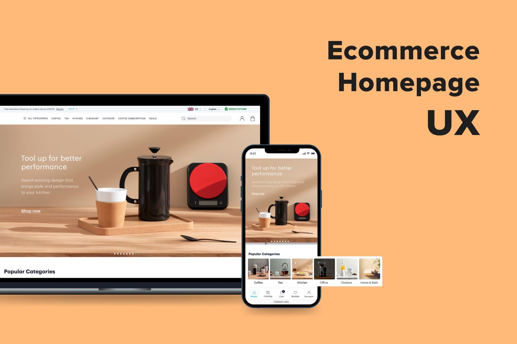
3. Designing Vital Homepage Elements for Mobile & Desktop
Once we’ve determined the main objectives and rules for a better eCommerce homepage UX, we can move to the separate blocks it’s made of. Although the selection and order of sections will differ depending on the store itself, we’ll try to describe a typical layout. Let’s discuss the sections and their implementation peculiarities for smartphones and laptops/PCs.

Explore our eCommerce portfolio on Behance
See how Onilab's designers and developers transform the UX and improve conversions for online stores across the globe.
3.1 The Navigation
It’s relatively easy to organize the crucial controls on the desktop format; it’s far more challenging on mobiles. However, thanks to native apps and evolving, you can simultaneously save space, provide the needed elements, and enhance the user experience.
The Desktop Navigation
On desktops, the primary navigation hub is the header. At the very top of the page, users expect to find:
- A logo. It’s always clickable so that users can immediately jump back to the homepage from any other one, even checkout, which is considered part of .
- A menu. It’s usually a strip with several category names. Its behavior (the way it opens) could vary, which we’ll consider later. Don’t hide these titles under a generic one like “Shop” or “All”, as they tell nothing about the assortment.
- A search bar. If your buyers use search oftentimes, the rule is simple: the more prominent it is, the better. A well-placed and designed search bar can significantly enhance user experience by making it easier for users to find products. Some stores prefer to leave a tiny icon instead of a field, decreasing the chances for it to be noticed and used.
For a deeper understanding of the importance of search UX, explore our comprehensive guide “.
- The cart, account, and wish list icons. It’s handy for customers to access them from any page.
- A benefit bar. Most often, it’s a narrow stripe at the very top containing the main offers as of today. There might be a threshold for free shipping, a discount amount for an ongoing sale, or an extended period for returns. If there’re nuances, a link supplements the message.
- Service links: a country and language selection, store locator, order tracking, and help center links.
Check out the headers from Tiffany, Rituals, and two clients of Onilab, and Overneed.
The Mobile Navigation
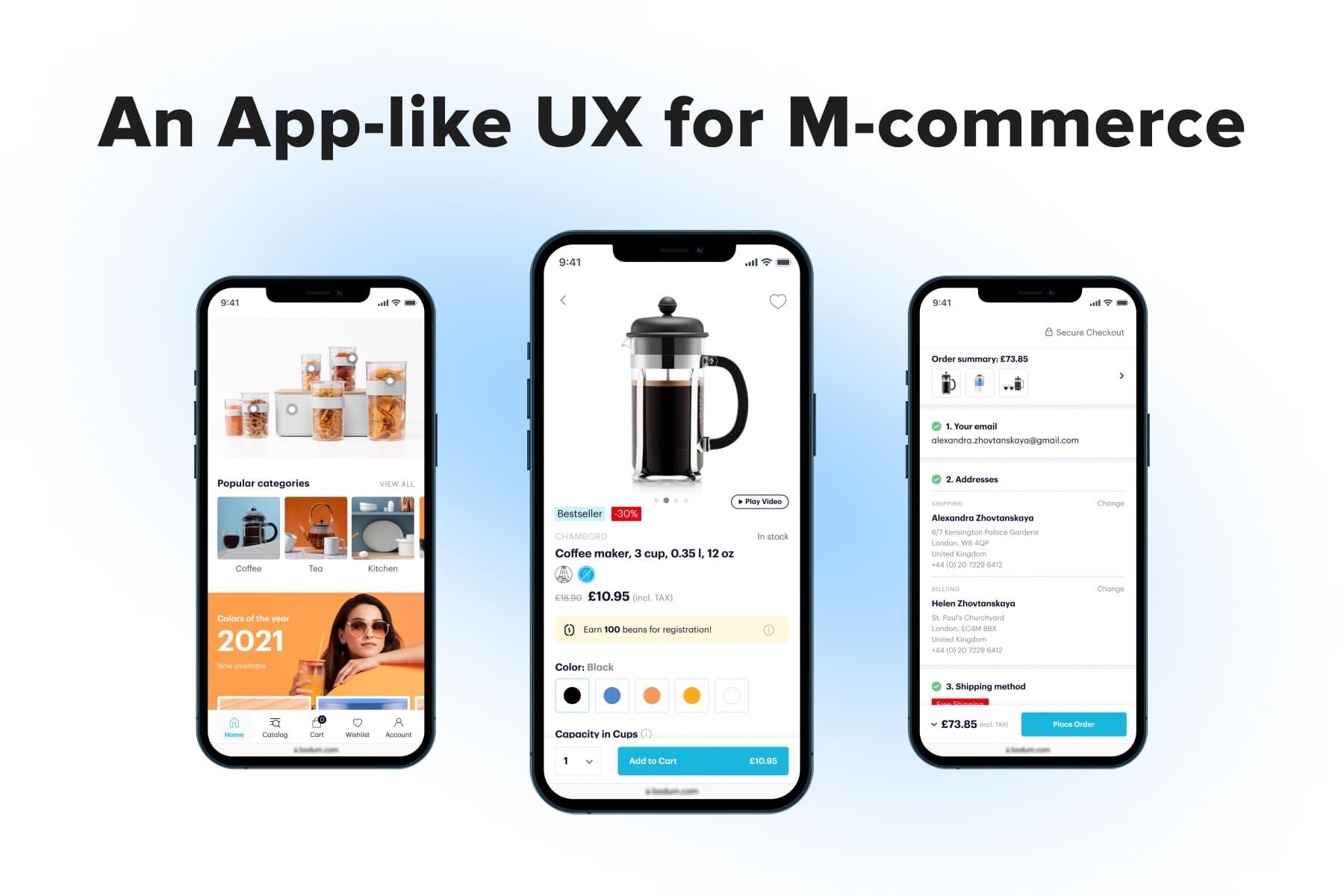
Here, the scheme is more complex than for desktops. To achieve an exceptional eCommerce homepage UX, those elements enumerated above must comply with mobile UX principles regarding location, look, and user behavior too. The lack of space urges us to get more creative.So now, designers tend to place navigation elements not only in the header. Today’s stores have two paths to follow:
- A top navbar (standard header). Most stores still use a hamburger menu and only have the header to display the primary controls. In this case, just a bare minimum fits: the logo, menu icon, search, cart, and sometimes account. The rest they’re forced to hide either inside the menu or in the footer. Frankly, it’s an unpleasant trade-off between design and usability.
Our team made no exception for , a French provider of IoT devices. Replacing the hamburger menu with a bottom bar was one of our many changes to boost mobile UX. - A tab bar (bottom menu). It’s innate for mobile apps, and designers have recently started to embrace it for websites as well. Firstly, you have two times more space to utilize. The bottom bar comprises the homepage, menu, cart, account, and wish list/help tabs, while the header shows the logo and search. Secondly, this navbar is fixed and always at hand.
Onilab is an ambassador of the app-like approach in web design. When we provide to our clients, we insist on the tab bar.
Does the Store Need a Sticky Header?
You can pin the header so that it doesn’t disappear as users browse the page through. This way, people scroll less to go back to the search or navigation. Generally, it’s a useful feature, but with a couple of stipulations on implementation:
- Modify the sticky header. If it’s quite wide, narrow it down and leave only essential features/pictograms so that it consumes less space in the viewport.
- Show it only when users scroll up. It may be a sign they want to get to the top and use the search, for instance.
- Don’t add the sticky bar if you have the tab bar for the mobile format because the store already has primary controls at the bottom.
Each centimeter (and even millimeter) is important for mobile devices with small screen resolutions. So, saving room for valuable information is a top priority.
3.2 The Menu Type
It’s the centerpiece of the store’s navigation, acquainting users with the catalog and guiding them to the correct sections. Designers came up with a few menu types for desktop and mobile. Let’s see the most and least user-friendly ones.
The Desktop Menu
Most likely, each online store you open will have one of these three menu configurations:
- A mega menu;
- A drop-down menu;
- A vertical menu (also called side navbar).
We univocally give a preference to the first type. The mega menu gives visitors an exhaustive overview of categories and the next nesting levels (sub- and sub-subsections).
The drop-down one showcases only a limited selection and can accidentally close if it’s designed to open on hover. The vertical variation uses the available desktop area less effectively and again displays fewer sections than the mega menu.
The Mobile Menu
Most mobile sites have one of these two menu forms:
- A hamburger menu;
- A tab bar (also called a navbar or bottom menu).
In practice, just a tiny proportion of eCommerce websites have implemented the bottom menu, even though most native apps have been using them for a long time.
The hamburger menu is considerably inferior to the tab bar in convenience. The former is at the top left/right corner, whereas the latter is right under the thumb. And this is just one advantage from the list. We considered all possible kinds of menus, their behavior, and pros/cons for mobile and desktop in the article.
3.3 The Banners
Banners right under the header are designed to engage users in milliseconds after landing on the homepage. These vivid pics tell about a current sale, new drop, or direct visitors to the main categories.
The Design Aspect
Some brands make sets of static banners (tiles), and the rest go with good-old carousels (sliders) since they allow to display several touchpoints without bloating the page. We’ll focus on them mainly, but some advice applies to tiles and single banners as well.
The thing is implementing sliders with the positive in mind. This checklist may help:
- Add the auto-switching. If it’s not provided, likely, shoppers won’t leaf the slider through manually. They might overlook there’s more than one banner.
- Don’t rotate pics too fast. Give users time to read a text and think for a sec.
- Add navigation signs. Indicate that users can return to the needed banner by arrows. Mark the number of pics in the slider with dots.
- Stop autorotation when users hover over a banner (on desktops). The move can signify a person is interested in the offer and wants to hit a button.
- Emphasize a CTA. Even though the whole banner area is usually clickable, an understandable and encouraging call-to-action button won’t be redundant.
The Technical Aspect
Whichever multimedia type you choose to show, reduce its impact on the overall page performance. If the content is weighty, it slows down loading, adversely affecting the user experience.
To some extent, it lowers your position in the search too. Google has recently introduced a few UX-focused ranking factors: Largest Contentful Paint (LCP), First Input Delay (FID), and Cumulative Layout Shift (CLS), known as Core Web Vitals.
For instance, LCP measures the time needed to show users the largest above-the-fold element. On the homepage, it’s exactly the carousel/video we’re discussing. Read our article on to learn more about what to strive for and how.
3.4 The USP Bar
USP stands for the unique selling proposition and implies a benefit(s) that help a store to stand out from the competition. You might state the USP in the benefit bar, but if there’s more to say, it can become a separate block. Speaking of recommendations:
- Define your real benefits and competitive advantages. Basically, mono-brand stores underline the uniqueness and strong sides of the product, while multi-brand ones accentuate the service pros. If you offer many brands but have a clear concept (for instance, cruelty-free beauty products only), mention it in the USP bar.
- Be as concrete and concise as possible. You need shoppers to grasp the USP super quickly, almost without reading. So the messages ought to be short and contain facts and digits.
- Open links in pop-ups. Any shipping and return policy has some limitations, and you cannot describe the loyalty program in one sentence. Then embed links and, as an advanced tip, open info in pop-ups. At Onilab, we apply them both for desktop and mobile layouts: this way, users don’t leave the homepage to read service content. One more option is tooltips, but they work only for desktops.
- Find a sweet spot on the homepage. We recommend locating the USP block either under the banners or featured categories. In other words, not too low to improve the odds of being seen. You may even try and fit this section above the fold, but make sure it doesn’t consume much space. We sometimes design it in a slider form for mobile.
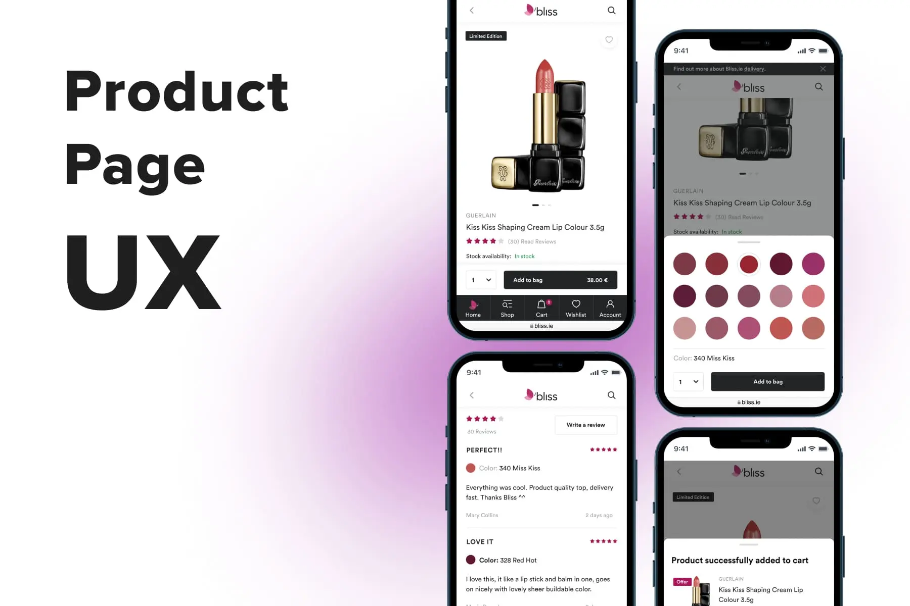
3.5 The Categories & Products
Presenting parts of the catalog on the homepage performs two tasks: introduces visitors to the product range and takes them from the interest to further sales funnel stages.
Which Categories to Feature?
First and foremost, let’s think about what you will add to the homepage. When the store is small or mid-sized, selecting the sections and products to display is quite easy. But what if it’s a large one or even a marketplace? Ecommerce stores need to rely on analytics and business goals to select the right categories to feature on the homepage; there’re no hard and fast rules. Here are some general ideas:
- Popular categories. It’s the most logical move. There can also be subcategories if they’re more sought-after than the main ones. For example, you may showcase the “Shoes” section, but if “Sneakers” is more in demand, it makes sense to choose it instead.
- Seasonal and holiday categories. For instance, as winter approaches, people start searching for warmer shoes, skiing equipment, Christmas stuff, and so on. Then bring corresponding sections to the forefront.
- Filtered categories. Track your own sales and overall fashion tendencies to pick out categories. For instance, instead of a wide “Sneakers” category, offer people “Chunky Sneakers” or even “New Balance 530”. Inside, buyers will find items filtered by style/model. There can also be other filters: a brand in its heyday (Is YSL in-demand after their latest fashion show?) or a trendy device (Has a new iPhone already been released?).
Which Individual Items to Feature?
Products on the homepage serve as a detour, taking users right to the middle of the conversion funnel. That’s what we recommend to show:
- Bestselling goods;
- New items;
- Products on discount, promo offers;
- Recently viewed goods;
- Recommended products (based on customers’ browsing history, previous purchases, and a wish list).
To ensure that your website is effectively guiding users through the conversion funnel and maximizing its potential, consider conducting a . This will provide you with tailored insights and actionable steps to enhance your site's performance.
Product blocks on the homepage look almost like in the standard listing but with fewer details. If a price is a must-have, the color/size options and a CTA may overload the design.
However, it might be sane to provide the “Add to cart” buttons for some product types if people tend to buy without reading product details. Another reason is a large share of regular customers: they know the store, the goods, and will be glad to purchase quicker.
To optimize this process further, it's beneficial to explore principles, ensuring that even these quick purchase decisions are supported by a user-friendly and efficient shopping cart design.
How to Design the Category/Product Sections?
We need to somehow fit a bunch of category and product blocks without making the homepage endless and stuffed with content. We use the following hacks:
- Save space by implementing sliders. It’s an actionable tip for mobile templates where we don’t have much room.
- Be picky. Since you mention all the sections and subsections in the menu, there’s no need to display each one on the homepage. It’s better to add the “View all” option to show more.
- Visualize the categories. A study by Nielsen Norman Group (a UX research and consulting firm) revealed that mobile users find the needed info on the list 37% faster when an icon accompanies the text.
- Choose relevant pics. If you use real photos to illustrate the category, make sure the depicted goods are actually present in the corresponding listing. Part of the purchasers clicks there because they count on finding exactly this item.
3.6 Devil in Details: Additional Sections & Features
We’ve covered the primary design elements and eCommerce homepage UX principles, but many more small features and blocks influence the customer experience. We’ll outline some tips for reaching a smooth UX.
Calls to Action
In the case of the homepage, CTAs most frequently call to visit the category/selection or learn more about the additional services. Creating noticeable CTAs is not rocket science: use a color contrasting the background, design them like buttons rather than links, make them quite large, and choose clear wording.
But imagine putting 5,10, or more such flamboyant CTAs on the homepage. Users may wind up disoriented because it’s tough to decide which of the numerous directions to take. At this rate, CTAs just lose their purpose. So try and limit the number of calls to action on the homepage.
Service Features
We mentioned them briefly in the “Header” section, but apart from just being present on the homepage, these features should be easy to interact with. We’d like to share some thoughts on UX, particularly for smartphones.
Store finder. It’s highly likely that you’ll have no space to place the corresponding link/icon in the mobile header. But it’s important information for customers, so consider creating a separate block with your offline locations. Place it somewhere in the middle of the mock-up.
Country and language selection. International stores may have dozens of localized website versions. Showing prospects the wrong one spoils the user experience from the very start. What could you do to insure against such a situation?
- Detect the location automatically. Actually, most stores do it correctly. But you need to foresee cases like when people travel but want to order from a homeland store. Then it makes sense to show the language and country selector explicitly. This also helps optimize pages for users coming from an external search engine, ensuring they land on the correct localized version.
- Show the selector in a pop-up. On mobile, you hide the option to alter country and language in the menu, account, or footer, and users must guess where it is. The pop-up is a rescue. Beware that users may confuse it with a newsletter subscription pop-up and accidentally close it. Avoid this by making the flag pic large enough for users to grasp what this pop-up requires.
Newsletter subscription. A while ago, marketers ideated swapping new users’ emails for 10-15% discounts for the first order. This win-win tactic works well, so if you haven’t added it to your promotion strategy yet, it’s worth doing. We advise the following configuration:
- A pop-up with the offer. A newcomer should see the message shortly after landing. A couple of pro tips: make the discount figure larger and ask to input just an email.
- Duplicate the offer somewhere on the homepage. Remember about ad and banner blindness: people tend to ignore blocks looking like intrusive ads. That’s why you can’t rely on pop-ups only. The subscription form can be located on the page or become a part of a footer. Then it’ll be available from any other page, but there’s a drawback: many won’t reach the page bottom.
See how Overneed, a Greek online store selling a wide range of goods, and a popular handle pop-ups.
Live chat/chatbot/help center. Having this feature is always an advantage, but the implementation might screw up the UX. Check whether your chat is convenient enough:
- It’s not hidden. Users need to find the chat easily. On desktops, it’s better to pin an icon in the lower right/left corner. On mobile, you can do either the same way or allocate a tab in the bottom menu.
- It’s unobtrusive. Sometimes the chat window expands by itself, and automatic messages appear. It’s not only unnecessary but also annoying. Don’t force users to interact with the feature until they want to.
All in all, customer support should be accessible yet wisely organized. And even if you don’t think the dedicated chat is necessary for customer service, ensure users can contact the team anyway. Feature the contact details at least in the footer.
Additional Blocks
Depending on the industry and marketing strategy, consider adding extra sections to the homepage. They foster customer trust in the store, bring added value to the audience, and aid in promoting the brand:
- Links to the socials if you run them.
- A social media content feed. It’s a must-have for beauty and fashion domains as well as for any brand betting on user-generated content.
- Reviews. There might be the product (if the brand produces what it sells) or service reviews and the button to add one (to emphasize that every customer can leave a comment). This advice is more relevant to B2B companies.
- Blog articles like guides, tutorials, and overviews (especially for complex product sellers).
- Frequently asked questions.
The Footer
In practice, most shoppers deem this area a last resort for finding something they didn’t see anywhere else: the delivery and return policy, contact details, and company information.
Also, it’s a place for formal info like terms and conditions. Many links we mentioned above are also duplicated there (like a store locator, FAQs, blog, socials, and more). Finally, stores traditionally put here some trust signals: payment methods they accept, data encryption type, and other benefits.

Get a Free UX Audit Example
Read our demo UX report exploring the online store’s checkout issues.
4. Design the Perfect Homepage
People will make snap judgments about your store whatsoever as soon as they open it. If they’re not okay with it, they leave. So the paramount task of the homepage is engaging users right off the bat and encouraging them to move forward.
We’re sure the given eCommerce homepage UX best practices will be helpful. But maybe you’re planning a more profound revision of the store? Onilab’s team is ready to step in with all our experience in , user testing, creating mobile and desktop themes, and building modern headless store architecture.