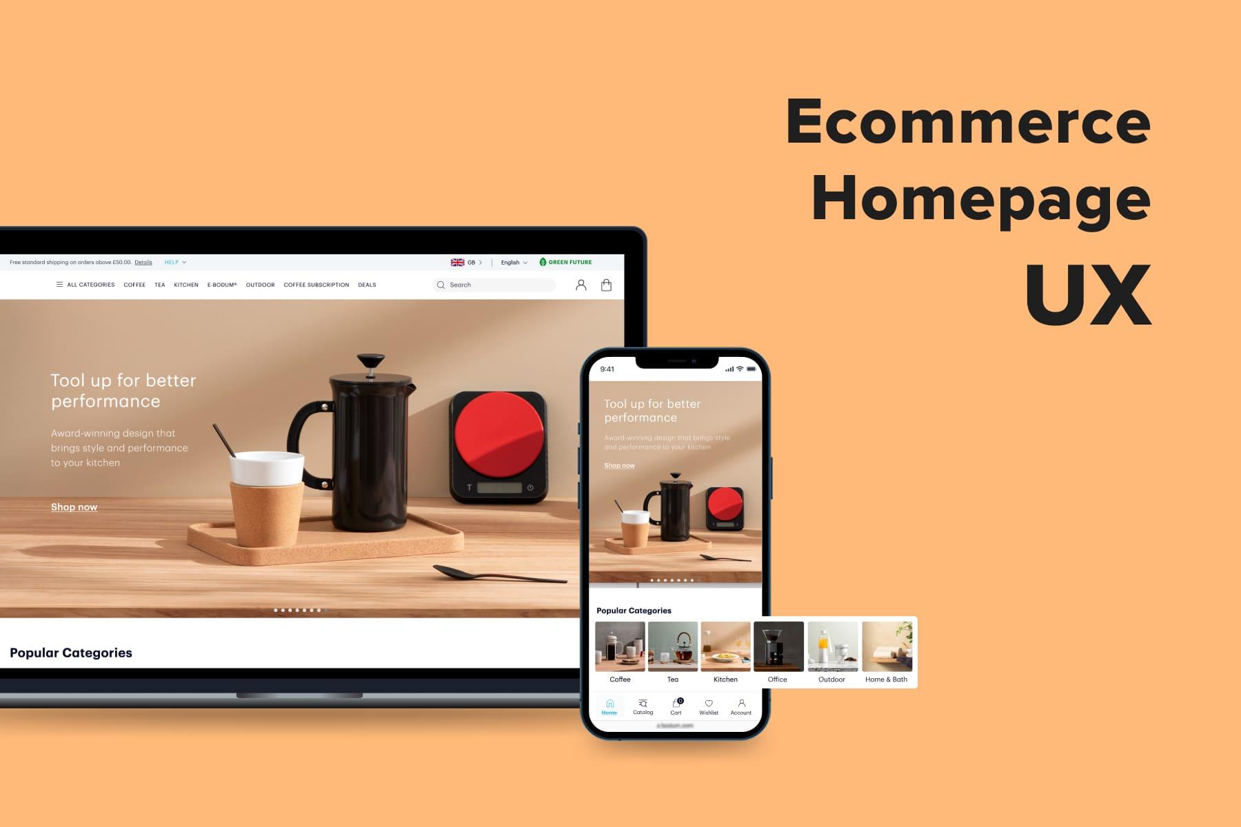
Purchasers can skip a homepage and catalog when they land on your store from ads. They can convert without using navigation (a search, menu, filters) as well. But people rarely buy without visiting a product page. That’s why UX experts consider it the heart of a user experience in eCommerce.
The product detail page UI is equipped with dozens of blocks and features: a CTA, description, available options, photos and videos, reviews, cross-sell blocks, customizer, etc. Most of them are must-haves since users rely only on what they see on the screen. They can’t touch, test, or try on items physically.
The more comprehensive the representation is, the more convincing it looks to prospects. Besides this, the elements have to be handy and intuitive either on mobile or desktop. Finally, the location of each part and its design really matter. In this guide, we’ll study the key components of the robust product page and discuss examples, both excellent and horrible in UX terms.
Table of Content
The Significance of the Product Page in Ecommerce
The product page is an integral part of a customer journey. When creating a CJM (customer journey map), UI/UX designers attribute this page to the Decision stage, resulting in a conversion. Basically, there are three steps inside: choosing the product, studying, and ordering. Several store pages are responsible for a successful move through a sales funnel at this stage. But here, let’s consider how the product page contributes to it.
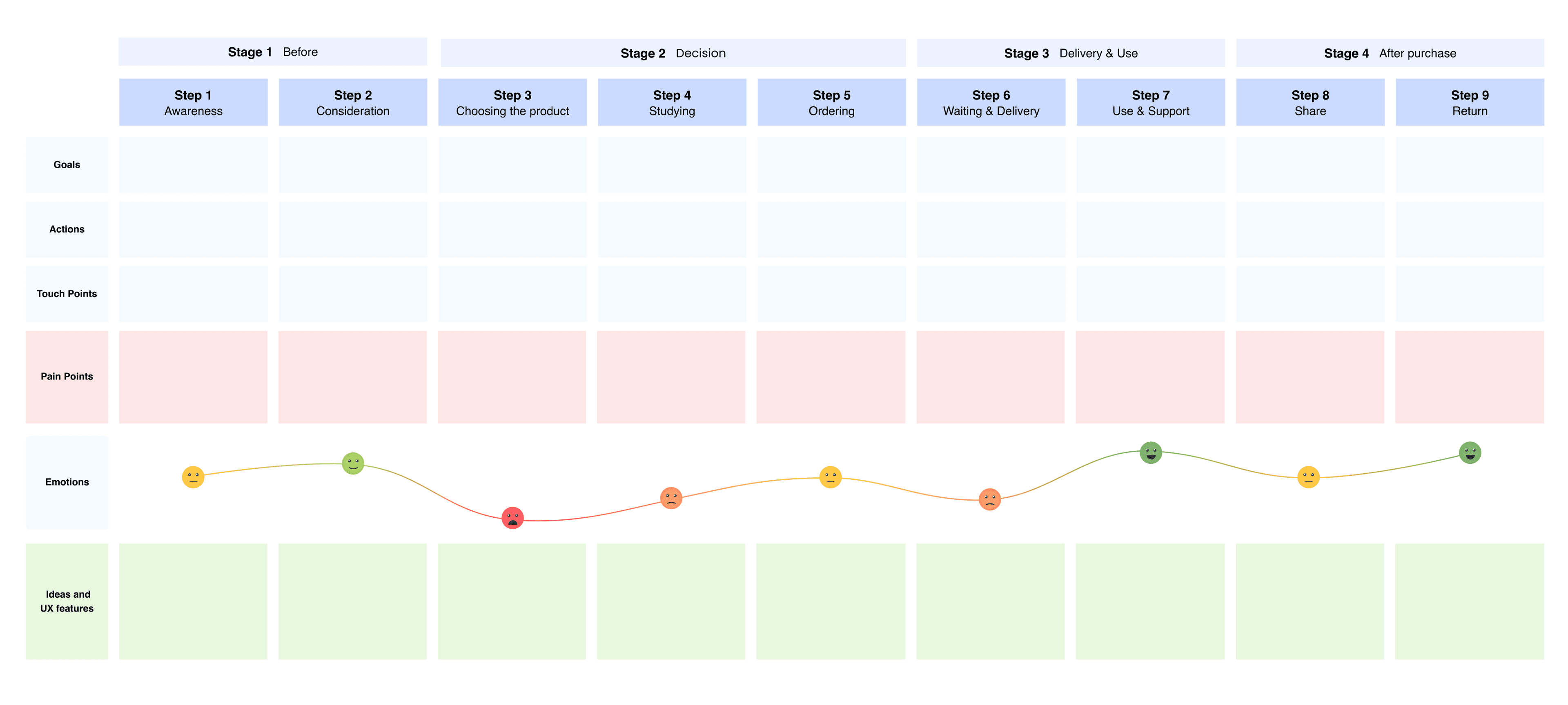
- Choosing the product This step implies getting acquainted with items and comparing them. When a prospect clicks to see a particular product page, they’ve already been fascinated and want to know more. Elements like photos, videos, a price, a discount, and a description work like hooks.
- Studying the product If the first impression is positive (or even controversial), shoppers are expected to start exploring the item. So the blocks such as available options (colors and sizes), product details (material, care info), service information (delivery, return, taxes), reviews, product comparison, and user-generated content (UGC) come into the limelight.
- Ordering Finally, the visitor decides something. It can be placing an order, so a vivid and large CTA must be at hand. It could be uncertainty about purchasing now, so a wish list button comes in handy. Of course, the user might realize this item isn’t what they need, so the “You may also like” block improves the odds of choosing another product.
All in all, each element’s presence on the product page is determined by its role in making a purchase decision.
Five Aspects to Consider When Creating the Product Page
The contents, the elements order, and design accents may vary depending on the store type, customer behavior peculiarities, business goals, and strong/weak points. Thus, we recommend addressing the following questions before creating the product page UX design.
How Do Customers Get onto the Product Page?
Most likely, there will be one of these variants:
- A classic path through the homepage, menu or , and product listing
This way, users learn some info about the product during the interaction. Probably, these visitors are sure enough about the choice: they want to quickly check details and proceed to the checkout. - A shortcut through a newsletter, social media, or Google Ads
In this case, people know far less: they are usually attracted by a small photo and price. Thus, the product page aims to engage prospects and convince them to order. - A targeted search Leads land on a particular product page, having a clear intent: to compare prices and/or purchase.
Are Users Acquainted with Your Products?
Marketers and designers must also come from the following assumptions:
- Some customers know the product they’re about to buy
They won’t waste time reading and comparing. They’ll be focused on the price and delivery, choosing the needed size, volume, configuration, or color, and adding the product to the cart. - Others don’t know much about the product
They’ll want to explore the item in depth: which features it has, how it looks in detail, what other buyers think about it.
Which Parameters Are Vital for Shoppers?
The criteria impacting the purchase decision also vary for your customers:
- The price
Many compare how much a particular item (especially devices and home appliances) costs on several websites. - The visual info
When it comes to apparel and shoes, home decor, and stationery, people draw more attention to photos and videos. - The main features
When looking for home appliances, beauty products, and other goods, people tend to thoroughly read what these goods are capable of and watch product demos.
To gain credible insights on these matters, your team has to conduct a deep analysis of customer behavior. Based on our experience in providing , we advise the following methods.
Heat, scroll, and link maps help find out where leads focus and spend more time, which links are more popular and where are the grey areas that require improvement. For example, you have the product description and specifications hidden in accordions (expandable by click) and see that people more often click on specifications. So why not open the parameters or raise the section above the description?
The data can be interpreted differently, so designers make a hypothesis, confirm or deny it through additional analysis, and come up with a solution. For instance, they study video sessions to see how visitors interact with the store’s elements. Usability testing with focus groups is another efficient way to understand what to fix or change. Google Analytics reports also bring accurate user activity data.For example, designers see that shoppers rarely use a top sticky bar. There could be several hypotheses: people don’t notice it, don’t know how to utilize it, or don’t need it. Depending on the gained data, the team can make the sticky bar more noticeable, intuitive or even get rid of it in favor of another solution.
One more source of insights is customer support or/and chatbots. Keep tracking the questions and complaints to use the info for further product page enhancements. When leads oftentimes ask you what material the items are made of, consider adding this info or making it more visible.
What Are the Store’s Competitive Advantages?
And what is your unique selling proposition? These factors are also crucial for crafting product pages.
- The price
If you offer an enticing price compared to others, emphasize it by any means. - An innovative product
Do you sell something unique? Then photos, videos, the opportunity to customize a piece or view it in AR might be vital in gaining conversions. - Convenient payment and delivery options
If you’re proud of free and fast shipping, numerous payment gateways, or payment by installments, reflect this in the product page design.
Which Industry Do You Represent?
For some stores, it’s unnecessary to concentrate on the product detail page design. Let’s say online grocery shoppers barely study products. Then let them press the “Quick view” button or add items to the cart right from the catalog. Work through your listings rather than product pages.
Overall, visitors to any online store are people having all the mentioned behavioral patterns and criteria influencing their decisions. The primary challenge is to find the compromise so that most customers find it comfy to buy from you from a smartphone, tablet, laptop, or PC.
UI/UX designers research, describe customer segments, and determine the proportion of each one. This analysis is needed to understand what is crucial to have, prioritize elements on the page, and ideate balanced solutions. Suppose half of the buyers don’t read reviews, and the other half do. One of the ways out here is to locate the review section closer to the bottom but leave the link to it above the fold (it’s an upper area of the page that you see on the screen without scrolling).
An advanced solution is the product page layout designed differently for prospects coming from various channels. But it’s how eCommerce UI might look in the future. So further, we’ll be talking about a versatile product page that ensures a pleasant user experience for as many customers as possible.

Get a Free UX Audit Example
Read our demo UX report exploring the online store’s checkout issues.
An Above-the-Fold Screen: Essential Elements
What purchasers see right after opening the product page is crucial for your success. Everybody wants to easily get their bearings and buy without hesitation and annoyance. Let’s discuss this first screen in detail: core features' placing, behavior, and appearance.
On the best product pages in eCommerce, this area (both on mobile and desktop) contains the next components, helping to instantly get an idea of an item:
- Price;
- CTA;
- Photos & videos;
- Service features (the “Wish list” and “Compare” buttons, quantity selection);
- Marketing hooks (“Bestseller”, “New”, “30% off”, “Limited edition”, link to the review block);
- Advanced features (virtual try-on, customizer).
Since desktops imply more room for maneuver, it’s possible to place not only the abovementioned features but also the following ones:
- Available options (colors, sizes, volumes);
- Size guide;
- Delivery & shipment info (optional);
- Short product description and/or details (optional).
Designers should strive to fit this all above the fold and take care of usability. Further, we’ll delve into this matter.
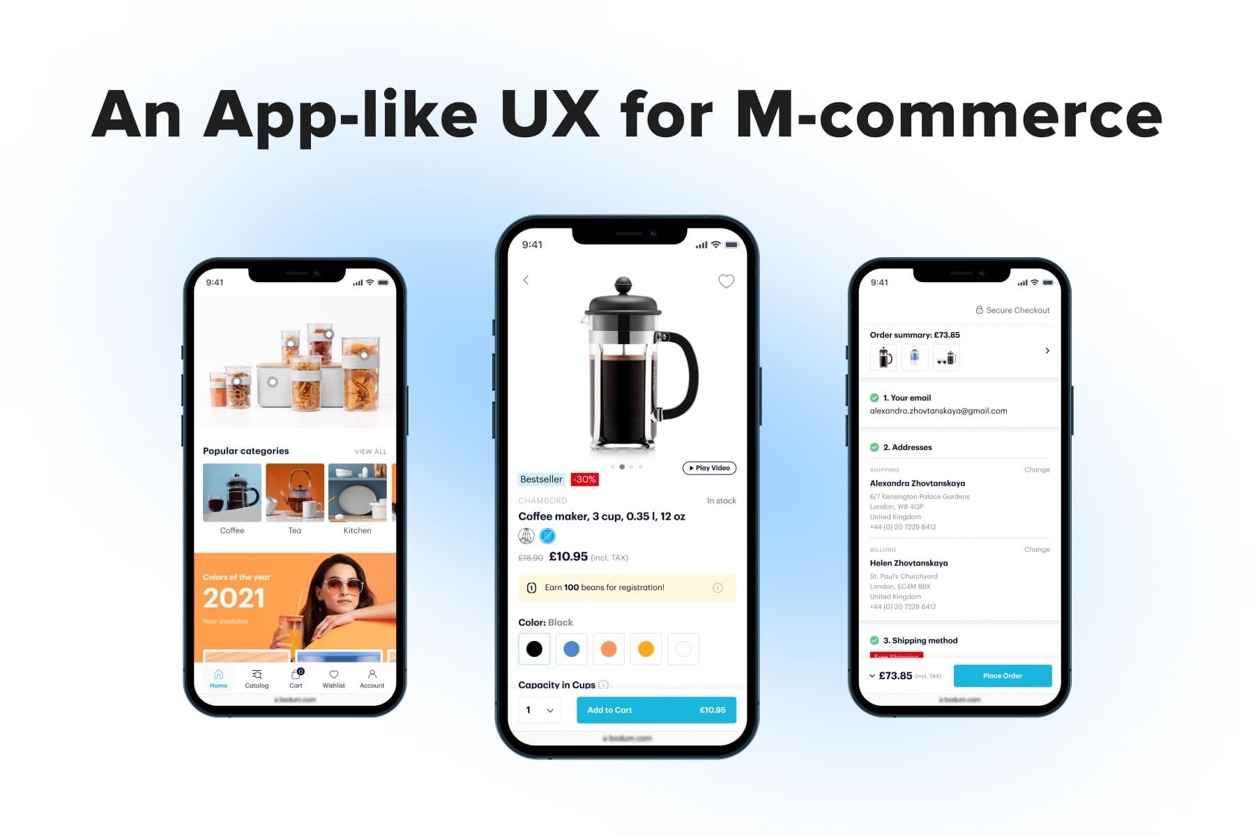
1. The Price
UI/UX specialists admit that the product page starts with the price in most cases since it’s one of the primary arguments for leads. In the meantime, it’s the simplest element on our list. Here are best practices regarding prices:
- Always locate the price above the fold;
- Make it visible whatever part of the page users view. For a , we duplicated the price on a CTA that, in turn, is implemented as a sticky bar. As a customer scrolls back and forth, it remains in sight. On the desktop version, the whole side block with the price and other features becomes sticky.
- If prices are your competitive advantage, underline this by the font size and color;
- If there’s a discount, simultaneously showcase the old, new price, and the discount percentage.
2. CTAs
A call to action is indispensable for the product detail page UI. Let’s discuss how to make it vivid.
2.1 CTA Placing
Purchasers come across various calls to action on the product page: “Add to cart/bag”, “Buy now”, “Notify me”, “Add to quote”, “Try on”, and “Configure”. On desktop, they’re traditionally placed on the right above the fold, whereas on mobile, there are four ways to apply CTAs.
a) A sticky button. Being pinned to the bottom, the CTA will be visible anywhere on the page. In the latest projects, the Onilab team prefers this variant.
b) A CTA on the page + in the sticky bar. It means the button is a static element on the page. But as customers scroll, it appears in the sticky bar as well. For instance, Tiffany adopted this option.
c) A CTA above the fold. People may decide to buy an item at any moment of studying the product: while reading the description, reviews, or viewing the Instagram widget. That’s why it’s good practice to keep the CTA nearby.
d) A CTA below the fold. By doing so, you’re reducing the odds of pressing on the CTA and converting. We still see such instances even on popular eCommerce sites like Zalando.
2.2 CTA’s Behavior
What should happen after the user taps on the CTA? They must see that it worked. The number of items will be reflected next to the cart icon, but it’s not enough noticeable change. We advise the following scenarios:
a) They see a success message. Often it’s implemented as a pop-up message that disappears in a couple of seconds.
Another type is a pop-up with the main details like the product name, price, and quantity selection. Besides, people see the next CTA inviting them to view the cart, continue shopping, or proceed to checkout (if analytics indicates that people order just one item). Sometimes, the store also offers related items in this mini cart.
The pop-up shouldn’t occupy the whole page. Besides, make it easy to close: by tapping on the cross, clicking outside the window, and swiping (on mobile).
b) The button color and/or title changes, confirming the item is added, and the purchaser can go to the cart/checkout.
You can choose either one technique or leverage both for more efficiency.
2.3 Double CTA
Finally, some stores provide two CTAs on the product page: “Add to cart” and “Buy now”. The latter implies instant redirection to the , skipping the cart page. But this move is quite controversial:
- Having two buttons might be reasonable only for stores that frequently sell one piece at a time;
- The “Buy now” button aims to shorten the way to the conversion. But we’re talking about just a couple of clicks since users still have to log in, register, or fill lots of fields if they checkout as guests. So it’s a questionable practice in time-saving terms.
- The meaning of the “Buy now” button and its difference from the “Add to cart” one isn't apparent to customers. Two CTAs will confuse part of visitors. After pressing “Buy now”, a person is redirected to the checkout. If they want to continue shopping, they need to return.
- Two CTAs take up much space, which is critical for mobile versions (see the screenshots from Amazon). Some brands place two smaller buttons next to each other, which isn’t nice for usability.
2.4 “Notify me”
One more useful feature relates to out-of-stock products. Add the “Notify me” button and the possibility to leave an email after pressing it. Don’t lose the chance to gain more conversions tomorrow.
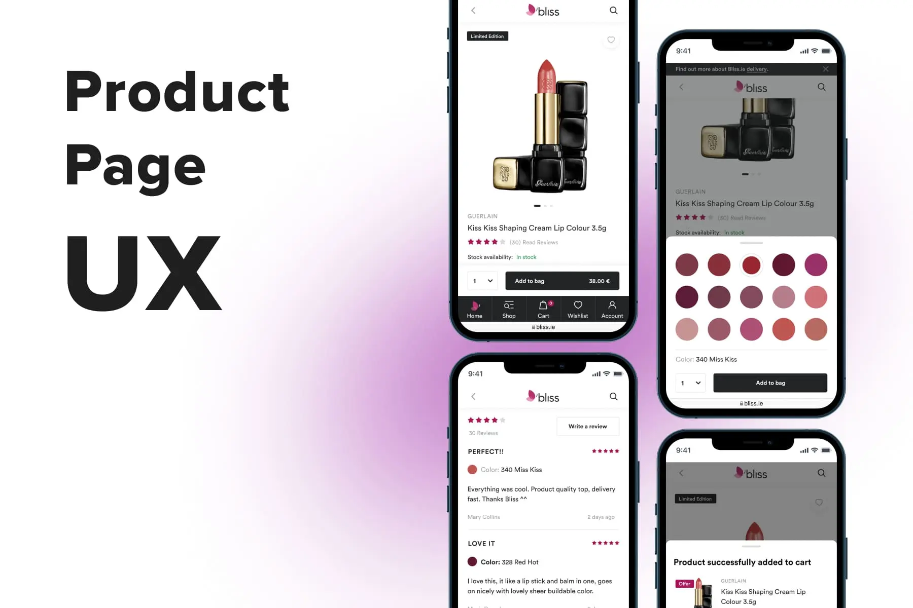
3. Photos & Videos
It goes without saying that every store must enrich its product pages with photos and often videos of excellent quality. You have to add close-ups and show off the product in use: a styler making curls, a coat on a model in motion, etc. In the meantime, make sure files load fast and don’t slow down the overall page performance.
We’d like to delve into how these media galleries should look and behave on desktops and mobiles so that it’s convenient to interact with them.
3.1 Gallery’s Appearance
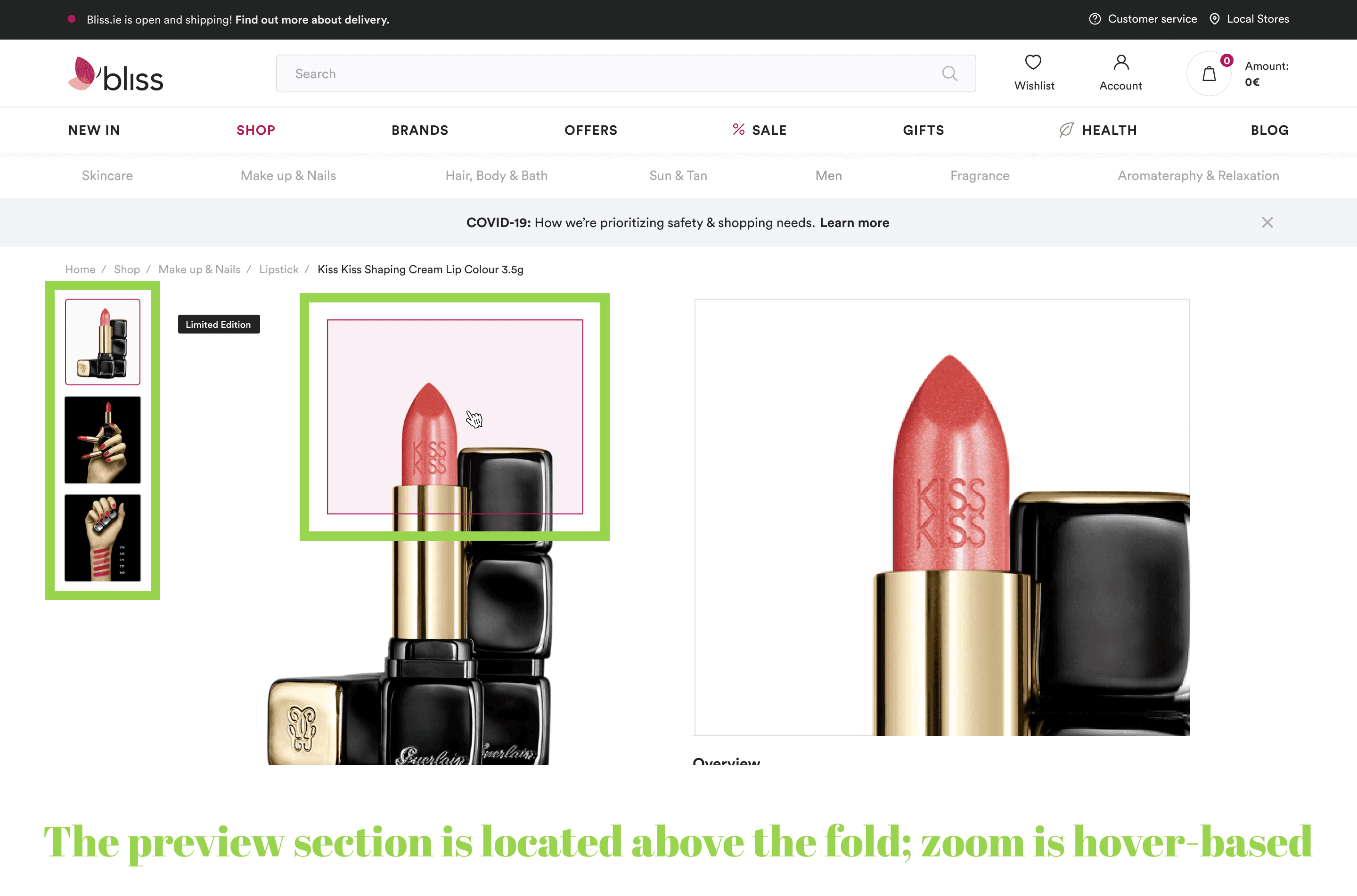
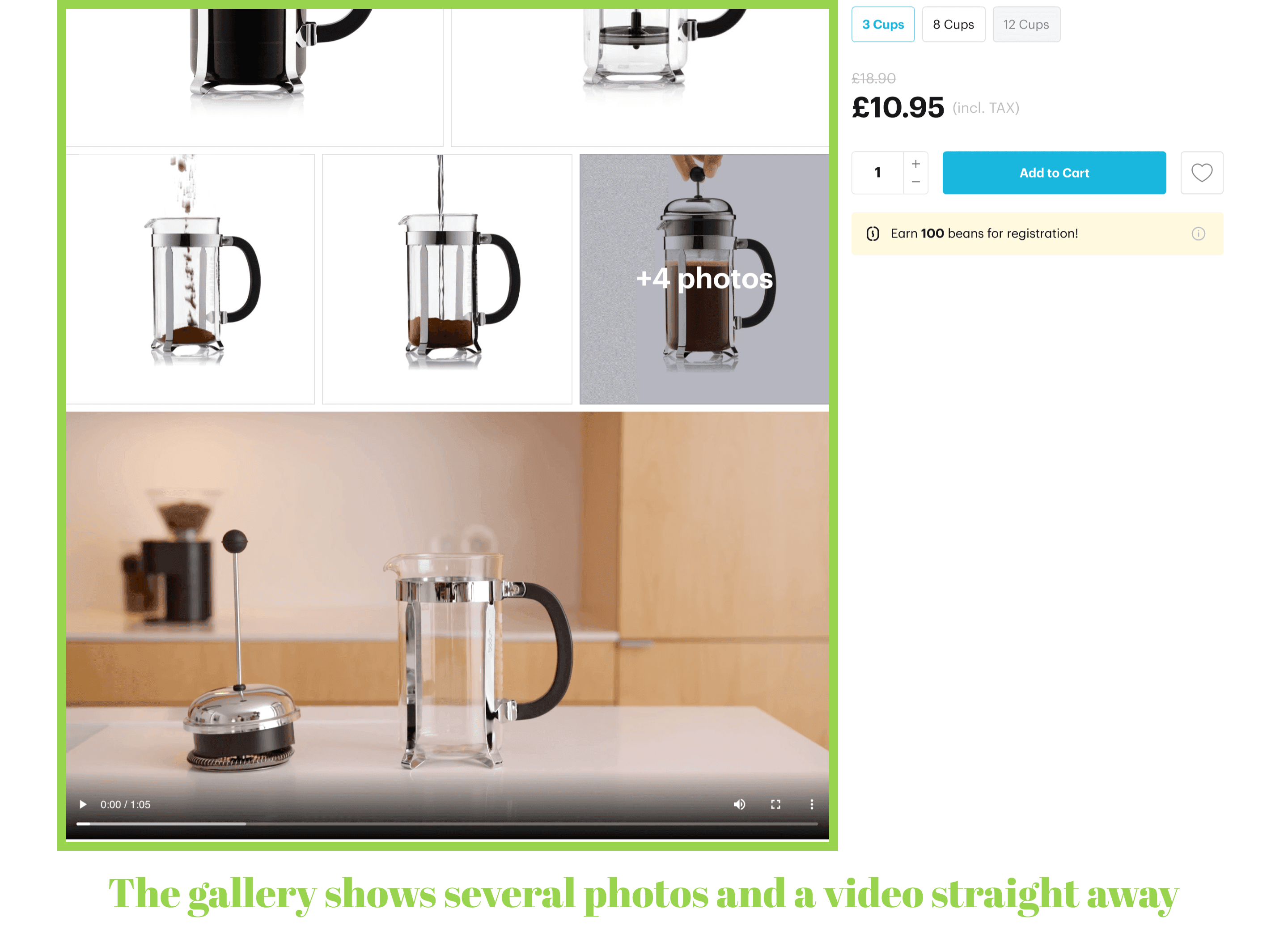
Desktop versions have a far wider range of possibilities than mobile. So leverage multimedia to promote your goods. Some stores place photos in a classic gallery where only one image is visible at a time (see Adidas). Others demonstrate all photos straight away to grab one’s attention at first sight (Jaquemus).
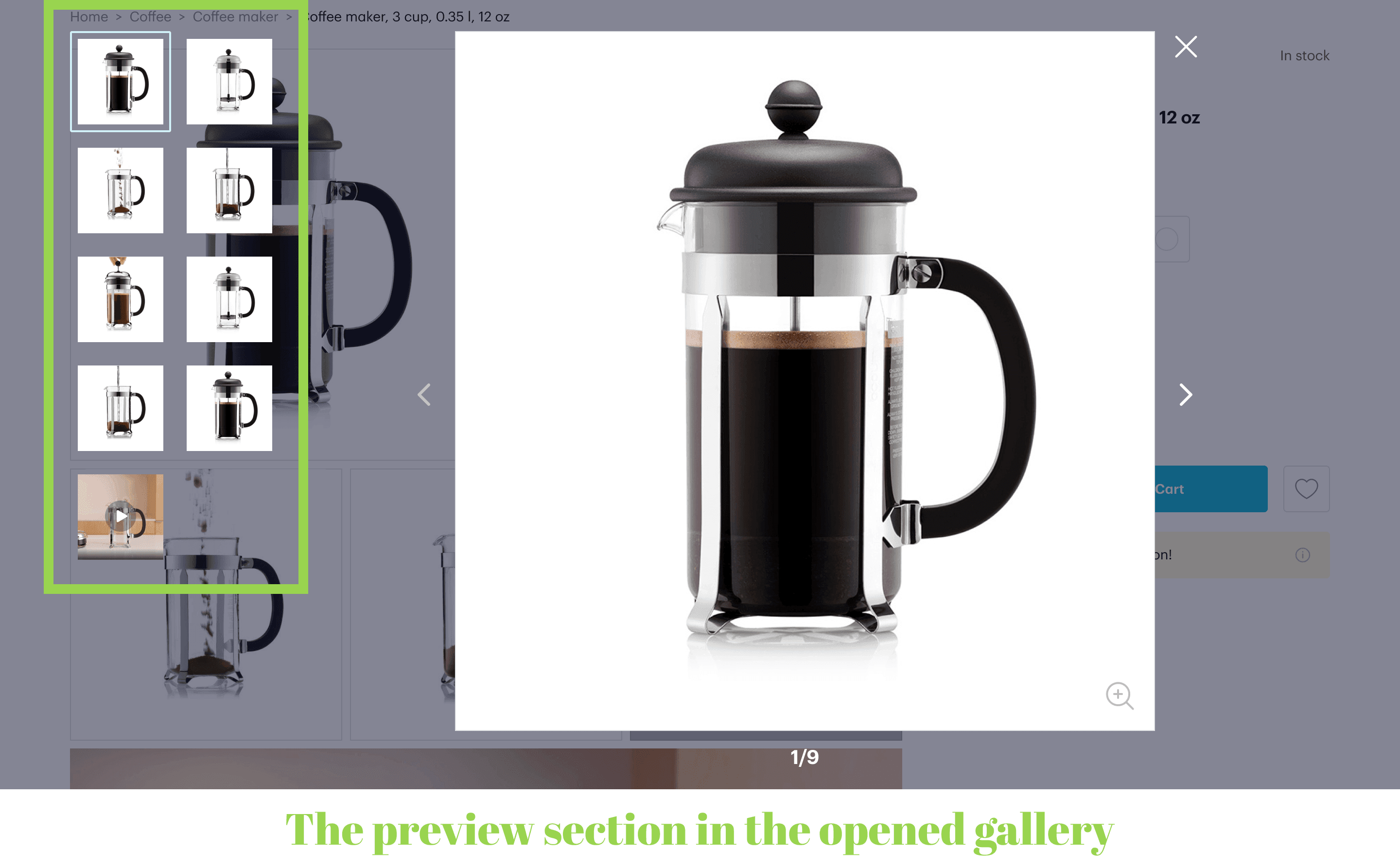
When adopting either of these options, we recommend adding a preview section with thumbnails somewhere next to the gallery. It serves three aims: prompts how many images the item has, shows the content, and allows us to go to a particular photo.
Another good move would be to show a few mid-sized photos at once to fascinate visitors. Below is the example from our client’s store: the block resembles a Facebook post containing a bunch of photos.
You can’t do much on mobile, so just choose the size that will be informative enough but leave room for the essential details and features.
With videos, you have some options as well. They can be a part of the gallery or a separate block somewhere below the fold.
3.2 Gallery’s Behavior on Desktop
Which mechanics are better for viewing and zooming product photos?
a) The gallery opens in the pop-up. For our client, we blacked out the background, added thumbnails for comfortable switching between pics, and applied a loupe icon to activate zoom. Enlarging is also available by double-tapping the image. To close the window, users need to click either on the cross or somewhere in the darkened area.
b) A classic carousel demands users to constantly click on small arrows, which is tremendously inconvenient. That’s why this method is considered outdated.
When customers click on the image on Missguided, the gallery doesn't open in a pop-up. It works like zoom: images open in giant sizes, so users need to scroll. The pop-up takes up all available space, and the only way to close it is by reaching the cross. Besides, a person doesn’t see the preview block: it’s below the fold while there’s much blank space on the left.
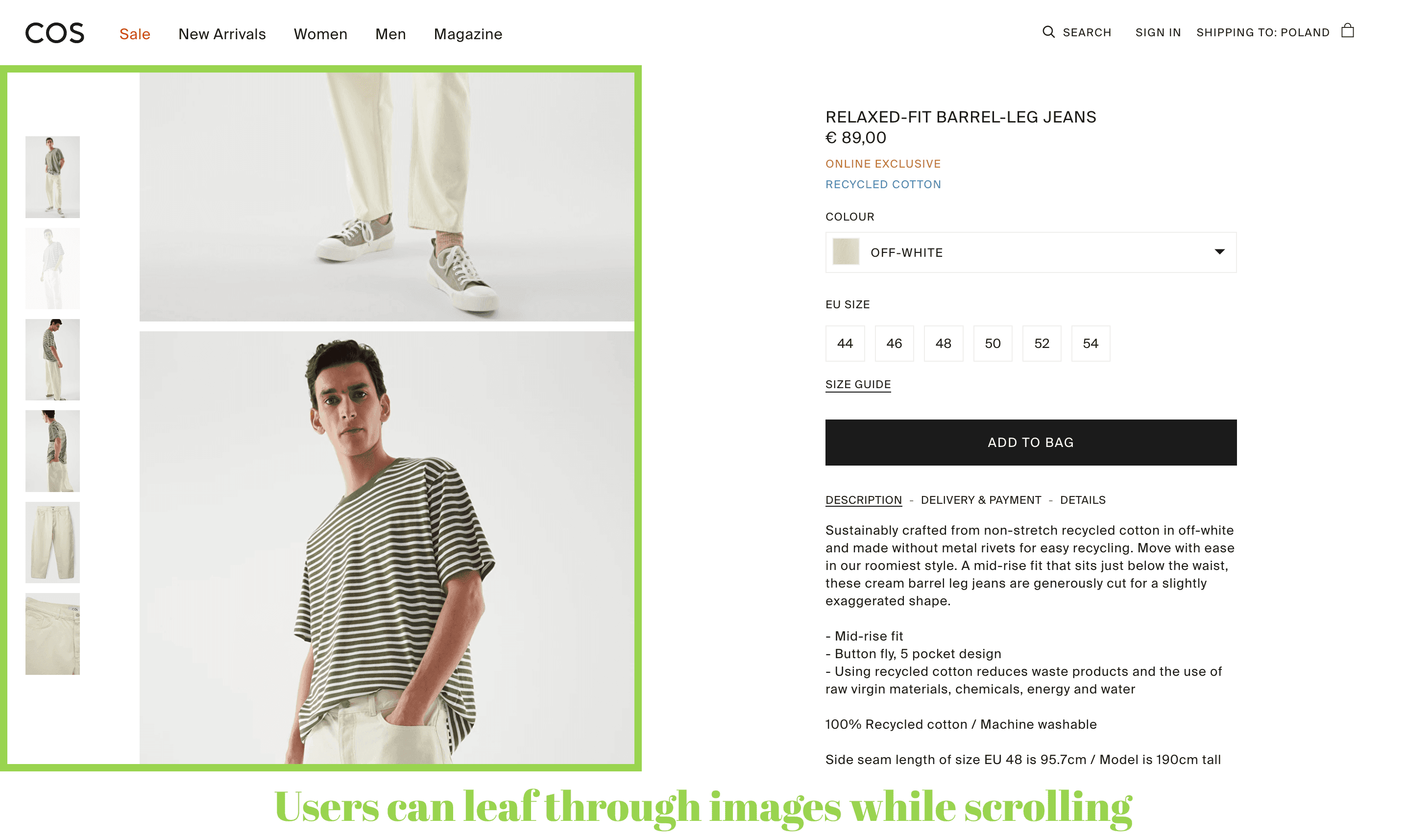
c) Browsing images while scrolling is a quite curious technique. On Cos, visitors just scroll pics, which are large enough. Users can choose a specific one in the preview section and zoom on hover, which is particularly handy. There’s no acute need to open full-fledged files, but it’s possible. People can click to enlarge further and click onсe again anywhere on the page to close.
3.3 Gallery’s Behavior on Mobile
Things are far easier when we’re talking about the product page UX on smartphones.
a) A traditional photo gallery can be swiped left and right. It’s customary for users and doesn’t cause any problems.
After opening the gallery, people can see the preview block (see our design for ). Sometimes this block is located outside (see how we allied this on GSM). Make it possible to close the gallery not only by pressing the cross but also by swiping down.
These basic features are unavailable on Zalando: there’s no preview section; users have to tap the arrows to see the following image and press the cross to close.
b) Now, we sometimes see another way to browse the gallery: scrolling it back and forth. It’s an absolutely natural move when we use social media and online stores from smartphones. Moreover, when photos are of the same width, they can be both vertical and horizontal, and the gallery will look tidy.
Zara has already introduced this mechanic. But there’re some UX imperfections: no preview block and no ability to view all images after opening a full-sized pic. You need to tap once again and choose the next photo.
Zooming on mobile means simply pinching with two fingers. The main thing is to provide such a possibility and care for the content quality.
4. Service Features
The wish list, comparison, help icons, and quantity selector are extremely useful on the product page, and usually, online merchants don’t forget to provide them. We’ll only outline some nuances.
4.1 The Wish List
It hugely facilitates shopping for those who want to go back to goods later. The most logical place for this icon/button is near the “Add to cart” button. When saving products, there has to be an indication of success:
a) The pictogram changes its color;
b) If it’s a button (or the icon has a prompting caption), the title changes;
c) The number of added products must be reflected near the main wish list icon (in the header/bottom menu).
Maybe your store doesn’t need the wish list. But if people tend to add many goods to the shopping cart and substantially edit it before ordering, it’s a sign they need this functionality. Likewise, if your products are often sold as gifts, it’s worth having the feature with an option to share wish lists via email or socials.
In such scenarios, focusing on becomes crucial to ensure that the shopping cart is intuitive and user-friendly, accommodating the varied needs and behaviors of your customers.
4.2 Comparison
The comparison option is vital for many online stores, especially for electronics sellers. Purchasers expect to find a corresponding feature both on listings and product pages. There are two ways of embodying it:
a) A pictogram. There’s no typical appearance of this icon: scales, diagrams, and so on. It’s hard to understand what it is about until someone presses on it. Obviously, it’s not good for the UX.
b) A CTA or link with a title. On the contrary, it’s clear for users what it is for.
Ok, a person taps on the pictogram. What’s next? For , an IoT devices seller, we decided to create a pop-up with preview and prompts before directing prospects to a comparison page.
4.3 Customer Support
It’s not enough to place the “Help” link in the header and footer; there has to be quick access to customer service from the product page. Let’s see how you can apply it:
a) The “Help” button in the tab bar. If support is a popular option in your store, make it one of the main controls in the bottom menu.
b) A sticky icon or pop-up. It’s pinned close to the bottom and remains within eyeshot all the time. The main challenge is to make it small and non-distracting but still understandable and handy. We warn you against constant pop-up messages that are irritating, not helpful. Often these chats are provided through third-party services, so you need to be cautious when choosing one.
4.4. Quantity selection
Finally, this small but important feature could bring a great deal of inconvenience to shoppers if implemented without caring about the customer experience. Here is how different stores see it:
a) Users can alter the number by using a stepper (pressing “+” and “-”). Steppers can be vertical or horizontal. If your customers buy quite large quantities, provide an option set it manually.
Basically, this method leaves much to be desired in terms of the UX because the controls are too small. Designers advise giving preference to the horizontal orientation and making buttons larger like on Lancôme.
Home Depot is another good instance: it has a handy selector placed into a sticky bar. Also, it has a manual input, while Lancôme doesn’t provide the feature.
b) A widespread option is using the browser feature as is. It opens the selector in a pop-up. If your customers rarely order more than one piece, you can apply the selector like this and save more space for a CTA.
5. Options Selection
On the desktop, you can afford to demonstrate all available options above the fold, while on the mobile version, it depends on the screen resolution. Anyway, this block will definitely be used by purchasers who intend to buy. So it has to be as close to the top as possible.
How will you organize the whole range of sizes, colors, volumes, and models?
a) Keep all options visible to users. This is what UI/UX designers insist on: this way, you reduce the number of actions people have to perform on the page. Moreover, they will immediately see what’s available: you take care of users’ time.
You can use grids like we've done for an electronics seller . Alternatively, color swatches can be placed in a slider like in our product page UX design for Bliss. Also, you can display models in other colors using thumbnails below the gallery.
b) If the options are hidden, they must be opened in pop-ups, not in drop-downs, and closed in several ways (as we explained above).
A curious hybrid solution we see on the Adidas website. Users see all sizes at once, and the CTA encourages first to select one. If a customer doesn’t notice the text and presses without opting for the size, the pop-up with options appears.
Let us stress some more nuances concerning the options selection:
- Always sign colors for people with vision problems;
- Be careful with preselected options, especially sizes. If people miss this step and get the wrong parcel, they’ll return it.
6. Advanced Features
Marketers, together with developers, invented several new means of engaging shoppers and persuading them to convert.
- Customizers or product builders allow people to alter a product’s design and modification to their liking. Online sellers offer to customize almost everything: stationery and cosmetics, apparel and shoes, watches and jewelry, electronics and cars.
- Virtual try-on or AR-view makes it possible to fit on sneakers, accessories, beauty products, hair dye, or see furniture in the room thanks to augmented reality.
You can invite users to try these features by a CTA located next to the main one. Some merchants even place the CTA on the photo.
The technology mustn’t slow down the store’s performance. Otherwise, its favorable marketing effect will be negligible compared to a growing bounce rate. Remember, these are additional features, not primary. And if you feel it’s time to upgrade your store both in speed and design terms, see our article on .
7. Marketing Hooks
Online stores highlight some products with various messages working as incentives to buy:
- Marketing labels: “Bestseller”, “New”, “30% off”, “Limited edition”. It’s ok to have them, but only if the messages are relevant and, of course, true.
- Links to reviews. It’s a good practice since social proof works better than many marketing tools. Make sure this link contains the average rating and the number of reviews.
- Messages creating a sense of urgency: “Going fast”, “Several purchased in the last 48 hours”. People tend to lose trust in these tricks. Besides this, such hooks overload the page, which is already very informative.
- Gifts, loyalty program conditions. Always mention such benefits as they act as an additional nudge to press “Add to cart”.
Other Core Components of the Product Page
The blocks arranged below the fold or further also play a huge role in the product detail page UX. They’re needed to complement the knowledge of the product. Let’s name these elements:
- Options (colors, sizes, volumes);
- Product description & details;
- Sticky bars;
- Delivery & taxes info;
- Reviews;
- Product recommendations;
- User-generated content;
- Additional features (size guide, “true to size” bar).
Each store can prioritize the sections based on its unique analytics. We’ll focus on the .

Explore our eCommerce portfolio on Behance
See how Onilab's designers and developers transform the UX and improve conversions for online stores across the globe.
8. Product Description & Details
The largest section on the product page has to cover all item’s features and benefits, convince users to purchase, give tips on how to use/care/store, and offer manuals. It should be overarching but concise, which is challenging itself. Furthermore, this block must provide a great UX.
Very few online stores post huge chunks of content as is. Traditionally, they divide info into sections and partly hide texts to streamline navigation and avoid overwhelming users with data and scrolling. A short description may be visible, but the rest forms a kind of menu so people see all titles and can choose the one they want to learn first.
Let’s see the popular types of designing the description & details blocks.
a) Pop-ups. We’d say they ensure the best usability when shopping from smartphones. Why? Because buyers need to scroll much less. After reading, they just swipe down.
However, some brands implement this functionality wrongly. For instance, on Oliver Bonas, the description closes only by tapping the cross.
b) Accordions. It’s a widespread tactic both on desktop and mobile. We at Onilab reckon that it’s more comfy in use on PCs rather than smartphones. Take a look at the screenshots below from Nike. As a lead opens sections, they need to scroll down a lot. When they want to return to the beginning, they have to scroll again. One of the accordions contains just a link, while there’s no reason to hide it at all.
c) Tabs. It’s a convenient way to simultaneously present all titles (“Description”, “Delivery &Payment”, “Details”) and avoid excessive scrolling. Cos is a nice example in these terms. On mobile, users can immediately jump to these sections by pressing the button on the sticky bar.
The only issue we encounter when browsing on a PC. The brand wanted to fit the texts above the fold but didn’t manage to do so. As a result, people need to scroll inside the area.
d) A hybrid menu. A relatively controversial blend of pop-ups and accordions we found on Ikea. It operates like this: a user clicks on the title, and the pop-up opens. On mobile, it looks natural, while on a desktop, a new window is too narrow, increasing the amount of senseless scrolling. At the bottom, the prospect may or may not find further details hidden in accordions.
At last, there’s a handful of general tips and tricks on text content on the product page:
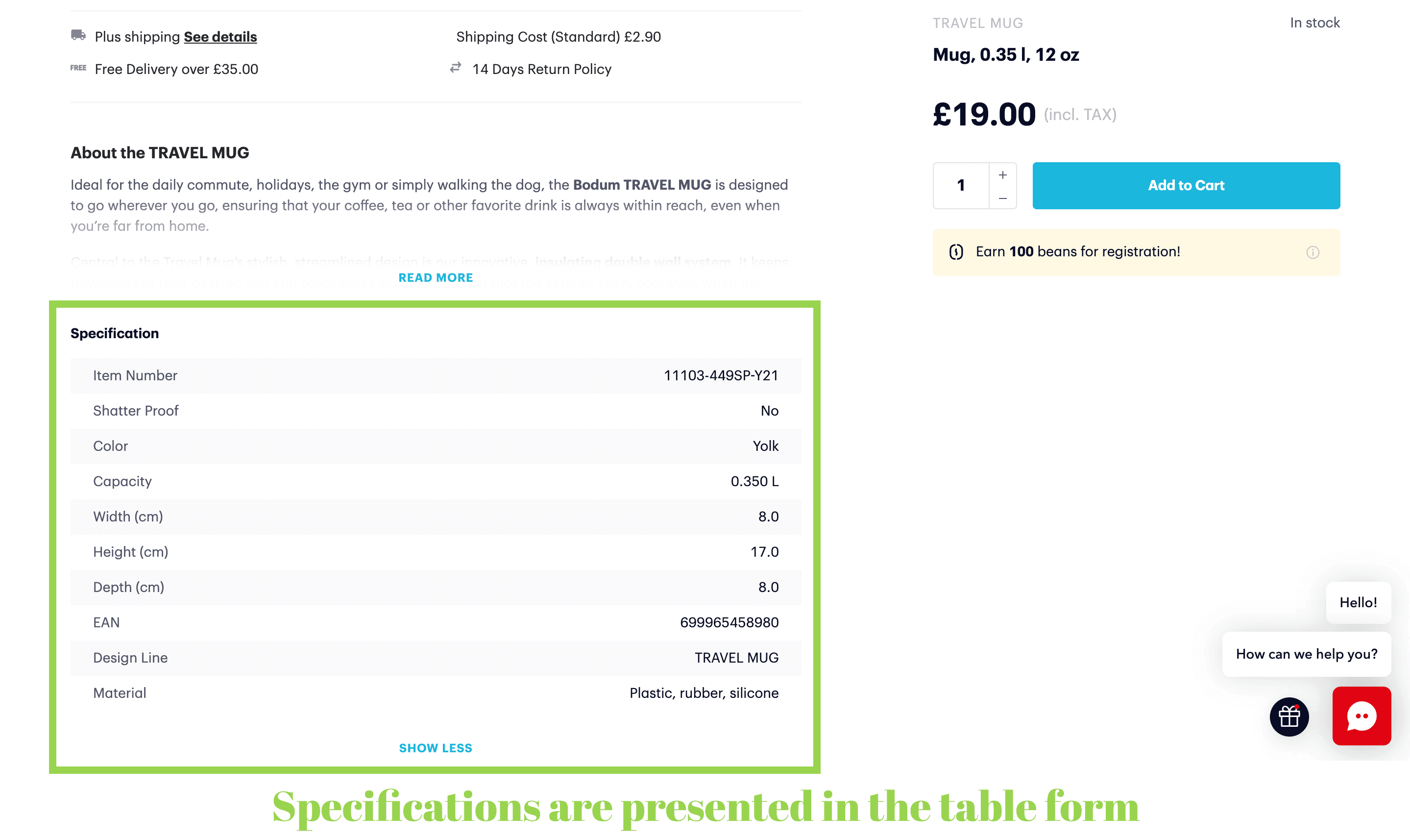
- You have much free space on the desktop, so try to announce what kind of data is inside. For instance, you can show the beginning of each text.
- Provide technical details in the table form to make them more readable;
- Provide links for downloading manuals;
- Don’t overdo it with SEO techniques: long texts flooded with keywords make no sense and tire readers.
9. Sticky Bars
As we’ve already mentioned, sticky bars allow us to always keep necessary information or controls within the area a user is viewing. On the product page, there are two types of them worth adding:
a) A sticky “Add to card” section. On mobile, it contains the CTA, price, and sometimes the quantity selector. On the desktop, it makes sense to pin the whole side block, including option selectors.
b) A sticky menu. As a rule, the product page is pretty long. To streamline studying it, showcase the titles: “Description”, “Specifications”, “Use and Care”, and so forth. In the examples below, the sticky bar appears at the top of the page as a user goes below the fold. It’s horizontally scrollable, and the tabs are clickable.
This menu prompts shoppers which blocks they’ll find on the page. For instance, Adidas even added a table of contents right below the photo gallery; it transforms into a sticky bar when a person scrolls.
10. Delivery & Taxes Info
Shipment terms largely determine whether a prospect will place an order or not. So you need to specify the conditions you offer before moving to the product details. Let’s briefly discuss the possibilities.
a) A benefit bar. It’s a tiny strap right under the header with a short and attractive message like “Free shipping!”, “100 days for return”, “Free standard shipping from $35. See details”. It’s a good move for desktop versions, but we at Onilab use it less often to save precious screen space.
b) A marketing message in plain sight. You can use the photo gallery or the pop-up screen with the cart details to, e.g., prompt prospects the sum for free delivery: “Spend $50 for free shipping” or “Spend $22,50 more for free delivery”.
c) Links opening pop-ups. It’s one of the best ways to organize detailed information. As you know, pop-us are closed by swipe. And if there’s no massive amount of text, people even don’t need to scroll.
d) A separate tab in the description. If this section is organized in tabs (we’ll talk about this further), you can dedicate one of them to shipping.
e) Plain text on the product page. You can display the data this way as well, but above we named a few more sophisticated methods that make the product page tidy.
f) A link to a new page. On Fenty Beauty, customers can read the shipping and returns details on the corresponding pages. The main drawback of this solution is that people are redirected and then forced to go back to the product page.
11. Reviews
Ecommerce players can’t underestimate the power of social proof. That’s why every successful online store has reviews on product pages. Basically, this functionality is plugged in using third-party services. When selecting one for your store, draw attention to the following peculiarities.
11.1 Features for customers who read feedback
It should be simple to navigate through the whole block and find the reviews they want to check first. So a decent review block should meet these requirements:
- Has the summary in graphic representation: the overall rating (classically, in stars), the total of posts, the number of 1-to-5-star opinions. They must be clickable to jump to a specific group of reviews.
- Has the sorting option to show first the newest, high/low rated, and so on.
- Has the photo and video review block at the top. It’s relevant for many industries where the item’s appearance tells much. Unsurprisingly, marketplaces like Aliexpress have this section.
11.2 Features for customers who write feedback
To encourage leaving more reviews, the interface must be as simple as possible:
- Has an adequate number of fields to fill out. The shorter the form is, the more chances you have to gain opinions.
- Minimize the number of obligatory fields. A good practice is offering evaluation in stars and making the rest optional.
- Of course, provide the ability to comment only to logged customers to eliminate episodes of unfair competition.
12. Product Recommendations
There are three main subtypes of this section, and online stores tend to use them all on product pages.
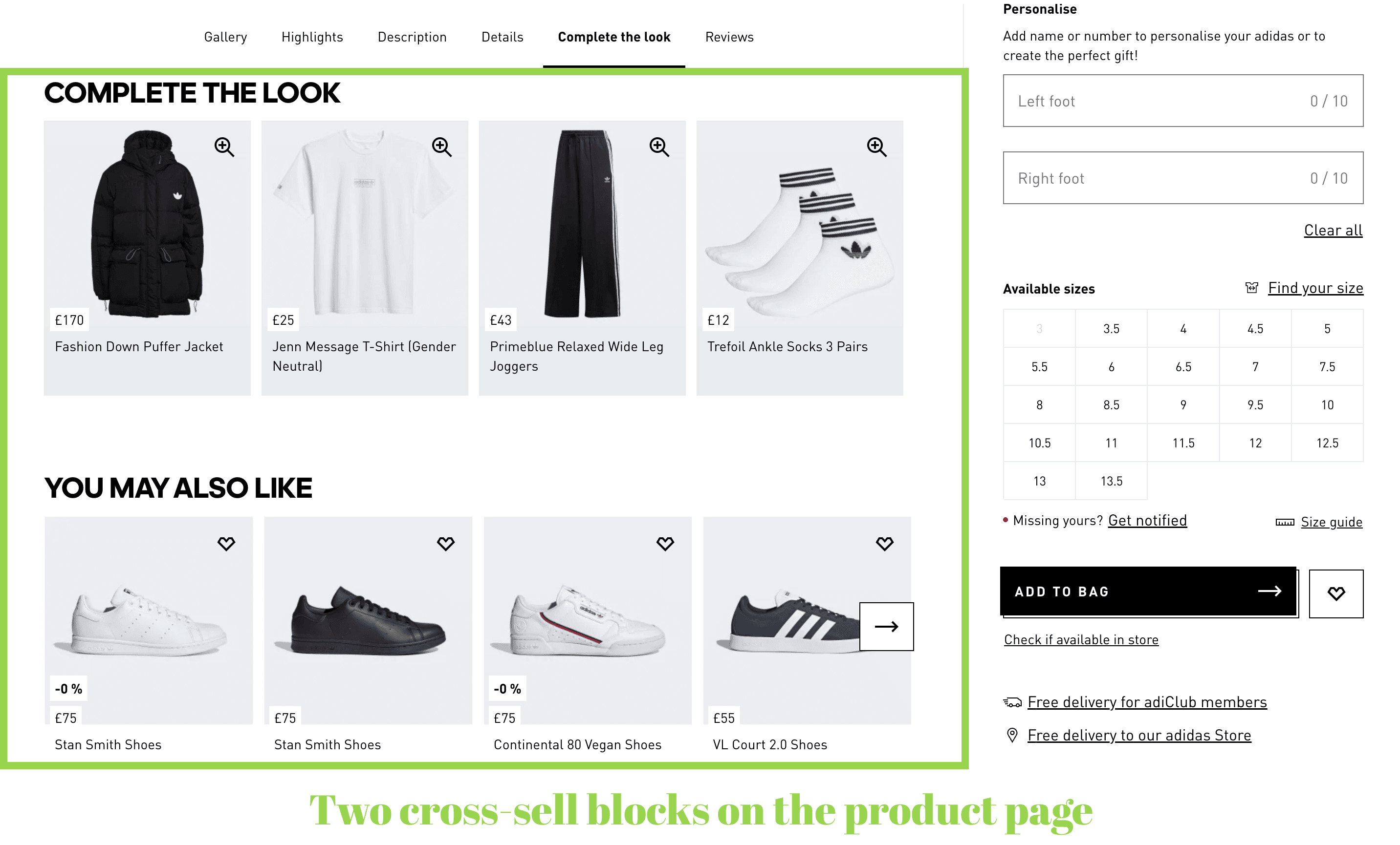
a) The “You may also like” block. Or “Others also bought”/“Related products”. Its purpose is to prompt similar products and motivate users to check them if they’re not satisfied with a current one. By adding it, a merchant raises the chance to sell at least something.
b) The “Frequently bought together” section. Its other names are “Goes well with” or “Complete/buy the look”. It’s a classic cross-sell block that suggests additional goods compatible or matching stylistically with one a person is viewing. It’s a trick to increase the average order value.
c) The “Recently viewed products” block. It’s a sort of reminder in case people want to return to the products they opened previously.They’re implemented as sliders and contain product cards with thumbnails, names, prices, a wish list icon, a link to reviews, and often the “Add to cart” button.
13. User-Generated Content (UGC)
Buyers' photos and videos on your product pages significantly contribute to customer trust. Some brands add widgets where social media content is posted, while others even add UGC to the main gallery.
Just a couple of rules to follow:
- Don’t upload unpresentable photos to the main gallery. It’s a place to show off your product, so the content must comply.
- Mention authors' social media accounts (surely, asking for permission first): it’s proof for incredulous prospects and a sign of respect for those who shared the content.
14. Additional features
The last but not the least point is little “cheat sheets” helping leads make up their mind and order a suitable product. Such hints are particularly relevant for fashion brands where people are always concerned about choosing the wrong size.
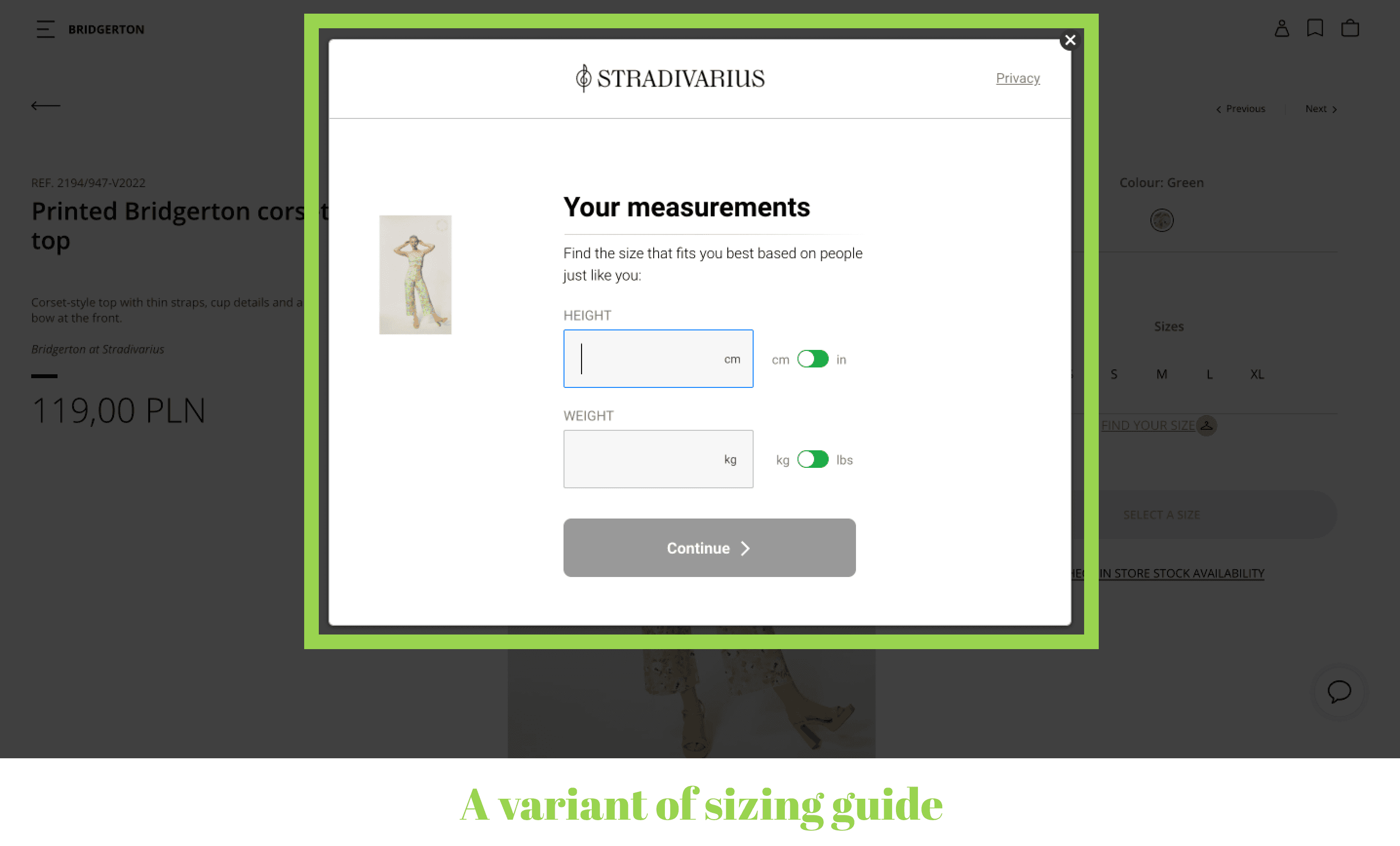
- A size guide. You can act conventionally and attach a table to match your sizes with shoppers’ measurements and other common size grids.
Stradivarius chose another path. It offers to take a survey: height, weight, a belly/hip shape, age, fit preference, and a couple more questions. In the end, it prompts the most likely size without even using a tape measure. As a bonus, the brand gains valuable customer data for marketing purposes.
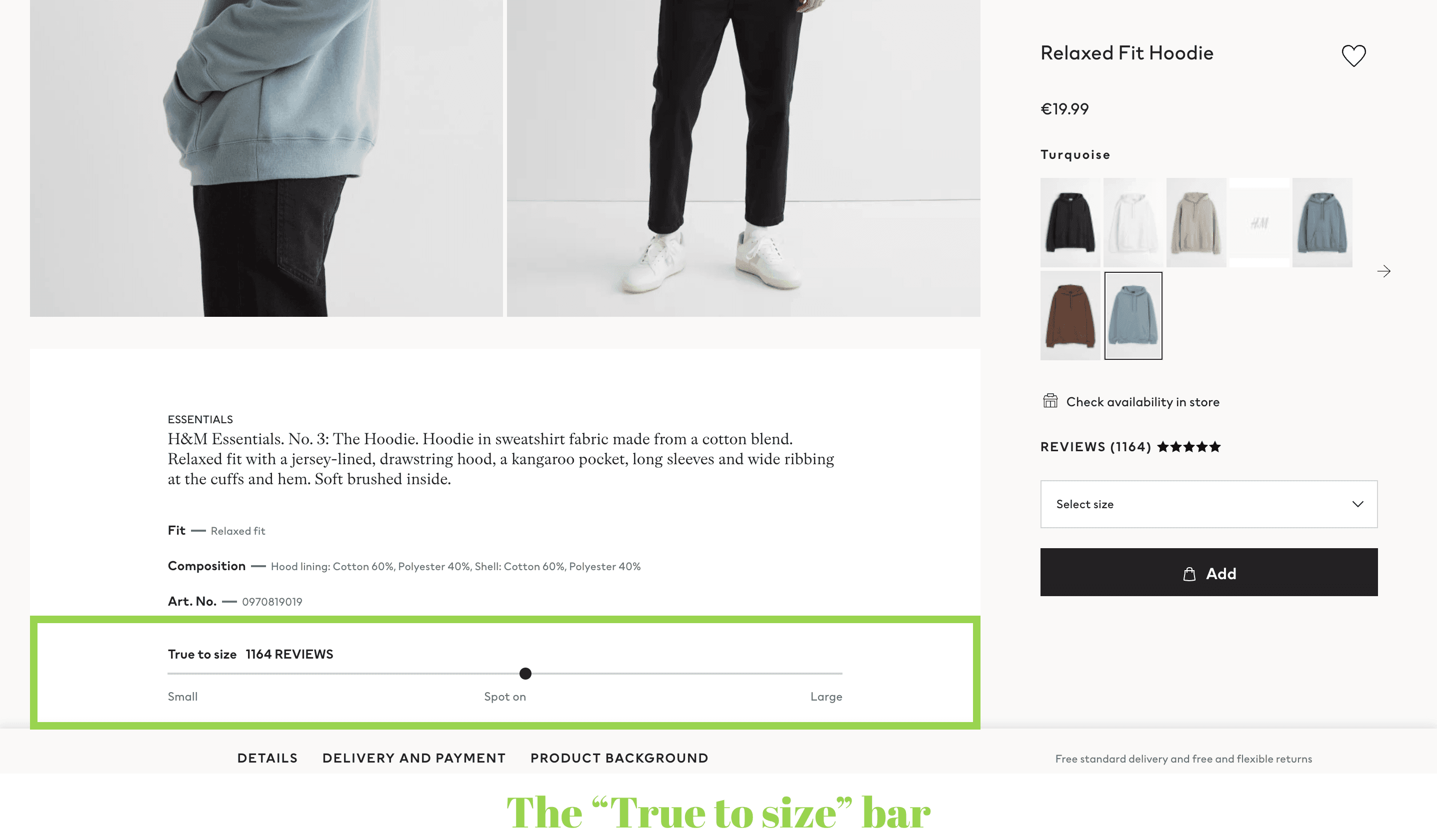
- The “True to size” bar. It displays buyers’ opinions on how the item corresponds to the declared size. Customers can choose the position on the bar when writing reviews and help those who are going to order.
Designing the Product Page: the Universal Principles
Finally, let us briefly outline four fundamental rules that help UI/UX designers to achieve a better product page UX.
Firstly, try to concentrate all primary features and controls above the fold. It’s for regular customers and those sure of their choice. In fact, leads who thoroughly learn the details then move to the top and expect to quickly adjust the options and press a CTA.
Secondly, aim to minimize clicks, scrolls, and content shifts, avoid drop-downs and accordions where possible. Each product page is heavy-loaded with data and options, so don't test customers’ patience: always take the into account.
Thirdly, strive for minimalism. Omit the non-essential features, icons, titles, and benefit bars. And don't get carried away by design (too many colors, fonts, and so on).
Fourthly, be in line with the eCommerce standards regarding the components’ look and placement. For instance, shoppers are used to seeing a wish list beside the “Add to cart” button or right on the photo, so don’t place it somewhere else. In the meantime, take the chance to showcase the product in a unique way. Experiment with the photo gallery appearance, integrate video content, and leverage product customizers or virtual try-ons.
Beyond these principles, make sure the website loads lightning-fast. If you’re a Magento store owner, we’ve prepared a comprehensive to make this process more manageable.
Final Word
That’s it! We’ve covered all the key elements making an exemplary eCommerce product page. The main focus should be on how customers perceive and interact with it on various devices and how to achieve the best product page UX. Onilab’s team follows the same principles when working on any eCommerce project, be it a or providing .