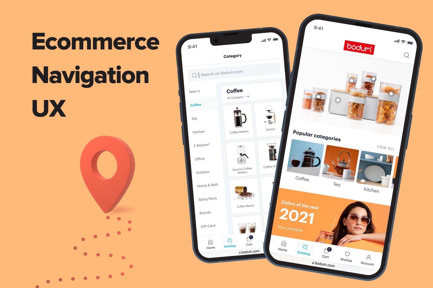
Navigation, in its broad meaning, helps reach your destination without wandering and anxiety. In eCommerce, diligently thought out navigation ensures a seamless user experience, a store’s higher ranking in search engines, and better profitability.
Plentiful components make up great eCommerce site navigation: the right menu type and product categorization, the homepage layout, smart and convenient design, and more. The navigation structure will differ drastically for desktop and mobile versions, large and small stores, mono brands and marketplaces.
In this guide, Onilab’s UI/UX designers share their expertise on mobile and desktop navigation in eCommerce. We’ll discuss best practices and typical mistakes using numerous examples.
Table of Content
1. Top 4 Ecommerce Navigation Design Principles
Before talking about specific rules and cases, let’s outline the requirements for online store interfaces. Based on the universal heuristics for user interface design by usability expert Jakob Nielsen we can highlight the general principles when designing navigation for any online store.
1.1 Customary and Understandable Navigation
In general, familiarity beats creativity. The “Consistency and standards” heuristic supports this thesis. It recommends sticking to the industry standards because it eases the customer journey.
If all controls in your online store are located and look similar to thousands of other websites, it’s the best case. Why? Because most users have solid behavioral patterns for online shopping. Your aim is to live up to their expectations. So, don’t force your customers to make an unnecessary effort; choose in favor of the “classics”.
The “Match between system and the real world” heuristic advises using comprehensible terms, icons, and other elements. For example, mark a cart with a bag or basket icon so that people understand its purpose straight away.
1.2 Convenient Navigation
Good navigation makes the path through the sales funnel as smooth as possible. It should be simple for any buyer to switch between the sections, find goods, explore the catalog and , choose something, change their mind, and leave the dead ends.
The “User control and freedom” point underlines the importance of the “Undo”, “Cancel”, “Redo” buttons. They’re indispensable when a customer does something by mistake or wants to change their shopping scenario. Also, a store must have a clear “go back” option.
The “Error prevention” heuristic implies not only showing clear error messages but also reducing the potential number of them. Certainly, it’s essential to take care of the technical aspects to achieve this.
For instance, make your search engine return more accurate results so that people can find items by name or article, with typos or mistakes, etc. Check how to CMS in the speed and relevance terms.
1.3 Informative Navigation
The “Visibility of system status” point says: a user should know where they are at any moment and what’s going on. So, online stores must somehow highlight the category the person is currently browsing, the number of items in the basket, whether the person is logged in or not, and so forth.
1.4 Minimalistic Navigation
Finally, the best eCommerce navigation design is always minimalistic. Or, as designer Joe Sparano once said “Good design is obvious. Great design is transparent”. The “Aesthetic and minimalist design” calls not to overload the pages with redundant information, both textual and visual.
To keep customers focused on the main features, products, and elements, you may sacrifice something. For instance, it might be better to unite some categories (if it’s possible) or hide rarely used icons.
At the same time, the “Recognition rather than recall” principle reminds us to keep the balance. The more accessible the main controls and data are, the higher the chances of gaining conversions. This can be one of the key steps in your strategy. Your aim is not to exploit a customer’s memory where possible.
What’s Next?
So these are the basics. But each online store has its unique peculiarities that dictate how to build mobile and desktop navigation. This guide aims to give you practical advice, warn against the wrong ways, and inspire you to seek the perfect solution, particularly for the business you run. However, to make informed decisions, you first need to identify what may be wrong or right on your pages. That’s where website analysis may be helpful. By creating or downloading a , you may outline the further steps to a better UX. Consider ordering to outsource this task to experienced professionals.
Now, let’s move on to the specific tips regarding the homepage, header, footer, menus, and category pages.

Get a Free UX Audit Example
Read our demo UX report exploring the online store’s checkout issues.
2. Ecommerce Navigation: The Homepage, the Header, and the Footer
This list of eCommerce navigation best practices begins from the homepage. It’s the face of an online store and its navigation “heart,” even if the customer journey does not always begin here.
The primary aim of the homepage is to give prospects a clear idea about what you’re selling, how you differ from competitors, and which benefits you offer. That’s why you have to keep it straightforward, up-to-date, and attractive.
We’ll cover all the homepage contents in detail in our upcoming guide. But now we’ll focus more on the header and footer.
2.1 The Header on Mobile
The mobile-first approach is now ruling eCommerce, and UI\UX designers test numerous ideas to enhance the shopping experience on smartphones. Since the screen space shortage is the main limitation, they have to choose what to add to the header.
While there are many variations, a traditional mobile header contains:
- A store’s logo leading to the homepage (but make sure it’s not clickable on the homepage itself because it hurts SEO).
- Essential icons: a menu (if it’s a hamburger menu), a cart, an account, and sometimes a wish list. The set depends on the use frequency.
- A search feature: preferably the full-fledged search bar. Why? See our latest guide on .
- A benefit bar with some enticing offers. Usually, such bars are very narrow, contain one-line messages, and are located either above or below the header.
But note that you can distract people with this promotional content. Firstly, benefit bars shouldn’t be overly intrusive (e.g., animated) or/and too large.
Secondly, ask yourself whether this benefit bar is justified. If you want to highlight something advantageous (an ongoing sale or new referral program), it’s fine. If you place a faceless phrase like “Free Shipping + Returns” or even “Shop the latest arrivals here”, this will just eat up precious space.
For example, Farfetch breaks both rules: people see a massive bar, which becomes even larger after tapping on the plus and contains no appealing info.
That’s it! You don’t have room for more features here.
2.2 The Header on Desktop
Obviously, you have much more space in the desktop header to locate all critical navigation links. At the same time, don’t get trapped by this opportunity: don’t overload the header with information.
To understand what’s worth placing, you need to study shoppers’ behavior using analytics and heat maps. Equipped with precise data, you’ll be confident about the next steps.
All in all, each good online store locates at least this info in its header area:
- A store’s logo. We’ve mentioned that it’s simultaneously a link to the homepage. It’s weird when instead of this simple trick, brands place the “Home” title in the menu.
- A menu. There are various types you can implement, including mega menus and drop-downs. We’ll discuss them in detail further.
- Essential pictograms. Usually a cart, an account, a wish list, a store locator, and the country of delivery.
- A search bar. Again, its look and contents may differ based on your store size and type.
- A benefit bar. A promo stripe with short information.
- A link to the FAQ or help center.
Note: the header takes an entirely different look on the checkout page. The logo is non-clickable, or the homepage opens in a new tab, and navigation elements disappear. It’s done to eliminate possible distractions and motivate a user to complete their order. In our guide, we cover the essential principles of organizing .
2.3 Do You Need a Sticky Header?
In both cases (mobile and desktop), your store’s header can be modified and pinned to be present in the viewport for faster access.
There are two popular sticky header looks:
a) The header doesn’t change in appearance. It’s not the best scenario both for desktops and mobiles because the sticky header will occupy too much screen space. For instance, if you equip the store’s mobile version with such a feature, it will consume up to one-third of the available space!
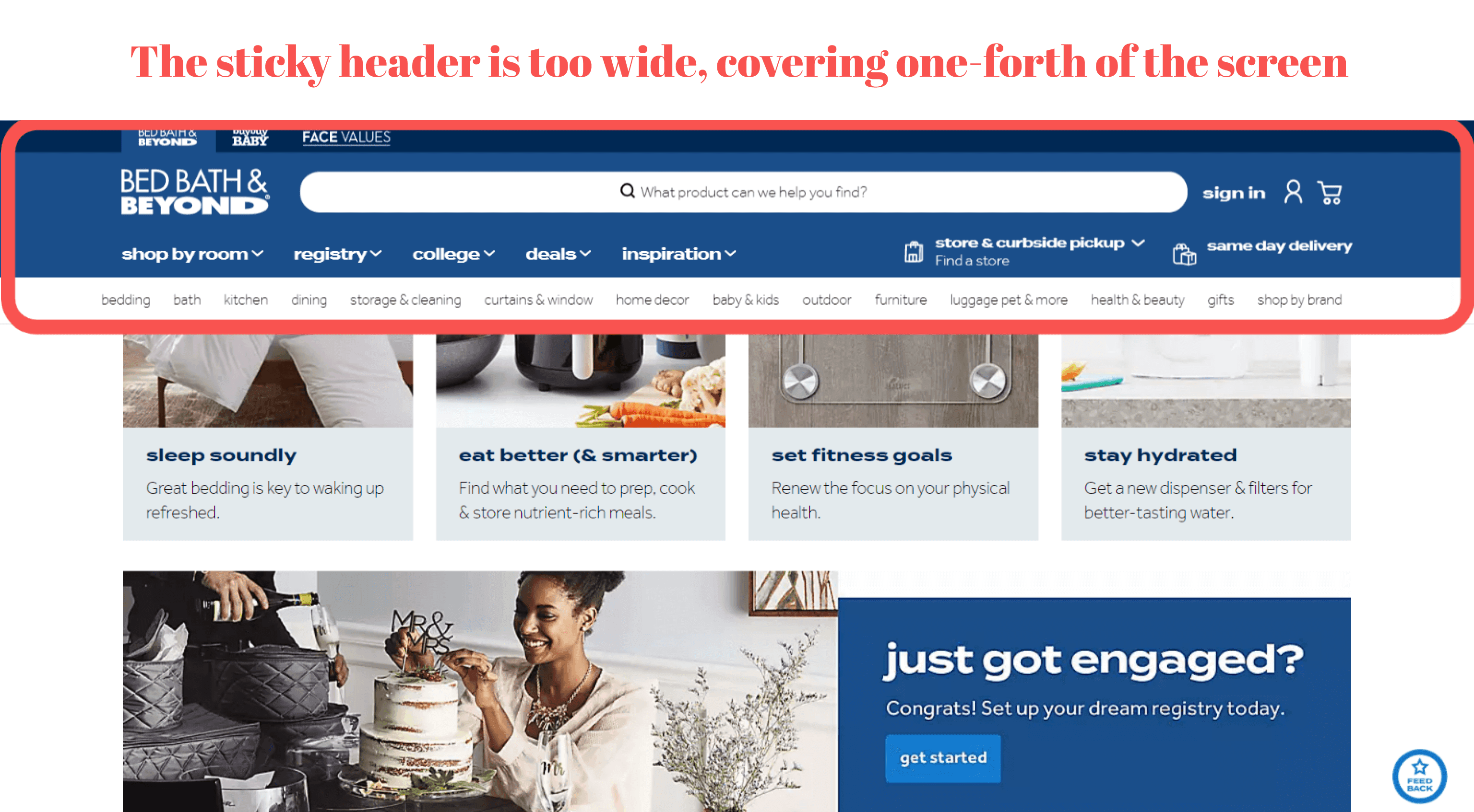
b) The header changes in appearance. If the sticky header narrows down and has only a cart, account icons, and logo, it saves more room for content while keeping the main navigation at hand.
There is one case when you don’t need the sticky header: a bottom menu with all main controls pinned (we’ll discuss this menu type below). However, the sticky bar can still be helpful. In Onilab’s design project for a , the sticky header shows filters and sorting in product listings.
2.4 The Footer on Mobile and Desktop
As a rule, customers can find the following information in the footer:
- Social media links;
- A newsletter subscription feature;
- Available languages and countries of delivery;
- Service and info links: “About”, “Help”, “Delivery”, “Returns & Refunds”, “Store Locator”, “Terms & Conditions”, “Cookie Settings”, and so forth.
- Sometimes vital features like an account and cart are duplicated.
3. Ecommerce Navigation: The Menu
What is the right eCommerce menu design? There’s definitely no simple answer to this question because there is no universal menu template to utilize. The store size, niche, and customer behavior drastically vary for online stores and define which navigation to build.
The menu type (or subtype) that will be perfect for your business largely depends on multiple aspects:
- How many product categories and brands do you need to present?
If you’re a brand that offers only apparel, you’ll follow one approach. If you’re a marketplace with an endless inventory and hundreds of vendors, you’ll need to organize the whole menu in a different fashion. - Which categories are the most profitable in your online store, according to analytics? Or which ones do you bet on?
Having the answer, you’ll define which titles it’s essential to make as vivid as possible and what to do with the rest. - How do customers interact with your store? How do they search for items?
Let’s say you sell sunglasses. Presumably, people look at particular shapes first. Then UI/UX designers may add the “Shop by shape” block right into the menu. But every case will be unique in this respect.
3.1 The Menu Types on Mobile
The share of has been only growing in recent years. So it’s reasonable that you want to please customers who shop in your store via smartphones with a flawless user experience.
We’ve identified the following menu types for mobile:
- A hamburger menu;
- A tab bar (navbar, bottom menu, bottom navigation bar);
- Hybrid menus.
Further, we’ll consider which principles the smartphone menu should follow and which one to choose for your business.
a) A Hamburger Menu
Being named after the corresponding pictogram (three parallel horizontal lines), this type is the most common in eCommerce for mobile versions. Here are its typical features:
- The whole menu is hidden behind the hamburger icon or marked by the “Menu” button.
- As a rule, the menu icon is located in the upper left corner of the header. In the open state, the menu fully or partly covers the page.
- After opening the menu, a customer sees the main sections (parent categories). Subsections can be opened either on a new screen or in an accordion (it’s an expandable and collapsible sort of a drop-down).
- To close this menu, users need to press the cross in the upper right corner or use the back arrow. Sometimes they can also swipe.
Pros & Cons of Using Hamburger Menus
As we said, the hamburger has been the standard mobile menu for eCommerce up to now. Here are its advantages:
- Saving screen space, which is crucial for smartphones.
- It’s a familiar pattern to millions of users across the globe. They know what to expect, which is good for the UX.
Nevertheless, the hamburger menu has some flaws:
- When this approach was gaining traction, phones were far smaller, making interactions with the menu relatively easy. But now, when phones get bigger, it’s just inconvenient to reach for the icon by thumb every time.
- When a person explores the menu and goes to the nesting levels, it may be inconvenient to return to the homepage. Check whether it’s possible to close the menu on each level.
- Let’s imagine a user browsing a catalog and suddenly deciding to check the cart or something else. If they want to return to a specific subcategory, they need to repeat the path step by step.
In this context, implementing becomes crucial, as it streamlines the navigation process, reducing the steps a user must take to return to their previous point, thereby enhancing the overall shopping experience and potentially increasing conversion rates.
Which eCommerce stores should consider using a hamburger menu?
It’s a worthy solution for small stores because if you don’t have a large catalog, people won’t turn to the menu often. So it’s not optimal to implement bottom navigation that will eat up space. You can place everything on the homepage and in the hamburger menu.
Hamburger Menu Examples
Example 1
A couple of years ago, the bottom menu (that we’ll discuss later) was too new to the online stores' audience. That’s why for , a mobile accessories boutique, we chose the hamburger menu.
The menu covers the whole page, and each subsequent section appears on a separate screen. To go one nesting tier back, users can tap the arrow. To leave the menu, they click on the cross.
The menu includes a bunch of upper blocks: an account, orders, support, and search by brands. Prior to the redesign, the Onilab team did comprehensive research, and it turned out that these features are popular amongst customers. For instance, more than 50% of visitors logged in.
Some of these sections are present in the header, but it’s okay to duplicate the most popular ones within the menu to make them more prominent and accessible.
Example 2
For another Onilab client, the eyeglasses store My-Spexx, we added visual blocks with preselected filters for some sections. For instance, in “Brands” people see brand logos, while in “Sunglasses” they can also choose frame shapes.
Example 3
In the meantime, there are also questionable instances of the hamburger menu in eCommerce. A store called Healthish offers its signature water bottles and some related products. Its hamburger menu is organized very inconveniently. To begin with, it overlaps only half of the screen. The background page remains visible, which is distracting.
Then, although there are just five points in the menu, a user needs to scroll to see the social media links because the buttons are too big. By the way, the “Shop” button should have been the first one on the list since the main purpose of any store is to sell.
b) A Tab Bar
More and more successful players in eCommerce move the mobile navigation bar to the bottom. We’d say the new era of bottom navigation bars is coming. There are more and more cases when UI/UX designers move the main controls down. For instance, in iOS 15, the search bar in Safari has been placed at the bottom of the screen.
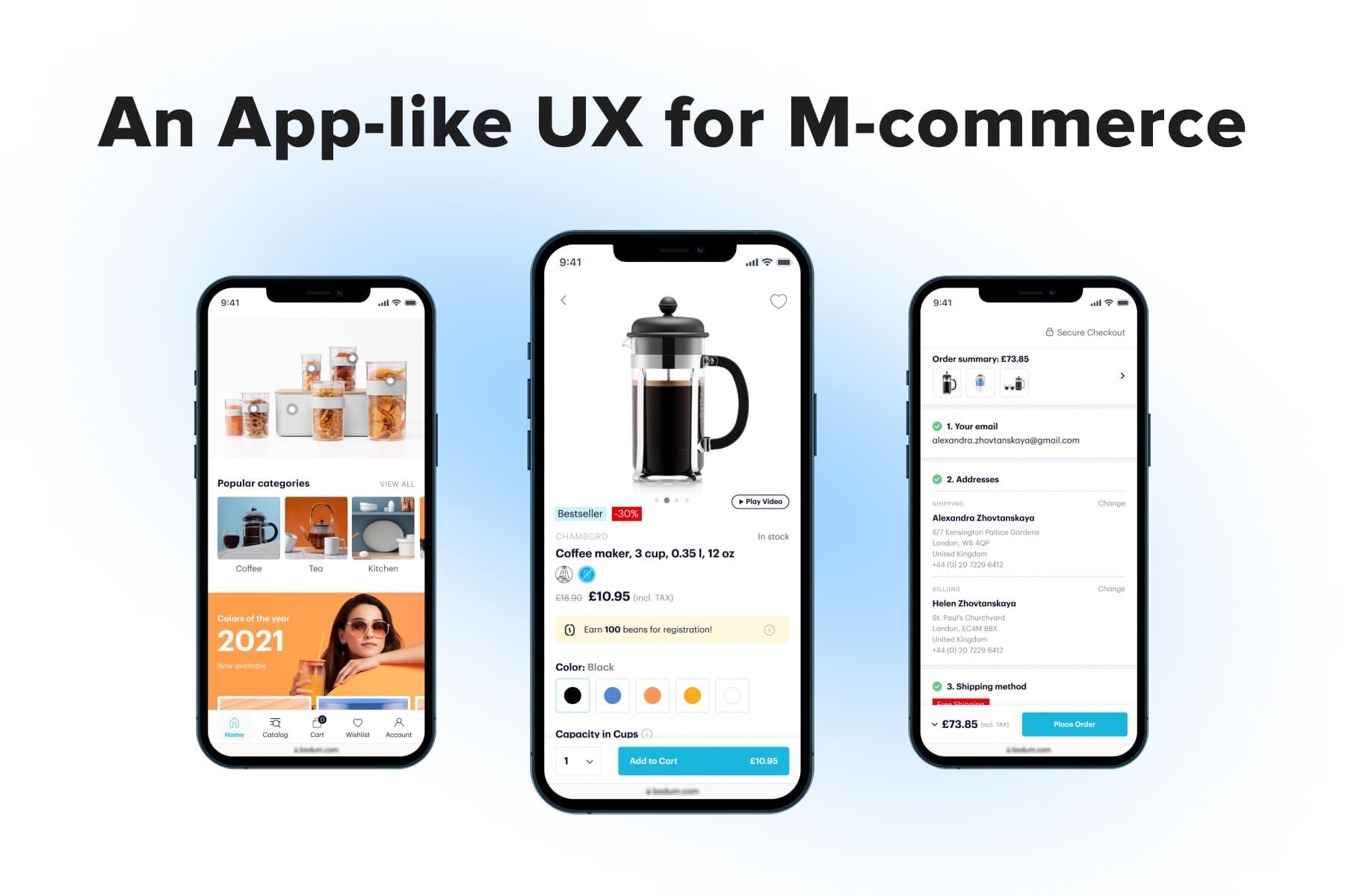
Mobile apps also changed behavioral patterns. Having the possibility to create apps from scratch, designers relocated the main navigation elements down. In this position, they’re easily reachable even when a user holds a phone in one hand. People find it comfy to use native apps, so the app-like design has become the latest trend in mobile web development, especially for projects.
The tab bar has the following traits:
- It’s pinned to the bottom of the page so that the controls are at hand at any time.
- In practice, there are 4-5 tabs in the menu: “Home”, “Catalog”, “Cart”, “Account”, sometimes also “Wish list” or “Help”.
- Sections can be marked either by pictograms or both icons and titles.
- Nesting levels can open in new screens, or in an accordion, or in a mixed style.
Pros & Cons of Using a Tab Bar
Let’s name the main benefits:
- Handy navigation on small, medium, and large smartphones. Users can easily switch between the main tabs.
- We’ve mentioned the case when a prospect studies your catalog and needs to switch to another tab. So when they return to the “Catalog” one, they can continue the customer journey from where they stopped.
Amongst the negative sides, we could note the following:
- Navigation with the tab bar takes twice as much screen space as the top navigation with the hamburger menu. That’s why it might be unnecessary for small stores.
- The number of icons in the navbar is strictly limited: it’s impossible to locate more than 4-5. It means you have to choose what’s more important to prospects. For example, some stores note that the wish list feature is popular, while others see more necessity in customer support.
Which online retail businesses should opt for tab bars?We’d offer the tab bar to any online store with a vast inventory, especially if its target audience is younger people who use apps all the time. You’ll seriously improve their shopping experience.
And what about those who prefer classic mobile navigation via the hamburger menu out of habit? A possible solution is customer onboarding: using animated elements, you can show where the controls are placed and how to navigate now.
Some eCommerce store owners think it’s too early to switch to bottom navigation bars because customers aren’t ready. That’s why even the modern progressive web apps are still often created with the hamburger menu (for instance, browse these with good and bad UI/UX considered). In turn, we advise store owners to choose in favor of the tab bar.
Tab Bar Examples
Example 1
Here you can see our bottom menu implementation for one of our clients. It’s somehow a unique example in which we’ve managed to fit both the sections and subsections in one screen. Moreover, we included thumbnails.
Example 2
And here is another Onilab’s project for IoT solutions provider . It's a more conventional instance when the menu showcases only categories, and users tap to see subcategories. The next nesting tiers open in new screens.
In these stores, the menu covers the whole page using available space to the fullest. Both duplicate the search bar, and when prospects don’t find what they need, they can type queries straight away. Both provide users with the “See all” option to explore the entire sections and then apply specific filters.
c) A Hybrid Menu
We also came across other eCommerce mobile navigation examples. For instance, a store can have both the hamburger and bottom menus.
Below are the screenshots from a marketplace called Wildberries that presents a successful implementation of such an idea. A user can open a catalog on the top and bottom of the page: the menu looks the same inside.
The menu structure is a bit controversial since it combines two ways of opening the next nesting level. Subcategories open in separate screens while sub-subcategories open in accordions. But these lists include enough titles to be opened in new screens as well.
In which cases should eCommerce websites go for hybrid menus?For instance, your store has a diverse audience with sometimes opposite shopping behavior. Youngsters deal with numerous mobile apps that almost always have the menu at the bottom. But middle-aged people could get accustomed to browsing mobile websites with hamburger menus. Having two access points is a nice take to comfort both the former and the latter.
3.2 The Menu Types on Desktop
Although there’s no precise taxonomy, we can name the following menu types that are suitable for desktops:
- A mega menu;
- A drop-down menu;
- A vertical menu (side navbar);
- Hybrid menus.
Using good and bad implementation instances, we’ll try to help make up your mind.
a) A Mega Menu
It’s probably the most popular type for online stores. We’d even call it the best eCommerce navigation menu for desktops in terms of information structuring. Why is it called like this? Because the mega menu always showcases more than one nesting level.
Mega menus appear in numerous variations but always have some common traits:
- The menu takes up full-screen width or opens to the width of the internal content. It either partly or fully covers the screen in height. If the current page is still visible in the background, it often gets dimmed or blurred.
- The menu contains two or more nesting levels: sub- and often sub-subcategories of one parent category. Usually, they’re divided into columns for clarity.
- Most options related to the parent category are visible at once, except for some unpopular ones.
Pros & Cons of Using Mega Menus
The mega menu is our clear favorite for desktops from the UX perspective.
- The best thing about it is the possibility to explore a whole range of subcategories without additional scrolling, hovering, or clicking.
- With the mega menu, you also critically reduce the chance of accidentally clicking outside the menu and going to the wrong page.
On the other hand, mega menus can offer too many possible ways to go that may overwhelm some users. The way out in this situation is thoughtful structuring.
When does it make sense to use a mega menu?
We recommend mega menus primarily to large stores and marketplaces since this is the only way to organize a vast product range smartly and not confuse shoppers. Let’s see how differently mega menus may look.
Mega Menu Types & Examples
Type 1: A classic mega menu
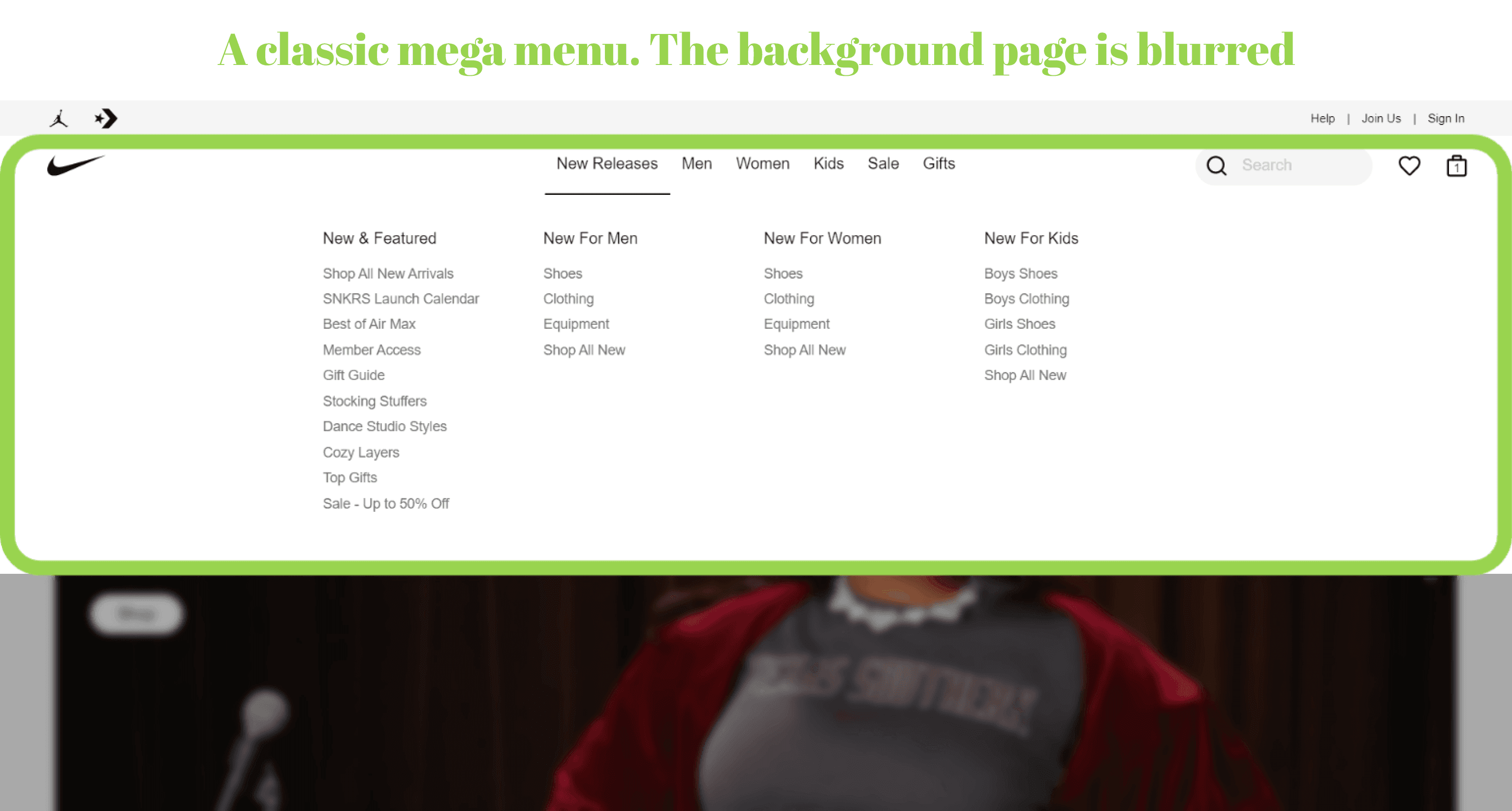
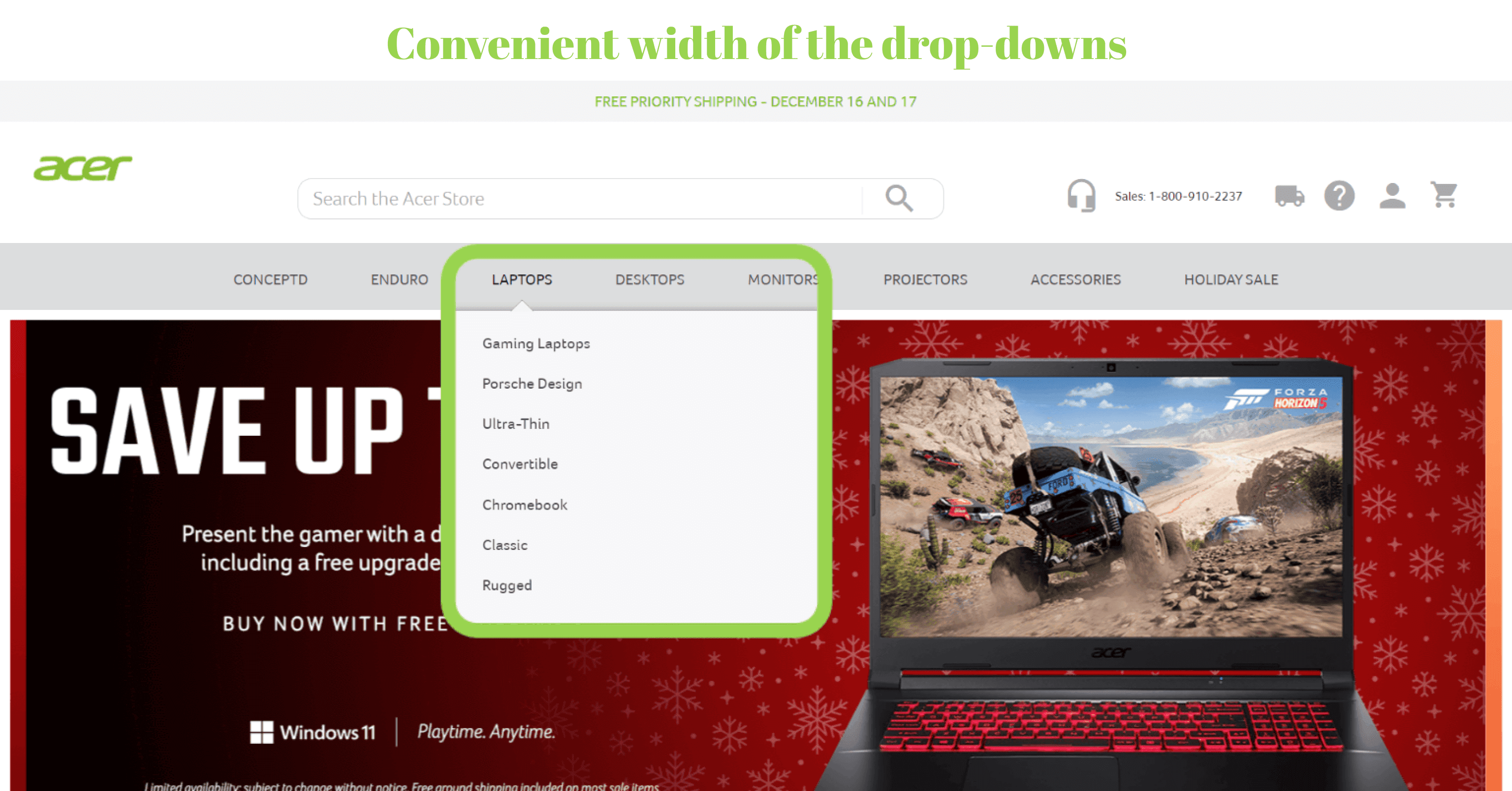
A plain mega menu contains only links to subsections of the selected section. It’s clean, minimalistic, well-structured, and informative. The menu size alters as a user hovers over labels because they have various numbers of sub- and sub-subcategories.
An important rule here is to fit all titles within the above-the-fold area so that no scrolling is required. If you have too many categories to place, it’s better to omit some. You can show them later in the side menu on the category page.
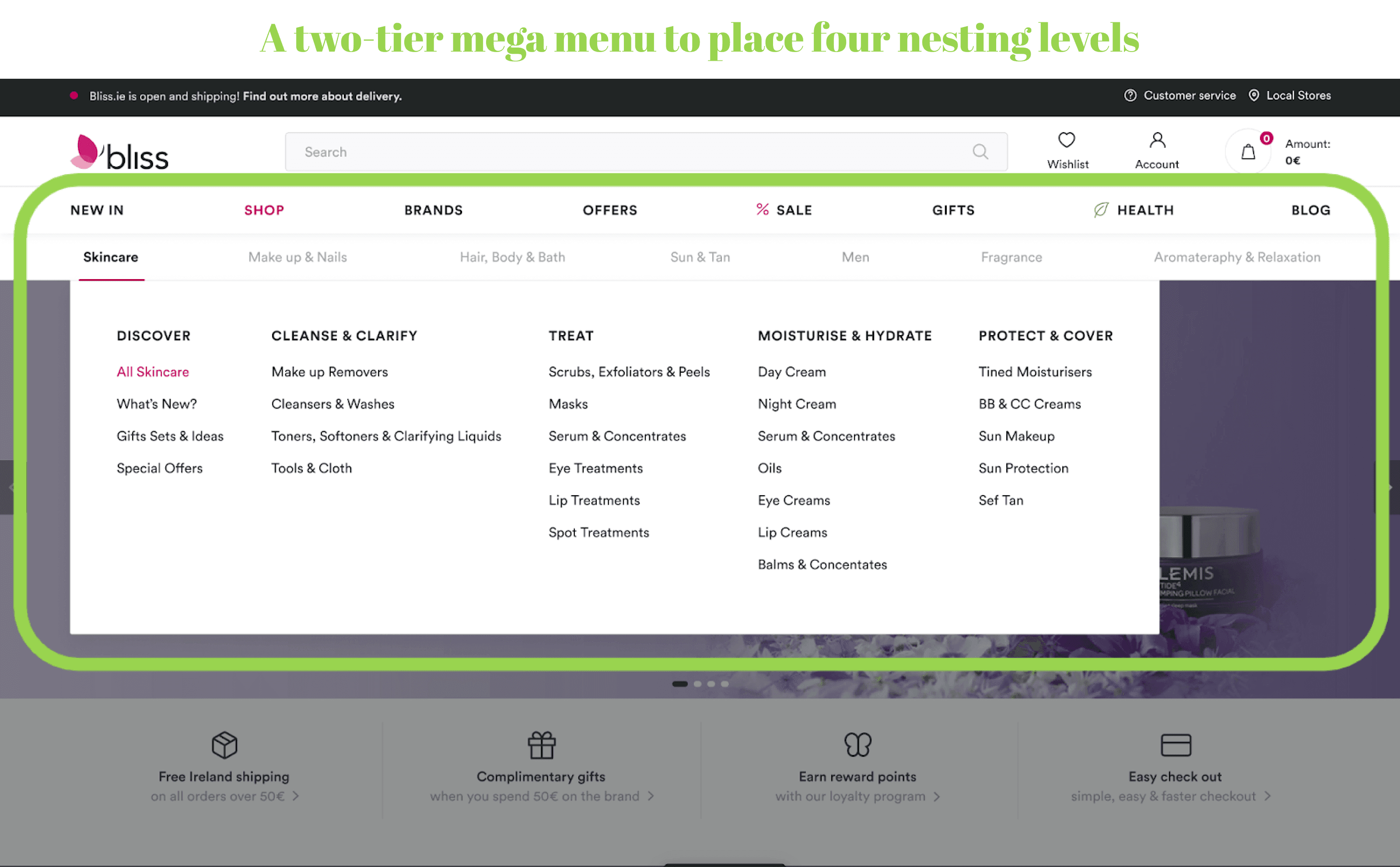
We’ve embodied a traditional mega menu for one of our clients, . But we needed to organize categories with an unusual number of nesting levels: four instead of the standard two or three. We suggested a two-tier mega menu with the preselected “Shop” tab to make the main assortment visible. Outside the “Shop” category, the second tier (the submenu) disappears.
Type 2: A full-screen mega menu
As we’ve already mentioned, there is no fundamental categorization of menu types. So this is how we decided to name this subtype.
If a conventional menu is hover-based, the full-screen mega menu opens and closes by click. As a rule, it fills the entire above-the-fold area except for the header. All in all, there is no way to close this menu unintentionally.
The only possible cause for concern is the increasing number of clicks. But the famous 3-click-rule was debunked a while ago: there is little difference between three and even two dozen clicks. The main thing is that clicks have to be justified and help progress towards a goal.
When a prospect clicks on any category of the full-screen mega menu, there can be a couple of paths:
- They see all subcategories, but the next level of nesting is visible only for the selected subsection
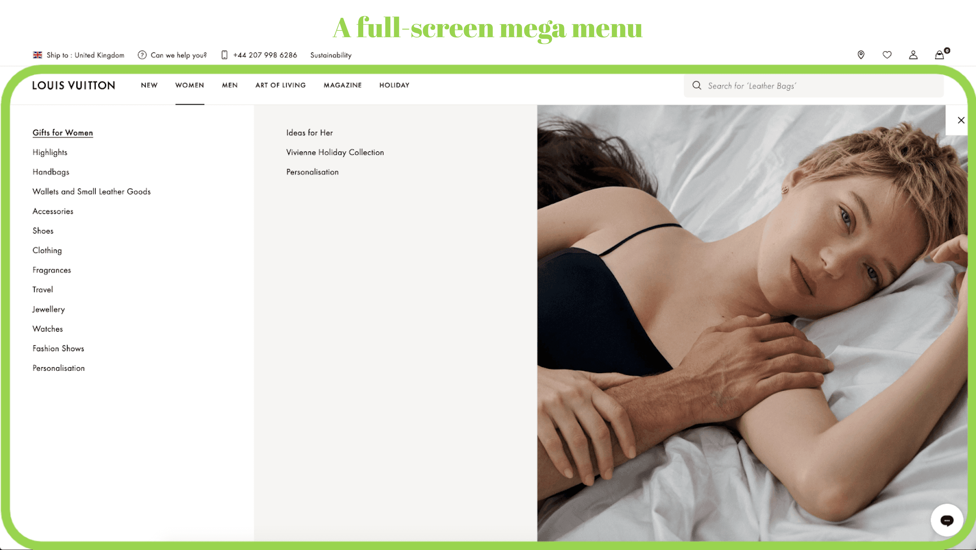
It’s the way to reduce the number of labels in the mega menu and ease decision-making.
Besides texts, this variation might include clickable photos that attract one’s attention and lead to a corresponding part of the catalog.
- They see subcategories with thumbnails. Take a look at one of our cases.
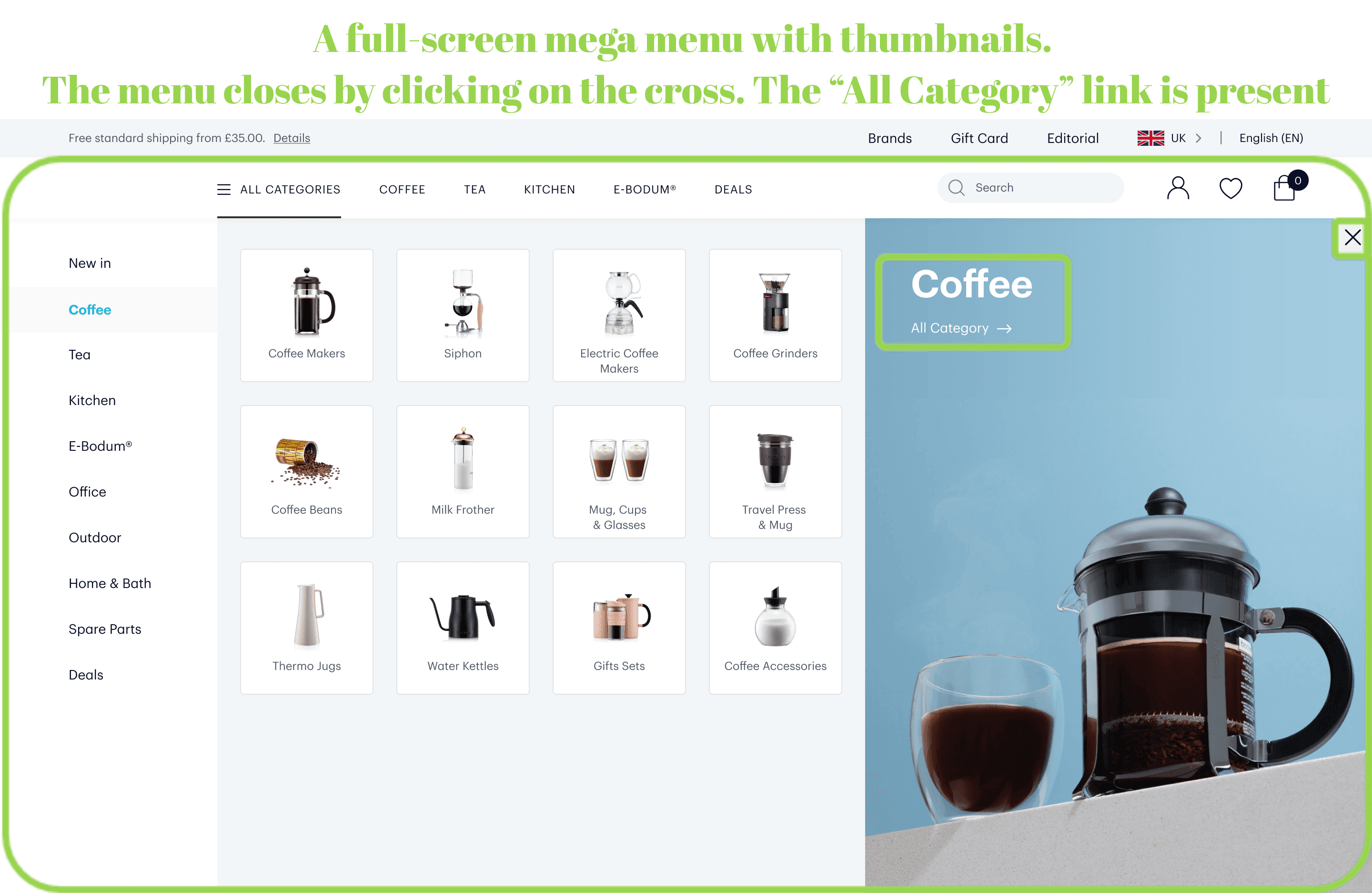
Here you can see two peculiarities: no sub-subcategories (the catalog isn’t that big) but quite large thumbnails. It allows people to instantly grasp what every section is about and decide what they want.
Since it’s vital to allow shoppers to browse all products in any category, we added the “All Category” link on the right.
And here’s one more solution for large catalogs. A store we worked on, had more categories than we could fit into the header, so we introduced the “All Categories” link where users will see the rest.
Type 3: A mega menu with extra blocks/features
Brands often stuff mega menus with promo banners, photos, specific products, and other functionality. It’s done for marketing purposes, to facilitate navigation, and because the desktop resolution allows for it.
But it’s vital to keep the balance so that additions don’t distract customers from the main features and desired actions. If a prospect goes to the menu, their primary goal is to explore the category. And if links fade next to banners (or even gifs!), it adversely affects navigation usability.
Ok then, what can you add to enhance the UX and conversions?
- Show links to category pages with preselected filters
When you have a large inventory, the customers’ behavioral patterns change. For instance, they get interested in seeing certain brands. Also, the typical searching manner for specific products may vary. For example, people prefer to select lipsticks by color rather than other characteristics.
Let’s analyze our mega menu for My-Spexx.de.
Besides traditional lists with subcategories, we decided to add links to categories with preselected filters: glasses of different shapes and items from popular brands. To facilitate interacting with these menu points, we equipped them with pictures/logos. You can also use such a solution to display seasonal offers.
- Mind your filters, banners, and thumbnails
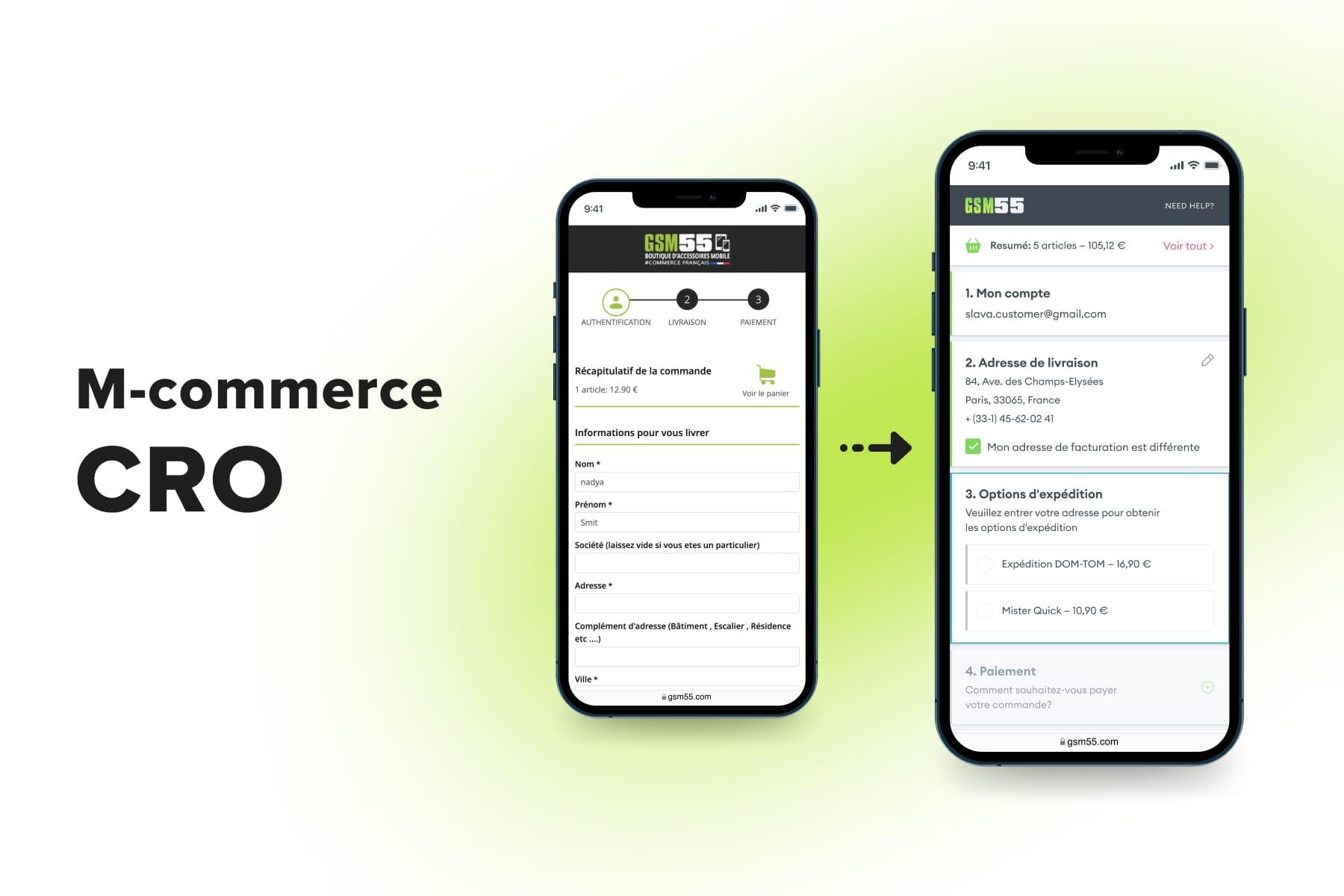
When you need to navigate people through a huge and highly specific product range, you might need more visual language alongside titles. Here are the screenshots from our design project for GSM55.
Based on the niche peculiarities, we uniquely approached each category, depending on the popularity of certain clarifying queries. For instance, in the “Audio” category, we see subcategories, a category photo, and links to sections with pre-applied filtering by brand. It’s so because people search for headphones from their beloved brands.
But in the “Protection” tab, we displayed popular devices for which people look for cases and other stuff. Besides this, we added thumbnails to simultaneously emphasize subcategory links among other content and make it clear what’s behind each of them.
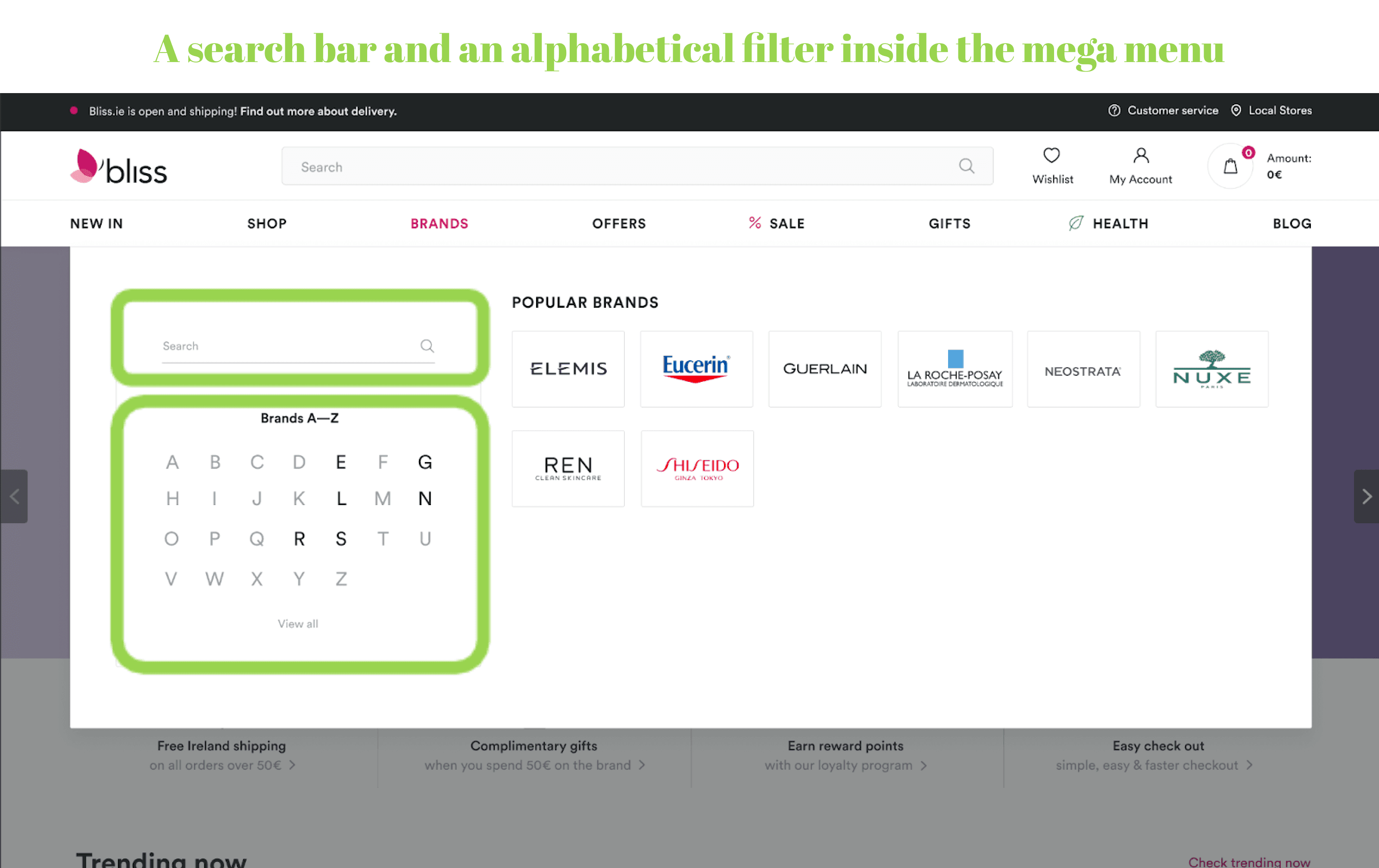
- Imply complex functionality
Finally, when you need to organize an extensive catalog, you may utilize even more artful features such as a search bar or an alphabetical filter inside the menu.
One of our clients, Bliss, wants to critically expand its brand range. That’s why we added both options we’ve mentioned.
- What you shouldn’t do
And here is an example of a questionable mega menu implementation.
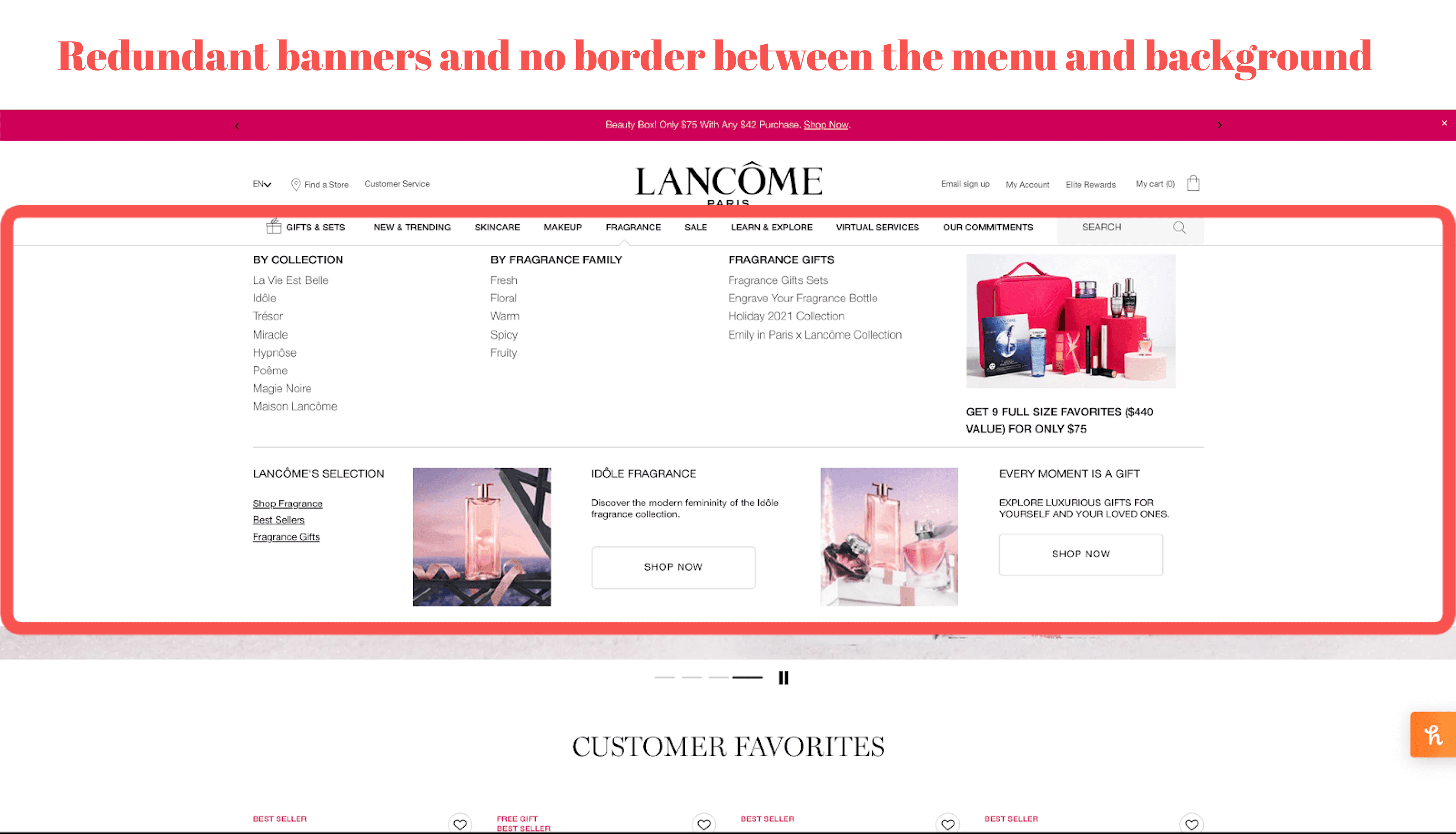
Firstly, the menu isn’t visually separated from the background page, so users don’t understand where the menu ends. Secondly, there are too many banners for one tab which distracts users from the categories themselves. Finally, the font color and sizes make titles even more faded compared to banners.
b) A Drop-Down Menu
Drop-downs are familiar to all users: program interfaces and lots of websites adopt exactly this type of menu for their desktop versions. It has the following characteristics:
- Typically, it’s a simple list of options placed in a narrow vertical rectangle.
- Sometimes the next nesting level is present as well, available by hover or click.
- For eCommerce sites, the call method is most commonly hover-based, but there are some exceptions.
Pros & Cons of Using Drop-Down Menus
Any drop-down menu has far fewer titles in sight than a mega menu. It means people won’t get lost in abundant information.
On the other hand, it seems that drop-downs have more shortcomings than benefits:
- If a store has numerous categories and a few tiers of nesting, it’s unlikely that you'll organize them all in drop-downs conveniently.
- Another significant issue is constantly closing drop-downs when customers accidentally move the cursor. Apart from the need to choose options one more time, a prospect may end up clicking outside the menu and going to a page they didn’t mean. It’s annoying, so it won’t be surprising if the user closes the website eventually.
So should eCommerce stores apply drop-down menus?
This menu is appropriate mostly for blogs and various informational websites because such sites don’t have a large nesting.
But in eCommerce, the situation in most cases is the opposite. Online stores have loads of categories and subcategories, so placing them into narrow and labile drop-downs is an obsolete approach.
And what about small stores with just a couple of categories and subcategories? You can either use the drop-down menu or display the main titles in the header while locating subcategories on the category page (in the side menu).
Drop-Down Menu Examples
Example 1
This example illustrates an acceptable implementation of the drop-down. It has only one level of nesting; the font size and space between the lines are normal; the drop-downs themselves are wider than usual for a better UX.
Example 2
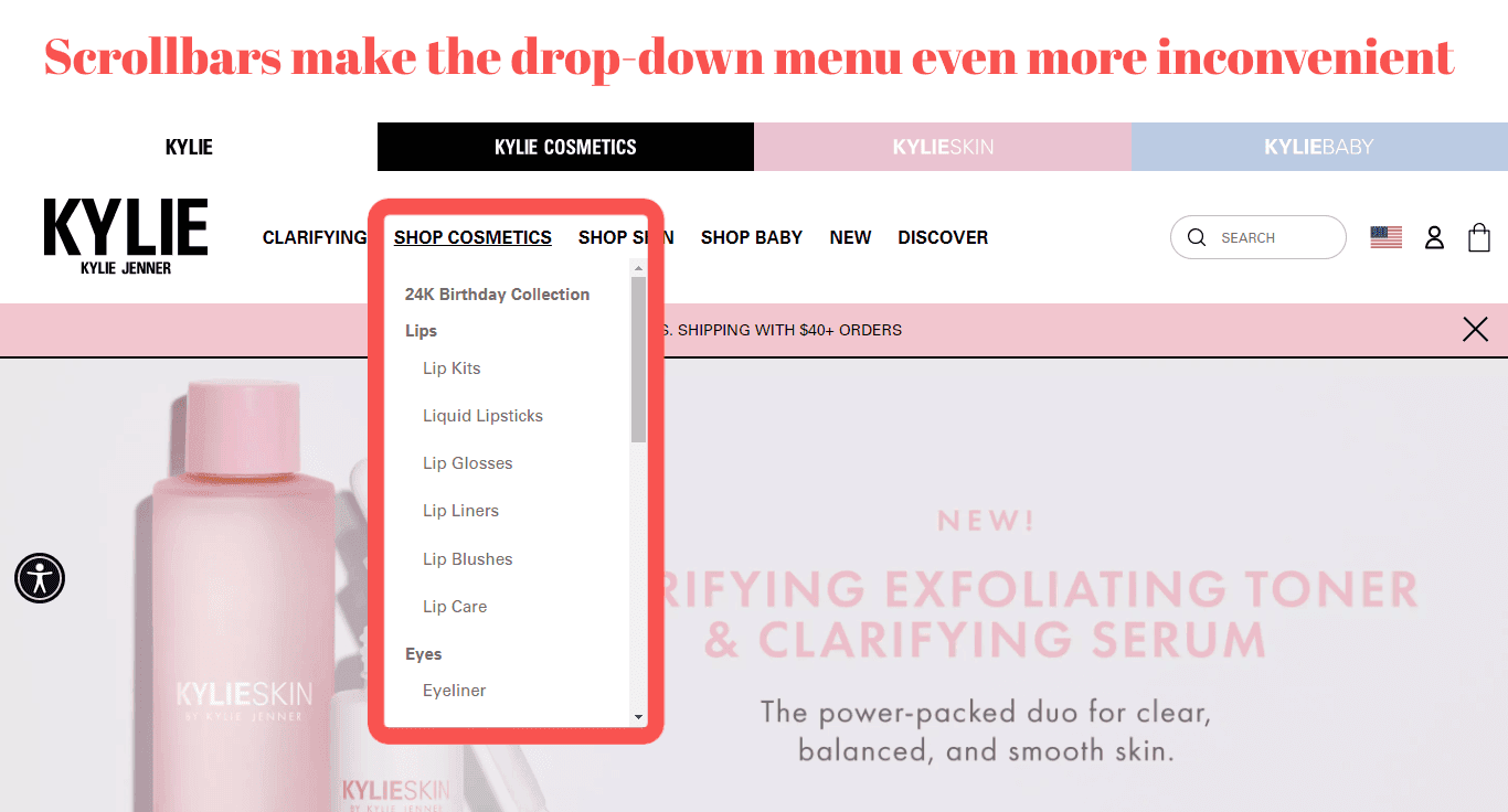
Fortunately, it’s difficult to find eCommerce websites with drop-downs containing two or three nesting levels. But we found another unacceptable instance of the drop-down menu: a scrollable one. To understand why it’s so horrendous, try to use the scrollbar. We bet that your cursor will just slip off and the tab will close.
c) A Vertical Menu (Side Navbar)
Being a primary menu type for mobile websites, it’s not so popular on desktop versions. Let’s see the signs of side navbars:
- The whole menu is most commonly hidden in the hamburger icon or the “All” or “Menu” title in the header.
- It’s called by hover or click and appears on the left (on rare occasions on the right).
- Nesting levels aren’t usually visible until a user clicks or hovers on the parent category.
Pros & Cons of Using Vertical Menus
To be honest, it’s hard to find cases when using a side navbar is justified on desktops. So why does such a type appear even in world-renowned online stores?One reason behind this is the mobile-first approach: some brands design their mobile versions prior to desktop ones and decide to leave the menu as is. But the UI/UX principles for various devices are critically different, so we don’t recommend you do so.Here are the arguments against using vertical menus on desktops:
- If the menu is entirely hidden, potential customers can’t immediately comprehend what you sell and opt for a category. It’s better to keep main labels in sight.
- So why not make all titles visible? If the whole set of categories is displayed like a list, this will take up more space than if you locate the main ones in the header horizontally.
- Maybe pictograms are the way out? Not really, because it’s tough to mark certain categories so that it’s easy to grasp what’s behind icons.
Is it reasonable to use vertical menus on desktop versions of stores?
As you’ve already understood, we don’t advise applying a side navbar to the desktop versions of online stores. Anyway, let’s see which forms this menu can take in eCommerce.
Vertical Menu Types & Examples
Type 1: A slider
In fact, it operates precisely like on mobile. Each new nesting tier appears in a new slide either covering a previous level or opening sideways. Amazon represents the first option.
It hides a list of categories as a user chooses one while there’s so much room for expanding the menu. Prospects will definitely forget what was listed previously. Also, they have to return if nothing matches their query. Moreover, some subcategories don’t fit in the list, and a person must scroll back and forth.
Ok, people frequently use the site’s search. But for those just interested in buying something it’s inconvenient to explore this vertical menu on desktops.
Online merchants might think that successful giants like Amazon do everything right, and it’s fine to copy some ideas. The truth is, some popular websites can afford to fall short of expectations in terms of the user experience as long as they’re market leaders. It’s not safe to follow their lead ignoring the UI\UX principles.
Type 2: An accordion
The main drawbacks of this solution are the need to scroll too much and the very limited visibility of subsections. Usually, when a person selects a new subsection, the previous one is collapsed.
At the same time, accordions are quite useful when a store needs to showcase just a couple of subsections (maybe there’s no need to go to a separate screen). Zara is a vivid example of such a menu.
Firstly, users should find a little hamburger icon in the upper left corner. Then they explore a very long and narrow list of options. Is it convenient? Absolutely not.
Why did the brand create the menu this way? Well, it mainly bets on its offline stores and uses the website more as an online magazine. So Zara can afford a bizarre interface. But for brands focused on online sales, we’ll never recommend implementing this menu on desktops. We’re also convinced that Zara would only win from having a full-fledged mega menu.
Type 3: Several nesting levels
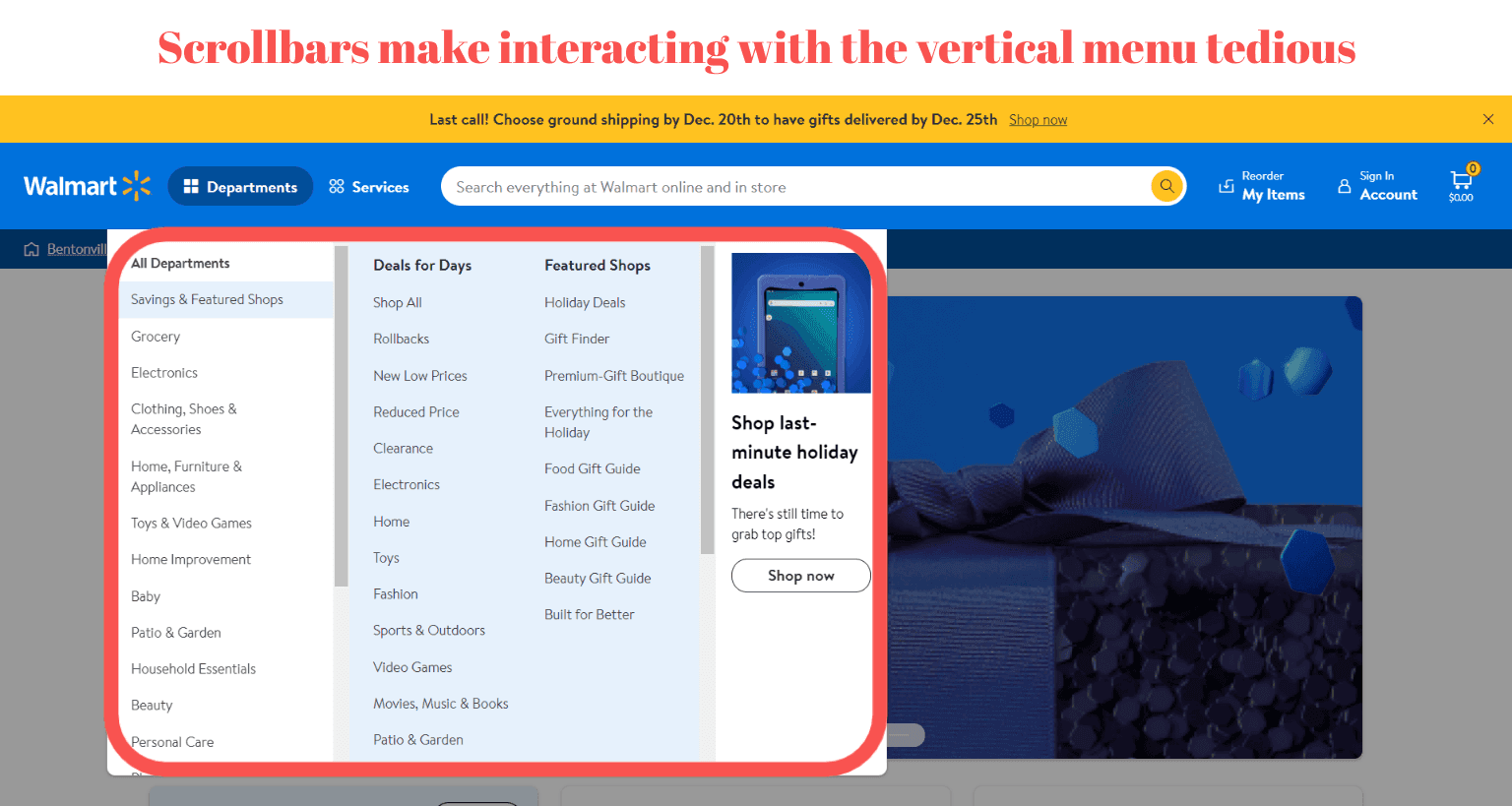
One more variation of the vertical menu shows several nesting tires at once. Take a look at the example below. It would be more convenient for customers than the subtypes mentioned above if there weren’t any scroll bars.
d) A Hybrid Menu
Sometimes we come across various modifications of the menus that we’ve already discussed. Let’s consider a couple of instances.
Hybrid Menu for Desktops: Types & Examples
Type 1: A mega menu + hamburger menuConventionally, brands try to fit all essential links (the account, cart, wishlist, store locator, and so forth) in the header.
Wayfair went another way: the main store sections are organized in a mega menu while axillary services and personal data links are in the hamburger. We’d advise not to hide the account pictogram, but this menu subtype seems to be quite nice in usability terms.
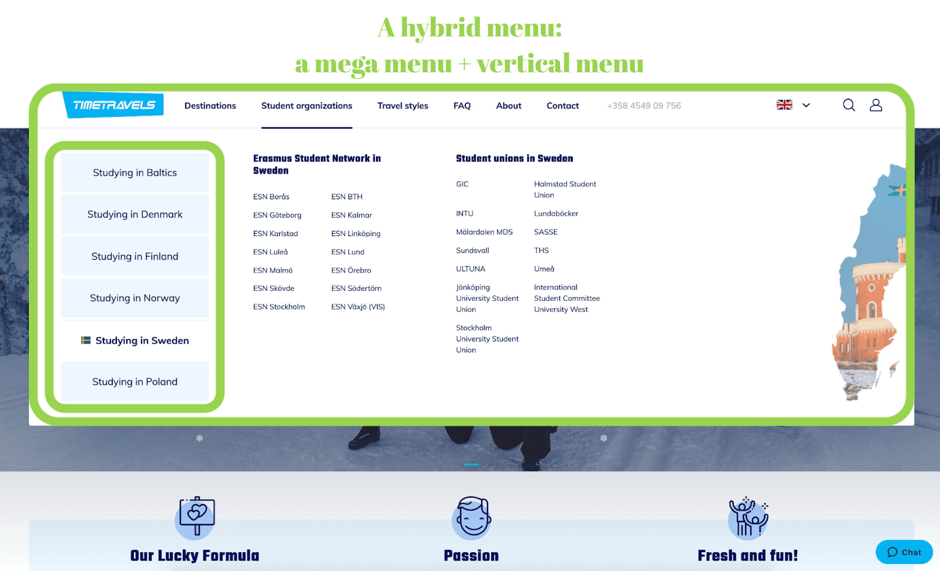
Type 2: A mega menu + vertical menuIn our project for the travel agency , we’ve embedded a vertical menu into a classic mega menu to structure loads of country-related options. Such a move allowed us not to overload the menu with data. At the same time, it’s better for travelers to choose the destination first and then study available info.
Type 3: A horizontally scrollable mega menuIt was truly astonishing to discover this example. At first glance, it’s a typical mega menu (by the way, it could be organized better to avoid scrolls). But it turned out that a horizontal bar containing section titles can be moved to the left and reveal a few more categories. It’s doubtful that a user will notice it (the first screenshot was taken on a laptop with a popular 1366x768px display resolution).
4. Universal Tips for Organizing Categories
The best eCommerce navigation solutions not only focus on the menu type but also structure the categories logically. There are some rules applicable to almost any store, be it a mobile or desktop version.

Explore our eCommerce portfolio on Behance
See how Onilab's designers and developers transform the UX and improve conversions for online stores across the globe.
4.1 Parent Categories
Below we’ll share four things to keep note of when designing parent categories.
Tip 1: Make categories prominent
Remember that newcomers should understand what your online store is all about. On desktops, you can implement a mega menu and display the main categories in the header. On mobile, the menu is anyway hidden, so what can you do?For instance, place a slider with category titles and thumbnails on the homepage, in the above-the-fold area.
[onilab_carousel name="Macy's website screenshots"]
Tip 2: Give the titles and menu structure some thought
All labels must meet two criteria: be comprehensible to your customers (no jargon) and as short as possible (preferably one word).
How do you name sections and categorize products correctly? Conduct research using the card sorting method. Open card sorting implies that the category titles aren’t defined: your focus group has only cards with product names and should answer where they will be seeking these items.
If the categories are predefined and the task is to just sort products into categories, it’s called closed card sorting.
Tip 3: Define the must-have categories
Traditionally, online stores include the “Sale” (“Clearance”) and “New” sections in the menu. Why? Everybody loves discounts, and your regular customers like to explore new collections.Besides, include various seasonal categories like “Christmas Gifts”, “Mothers Day”, and so forth to facilitate the search for customers and increase your sales.
Tip 4: Choose the right number and selection of categories to display
Don’t hide the whole catalog into one “Shop” category because it says nothing about the store’s assortment. And don’t divide the catalog into an endless list of too-small sections.
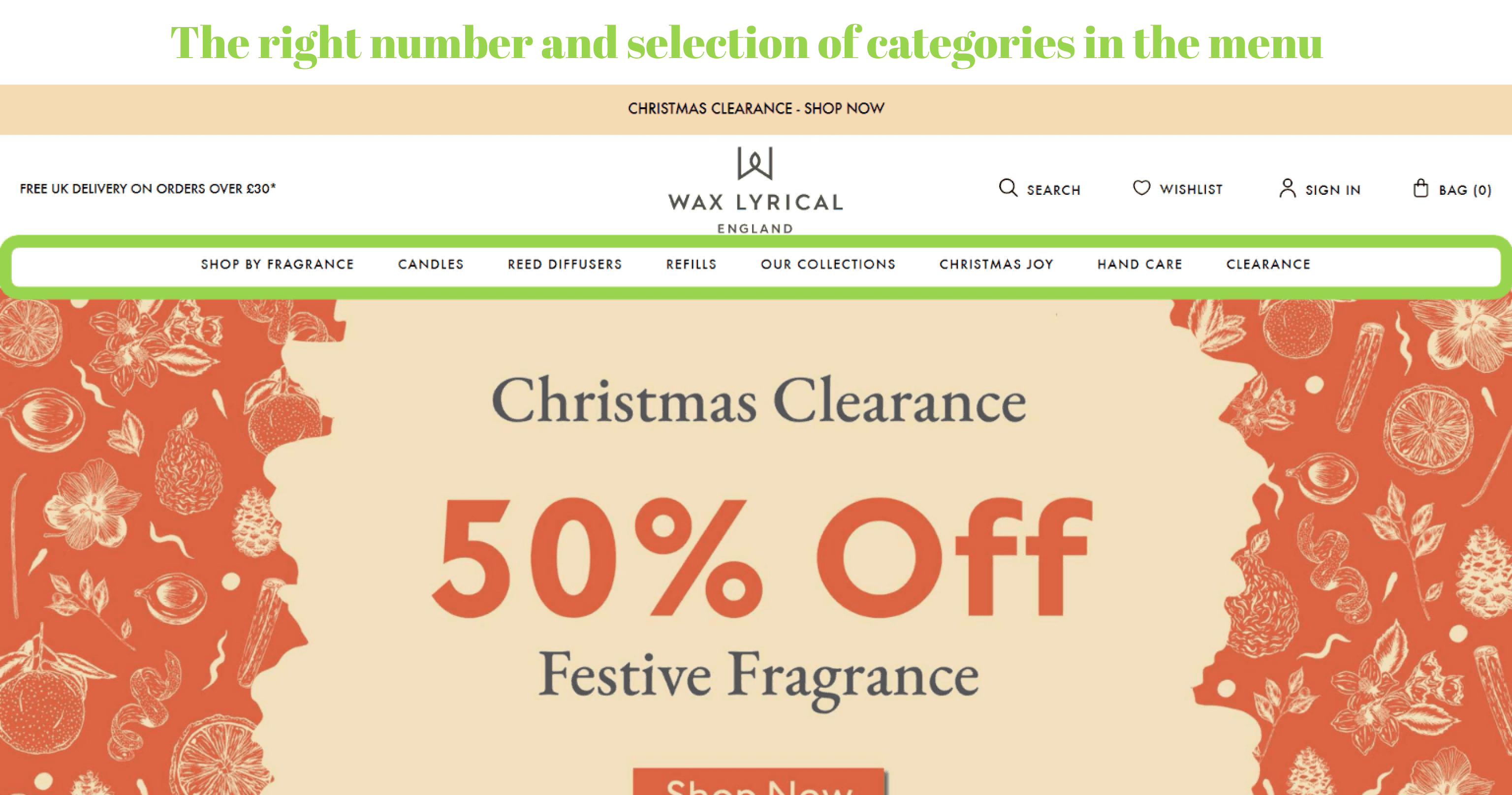
But what if a store itself is small? Let’s say you sell candles. Goods slightly differ from each other, so you can hide an entire catalog behind the single “Shop” title. But a better way would be to analyze the search queries on your site and on Google. Find out how people search for your product type and use these keywords in the menu.
For instance, Wax Lyrical shows the “Shop by Fragrance” section since people prefer scented candles. Note that there are also categories we discussed above: “Christmas Joy” (a seasonal one) and “Clearance” (sale).
4.2 Subcategories
The menu’s hierarchy is extremely important. So let’s talk about what you can do with the subsections.
Tip 1: Make sure customers can explore the whole subcategory
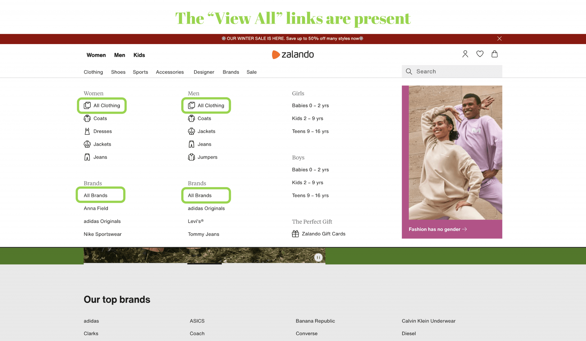
When people choose a category (e.g., “Clothing”), they see the list of sub- and sub-subcategories. Yes, it’s right to provide customers with narrower options. But ensure they can also explore all products from the subcategory or all sub-subcategories (if there’re dozens of them) in one click. You can do so in two ways:
- Add the “View All” link (on mobiles and desktops). It’s smarter to locate it at the top of the list;
- Make the subcategory titles clickable (on desktops).
Tip 2: Don’t make subcategories too narrow
It’s a definitely bad user experience when shoppers come to a dead end almost at the beginning of the customer journey.
To avoid it, every subsection should have a sufficient number of products. If there are few of them, revise the structure: you might not need some subsections. After all, buyers can apply filters.
Tip 3: Duplicate sub-subcategories
In some cases, people can search for the same goods in different sections. It’s very likely to happen in marketplaces.
For instance, users will look for a camera bag in the “Camera & Photo” as well as the “Accessories & Supplies” categories. What will you do? Place corresponding options in both sections to improve the odds of finding them.
4.3 The Main Category Pages
We’d like to emphasize having top category pages amongst the best practices for eCommerce navigation (especially for large online stores and marketplaces). Sometimes they're also called landings, intermediary pages, or mini-homepages.
Why do you need them?
- Firstly, to make your huge inventory better organized for customers in visual terms.
- Secondly, to build more targeted and, therefore, efficient marketing campaigns.
Tip 1: Create a section overview
The main category page should give an overview of the section and can have the following blocks:
- Subsections belonging to the parent section, accompanied by thumbnails or photos;
- Various promo banners;
- Product selections and gift guides;
- Popular products.
Tip 2: Be relevant
On top category pages, stick to the two rules:
- Prioritize subcategories over promotional content. The best solution is to have subsections visible in the above-the-fold area.
- Keep the visual info relevant. It’s irritating when customers click to see product listings and can’t find items featured in the banners/thumbnails.
To Conclude
We’ve covered the vital aspects of eCommerce navigation: organizing the header and footer, choosing the menu type, structuring categories, and more. Study the user experience, explore navigation in competing stores, create several hypotheses, and A/B test them. Such a strategy will help you reach more efficiency, reducing the bounce rate and leading more users to the checkout.
But, of course, it works only if you keep track of the site’s speed. It’s a required condition for any modern store (check our for tips).
The best practices mentioned in the article aren’t ready-made templates because it is your business with its own peculiarities and customers’ behavior that determines which route to take. In the case of , our team takes all these aspects into account to create a simple-to-navigate, convenient, and usable store design.
To achieve optimal navigation and user experience, consider partnering with an that can conduct in-depth user research and develop tailored solutions for your store.