Each store experiences this: a high cart and checkout abandonment rate. On average, about 7 out of 10 created orders don’t result in transactions. On the one hand, such user behavior is quite natural and inevitable. A large proportion of people just go window shopping from time to time, comparing prices, forming a kind of wish list, looking for gifts, and waiting for future discounts.
On the other hand, many actually want to purchase but, for some reason, don’t make it to the finish. Losing visitors with a high buying intent is particularly frustrating for a business.
There’s a whole list of reasons behind the cart abandonment phenomenon, from unsatisfactory shipping and return policies to a confusing checkout, an unoptimized mobile site, and performance issues. We preach (and practice) a strategic approach because stores basically have more than one flaw to address. Let’s discuss those triggers, see some fascinating statistics, and learn how to reduce the cart abandonment rate for eCommerce websites.
Table of Content
1. Understanding Cart Abandonment
We all know the answer to “What is shopping cart abandonment?” But let’s refresh how to calculate it. As a rule, stores track this metric monthly.
Firstly, we divide the number of completed orders by the number of shopping carts created during the given period. Secondly, we subtract the result from 1. Thirdly, we multiply it by 100%.
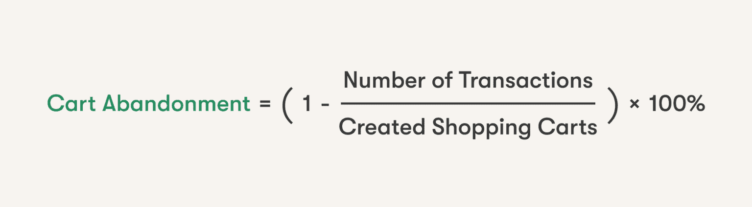
If visitors initiated 10,000 sales (add something to a basket) last month, and only 4,000 of those resulted in actual transactions, then you have a 60% shopping cart abandonment rate.
1.1 What Is the Current Cart Abandonment Rate?
Now let’s put your store’s percentage in context and find out why people tend not to complete their orders. Authoritative market researchers constantly monitor cart abandonment-related stats globally and in individual states. They also do segmentations by industry and device type.
- The average eCommerce cart abandonment rate in 2023 is 69,99%, according to Baymard Institute.
- On mobile, this figure is traditionally about 10 percentage points higher than on desktop. In the US (as of the 2nd quarter of 2022), cart abandonment on smartphones reached 84%, while on laptops and PCs, it was 72%, Statista says.

- Statista records approximately the same ratio (mobile vs. desktop) in the 3rd quarter of 2022 in the UK (81% vs. 72%), France (89% vs. 79%), and the Netherlands (80% vs. 68%). Here you can also notice how the cart abandonment rate differs from country to country.
1.2 The Reasons for Cart Abandonment
Breathe a sigh of relief: for eCommerce, an abandoned cart is a typical issue. Now let’s move to the reasons for not completing purchases.
- As much as 58% of those giving up orders do so because they were just browsing or weren’t ready to buy. It’s the findings from a 2022 Baymard survey amongst US online shoppers.
Joint research by Baymard and Statista weeds out this group and zeroes in on the remaining cart abandonment reasons that online stores can combat. Here is what Americans regard as the primary factors for not closing deals on eCommerce websites:
- Too high additional costs like shipping or taxes – 48%
- The need to create an account – 24%
- Slow delivery – 22%
- Misgivings about sharing credit card details with a website – 18%
- A lengthy or complicated checkout flow – 17%
- Inability to view or calculate the whole order sum in advance – 16%
- Website errors – 13%
- Unsatisfactory return policy – 12%
- An insufficient number of payment methods – 9%
- A credit card was declined – 4%
At last, we also have insights into what happens after users abandon their carts.
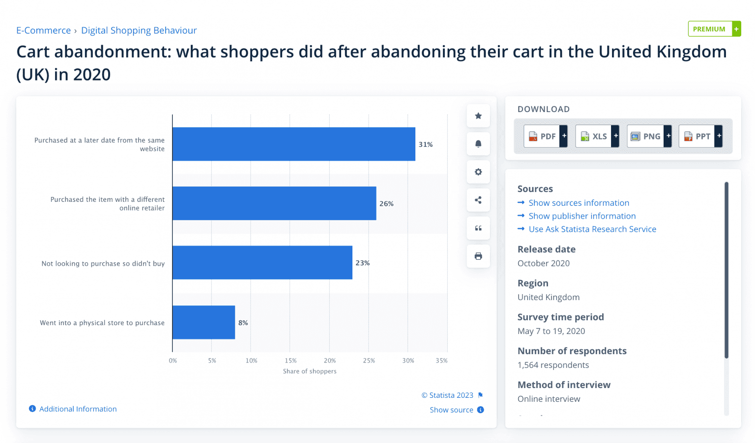
- Statista’s 2020 survey in the UK shows that 31% of those leaving without a purchase return later to purchase from this store. But 25% eventually buy from rivals.
In fact, users prompt stores about the pain points to cope with. What problems would apply to your case exactly? You may not know for sure. By partnering with an , you can spot friction points and remove them.
Further, we'll discuss actionable ways to prevent cart abandonment and encourage cart recovery.
2. How to Reduce Cart Abandonment in the Store?
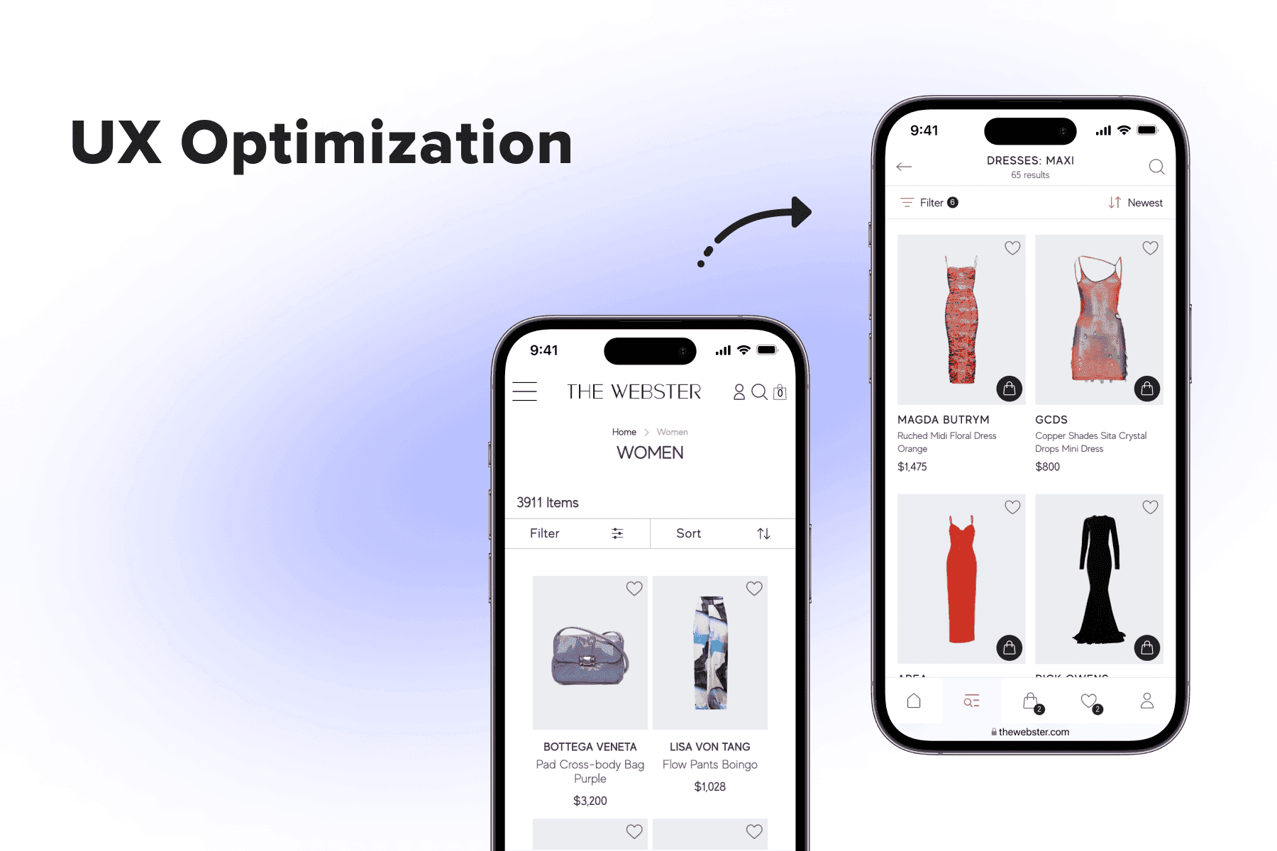
It’s way easier to convince customers to complete orders when they’re still on the website than if they bail out after hitting a snag. So, the top means for reducing Shopify, BigCommerce, or Magento cart abandonment is to refine the user experience in the store. That's where you can benefit from to find out what disrupts a smooth user journey.
But first, the store team should identify the weak areas. By and large, the issues are likely to match those typical ones stated above, but some will be unique for each site. The best method to spot them is spending a lot of time in Google Analytics looking for patterns and abnormalities:
- Take a look at the most popular exit pages. Which parts of the site become the end of the customer journey? Do users actually go to the cart or just add items and bounce from the product pages? Do they more frequently abandon the cart or checkout page?
- Evaluate the performance in relation to past periods. Are there any changes compared to the previous month, quarter, or year? What might they be linked to (new features, UX changes, marketing campaigns, etc.)?
- Segment the data by device, country, OS, browser, and so forth. Is mobile cart abandonment even higher than the rate for your industry or region? Are foreigners tend to drop off after seeing the shipping costs? Do people find out you don’t work with their region before adding items to a basket?
The data-backed approach allows us to opt for better tactics to reduce shopping cart abandonment. Let’s see what’s in the armory.

Get a Free UX Audit Example
Read our demo UX report exploring the online store’s checkout issues.
2.1 Tackling Cart Abandonment: Strategies for the Whole Store
Analyzing the reasons, we can form a few groups of objections. First and foremost, it’s the lack of transparency that accounts for a large proportion of abandoned shopping cart cases. Some will check the actual shipping options, extra costs, and return policy themselves. But others will find out later, may deem it as a ploy, and just leave.
If you showcase these essential details as early as possible in the conversion funnel, you’ll ease online shopping for all customers.
Cut Additional Costs or Don’t Hide Them
Let’s recall: 48% of online shoppers name high extra costs as the reason why they abandoned shopping carts. And 16% blame the absence of a possibility to see or calculate the total sum earlier than at the checkout.
Indeed, nobody likes spending extra money on delivery, especially having lots of other stores not charging for it. But hidden costs peeve users even more. That’s what you can do to remove this hurdle or at least mitigate its effects:
- Be forthcoming: announce the shipping terms on product detail pages (PDPs). When it comes to free shipping, brag about it literally everywhere, including on a benefit bar (above the header) and the homepage. If you charge something, mention the range/starting fee/threshold on the PDP. If you reveal this info on the cart/checkout stage, it’s too late: you’ve undermined customer trust.
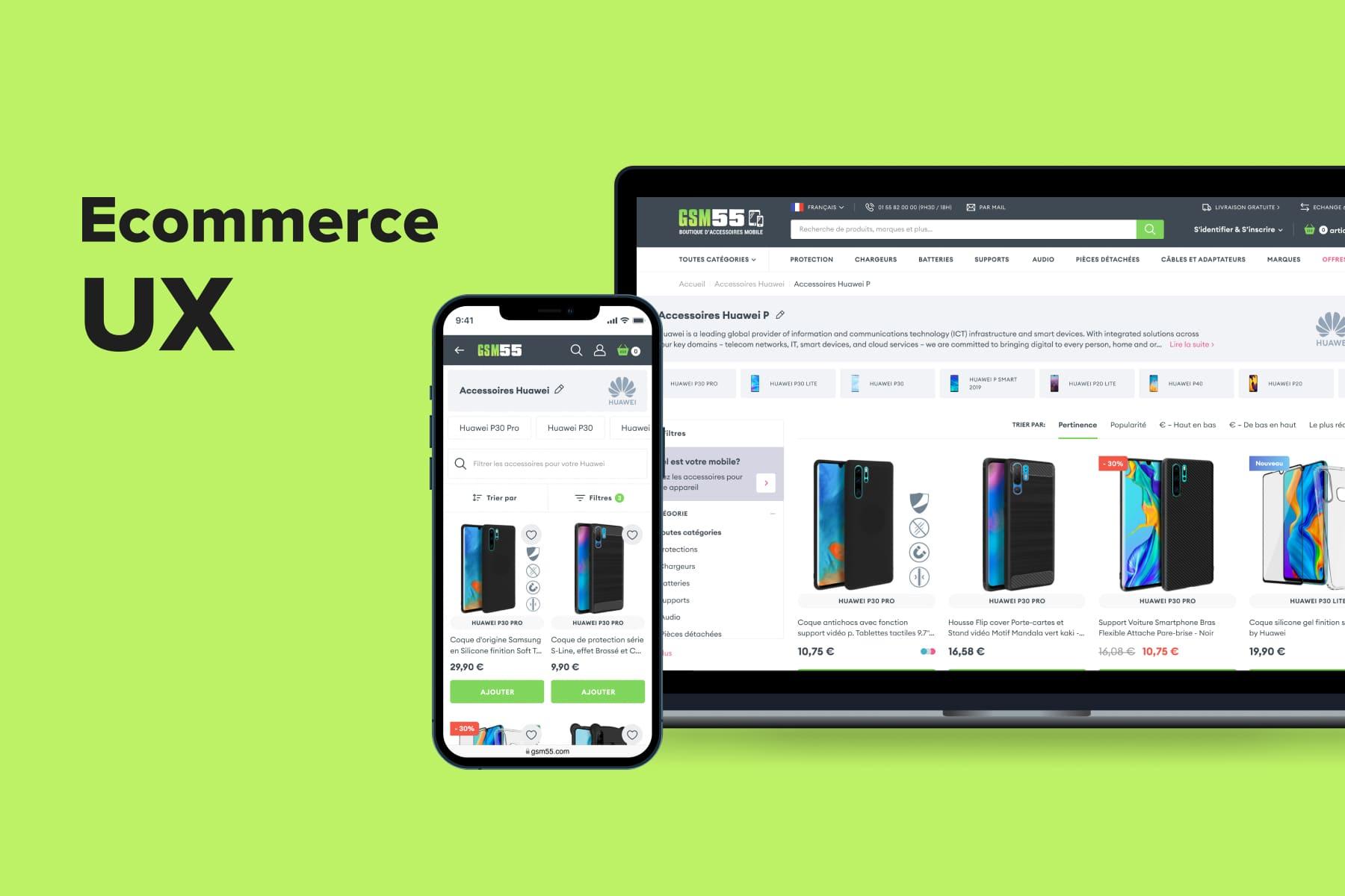
Onilab’s long-term client, , whose case you can read in our portfolio, avoids this mistake. The French mobile accessory retailer provides full information upfront, leaving no room for surprises when it’s time to pay.
- Consider lowering the threshold for free delivery if lifting shipping fees is impossible. Always highlight this minimum needed sum on the PDP (“Free shipping from $50”) and cart pages (“$12,55 left for free delivery”). Add a progress bar to visualize how much remains until one is eligible for free delivery.
Our Onilab team adopted this approach when upgrading an Irish online store, Bliss. Take the time to read its .
- Add a calculator to the PDP if the sum hugely depends on the shipping address. After entering a zip code, visitors can see how much it will cost them. If you obtained user data (postcode, shipping method) at this stage, prefill the corresponding fields on the checkout page.
We brought this idea to life for , an American retail store chain selling a variety of products, from furniture and electronics to appliances and jewelry.
Accelerate Delivery or Give More Options
Why is shopping cart abandonment a problem for retailers? Partly because it indicates a bunch of flaws on the website and in the overall concept. Stores must tackle them to stay relevant and profitable.
As we know, about 22% of surveyed US buyers decide not to close a deal due to slow order delivery. Other studies showed that in 2012, people mostly expected to get their parcels in 5,5 days; in 2016, in 4,8 days; and in 2019, in 2-3 days.
We again have many big market players that got people accustomed to 2-3 business days delivery. Many stores can’t easily keep up with this industry benchmark. What should they do?
- Say as it is and as early as possible. It’s better if users are aware of the estimated delivery date when they’re at the consideration stage (a product page). And if you provide superfast shipping, stress this benefit across the site.
Follow the example of , an Australian brand of customizable goods. The online store gives customers a glimpse of delivery options right on the product page, in contrast to Ikea, where this information is available only at checkout.
- Open the details in pop-ups. The delivery terms for different regions (and overseas) might differ substantially. To keep such service messages succinct, mention a time range and add a link to more info. Importantly, don’t take people away from the current page. Pop-ups help to avoid disrupting the flow.
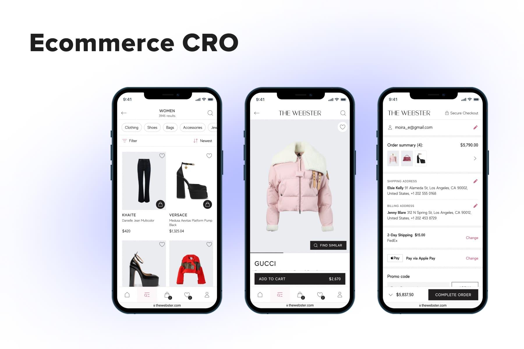
Our team implemented this solution for , a renowned American luxury fashion retailer.
- Broaden the shipping possibilities. Apart from courier delivery, you can utilize parcel lockers (in many cases) and the BOPIS option (“Buy online, pick up in store”, also called ”click and collect”). They might be simultaneously faster and cheaper. Anyway, diversity rules: the more variants you provide, the higher are odds of matching customers’ needs.
Mention the Return Policy
12% of purchasers call return terms the reason they change their mind about ordering. You’ll persuade more visitors to take this little risk if you explicitly say how convenient it is to send back the pieces and get a refund. So we advise placing brief info on returns right on product pages. And, surely, adjusting the policy if it’s not so attractive now.
- Free returns. It’s effectively an eCommerce standard, and customers won’t settle for anything less (in this case, more). But still, do accentuate this as a benefit for buying from you.
- A longer return period. While traditionally, stores offer 14-30 days, some prolong the period up to 100 days, for instance.
- Improve service. Firstly, provide various ways to return: order collection by a courier, dispatch via lockers/partner pick-up points, or use the BORIS option (“Buy online, return in store”). Secondly, print the return labels and put them into boxes/envelopes. Also, the best eCommerce companies use resealable packages to make shopping even more effortless and pleasing.
- Make it clear about refunds. Tell visitors how long it takes to see their money back, depending on the payment method. Again, use pop-ups to store this extensive info compactly and avoid sending users to other pages.
And if you can’t afford attractive terms, consider launching promo campaigns with free shipping + extended return period. Another good idea is to add free shipping as a benefit to a loyalty program. And if you can boast prolonged warranties, do so as well.
Eliminate Glitches and Speed Up the Website
As you remember, 13% of surveyed buyers experience the worst possible scenario while making purchases: errors or a site crash. In this case, there is almost no chance of closing the current deal, and the odds of retaining customers also decline.
But even without such severe issues, a poorly optimized, sluggish site might nullify the efforts to reduce cart abandonment. Each consecutive second of loading, each extra millisecond of server latency, and each layout shift irritates users and decreases the likelihood of successful ordering. As such, you may want to consider modern approaches like or convert a website into a progressive web app for smoother loading.
Apart from constant performance tracking and optimization, your site might need to overcome limits imposed by a legacy monolithic architecture. Read on to learn more about headless commerce solutions.
2.2 Three Tactics for Improving the Cart Page
Now, let’s move to the shopping cart abandonment reasons on the dedicated page. While most stores design a full-fledged one, others organize it as a pop-up, giving more priority to the checkout page and reducing the customer journey. We’ve observed all these intricacies as well as desktop and mobile design peculiarities in the guide.
Below, we’ll focus on the moments directly affecting the shopping cart abandonment rate and give tips on making the UX smoother.
Allow Easy Cart Editing
Users shouldn’t think a sec about how to deal with the cart page. We mean, don’t hide editing features in collapsible menus that require additional clicks. Also, make the controls handy on desktop and mobile sites:
- A quantity selector. We recommend going for a horizontally oriented configuration with “+”, “-”, and a slot for manual input in between.
- The “Remove” button. We’d also added the “Undo” message because sometimes users delete an item accidentally.
- The “Save to wish list” button. This feature helps set pieces aside for later. It influences future shopping sessions rather than a current one, but some buyers may find a new sum more pertinent and decide to proceed to checkout.
Be Cautious with Links
The cart page should be informative and manageable, yet not tempting to leave it. To make this balance work, act smartly:
- Provide inconspicuous links to PDPs. Usually, a link looks like an underlined title. Many people would want to visit it once again to check the details, just in case. Some will never come back. Then make the thumbnails lead to product pages: it’s not so obvious, but those who really need to see the PDP again will guess. Showing the titles as links only on hover is also ok but less safe for a store.
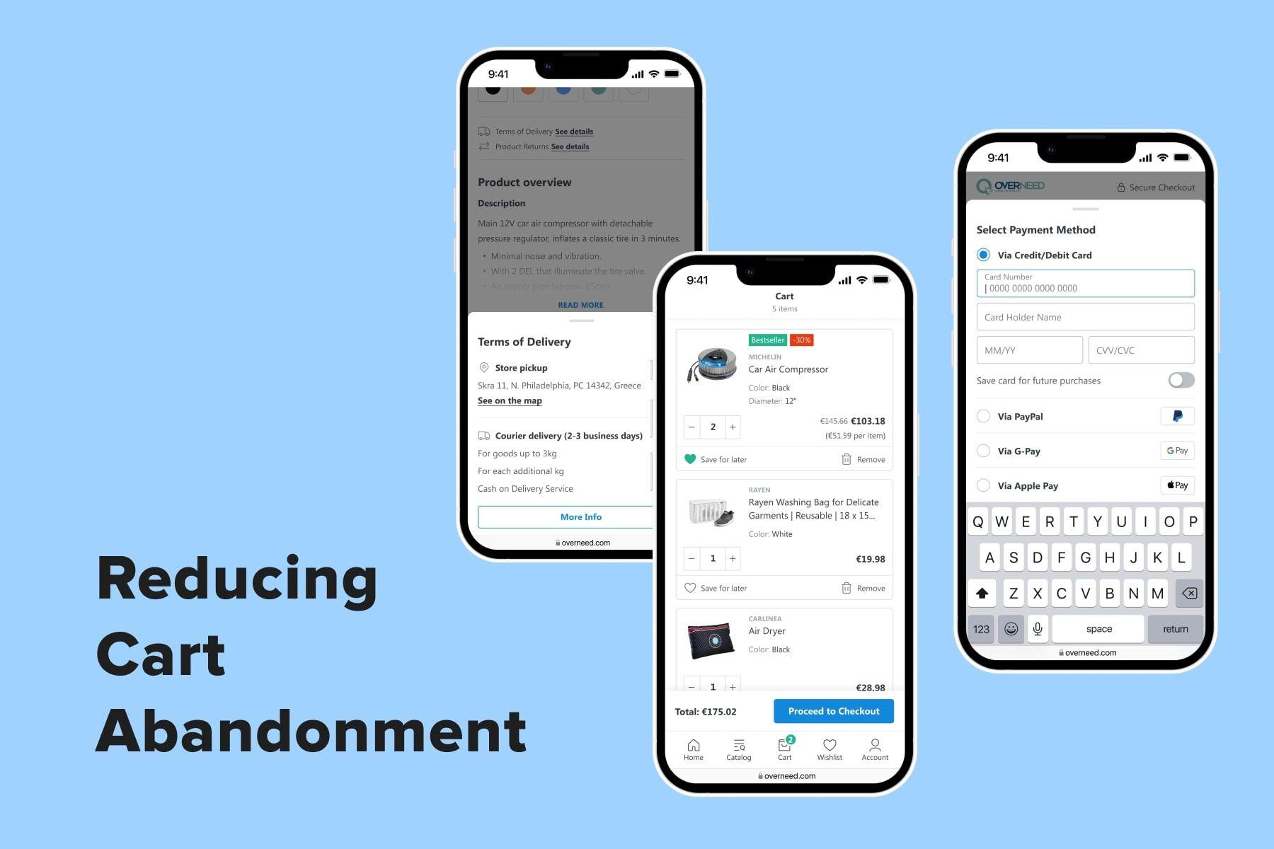
- Open extra links in pop-ups. It’s a good idea to mention your shipping and return policies once again in the cart, but the form matters. Instead of directing users to dedicated pages, keep opening the details in pop-ups.
That’s what we did for one of our projects. For more useful details, .
- Be wise with cross-selling blocks. The cart is a popular spot for displaying product recommendations. But wavering customers may decide to explore, say, similar items and end up being flummoxed, tired, and not wanting to buy anything. Regarding related goods like matching pants for a jacket, consumables for a lantern, or hair dryer attachments, it’s worth offering them. However, it’s better to demonstrate them on the PDP. Also, showcasing earlier bought/viewed items is relatively safe since people have already explored them.
Be Proactive with Promo Codes
We often come across advice to keep the corresponding field in an accordion to prevent shoppers from leaving the cart page in search of a promo code. In fact, a collapsed block is still visible; this trick won’t stop people. What you can do instead:
- Offer relevant promo codes right next to the field. There can be sitewide campaigns or individual discounts for registered customers. All users need to do is tick the checkbox. On mobile, you may need to collapse this block just to save space. It's considered the best practice in devices, leading to better usability without sacrificing accessibility. But on a desktop, there’s no point in hiding.
- Make it easy to copy the promo codes on the home and product pages. Any kind of discount motivates people to make a purchase. But when it comes to promo codes, users often need to highlight and copy the word. It’s not comfy on mobile, for example. But if you provide a little icon to tap and copy instantly, you’ll simplify the flow.
2.3 Three Strategies for the Checkout Page Refinement
Most prospects at this position in the sales funnel have already decided to buy. Then the greatest work for mitigating shopping cart abandonment effects has to be done on the checkout page.
“Simplify and accelerate” must be the motto for all the improvements aimed to reduce the cart abandonment rate. Further, we’ll find ways to alleviate the process for new and regular customers.
Don’t Complicate the Login Step
Some stores discourage visitors at the very beginning of the flow. As we remember, 24% of online shoppers refuse to buy if forced to create an account. In the meantime, signing up/in can be eased both on desktop and mobile:
- Add the “Continue as a guest” option. Let’s say a person came across your store on Instagram to make an emotional, spontaneous purchase. Faced with such an obstacle, they can lose interest right away. Yes, you want their data and email for marketing purposes. And yes, they know the benefits of being a customer, like saved shipping and payment details and participation in a loyalty program. But let them choose.
- Allow signing up/in via social media, Google, and Apple ID. Relieve people of the need to create and remember yet another password. Sure, browsers and smartphones have autosaving options, but the more convenient options you provide, the better.
- Offer to create an account at the end of the checkout process or on the success page. When people fill out almost all fields, they might be more ok with it. Especially if you give a discount or loyalty program points in return.
- Embrace one-time passwords. An alternative way to register customers is when the system itself creates a password for a newcomer. When they come back and enter the email, it detects a registered user and sends them a one-time code by email or phone number. Then customers can either change the password or continue using these temporary ones for each new session.
Revise the Layout
17% cancel a purchase because of a too-long or/and complicated checkout process.
Surely, you don’t want prospects to make it to the checkout page and say, “Sheesh!” But when they see a very long page or a multi-page process, they might get reluctant to complete the order.
A top priority for each online store must be a convenient checkout. On laptops/PCs/tablets, and, even more importantly, smartphones.
- Remove all possible distractions. Ideally, the checkout is a sort of dead end: it doesn’t display the icons like cart and account; a search field and link-stuffed footer are also absent. It doesn’t have noticeable links to product or service pages as well. The only place to go from the checkout is the homepage since you can’t cut the escape route completely.
- Spare screen space and users’ time. Still, many stores don’t care about their gigantic checkout pages that take up several screens, even on desktops. It’s tiresome to scroll back and forth to check whether the quantity of units is right, the address has no typos, and the total sum is ok. A golden usability rule for eCommerce is showcasing as much important details as possible above the fold. Rearrange the blocks on the page in line with this principle. Also, learn more about forms improvement (from cutting fields to address finder) in the guide.
- Switch to a one-step checkout. Based on their extensive eCommerce expertise, Onilab designers created a formula to keep the checkout flow compact yet informative and convenient for customers. All the forms (shipping address, method, and payment) are gathered on one page. But they’re collapsed, which helps to avoid the mess inherent in a traditional one-step design. The forms appear in pop-ups with no layout shifts, no scrolling, and no loading of separate pages, which is especially handy on smartphones.
Include Newer Payment Methods
Returning to the order abandonment survey by Statista, we see some payment-related issues. 18% of shoppers refuse to entrust their card details to online stores. 9% say there are not enough payment options. So let’s make this part of the checkout experience up to snuff.
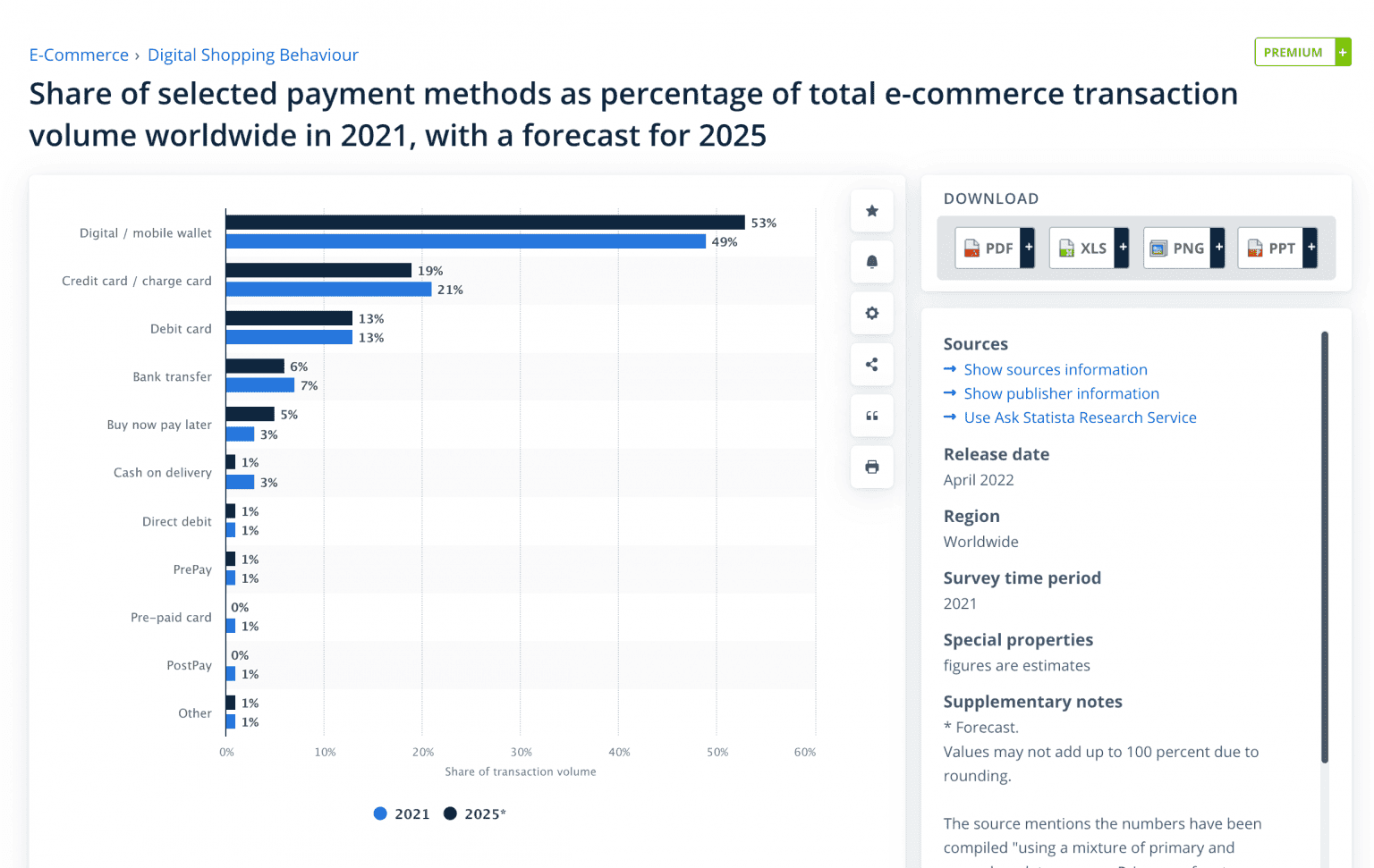
- Integrate digital wallets. These are Apple Pay, PayPal, Google Pay, and Samsung Pay, to name a few. There are two primary benefits of embracing them: wallets securely store credit card information, and with them, users don’t waste time typing and confirming transactions by codes. Statistics show that in 2021, 49% of eCommerce transactions were done via digital wallets.
- Help to skip more steps. Services like PayPal and Amazon Pay also save users’ addresses. It means people won’t need to type them too.
- Implement BNPL (buy now, pay later) options. Services like Klarna and AfterPay allow buyers to split the sum and pay it in a few interest-free installments.
Many of these tactics intersect with tips, so we recommend reading this article too.
3. How to Reduce Cart Abandonment Outside the Store?
The worst effects of shopping cart abandonment, if it’s too high, are lower conversions (and revenue) and lost customer loyalty. But still, you can return people to the sales funnel if they bounce: there are some aces up your sleeve.

Explore our eCommerce portfolio on Behance
See how Onilab's designers and developers transform the UX and improve conversions for online stores across the globe.
3.1 Use Retargeting
This tactic implies showing ads on different websites to users who browsed your store previously but left it empty-handed. Many online stores actively use retargeting, catching up with leads on news portals, social media, and other sites and reminding them of the goods they viewed or placed into a basket but didn’t buy.
This works thanks to cookies that collect data about users (who gave consent) and their behavior in the store. This info becomes the base for precise (which automatically means effective) PPC ads created via Google or Facebook.
BTW, don’t confuse retargeting and remarketing, which refers to interactions (mostly email ones) with customers who bought something previously. So, the former refers to shopping cart abandonment solutions, and the latter deals with customer retention.
3.2 Sent Cart Recovery Emails
If you have the user’s email (they registered or signed up to receive newsletters), you should leverage it by sending the contents of their carts. Marketing studies show that an optimal time slot for such letters is one hour after the cart abandonment event; there are more chances it will lead to a conversion. 20-30 minutes after is too early, and one day on is too late.
Actually, statistics prove cart recovery emails to be quite effective. One study says that the open rate for these emails in 2021 was 43,76%, remaining quite stable since 2016. The CTR for them in the same period fluctuates between 8,29% and 9,16%. So definitely give it a shot.
The Takeaway
Indeed, the more ways to reduce shopping cart abandonment you use, the more improvements you’ll see over time. Many of the measures we discussed lie in the UX/UI design realm, and some deal with performance optimization. Here Onilab’s come in handy. We've already helped dozens of online stores all over the globe to identify and eliminate all sorts of bottlenecks, reduce shopping cart abandonment, and boost online sales. In this light, consider our as a starting point on the way to higher conversion rates.